Create a .NET MAUI Shell app
 Browse the sample
A .NET Multi-platform App UI (.NET MAUI) Shell app can be created with the .NET MAUI App project template, and then by describing the visual hierarchy of the app in the AppShell class.
For a step-by-step walkthrough of how to create a Shell app, see Create a .NET MAUI app.
Describe the visual hierarchy of the app
The visual hierarchy of a .NET MAUI Shell app is described in the subclassed Shell class, which the project template names AppShell. A subclassed Shell class consists of three main hierarchical objects:
- FlyoutItem or TabBar. A FlyoutItem represents one or more items in the flyout, and should be used when the navigation pattern for the app requires a flyout. A TabBar represents the bottom tab bar, and should be used when the navigation pattern for the app begins with bottom tabs and doesn't require a flyout. Every FlyoutItem object or TabBar object is a child of the Shell object.
- Tab, which represents grouped content, navigable by bottom tabs. Every Tab object is a child of a FlyoutItem object or TabBar object.
- ShellContent, which represents the ContentPage objects for each tab. Every ShellContent object is a child of a Tab object. When more than one ShellContent object is present in a Tab, the objects will be navigable by top tabs.
These objects don't represent any user interface, but rather the organization of the app's visual hierarchy. Shell will take these objects and produce the navigation user interface for the content.
The following XAML shows an example of a subclassed Shell class:
<Shell xmlns="http://schemas.microsoft.com/dotnet/2021/maui"
       xmlns:x="http://schemas.microsoft.com/winfx/2009/xaml"
       xmlns:views="clr-namespace:Xaminals.Views"
       x:Class="Xaminals.AppShell">
    ...
    <FlyoutItem FlyoutDisplayOptions="AsMultipleItems">
        <Tab Title="Domestic"
             Icon="paw.png">
            <ShellContent Title="Cats"
                          Icon="cat.png"
                          ContentTemplate="{DataTemplate views:CatsPage}" />
            <ShellContent Title="Dogs"
                          Icon="dog.png"
                          ContentTemplate="{DataTemplate views:DogsPage}" />
        </Tab>
        <!--
        Shell has implicit conversion operators that enable the Shell visual hierarchy to be simplified.
        This is possible because a subclassed Shell object can only ever contain a FlyoutItem object or a TabBar object,
        which can only ever contain Tab objects, which can only ever contain ShellContent objects.

        The implicit conversion automatically wraps the ShellContent objects below in Tab objects.
        -->
        <ShellContent Title="Monkeys"
                      Icon="monkey.png"
                      ContentTemplate="{DataTemplate views:MonkeysPage}" />
        <ShellContent Title="Elephants"
                      Icon="elephant.png"
                      ContentTemplate="{DataTemplate views:ElephantsPage}" />
        <ShellContent Title="Bears"
                      Icon="bear.png"
                      ContentTemplate="{DataTemplate views:BearsPage}" />
    </FlyoutItem>
    ...
</Shell>
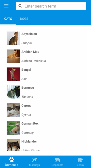
When run, this XAML displays the CatsPage, because it's the first item of content declared in the subclassed Shell class:
Pressing the hamburger icon, or swiping from the left, displays the flyout:
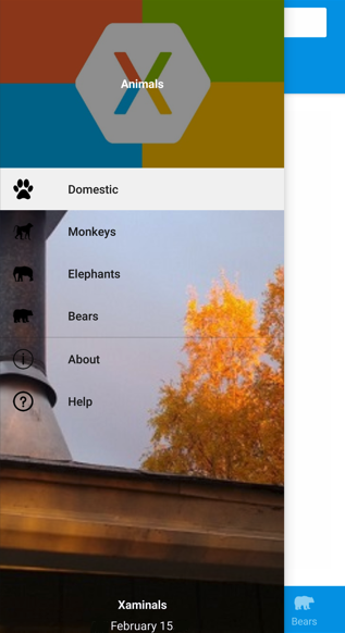
Multiple items are displayed on the flyout because the FlyoutDisplayOptions property is set to AsMultipleItems. For more information, see Flyout display options.
Important
In a Shell app, pages are created on demand in response to navigation. This is accomplished by using the DataTemplate markup extension to set the ContentTemplate property of each ShellContent object to a ContentPage object.
Feedback
Coming soon: Throughout 2024 we will be phasing out GitHub Issues as the feedback mechanism for content and replacing it with a new feedback system. For more information see: https://aka.ms/ContentUserFeedback.
Submit and view feedback for