ListView
 Browse the sample
The .NET Multi-platform App UI (.NET MAUI) ListView displays a scrollable vertical list of selectable data items. While ListView manages the appearance of the list, the appearance of each item in the list is defined by a DataTemplate that uses a Cell to display items. .NET MAUI includes cell types to display combinations of text and images, and you can also define custom cells that display any content you want. ListView also includes support for displaying headers and footers, grouped data, pull-to-refresh, and context menu items.
The ListView class derives from the ItemsView<Cell> class, from which it inherits the following properties:
ItemsSource, of typeIEnumerable, specifies the collection of items to be displayed, and has a default value ofnull.ItemTemplate, of type DataTemplate, specifies the template to apply to each item in the collection of items to be displayed.
ListView defines the following properties:
Footer, of typeobject, specifies the string or view that will be displayed at the end of the list.FooterTemplate, of type DataTemplate, specifies the DataTemplate to use to format theFooter.GroupHeaderTemplate, of type DataTemplate, defines the DataTemplate used to define the appearance of the header of each group. This property is mutually exclusive with theGroupDisplayBindingproperty. Therefore, setting this property will setGroupDisplayBindingtonull.HasUnevenRows, of typebool, indicates whether items in the list can have rows of different heights. The default value of this property isfalse.Header, of typeobject, specifies the string or view that will be displayed at the start of the list.HeaderTemplate, of type DataTemplate, specifies the DataTemplate to use to format theHeader.HorizontalScrollBarVisibility, of typeScrollBarVisibility, indicates when the horizontal scroll bar will be visible.IsGroupedEnabled, of typebool, indicates whether the underlying data should be displayed in groups. The default value of this property isfalse.IsPullToRefreshEnabled, of typebool, indicates whether the user can swipe down to cause the ListView to refresh its data. The default value of this property isfalse.IsRefreshing, of typebool, indicates whether the ListView is currently refreshing. The default value of this property isfalse.RefreshCommand, of type ICommand, represents the command that will be executed when a refresh is triggered.RefreshControlColor, of type Color, determines the color of the refresh visualization that's shown while a refresh occurs.RowHeight, of typeint, determines the height of each row whenHasUnevenRowsisfalse.SelectedItem, of typeobject, represents the currently selected item in the ListView.SelectionMode, of typeListViewSelectionMode, indicates whether items can be selected in the ListView or not. The default value of this property isSingle.SeparatorColor, of type Color, defines the color of the bar that separates items in the list.SeparatorVisibility, of typeSeparatorVisibility, defines whether separators are visible between items.VerticalScrollBarVisibility, of typeScrollBarVisibility, indicates when the vertical scroll bar will be visible.
All of these properties are backed by BindableProperty objects, which means that they can be targets of data bindings, and styled.
In addition, ListView defines the following properties that aren't backed by BindableProperty objects:
GroupDisplayBinding, of typeBindingBase, the binding to use for displaying the group header. This property is mutually exclusive with theGroupHeaderTemplateproperty. Therefore, setting this property will setGroupHeaderTemplatetonull.GroupShortNameBinding, of typeBindingBase, the binding for the name to display in grouped jump lists.CachingStrategy, of typeListViewCachingStrategy, defines the cell reuse strategy of the ListView. This is a read-only property.
ListView defines the following events:
ItemAppearing, which is raised when the visual representation of an item is being added to the visual layout of the ListView. TheItemVisibilityEventArgsobject that accompanies this event definesItemandIndexproperties.ItemDisappearing, which is raised when the visual representation of an item is being removed from the visual layout of the ListView. TheItemVisibilityEventArgsobject that accompanies this event definesItemandIndexproperties.ItemSelected, which is raised when a new item in the list is selected. TheSelectedItemChangedEventArgsobject that accompanies this event definesSelectedItemandSelectedItemIndexproperties.ItemTapped, which raised when an item in the ListView is tapped. TheItemTappedEventArgsobject that accompanies this event definesGroup,Item, andItemIndexproperties.Refreshing, which is raised when a pull to refresh operation is triggered on the ListView.Scrolled, . TheScrolledEventArgsobject that accompanies this event definesScrollXandScrollYproperties.ScrollToRequested. TheScrollToRequestedEventArgsobject that accompanies this event defines Element,Mode,Position,ScrollX,ScrollY, andShouldAnimateproperties.
Populate a ListView with data
A ListView is populated with data by setting its ItemsSource property to any collection that implements IEnumerable.
Important
If the ListView is required to refresh as items are added, removed, or changed in the underlying collection, the underlying collection should be an IEnumerable collection that sends property change notifications, such as ObservableCollection.
ListView can be populated with data by using data binding to bind its ItemsSource property to an IEnumerable collection. In XAML, this is achieved with the Binding markup extension:
<ListView ItemsSource="{Binding Monkeys}" />
The equivalent C# code is:
ListView listView = new ListView();
listView.SetBinding(ItemsView.ItemsSourceProperty, "Monkeys");
In this example, the ItemsSource property data binds to the Monkeys property of the connected viewmodel.
Note
Compiled bindings can be enabled to improve data binding performance in .NET MAUI applications. For more information, see Compiled bindings.
For more information about data binding, see Data binding.
Define item appearance
The appearance of each item in the ListView can be defined by setting the ItemTemplate property to a DataTemplate:
<ListView ItemsSource="{Binding Monkeys}">
    <ListView.ItemTemplate>
        <DataTemplate>
            <ViewCell>
                <Grid Padding="10">
                    <Grid.RowDefinitions>
                        <RowDefinition Height="Auto" />
                        <RowDefinition Height="Auto" />
                    </Grid.RowDefinitions>
                    <Grid.ColumnDefinitions>
                        <ColumnDefinition Width="Auto" />
                        <ColumnDefinition Width="Auto" />
                    </Grid.ColumnDefinitions>
                    <Image Grid.RowSpan="2"
                           Source="{Binding ImageUrl}"
                           Aspect="AspectFill"
                           HeightRequest="60"
                           WidthRequest="60" />
                    <Label Grid.Column="1"
                           Text="{Binding Name}"
                           FontAttributes="Bold" />
                    <Label Grid.Row="1"
                           Grid.Column="1"
                           Text="{Binding Location}"
                           FontAttributes="Italic"
                           VerticalOptions="End" />
                </Grid>
            </ViewCell>
        </DataTemplate>
    </ListView.ItemTemplate>
</ListView>
The elements specified in the DataTemplate define the appearance of each item in the list, and the child of the DataTemplate must be a Cell object. In the example, layout within the DataTemplate is managed by a Grid. The Grid contains an Image object, and two Label objects, that all bind to properties of the Monkey class:
public class Monkey
{
    public string Name { get; set; }
    public string Location { get; set; }
    public string Details { get; set; }
    public string ImageUrl { get; set; }
}
The following screenshot shows the result of templating each item in the list:

For more information about data templates, see Data templates.
Cells
The appearance of each item in a ListView is defined by a DataTemplate, and the DataTemplate must reference a Cell class to display items. Each cell represents an item of data in the ListView. .NET MAUI includes the following built-in cells:
- TextCell, which displays primary and secondary text on separate lines.
- ImageCell, which displays an image with primary and secondary text on separate lines.
- SwitchCell, which displays text and a switch that can be switched on or off.
- EntryCell, which displays a label and text that's editable.
- ViewCell, which is a custom cell whose appearance is defined by a View. This cell type should be used when you want to fully define the appearance of each item in a ListView.
Typically, SwitchCell and EntryCell will only be used in a TableView and won't be used in a ListView. For more information about SwitchCell and EntryCell, see TableView.
Text cell
A TextCell displays primary and secondary text on separate lines. TextCell defines the following properties:
Text, of typestring, defines the primary text to be displayed.TextColor, of type Color, represents the color of the primary text.Detail, of typestring, defines the secondary text to be displayed.DetailColor, of type Color, indicates the color of the secondary text.Command, of type ICommand, defines the command that's executed when the cell is tapped.CommandParameter, of typeobject, represents the parameter that's passed to the command.
These properties are backed by BindableProperty objects, which means that they can be targets of data bindings, and styled.
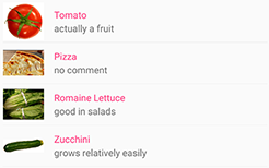
The following example shows using a TextCell to define the appearance of items in a ListView:
<ListView ItemsSource="{Binding Food}">
    <ListView.ItemTemplate>
        <DataTemplate>
            <TextCell Text="{Binding Name}"
                      Detail="{Binding Description}" />
        </DataTemplate>
    </ListView.ItemTemplate>
</ListView>
The following screenshot shows the resulting cell appearance:

Image cell
An ImageCell displays an image with primary and secondary text on separate lines. ImageCell inherits the properties from TextCell, and defines the ImageSource property, of type ImageSource, which specifies the image to be displayed in the cell. This property is backed by a BindableProperty object, which means it can be the target of data bindings, and be styled.
The following example shows using an ImageCell to define the appearance of items in a ListView:
<ListView ItemsSource="{Binding Food}">
    <ListView.ItemTemplate>
        <DataTemplate>
            <ImageCell ImageSource="{Binding Image}"
                       Text="{Binding Name}"
                       Detail="{Binding Description}" />
        </DataTemplate>
    </ListView.ItemTemplate>
</ListView>
The following screenshot shows the resulting cell appearance:
View cell
A ViewCell is a custom cell whose appearance is defined by a View. ViewCell defines a View property, of type View, which defines the view that represents the content of the cell. This property is backed by a BindableProperty object, which means it can be the target of data bindings, and be styled.
Note
The View property is the content property of the ViewCell class, and therefore does not need to be explicitly set from XAML.
The following example shows using a ViewCell to define the appearance of items in a ListView:
<ListView ItemsSource="{Binding Monkeys}">
    <ListView.ItemTemplate>
        <DataTemplate>
            <ViewCell>
                <Grid Padding="10">
                    <Grid.RowDefinitions>
                        <RowDefinition Height="Auto" />
                        <RowDefinition Height="Auto" />
                    </Grid.RowDefinitions>
                    <Grid.ColumnDefinitions>
                        <ColumnDefinition Width="Auto" />
                        <ColumnDefinition Width="Auto" />
                    </Grid.ColumnDefinitions>
                    <Image Grid.RowSpan="2"
                           Source="{Binding ImageUrl}"
                           Aspect="AspectFill"
                           HeightRequest="60"
                           WidthRequest="60" />
                    <Label Grid.Column="1"
                           Text="{Binding Name}"
                           FontAttributes="Bold" />
                    <Label Grid.Row="1"
                           Grid.Column="1"
                           Text="{Binding Location}"
                           FontAttributes="Italic"
                           VerticalOptions="End" />
                </Grid>
            </ViewCell>
        </DataTemplate>
    </ListView.ItemTemplate>
</ListView>
Inside the ViewCell, layout can be managed by any .NET MAUI layout. In this example, layout is managed by a Grid. The Grid contains an Image object, and two Label objects, that all bind to properties of the Monkey class.
The following screenshot shows the result of templating each item in the list:
Choose item appearance at runtime
The appearance of each item in the ListView can be chosen at runtime, based on the item value, by setting the ItemTemplate property to a DataTemplateSelector object:
<ContentPage ...
             xmlns:templates="clr-namespace:ListViewDemos.Templates">
    <ContentPage.Resources>
        <DataTemplate x:Key="AmericanMonkeyTemplate">
            <ViewCell>
                ...
            </ViewCell>
        </DataTemplate>

        <DataTemplate x:Key="OtherMonkeyTemplate">
            <ViewCell>
                ...
            </ViewCell>
        </DataTemplate>

        <templates:MonkeyDataTemplateSelector x:Key="MonkeySelector"
                                             AmericanMonkey="{StaticResource AmericanMonkeyTemplate}"
                                             OtherMonkey="{StaticResource OtherMonkeyTemplate}" />
    </ContentPage.Resources>

    <StackLayout Margin="20">
        <ListView ItemsSource="{Binding Monkeys}"
                  ItemTemplate="{StaticResource MonkeySelector}" />
    </StackLayout>
</ContentPage>
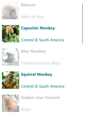
The ItemTemplate property is set to a MonkeyDataTemplateSelector object. The following example shows the MonkeyDataTemplateSelector class:
public class MonkeyDataTemplateSelector : DataTemplateSelector
{
    public DataTemplate AmericanMonkey { get; set; }
    public DataTemplate OtherMonkey { get; set; }

    protected override DataTemplate OnSelectTemplate(object item, BindableObject container)
    {
        return ((Monkey)item).Location.Contains("America") ? AmericanMonkey : OtherMonkey;
    }
}
The MonkeyDataTemplateSelector class defines AmericanMonkey and OtherMonkey DataTemplate properties that are set to different data templates. The OnSelectTemplate override returns the AmericanMonkey template, which displays the monkey name and location in teal, when the monkey name contains "America". When the monkey name doesn't contain "America", the OnSelectTemplate override returns the OtherMonkey template, which displays the monkey name and location in silver:
For more information about data template selectors, see Create a DataTemplateSelector.
Respond to item selection
By default, ListView selection is enabled. However, this behavior can be changed by setting the SelectionMode property. The ListViewSelectionMode enumeration defines the following members:
None– indicates that items cannot be selected.Single– indicates that a single item can be selected, with the selected item being highlighted. This is the default value.
ListView defines an ItemSelected event that's raised when the SelectedItem property changes, either due to the user selecting an item from the list, or when an app sets the property. The SelectedItemChangedEventArgs object that accompanies this event has SelectedItem and SelectedItemIndex properties.
When the SelectionMode property is set to Single, a single item in the ListView can be selected. When an item is selected, the SelectedItem property will be set to the value of the selected item. When this property changes, the ItemSelected event is raised.
The following example shows a ListView that can respond to single item selection:
<ListView ItemsSource="{Binding Monkeys}"
          ItemSelected="OnItemSelected">
    ...
</ListView>
In this example, the OnItemSelected event handler is executed when the ItemSelected event fires, with the event handler retrieving the selected item:
void OnItemSelected(object sender, SelectedItemChangedEventArgs args)
{
    Monkey item = args.SelectedItem as Monkey;
}
The following screenshot shows single item selection in a ListView:

Clear the selection
The SelectedItem property can be cleared by setting it, or the object it binds to, to null.
Disable selection
ListView selection is enabled by default. However, it can be disabled by setting the SelectionMode property to None:
<ListView ...
          SelectionMode="None" />
When the SelectionMode property is set to None, items in the ListView cannot be selected, the SelectedItem property will remain null, and the ItemSelected event will not be fired.
Cache data
ListView is a powerful view for displaying data, but it has some limitations. Scrolling performance can suffer when using custom cells, especially when they contain deeply nested view hierarchies or use certain layouts that require complex measurement. Fortunately, there are techniques you can use to avoid poor performance.
A ListView is often used to display much more data than fits onscreen. For example, a music app might have a library of songs with thousands of entries. Creating an item for every entry would waste valuable memory and perform poorly. Creating and destroying rows constantly would require the app to instantiate and cleanup objects constantly, which would also perform poorly.
To conserve memory, the native ListView equivalents for each platform have built-in features for reusing rows. Only the cells visible on screen are loaded in memory and the content is loaded into existing cells. This pattern prevents the app from instantiating thousands of objects, saving time and memory.
.NET MAUI permits ListView cell reuse through the ListViewCachingStrategy enumeration, which defines the following members:
RetainElement, specifies that the ListView will generate a cell for each item in the list.RecycleElement, specifies that the ListView will attempt to minimize its memory footprint and execution speed by recycling list cells.RecycleElementAndDataTemplate, asRecycleElementwhile also ensuring that when a ListView uses a DataTemplateSelector, DataTemplate objects are cached by the type of item in the list.
Retain elements
The RetainElement caching strategy specifies that the ListView will generate a cell for each item in the list, and is the default ListView behavior. It should be used in the following circumstances:
- Each cell has a large number of bindings (20-30+).
- The cell template changes frequently.
- Testing reveals that the
RecycleElementcaching strategy results in a reduced execution speed.
It's important to recognize the consequences of the RetainElement caching strategy when working with custom cells. Any cell initialization code will need to run for each cell creation, which may be multiple times per second. In this circumstance, layout techniques that were fine on a page, like using multiple nested StackLayout objects, become performance bottlenecks when they're set up and destroyed in real time as the user scrolls.
Recycle elements
The RecycleElement caching strategy specifies that the ListView will attempt to minimize its memory footprint and execution speed by recycling list cells. This mode doesn't always offer a performance improvement, and testing should be performed to determine any improvements. However, it's the preferred choice, and should be used in the following circumstances:
- Each cell has a small to moderate number of bindings.
- Each cell's
BindingContextdefines all of the cell data. - Each cell is largely similar, with the cell template unchanging.
During virtualization the cell will have its binding context updated, and so if an app uses this mode it must ensure that binding context updates are handled appropriately. All data about the cell must come from the binding context or consistency errors may occur. This problem can be avoided by using data binding to display cell data. Alternatively, cell data should be set in the OnBindingContextChanged override, rather than in the custom cell's constructor, as shown in the following example:
public class CustomCell : ViewCell
{
    Image image = null;

    public CustomCell()
    {
        image = new Image();
        View = image;
    }

    protected override void OnBindingContextChanged()
    {
        base.OnBindingContextChanged();

        var item = BindingContext as ImageItem;
        if (item != null)
        {
            image.Source = item.ImageUrl;
        }
    }
}
Recycle elements with a DataTemplateSelector
When a ListView uses a DataTemplateSelector to select a DataTemplate, the RecycleElement caching strategy does not cache DataTemplate objects. Instead, a DataTemplate is selected for each item of data in the list.
Note
The RecycleElement caching strategy requires that when a DataTemplateSelector is asked to select a DataTemplate that each DataTemplate must return the same ViewCell type. For example, given a ListView with a DataTemplateSelector that can return either MyDataTemplateA (where MyDataTemplateA returns a ViewCell of type MyViewCellA), or MyDataTemplateB (where MyDataTemplateB returns a ViewCell of type MyViewCellB), when MyDataTemplateA is returned it must return MyViewCellA or an exception will be thrown.
Recycle elements with DataTemplates
The RecycleElementAndDataTemplate caching strategy builds on the RecycleElement caching strategy by additionally ensuring that when a ListView uses a DataTemplateSelector to select a DataTemplate, DataTemplate objects are cached by the type of item in the list. Therefore, DataTemplate objects are selected once per item type, instead of once per item instance.
Note
The RecycleElementAndDataTemplate caching strategy requires that DataTemplate objects returned by the DataTemplateSelector must use the DataTemplate constructor that takes a Type.
Set the caching strategy
The ListView caching strategy can be defined by in XAML by setting the CachingStrategy attribute:
<ListView CachingStrategy="RecycleElement">
    <ListView.ItemTemplate>
        <DataTemplate>
            <ViewCell>
              ...
            </ViewCell>
        </DataTemplate>
    </ListView.ItemTemplate>
</ListView>
In C#, the caching strategy is set via a constructor overload:
ListView listView = new ListView(ListViewCachingStrategy.RecycleElement);
Set the caching strategy in a subclassed ListView
Setting the CachingStrategy attribute from XAML on a subclassed ListView will not produce the desired behavior, because there's no CachingStrategy property on ListView. The solution to this issue is to specify a constructor on the subclassed ListView that accepts a ListViewCachingStrategy parameter and passes it to the base class:
public class CustomListView : ListView
{
    public CustomListView (ListViewCachingStrategy strategy) : base (strategy)
    {
    }
    ...
}
Then the ListViewCachingStrategy enumeration value can be specified from XAML by using the x:Arguments attribute:
<local:CustomListView>
    <x:Arguments>
        <ListViewCachingStrategy>RecycleElement</ListViewCachingStrategy>
    </x:Arguments>
</local:CustomListView>
Headers and footers
ListView can present a header and footer that scroll with the items in the list. The header and footer can be strings, views, or DataTemplate objects.
ListView defines the following properties for specifying the header and footer:
Header, of typeobject, specifies the string, binding, or view that will be displayed at the start of the list.HeaderTemplate, of type DataTemplate, specifies the DataTemplate to use to format theHeader.Footer, of typeobject, specifies the string, binding, or view that will be displayed at the end of the list.FooterTemplate, of type DataTemplate, specifies the DataTemplate to use to format theFooter.
These properties are backed by BindableProperty objects, which means that the properties can be targets of data bindings.
Display strings in the header and footer
The Header and Footer properties can be set to string values, as shown in the following example:
<ListView ItemsSource="{Binding Monkeys}"
          Header="Monkeys"
          Footer="2022">
    ...
</ListView>
The following screenshot shows the resulting header:

Display views in the header and footer
The Header and Footer properties can each be set to a view. This can be a single view, or a view that contains multiple child views. The following example shows the Header and Footer properties each set to a StackLayout object that contains a Label object:
<ListView ItemsSource="{Binding Monkeys}">
    <ListView.Header>
        <StackLayout BackgroundColor="LightGray">
            <Label Margin="10,0,0,0"
                   Text="Monkeys"
                   FontSize="12"
                   FontAttributes="Bold" />
        </StackLayout>
    </ListView.Header>
    <ListView.Footer>
        <StackLayout BackgroundColor="LightGray">
            <Label Margin="10,0,0,0"
                   Text="Friends of Monkey"
                   FontSize="12"
                   FontAttributes="Bold" />
        </StackLayout>
    </ListView.Footer>
    ...
</ListView>
The following screenshot shows the resulting header:

Display a templated header and footer
The HeaderTemplate and FooterTemplate properties can be set to DataTemplate objects that are used to format the header and footer. In this scenario, the Header and Footer properties must bind to the current source for the templates to be applied, as shown in the following example:
<ListView ItemsSource="{Binding Monkeys}"
          Header="{Binding .}"
          Footer="{Binding .}">
    <ListView.HeaderTemplate>
        <DataTemplate>
            <StackLayout BackgroundColor="LightGray">
                <Label Margin="10,0,0,0"
                       Text="Monkeys"
                       FontSize="12"
                       FontAttributes="Bold" />
            </StackLayout>
        </DataTemplate>
    </ListView.HeaderTemplate>
    <ListView.FooterTemplate>
        <DataTemplate>
            <StackLayout BackgroundColor="LightGray">
                <Label Margin="10,0,0,0"
                       Text="Friends of Monkey"
                       FontSize="12"
                       FontAttributes="Bold" />
            </StackLayout>
        </DataTemplate>
    </ListView.FooterTemplate>
    ...
</ListView>
Control item separators
By default, separators are displayed between ListView items on iOS and Android. This behavior can be changed by setting the SeparatorVisibility property, of type SeparatorVisibility, to None:
<ListView ...
          SeparatorVisibility="None" />
In addition, when the separator is enabled, it's color can be set with the SeparatorColor property:
<ListView ...
          SeparatorColor="Blue" />
Size items
By default, all items in a ListView have the same height, which is derived from the contents of the DataTemplate that defines the appearance of each item. However, this behavior can be changed with the HasUnevenRows and RowHeight properties. By default, the HasUnevenRows property is false.
The RowHeight property can be set to an int that represents the height of each item in the ListView, provided that HasUnevenRows is false. When HasUnevenRows is set to true, each item in the ListView can have a different height. The height of each item will be derived from the contents of the item's DataTemplate, and so each item will be sized to its content.
Individual ListView items can be programmatically resized at runtime by changing layout related properties of elements within the DataTemplate, provided that the HasUnevenRows property is true. The following example changes the height of an Image object when it's tapped:
void OnImageTapped(object sender, EventArgs args)
{
    Image image = sender as Image;
    ViewCell viewCell = image.Parent.Parent as ViewCell;

    if (image.HeightRequest < 250)
    {
      image.HeightRequest = image.Height + 100;
      viewCell.ForceUpdateSize();
    }
}
In this example, the OnImageTapped event handler is executed in response to an Image object being tapped. The event handler updates the height of the Image and the Cell.ForceUpdateSize method updates the cell's size, even when it isn't currently visible.
Warning
Overuse of dynamic item sizing can cause ListView performance to degrade.
Right-to-left layout
ListView can layout its content in a right-to-left flow direction by setting its FlowDirection property to RightToLeft. However, the FlowDirection property should ideally be set on a page or root layout, which causes all the elements within the page, or root layout, to respond to the flow direction:
<ContentPage xmlns="http://schemas.microsoft.com/dotnet/2021/maui"
             xmlns:x="http://schemas.microsoft.com/winfx/2009/xaml"
             x:Class="ListViewDemos.RightToLeftListPage"
             Title="Right to left list"
             FlowDirection="RightToLeft">
    <StackLayout Margin="20">
        <ListView ItemsSource="{Binding Monkeys}">
            ...
        </ListView>
    </StackLayout>
</ContentPage>
The default FlowDirection for an element with a parent is MatchParent. Therefore, the ListView inherits the FlowDirection property value from the StackLayout, which in turn inherits the FlowDirection property value from the ContentPage.
Display grouped data
Large data sets can often become unwieldy when presented in a continually scrolling list. In this scenario, organizing the data into groups can improve the user experience by making it easier to navigate the data.
Data must be grouped before it can be displayed. This can be accomplished by creating a list of groups, where each group is a list of items. The list of groups should be an IEnumerable<T> collection, where T defines two pieces of data:
- A group name.
- An
IEnumerablecollection that defines the items belonging to the group.
The process for grouping data, therefore, is to:
- Create a type that models a single item.
- Create a type that models a single group of items.
- Create an
IEnumerable<T>collection, whereTis the type that models a single group of items. This collection is a collection of groups, which stores the grouped data. - Add data to the
IEnumerable<T>collection.
Example
When grouping data, the first step is to create a type that models a single item. The following example shows the Animal class:
public class Animal
{
    public string Name { get; set; }
    public string Location { get; set; }
    public string Details { get; set; }
    public string ImageUrl { get; set; }
}
The Animal class models a single item. A type that models a group of items can then be created. The following example shows the AnimalGroup class:
public class AnimalGroup : List<Animal>
{
    public string Name { get; private set; }

    public AnimalGroup(string name, List<Animal> animals) : base(animals)
    {
        Name = name;
    }
}
The AnimalGroup class inherits from the List<T> class and adds a Name property that represents the group name.
An IEnumerable<T> collection of groups can then be created:
public List<AnimalGroup> Animals { get; private set; } = new List<AnimalGroup>();
This code defines a collection named Animals, where each item in the collection is an AnimalGroup object. Each AnimalGroup object comprises a name, and a List<Animal> collection that defines the Animal objects in the group.
Grouped data can then be added to the Animals collection:
Animals.Add(new AnimalGroup("Bears", new List<Animal>
{
    new Animal
    {
        Name = "American Black Bear",
        Location = "North America",
        Details = "Details about the bear go here.",
        ImageUrl = "https://upload.wikimedia.org/wikipedia/commons/0/08/01_Schwarzbär.jpg"
    },
    new Animal
    {
        Name = "Asian Black Bear",
        Location = "Asia",
        Details = "Details about the bear go here.",
        ImageUrl = "https://upload.wikimedia.org/wikipedia/commons/thumb/b/b7/Ursus_thibetanus_3_%28Wroclaw_zoo%29.JPG/180px-Ursus_thibetanus_3_%28Wroclaw_zoo%29.JPG"
    },
    // ...
}));

Animals.Add(new AnimalGroup("Monkeys", new List<Animal>
{
    new Animal
    {
        Name = "Baboon",
        Location = "Africa & Asia",
        Details = "Details about the monkey go here.",
        ImageUrl = "https://upload.wikimedia.org/wikipedia/commons/thumb/f/fc/Papio_anubis_%28Serengeti%2C_2009%29.jpg/200px-Papio_anubis_%28Serengeti%2C_2009%29.jpg"
    },
    new Animal
    {
        Name = "Capuchin Monkey",
        Location = "Central & South America",
        Details = "Details about the monkey go here.",
        ImageUrl = "https://upload.wikimedia.org/wikipedia/commons/thumb/4/40/Capuchin_Costa_Rica.jpg/200px-Capuchin_Costa_Rica.jpg"
    },
    new Animal
    {
        Name = "Blue Monkey",
        Location = "Central and East Africa",
        Details = "Details about the monkey go here.",
        ImageUrl = "https://upload.wikimedia.org/wikipedia/commons/thumb/8/83/BlueMonkey.jpg/220px-BlueMonkey.jpg"
    },
    // ...
}));
This code creates two groups in the Animals collection. The first AnimalGroup is named Bears, and contains a List<Animal> collection of bear details. The second AnimalGroup is named Monkeys, and contains a List<Animal> collection of monkey details.
ListView will display grouped data, provided that the data has been grouped correctly, by setting the IsGroupingEnabled property to true:
<ListView ItemsSource="{Binding Animals}"
          IsGroupingEnabled="True">
    <ListView.ItemTemplate>
        <DataTemplate>
            <ViewCell>
                <Grid Padding="10">
                    <Grid.RowDefinitions>
                        <RowDefinition Height="Auto" />
                        <RowDefinition Height="Auto" />
                    </Grid.RowDefinitions>
                    <Grid.ColumnDefinitions>
                        <ColumnDefinition Width="Auto" />
                        <ColumnDefinition Width="Auto" />
                    </Grid.ColumnDefinitions>
                    <Image Grid.RowSpan="2"
                           Source="{Binding ImageUrl}"
                           Aspect="AspectFill"
                           HeightRequest="60"
                           WidthRequest="60" />
                    <Label Grid.Column="1"
                           Text="{Binding Name}"
                           FontAttributes="Bold" />
                    <Label Grid.Row="1"
                           Grid.Column="1"
                           Text="{Binding Location}"
                           FontAttributes="Italic"
                           VerticalOptions="End" />
                </Grid>
            </ViewCell>
        </DataTemplate>
    </ListView.ItemTemplate>
</ListView>
The equivalent C# code is:
ListView listView = new ListView
{
    IsGroupingEnabled = true
};
listView.SetBinding(ItemsView.ItemsSourceProperty, "Animals");
// ...
The appearance of each item in the ListView is defined by setting its ItemTemplate property to a DataTemplate. For more information, see Define item appearance.
The following screenshot shows the ListView displaying grouped data:
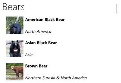
Note
By default, ListView will display the group name in the group header. This behavior can be changed by customizing the group header.
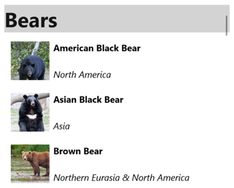
Customize the group header
The appearance of each group header can be customized by setting the ListView.GroupHeaderTemplate property to a DataTemplate:
<ListView ItemsSource="{Binding Animals}"
          IsGroupingEnabled="True">
    <ListView.GroupHeaderTemplate>
        <DataTemplate>
            <ViewCell>
                <Label Text="{Binding Name}"
                       BackgroundColor="LightGray"
                       FontSize="18"
                       FontAttributes="Bold" />
            </ViewCell>
        </DataTemplate>
    </ListView.GroupHeaderTemplate>
    ...
</ListView>
In this example, each group header is set to a Label that displays the group name, and that has other appearance properties set. The following screenshot shows the customized group header:
Important
The GroupHeaderTemplate property is mutually exclusive with the GroupDisplayBinding property. Therefore, both properties should not be set.
Group without templates
ListView can display correctly grouped data without setting the ItemTemplate property to a DataTemplate:
<ListView ItemsSource="{Binding Animals}"
          IsGroupingEnabled="true" />
In this scenario, meaningful data can be displayed by overriding the ToString method in the type that models a single item, and the type that models a single group of items.
Control scrolling
ListView defines two ScrollTo methods, that scroll items into view. One of the overloads scrolls the specified item into view, while the other scrolls the specified item in the specified group into view. Both overloads have additional arguments that allow the exact position of the item after the scroll has completed to be specified, and whether to animate the scroll.
ListView defines a ScrollToRequested event that is fired when one of the ScrollTo methods is invoked. The ScrollToRequestedEventArgs object that accompanies the ScrollToRequested event has many properties, including ShouldAnimate, Element, Mode, and Position. Some of these properties are set from the arguments specified in the ScrollTo method calls.
In addition, ListView defines a Scrolled event that is fired to indicate that scrolling occurred. The ScrolledEventArgs object that accompanies the Scrolled event has ScrollX and ScrollY properties.
Detect scrolling
ListView defines a Scrolled event which is fired to indicate that scrolling occurred. The ItemsViewScrolledEventArgs class, which represents the object that accompanies the Scrolled event, defines the following properties:
ScrollX, of typedouble, represents the X position of the scrollScrollY, of typedouble, represents the Y position of the scroll.
The following XAML example shows a ListView that sets an event handler for the Scrolled event:
<ListView Scrolled="OnListViewScrolled">
    ...
</ListView>
The equivalent C# code is:
ListView listView = new ListView();
listView.Scrolled += OnListViewScrolled;
In this code example, the OnListViewScrolled event handler is executed when the Scrolled event fires:
void OnListViewScrolled(object sender, ScrolledEventArgs e)
{
    // Custom logic
}
Important
The Scrolled event is fired for user initiated scrolls, and for programmatic scrolls.
Scroll an item into view
The ScrollTo method scrolls the specified item into view. Given a ListView object named listView, the following example shows how to scroll the Proboscis Monkey item into view:
MonkeysViewModel viewModel = BindingContext as MonkeysViewModel;
Monkey monkey = viewModel.Monkeys.FirstOrDefault(m => m.Name == "Proboscis Monkey");
listView.ScrollTo(monkey, ScrollToPosition.MakeVisible, true);
Alternatively, an item in grouped data can be scrolled into view by specifying the item and the group. The following example shows how to scroll the Proboscis Monkey item in the Monkeys group into view:
GroupedAnimalsViewModel viewModel = BindingContext as GroupedAnimalsViewModel;
AnimalGroup group = viewModel.Animals.FirstOrDefault(a => a.Name == "Monkeys");
Animal monkey = group.FirstOrDefault(m => m.Name == "Proboscis Monkey");
listView.ScrollTo(monkey, group, ScrollToPosition.MakeVisible, true);
Note
The ScrollToRequested event is fired when the ScrollTo method is invoked.
Disable scroll animation
A scrolling animation is displayed when scrolling an item into view. However, this animation can be disabled by setting the animated argument of the ScrollTo method to false:
listView.ScrollTo(monkey, position: ScrollToPosition.MakeVisible, animate: false);
Control scroll position
When scrolling an item into view, the exact position of the item after the scroll has completed can be specified with the position argument of the ScrollTo methods. This argument accepts a ScrollToPosition enumeration member.
MakeVisible
The ScrollToPosition.MakeVisible member indicates that the item should be scrolled until it's visible in the view:
listView.ScrollTo(monkey, position: ScrollToPosition.MakeVisible, animate: true);
Start
The ScrollToPosition.Start member indicates that the item should be scrolled to the start of the view:
listView.ScrollTo(monkey, position: ScrollToPosition.Start, animate: true);
Center
The ScrollToPosition.Center member indicates that the item should be scrolled to the center of the view:
listView.ScrollTo(monkey, position: ScrollToPosition.Center, animate: true);
End
The ScrollToPosition.End member indicates that the item should be scrolled to the end of the view:
listView.ScrollTo(monkey, position: ScrollToPosition.End, animate: true);
Scroll bar visibility
ListView defines HorizontalScrollBarVisibility and VerticalScrollBarVisibility properties, which are backed by bindable properties. These properties get or set a ScrollBarVisibility enumeration value that represents when the horizontal, or vertical, scroll bar is visible. The ScrollBarVisibility enumeration defines the following members:
Defaultindicates the default scroll bar behavior for the platform, and is the default value for theHorizontalScrollBarVisibilityandVerticalScrollBarVisibilityproperties.Alwaysindicates that scroll bars will be visible, even when the content fits in the view.Neverindicates that scroll bars will not be visible, even if the content doesn't fit in the view.
Add context menus
ListView supports context menus items, which are defined as MenuItem objects that are added to the ViewCell.ContextActions collection in the DataTemplate for each item:
<ListView x:Name="listView"
          ItemsSource="{Binding Monkeys}">
    <ListView.ItemTemplate>
        <DataTemplate>
            <ViewCell>
                <ViewCell.ContextActions>
                    <MenuItem Text="Favorite"
                              Command="{Binding Source={x:Reference listView}, Path=BindingContext.FavoriteCommand}"
                              CommandParameter="{Binding}" />
                    <MenuItem Text="Delete"
                              Command="{Binding Source={x:Reference listView}, Path=BindingContext.DeleteCommand}"
                              CommandParameter="{Binding}" />
                </ViewCell.ContextActions>

                ...
            </ViewCell>
        </DataTemplate>
    </ListView.ItemTemplate>
</ListView>
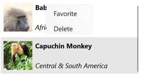
The MenuItem objects are revealed when an item in the ListView is right-clicked:
For more information about menu items, see Display menu items.
Pull to refresh
ListView supports pull to refresh functionality, which enables the data being displayed to be refreshed by pulling down on the list of items.
To enable pull to refresh, set the IsPullToRefreshEnabled property to true. When a refresh is triggered, ListView raises the Refreshing event, and the IsRefreshing property will be set to true. The code required to refresh the contents of the ListView should then be executed by the handler for the Refreshing event, or by the ICommand implementation the RefreshCommand executes. Once the ListView is refreshed, the IsRefreshing property should be set to false, or the EndRefresh method should be called on the ListView, to indicate that the refresh is complete.
The following example shows a ListView that uses pull to refresh:
<ListView ItemsSource="{Binding Animals}"
          IsPullToRefreshEnabled="true"
          RefreshCommand="{Binding RefreshCommand}"
          IsRefreshing="{Binding IsRefreshing}">
    <ListView.ItemTemplate>
        <DataTemplate>
            <ViewCell>
                ...
            </ViewCell>
        </DataTemplate>
    </ListView.ItemTemplate>
</ListView>
In this example, when the user initiates a refresh, the ICommand defined by the RefreshCommand property is executed, which should refresh the items being displayed. A refresh visualization is shown while the refresh occurs, which consists of an animated progress circle. The value of the IsRefreshing property indicates the current state of the refresh operation. When a refresh is triggered, this property will automatically transition to true. Once the refresh completes, you should reset the property to false.
Feedback
Coming soon: Throughout 2024 we will be phasing out GitHub Issues as the feedback mechanism for content and replacing it with a new feedback system. For more information see: https://aka.ms/ContentUserFeedback.
Submit and view feedback for