Windows Presentation Foundation
A part of the .NET Framework that provides a unified programming model for building line-of-business desktop applications on Windows.
2,676 questions
This browser is no longer supported.
Upgrade to Microsoft Edge to take advantage of the latest features, security updates, and technical support.
' cx='32' cy='32' r='32' /%3E%3Ctext x='50%25' y='55%25' dominant-baseline='middle' text-anchor='middle' fill='%23FFF' %3EKB%3C/text%3E%3C/svg%3E)
Hi,
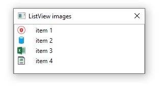
I've created an app in Visual Studio in C# using a WPF page - all works fine.
The app displays a list view which has several sub lists (looks very similar to an Expander), I don't like the large arrow in circle icon and would like to change it to something like the small arrows you can see in Windows Explorer or the arrows in the Solution Explorer in Visual Studio.
Any advise on the best way to do this, I've struggled with MS Blend but not managed to make this work.
Thanks/

You can change the Expander's circle icon to small arrows with below style:
  <Window.Resources>
        <Style x:Key="ExpanderStyle" TargetType="{x:Type Expander}">
            <Setter Property="Foreground" Value="#FF217cb5"/>
            <Setter Property="FontFamily" Value="宋体" />
            <Setter Property="FontSize" Value="14" />
            <Setter Property="Background" Value="Transparent"/>
            <Setter Property="HorizontalContentAlignment" Value="Stretch"/>
            <Setter Property="VerticalContentAlignment" Value="Stretch"/>
            <Setter Property="BorderBrush" Value="Transparent"/>
            <Setter Property="BorderThickness" Value="0"/>
            <Setter Property="Template">
                <Setter.Value>
                    <ControlTemplate TargetType="{x:Type Expander}">
                        <Canvas Background="{TemplateBinding Background}" SnapsToDevicePixels="true">
                            <ToggleButton x:Name="HeaderSite"
                          Canvas.Top="0"
                          ContentTemplate="{TemplateBinding HeaderTemplate}"
                          ContentTemplateSelector="{TemplateBinding HeaderTemplateSelector}"
                          Content="{TemplateBinding Header}"
                          IsChecked="{Binding IsExpanded, Mode=TwoWay, RelativeSource={RelativeSource TemplatedParent}}"
                          Style="{DynamicResource ToggleButtonStyle}" />

                            <Border x:Name="ExpandSite"  HorizontalAlignment="{TemplateBinding HorizontalContentAlignment}"
                      VerticalAlignment="{TemplateBinding VerticalContentAlignment}"
                      Visibility="Collapsed"
                      Canvas.Top="35" Canvas.Left="0"
                      Focusable="false"
                      BorderBrush="{TemplateBinding BorderBrush}"
                      BorderThickness="{TemplateBinding BorderThickness}"
                      Width="{Binding ElementName=HeaderSite,Path=Width}"
                      Background="#7Ae9f4fa"
                      >
                                <ContentPresenter Margin="10 10"
                          HorizontalAlignment="{TemplateBinding HorizontalContentAlignment}"
                          VerticalAlignment="{TemplateBinding VerticalContentAlignment}" />
                            </Border>

                        </Canvas>
                        <ControlTemplate.Triggers>
                            <Trigger Property="IsExpanded" Value="true">
                                <Setter Property="Visibility" TargetName="ExpandSite" Value="Visible"/>
                            </Trigger>
                            <Trigger Property="IsEnabled" Value="false">
                                <Setter Property="Foreground" Value="{DynamicResource {x:Static SystemColors.GrayTextBrushKey}}"/>
                            </Trigger>
                        </ControlTemplate.Triggers>
                    </ControlTemplate>
                </Setter.Value>
            </Setter>
        </Style>
        <Style x:Key="ToggleButtonStyle" TargetType="{x:Type ToggleButton}">
            <Setter Property="FocusVisualStyle" Value="{x:Null}"/>
            <Setter Property="Width" Value="245"/>
            <Setter Property="Height" Value="35" />
            <Setter Property="Background" Value="#7Ad2e7f4" />
            <Setter Property="Foreground" Value="#FF217cb5"/>
            <Setter Property="FontSize" Value="14" />
            <Setter Property="FontFamily" Value="宋体" />
            <Setter Property="FontWeight" Value="Bold" />
            <Setter Property="BorderThickness" Value="0"/>
            <Setter Property="HorizontalContentAlignment" Value="Left"/>
            <Setter Property="VerticalContentAlignment" Value="Center"/>
            <Setter Property="Padding" Value="20 10"/>
            <Setter Property="Template">
                <Setter.Value>
                    <ControlTemplate TargetType="{x:Type ToggleButton}">
                        <Canvas Width="{TemplateBinding Width}" Height="{TemplateBinding Height}"  Background="{TemplateBinding Background}" SnapsToDevicePixels="True">
                            <Canvas x:Name="canvNormal" Visibility="Visible"  Width="{TemplateBinding Width}" Height="{TemplateBinding Height}"  Background="{TemplateBinding Background}" SnapsToDevicePixels="True" Canvas.Right="0">
                                <Path Data="M13.5,10.697l-3.497-3.6l-3.497,3.6L6.494,8.328l3.503-3.631l3.48,3.592L13.494,10.697z" Fill="#297eb4" Canvas.Left="5" Canvas.Top="10" RenderTransformOrigin="0.5 0.5" >
                                    <Path.RenderTransform>
                                        <RotateTransform Angle="180" />
                                    </Path.RenderTransform>
                                </Path>
                            </Canvas>
                            <Canvas x:Name="canvChecked" Visibility="Hidden"  Width="{TemplateBinding Width}" Height="{TemplateBinding Height}"  Background="{TemplateBinding Background}" SnapsToDevicePixels="True" Canvas.Right="0">
                                <Path Data="M13.5,10.697l-3.497-3.6l-3.497,3.6L6.494,8.328l3.503-3.631l3.48,3.592L13.494,10.697z" Fill="#297eb4" Canvas.Left="0" Canvas.Top="8" />
                            </Canvas>

                            <ContentPresenter HorizontalAlignment="{TemplateBinding HorizontalContentAlignment}"  Margin="{TemplateBinding Padding}"  RecognizesAccessKey="True"  SnapsToDevicePixels="{TemplateBinding SnapsToDevicePixels}"  VerticalAlignment="{TemplateBinding VerticalContentAlignment}"/>
                        </Canvas>

                        <ControlTemplate.Triggers>
                            <Trigger Property="IsPressed" Value="true">
                                <Setter Property="Background" Value="#FFd2e7f4" />
                            </Trigger>
                            <Trigger Property="IsChecked" Value="true">
                                <Setter Property="Visibility" TargetName="canvChecked" Value="Visible" />
                                <Setter Property="Visibility" TargetName="canvNormal" Value="Hidden" />
                            </Trigger>
                            <Trigger Property="IsEnabled" Value="false">
                                <Setter Property="Foreground" Value="{DynamicResource {x:Static SystemColors.GrayTextBrushKey}}"/>
                            </Trigger>
                        </ControlTemplate.Triggers>
                    </ControlTemplate>
                </Setter.Value>
            </Setter>
        </Style>
    </Window.Resources>
    <StackPanel>
        <Expander ExpandDirection="Down "
                  HorizontalAlignment="Left" IsExpanded="true"
                  Margin="46,0,0,60" Style="{DynamicResource ExpanderStyle}"
                  Height="122.5" VerticalAlignment="Bottom" >
            <Expander.Header>
                <TextBlock Text="Header" />
            </Expander.Header>
            <Expander.Content>
                <TextBlock Text="Content  Content Content Content Content Content" TextWrapping="Wrap"  />

            </Expander.Content>
        </Expander>
        <Expander ExpandDirection="Up"
                  HorizontalAlignment="Left" IsExpanded="true"
                  Margin="46,0,0,60" Style="{DynamicResource ExpanderStyle}"
                  Height="122.5" VerticalAlignment="Bottom" >
            <Expander.Header>
                <TextBlock Text="Header" />
            </Expander.Header>
            <Expander.Content>
                <TextBlock Text="Content  Content Content Content Content Content" TextWrapping="Wrap"  />

            </Expander.Content>
        </Expander>
    </StackPanel>
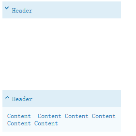
The result picture is:
If the response is helpful, please click "Accept Answer" and upvote it.
Note: Please follow the steps in our documentation to enable e-mail notifications if you want to receive the related email notification for this thread.
Thanks DaisyTian-MSFT - thats perfect to get me started.

Hello @Kevin Bell
This may or may not be what you want or perhaps lead you in the right direction. Would be great to see a screenshot of what you have.
https://github.com/karenpayneoregon/csharp-features/tree/master/WpfApplication1