Excel 2019 - hw does one left-justify the text in an Excel horizontal bar chart axis label?

gmj 131 Reputation points
2020-08-04T20:46:52.2+00:00

Environment
• Windows 10 Enterprise (1909) 64-bit
• Excel 2019 (part of Office Professional Plus 2019)

How graphic was created
• Highlight desired data in Excel spreadsheet
• From Excel ribbon

  • Insert chart
  • Bar
  • 100% Stacked Bar

One would think that by highlighting the label area text box and clicking on the alignment options, one could left-justify the text … nothing seems to work. A web search yields questions about this issue but no solutions.

How does one left-justify the text (as shown in the second image below)?

Image 1. How Excel generates the graphic …
15621-image-1.png

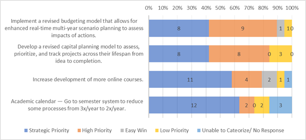
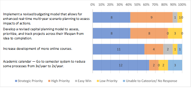
Image 2. How I’d like the graphic to appear – i.e., text in the row labels is left-justified (or right-justified) …
15593-image-2.png

Excel Management
Excel Management
Excel: A family of Microsoft spreadsheet software with tools for analyzing, charting, and communicating data.Management: The act or process of organizing, handling, directing or controlling something.
1,638 questions
0 comments No comments
{count} votes

3 answers

Sort by: Most helpful
  1. Alex 6 Reputation points
    2021-01-06T12:05:53.98+00:00

    Workaround: This is possible in Powerpoint Charts, although a bit hidden: Mark the text element, got to "Paragraph" section in the ribbon "Home" and click on the small arrow in the bottom right corner. In the dialogue, set your alignment in the dropdown of the section "General".

    Another possibility, if you need to stay in Excel: You could use data labels and assign each data label the address of the cell with the label text. Data labels can be justified, as suggested by teylyn here https://answers.microsoft.com/en-us/office/forum/office_2013_release-excel/cannot-format-axis-labels/137abcec-6009-4ce4-869b-357753447e0a.

    1 person found this answer helpful.
    0 comments No comments

  2. Mårten Alkhagen 5 Reputation points
    2023-08-04T07:48:40.1933333+00:00

    I just experienced the same problem and have made a simple work-around. If you have your labels for the Y-axis in for example A3:A13 you need to create column B where you input =A3&REPT(" ",MAX(LEN($A$3:$A$13))-LEN(A3)) in B3 and copy downwards. This will add blank spaces so that all labels have exactly the same length as the longest label in the range A3:A13. Use column B for your chart instead of column A.

    And now, here comes the trick, go to the chart and mark the Y-axis and select a monospaced font, e.g. Courier, Lucida Console, etc. This will make it look like it is left justified, I hope this can help!

    I noted that my solution works only for one row labels, for multiple row labels the auto wrapping will make a mess...

    1 person found this answer helpful.

  3. Emi Zhang-MSFT 21,626 Reputation points Microsoft Vendor
    2020-08-05T07:47:17.807+00:00

    I tested this problem and I found you cannot align the content to left, this is by default behavior in Excel.