Azure Media Services
A group of Azure services that includes encoding, format conversion, on-demand streaming, content protection, and live streaming services.
303 questions
This browser is no longer supported.
Upgrade to Microsoft Edge to take advantage of the latest features, security updates, and technical support.
' cx='32' cy='32' r='32' /%3E%3Ctext x='50%25' y='55%25' dominant-baseline='middle' text-anchor='middle' fill='%23FFF' %3EC%3C/text%3E%3C/svg%3E)
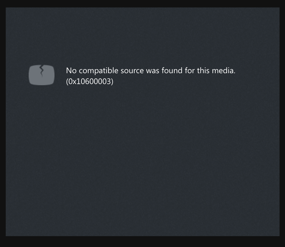
I'm trying to make my video responsive and get rid of the extra height above and below the video.
(Note the black background in the screenshot)
HTML:
<div class="video-embed-container">
<video id="vid1" class="video-embed azuremediaplayer amp-default-skin" autoplay controls width="640" height="400" poster="poster.jpg" data-setup='{"nativeControlsForTouch": false}'>
        <source src="http://amssamples.streaming.mediaservices.windows.net/91492735-c523-432b-ba01-faba6c2206a2/AzureMediaServicesPromo.ism/manifest" type="application/vnd.ms-sstr+xml" />
        <p class="amp-no-js">
            To view this video please enable JavaScript, and consider upgrading to a web browser that supports HTML5 video
        </p>
    </video>
</div>
CSS
.video-embed-container {
    position: relative;
}

.video-embed {
    position: absolute;
    top: 0;
    left: 0;
    width: 100%;
    height: 100%;
}
The code above doesn't work, especially for the height. Whenever I specify a height, the video disappears from view.
' cx='32' cy='32' r='32' /%3E%3Ctext x='50%25' y='55%25' dominant-baseline='middle' text-anchor='middle' fill='%23FFF' %3EA%3C/text%3E%3C/svg%3E)
ChokYiNing-7627, Thanks for the question. To better assist you on this, is this issue confined to only specific video? if you haven't done this already, could you try with https://ampdemo.azureedge.net/ and test your sample.
Hi, I tried replacing my media file with the share URL i got from your suggestion:
https://aka.ms/azuremediaplayer?url=%2F%2Famssamples.streaming.mediaservices.windows.net%2F3b970ae0-39d5-44bd-b3a3-3136143d6435%2FAzureMediaServicesPromo.ism%2Fmanifest
Now this is what appears on my page
This is the full code
<div class="video-embed-container">
<video id="vid1" class="video-embed azuremediaplayer amp-default-skin" controls width="640" height="400" poster="poster.jpg" data-setup='{"nativeControlsForTouch": false}, "playbackSpeed": {"enabled": true}'>
        <source src="https://aka.ms/azuremediaplayer?url=%2F%2Famssamples.streaming.mediaservices.windows.net%2F3b970ae0-39d5-44bd-b3a3-3136143d6435%2FAzureMediaServicesPromo.ism%2Fmanifest" type="application/vnd.ms-sstr+xml" />
        <p class="amp-no-js">
            To view this video please enable JavaScript, and consider upgrading to a web browser that supports HTML5 video
        </p>
    </video>
</div>
cyn-7627, Thanks for the follow-up and sharing additional info. I did not have any problem with the link on Edge. Just to clarify, on what device/browser did you see the error?
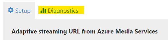
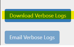
You may also review the diagnostic/verbose logs, by navigating to "diagnostics" option on https://ampdemo.azureedge.net/azuremediaplayer.html
 -->
--> 
i'm using google chrome. trying to embed the video on squarespace.
is there no simpler way to:
@cyn , Thanks for the info. While I'm checking on this internally for the embed video/config.
If feasible, could you please share the original source URL for the video?
And the player webpage that has problems (simple webpage with a repro is the best). Also, just to isolate, the possibility that the video itself contains the black bars to fit a certain aspect ratio(?).
We tested our AMP player hosted on the demo page and is responsive with no overrides to the default CSS.
Kindly let me know. Much appreciate the follow-up.
@cyn , Thanks for sharing the video URLs. We have tried both the streaming URL in AMP and the page URL, we did not see any black borders.
After further analysis, the black borders are not part of the video being streamed, looks they are being generated by the browser player. See reference the html 5 spec.

"In the absence of style rules to the contrary, video content should be rendered inside the element's playback area such that the video content is shown centered in the playback area at the largest possible size that fits completely within it, with the video content's aspect ratio being preserved. Thus, if the aspect ratio of the playback area does not match the aspect ratio of the video, the video will be shown letterboxed or pillarboxed. Areas of the element's playback area that do not contain the video represent nothing."
If you specify fixed width and height for the video element, then those must match the aspect ratio of the video content.
To make the video player "responsive” and self-adjust to whatever video aspect ratio, then you must use something like this: responsive web design -videos.
Note: This post contains 3rd-party sites for your reference only.
--
To benefit the community find the right answers, please do mark the post which was helpful by clicking on ‘Accept Answer’ & ‘Up-Vote’.