General form guidelines
This article contains the guidelines that apply to all forms, regardless of form pattern. This checklist must be used in addition to any pattern-specific guidelines.
Verification checklist
The verification checklist shows the steps for manually verifying that the form complies with the UX guidelines. This checklist doesn't include any guidelines that will be enforced automatically through the development environment. Open the form in the browser, and walk through these steps.
Standard form guidelines
Specific form patterns and subpatterns might have exceptions to these guidelines.
The form layout is responsive when the browser is resized or the app is run on different device sizes. In other words, all the fields should be accessible to the user either by reflowing the layout or by scrolling to the fields.
Make sure that the form’s default View/Edit state is correct. By default, forms are in View mode. If a form should always be in Edit mode, you must explicitly set Form.Design.ViewEditMode=Edit.
- The View/Edit state should be appropriate to the state of the entity. For example, if the state of the entity is Posted, and the form can’t be edited, the default state should be View mode (and Edit mode should be disabled).
Form captions:
- Avoid setting the form caption programmatically. Instead, consider setting the TitleDataSource property on the form design node to enable the framework to provide the caption dynamically.
- If you can't avoid setting the form caption programmatically, make sure that it's short (no more than 30 characters). This guideline exists because a large font size is used for the form in some form types.
- Exceptions: Custom Lookups, FactBoxes
- Form captions should provide the user with the context of the “type” of entity. The font size and the position of the form caption will vary, depending on the type of form.
- Don't use the form caption to convey contextual information such as the parent record or other status information.
All labels in the form are in sentence case. The framework guarantees consistency by putting some elements, such as Group labels, FactBox captions, Action Pane tab labels, and Button Group labels, in ALL CAPS. These strings should still be added in sentence case, but the framework will display them in all caps.
All labels in the form are spelled correctly and use proper grammar.
Avoid overriding the formatting alignment for extended data types (EDTs).
When custom filters are used, no more than five should be specified. Instead, consider pre-populating the filter pane with fields.
Occasionally, a decision must be made to determine whether a control should be temporarily disabled or hidden. The following information can help you make this determination:
- A control should be temporarily disabled if the specific conditions must be met before the control can be enabled, and the user must first perform some action to meet those conditions.
- A control should be hidden from the user if there is nothing that the user can do to enable or edit the control.
- Exception: The control is used to convey status to the user.
No UX guidelines are violated when security is applied for the various roles that have access to this form.
- Example: For role A, field A is not required, but for role B, field A is required.
No UX guidelines are violated when country/region codes are applied.
Two fields can share a single label. Group the fields into a group, and set the FrameType property of the group to GroupedFieldsLabel.
Other form guidelines
- Use a StaticText control instead of StringEdit for multi-line read-only text. StringEdit controls are semantically incorrect for informational text, because they can never be edited. Additionally, StringEdit controls typically have a border and different layout characteristics than StaticText controls, and these differences negatively affect the user experience.
- Controls that are always read-only but data-bound should be marked as ViewEdit=View.
- (Dialogs and Drop Dialogs only) The button that is chosen as the default button should be the safest, most secure response to the task that the user is performing. For example, the default button should correspond to the main instruction of a Dialog or Drop Dialog.
- If safety and security aren't factors, the button that is most likely to be clicked or that is most convenient for the user should be chosen as the default button.
- Exception: Don't select a destructive response as the default button, unless there is an easy, obvious way to undo the command.
Field state guidelines
It's important that the state of a field be set correctly. The state of the field communicates key information about what the user can do and how to do it. The following table outlines key guidelines about when to use the various field states. Note: In the past, field states weren't used correctly. People interchangeably used Enabled=No and Readonly=Yes. Note the semantic differences between the two states:
- Enabled=No – The data is not valid.
- Readonly=Yes – The data is valid.
| State | Description |
|---|---|
| Enabled=No | Disabled fields tell the user that the field isn't valid in the current state of the entity. Use the Enabled property to disable a field and prevent data input. A disabled field (Enabled=No) has these characteristics:
|
| Readonly=Yes | For read-only fields, the data is valid in the current context but can't be edited. The field isn't skipped in the tab sequence. If the value can never be edited, consider using ViewEditMode=View for the field. |
| ViewEditMode=View | Use this state when the value in a field can never be edited by the user and is for informational purposes only. |
| Secured | Fields are typically hidden if they are secured. In grids, each row can define different levels of security for each column. Therefore, for cells where the user has no access, a padlock appears in the field. This isn't an application-controlled ability and occurs automatically. |
| Not available | Similar to secured fields, data can appear in a grid where each row has a different set of columns. In this case, cells that aren't applicable to a row display a “not” symbol. This isn't an application-controlled ability and occurs automatically. |
Mandatory field guidelines
Mandatory fields are fields that the user must supply values for to guarantee database referential integrity and business logic integrity. By marking fields as mandatory, you provide an important indicator about what the user must do.
- All mandatory fields are marked.
- Mandatory fields should be set on metadata concepts in this order:
- Table
- Data source
- Form field
- Mandatory fields should be set programmatically, based on the state of the record. For example, a field that is required in order to post an entity should be marked as mandatory.
- If the user receives a validation message about an empty field, but that field isn't marked as mandatory, the user experience is negatively affected.
FastTabs guidelines
The fields in groups should flow across the FastTab.
The content of the first FastTab should be fully visible without scrolling. FastTabs should never horizontally scroll when the fields are displayed.
The first FastTab should contain the most important fields for this entity (the fields that will be edited most often).
FastTabs should display summary information.
- Exceptions:
- FastTabs that contain only a grid aren't expected to display summary fields.
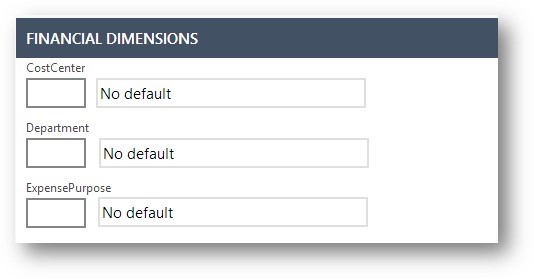
- Dimensions FastTab pages can't display summary fields, because this functionality isn't currently supported.
- Exceptions:
If the FastTab contains a grid, it should follow the Toolbar and List subpattern guidelines.
Radio button guidelines
- Follow all standard Microsoft guidelines for radio buttons. Specifically, observe these guidelines:
- The radio button control is used to select one option from a set of mutually exclusive choices.
- There are between two and seven choices. If there are more than seven choices, use a combo box instead.
- If none of the options is a valid choice, there is another option to reflect this situation, such as None or Does not apply.
- Selection of a radio button doesn’t perform commands, display other windows, such as a dialog box, or dynamically show/hide other controls that are related to the selection.
- One radio button option is always selected by default. (However, see the exceptions at the MSDN guidelines link.)
- The default option is the safest (that is, the option prevents loss of data or system access) and most secure and private option that is available. Alternatively, the default option is the most likely and convenient option.
- Every radio button has a label.
- If subordinate controls are required for the selection of a radio button, follow these guidelines:
- The subordinate controls are visible and appear to the right of or below the radio button.
- Using the subordinate control selects the radio button.
- The subordinate controls aren't nested radio buttons that have other radio buttons or check boxes.
- Options are listed in a logical order:
- From the most likely to be selected to the least likely to be selected
- From the simplest operation to the most complex operation
- From the least risk to the most risk
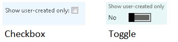
Check box and toggle guidelines
Toggle buttons are typically used instead of traditional check boxes.
- Follow all standard Microsoft guidelines for check boxes. Specifically, observe these guidelines:
- By default, use toggle buttons instead of check boxes in forms. The label must follow the Microsoft guidelines for check box labels.
- Exceptions:
- Use a check box when a large number of related options must be set in a group.
- Use a check box inside Custom Filter Group subpatterns.
- Groups where a check box is used on the frame to collect related fields. This exception is currently under review to add clarity.
- Exceptions:
- Don't use check boxes/toggle buttons as a progress indicator.
- Don't use check boxes to initiate a command. However, a message box can be shown to the user to refine or clarify the choice.
- Write the label so that it describes the selected state of the check box. The meaning of the cleared state must be the unambiguous opposite of the selected state.
- For a group of check boxes, use similar phrasing, and try to keep the length of all labels about the same.
- Use positive phrasing. Don't phrase a label so that selection of the check box means that an action is not performed.
- By default, use toggle buttons instead of check boxes in forms. The label must follow the Microsoft guidelines for check box labels.
Selection panel guidelines
- Occasionally, you'll require a discrete list of options that the user can select from, where each option presents the same interface. Don't use radio buttons to present the list of options. Instead, use a combo box control inside a Custom Filter Group .
- If the selection list is common to a set of items, the combo box should appear above all the items that are affected.
General grid guidelines
- Grids should be sorted on the first column and in ascending order, unless the scenario requires a different sort order:
- The identifier (ID) field for documents (Sales Order ID, Purchase Order ID, and so on)
- The name/description field for entities (Vendor name, Customer name, and so on)
- Depending on the scenario, sorting can be on another column that makes business sense, such as the sequence number or date.
- Editable grids:
- You must show and set the mandatory fields in the grid. It's not acceptable to alert the user to a missing mandatory field only when the record is saved.
- All editable grids must have a New/Delete or Add/Remove button in a toolbar above the grid, or in the global Action Pane.
- Order the columns so that the most important columns are on the left. Amount columns are most usable for a user when they are placed in the rightmost position in the grid.
- Image columns can be used to convey state information for an entity or process, such as the workflow status.
- In general, the image column should be placed on the left side of the grid, and there should not be a column label. The meaning of the image should be indicated by the tooltip.
- Numeric columns should be right-aligned. All other columns should be left-aligned.
- If the form can be opened in View mode and can be used to create records in Edit Mode, the property of the root data source that is connected to the grid should be Insert If Empty=No. This setting will prevent situations where a user sees and selects a blank record when a read-only form is opened.
Entity status field guidelines
- The entity status must appear in the upper-right of the form, to the right of the title fields. The Details form patterns provide an optional Group where status fields can be defined.
Standard Action Pane guidelines
- The Standard Action Pane is at the top of the form and follows the standard Action Pane guidelines.
- Exceptions: Dialog, Drop Dialog, Lookups
- For application-added actions, labels for similar actions should be used consistently across all Action Panes.
- If the name of the button doesn't adequately explain the action, a supplemental description should be shown in the tooltip.
- Actions on an Action Pane should apply to the whole entity. Never put actions that apply only to portions of the entity on the Action Pane. Instead, use local toolbars that are near the objects that will be acted on.
- There should be no more than 10 tabs on a Standard Action Pane.
- There should be between one and eight actions per group.
- The first tab is the home tab. It should have the same name as the entity and should be singular.
- Activity tabs:
- Actions that are related to a specific activity should be grouped into an appropriately named Activity tab.
- These tabs should be given the names of activities that the user will understand. The names should consist of action verbs.
- Remove system-defined actions from Activity tabs.
- New and Maintain groups group actions, such as New, Delete, Edit, and Save, that are related to these primary actions. The exception is New actions that are related to secondary types within the entity.
- Remove duplicate Refresh, Attachments, Export to Excel, Restore, OK, and Done buttons.
- General tab:
- If there are common, infrequent actions that aren't related to a specific activity, they should appear on the last tab, which should be named General.
- Commands that appear on the General tab should not be repeated on other tabs.
Buttons on canvas guidelines
- Buttons in the content area of a form that are related to the form, not to a specific field, should be placed on the standard Action Pane or in a Toolbar.
Button image guidelines
- Buttons that require images should use symbols for their images.
- If both an image and text are shown on a button, the image must be to the left of the text. No other configurations are supported.
- Standard Action Pane:
- Buttons that replace the system New/Delete buttons should use the New/Delete symbols.
- Common actions should have ButtonDisplay=Auto, unless they have symbols that are used by other system buttons. In that case, they should be TextOnly. Consult UX if there are other common actions that you believe should have symbols assigned.
- Other uncommon actions should be TextOnly.
- Images aren't supported on Action Pane tabs.
- Toolbars:
- Add/Remove (if applicable) should be the first buttons, should use the Add/Remove symbols, and should have both images and text (ButtonDisplay=Auto).
- Common actions should be moved just to the right of the Add/Remove buttons. These actions can also have both images and text (ButtonDisplay=Auto). If no appropriate image exists, these can be TextOnly.
- Subsequent uncommon actions should be TextOnly.
- Inside MenuButtons:
- Images aren't supported on buttons in MenuButtons.
Appendix
Frequently asked questions
This section will have answers to frequently asked questions that are related to this guideline/pattern.
- What types of fields aren't supported as summary fields on Fast Tabs?
- For performance reasons, we don't currently support reference groups and display methods. Additionally, unbound fields can't be used as summary fields.
Comentaris
Properament: al llarg del 2024 eliminarem gradualment GitHub Issues com a mecanisme de retroalimentació del contingut i el substituirem per un nou sistema de retroalimentació. Per obtenir més informació, consulteu: https://aka.ms/ContentUserFeedback.
Envieu i consulteu els comentaris de