Create slicers
Slicers are one of the most powerful types of visualizations, particularly as part of a busy report. A slicer is an on-canvas visual filter that allows report users to segment the data by a specific value. Examples of filters include by year or by geographical location.
Video: Create slicers
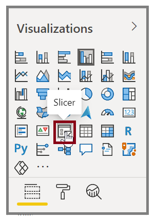
To add a slicer to your report, select Slicer from the Visualizations pane.
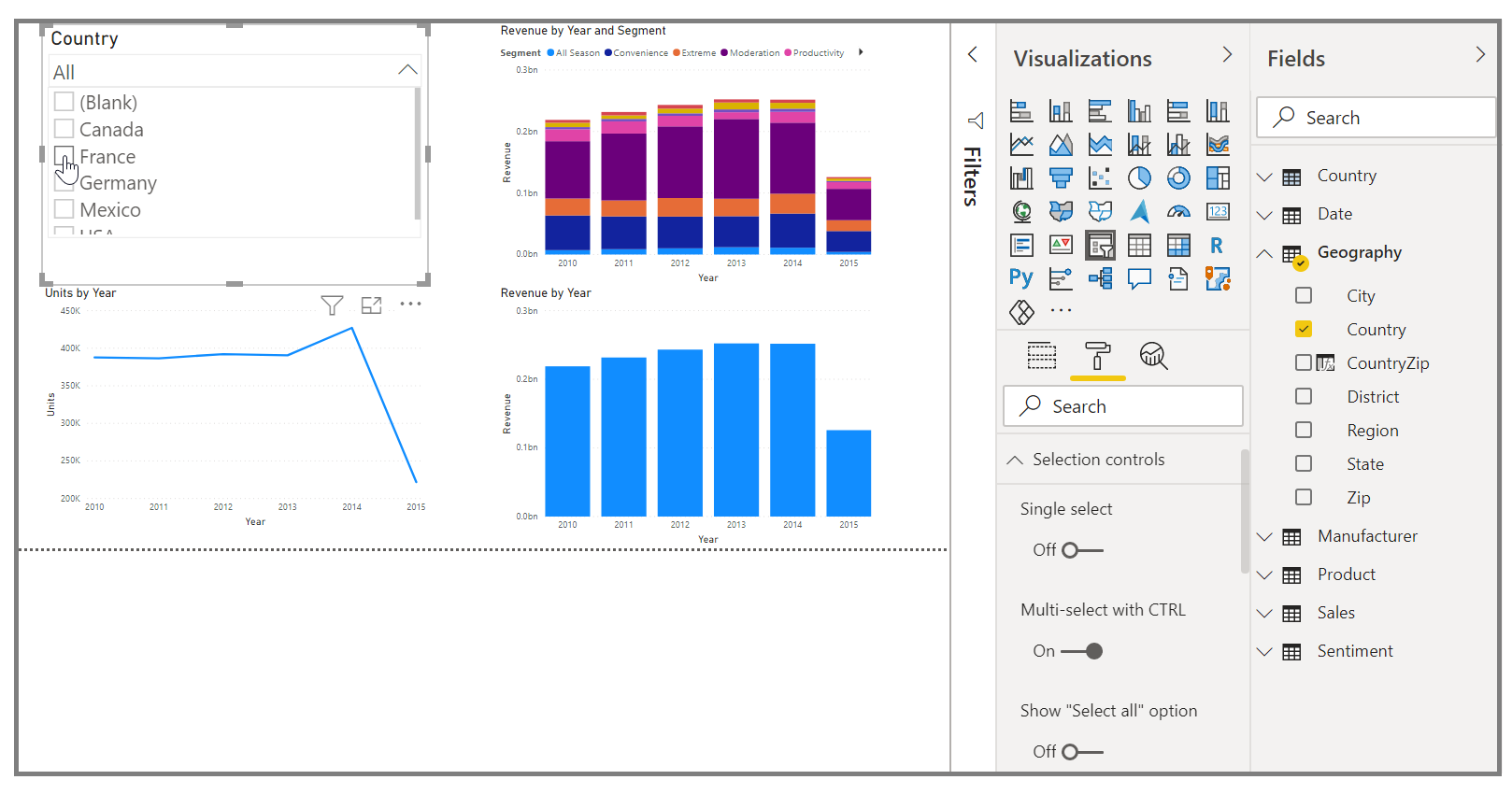
Drag the field by which you want to slice and drop it to the top of the slicer placeholder. The visualization turns into a list of elements with check boxes. These elements are your filters. Select the box next to the one that you want to segment, and Power BI will filter, or slice, all other visuals on the same report page.
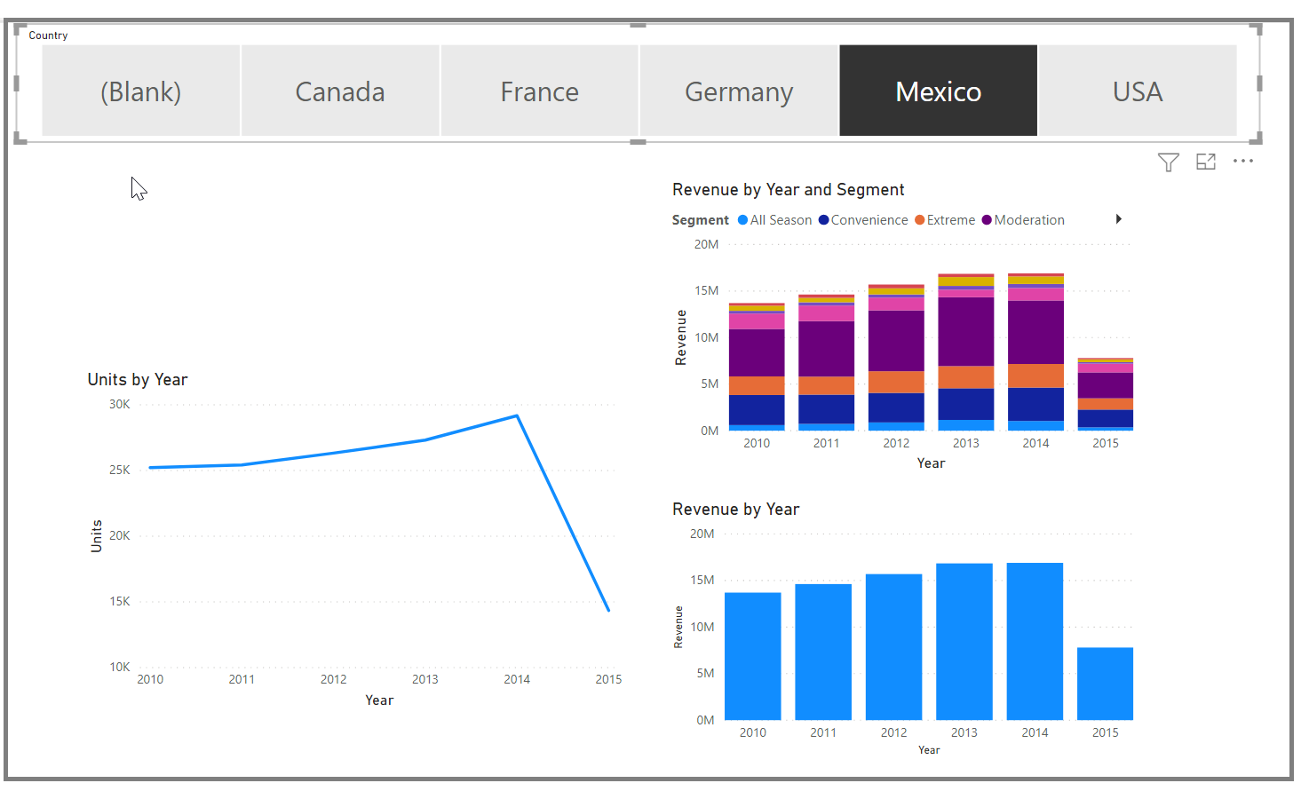
A few different options are available to help you format your slicer. You can set it to accept multiple inputs at once, or you can use the Single Select mode to use one at a time. You can also add a Select All option to your slicer elements, which is helpful when you have a long list. Change the orientation of your slicer from the vertical default to horizontal, and it becomes a selection bar rather than a checklist.
When you have multiple visualizations on the same report page, Power BI Desktop lets you control how interactions flow between visuals. For more information, see Change how visuals interact in a Power BI report.