Add tooltips to your Power BI visuals
Tooltips are an elegant way of providing more contextual information and detail to data points on a visual. The Power BI tooltips API can handle the following interactions:
- Show a tooltip.
- Hide a tooltip.
- Move a tooltip.
Tooltips can display a textual element with a title, a value in a given color, and opacity at a specified set of coordinates. This data is provided to the API, and the Power BI host renders it the same way it renders tooltips for native visuals.
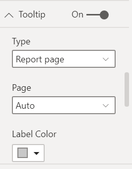
You can change the style of your tooltips or add drilling actions by enabling the modern tooltips feature.
The following image shows a tooltip in a sample bar chart:
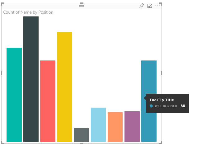
The above tooltip image illustrates a single bar category and value. You can extend the tooltip to display multiple values.
Manage tooltips
You can manage the tooltips in your visual through the ITooltipService interface. ITooltipService notifies the host that a tooltip needs to be displayed, removed, or moved.
    interface ITooltipService {
        enabled(): boolean;
        show(options: TooltipShowOptions): void;
        move(options: TooltipMoveOptions): void;
        hide(options: TooltipHideOptions): void;
    }
Your visual should detect mouse events within the visual and call the show(), move(), and hide() delegates, as needed, with the appropriate content populated in the Tooltip options objects.
TooltipShowOptions and TooltipHideOptions in turn define what to display and how to behave in these events.
Calling these methods involves user events such as mouse moves and touch events, so it's a good idea to create listeners for these events, which would in turn invoke the TooltipService members.
The following example aggregates in a class called TooltipServiceWrapper.
The TooltipServiceWrapper class
The basic idea behind this class is to hold the instance of the TooltipService, listen for D3 mouse events over relevant elements, and then make the calls to show() and hide() the elements when needed.
The class holds and manages any relevant state and logic for these events, which are mostly geared at interfacing with the underlying D3 code. The D3 interfacing and conversion is out of scope for this article.
The example code in this article is based on the SampleBarChart visual. You can examine the source code in barChart.ts.
Create TooltipServiceWrapper
The bar chart constructor now has a TooltipServiceWrapper member, which is instantiated in the constructor with the host tooltipService instance.
        private tooltipServiceWrapper: ITooltipServiceWrapper;

        this.tooltipServiceWrapper = createTooltipServiceWrapper(this.host.tooltipService, options.element);
The TooltipServiceWrapper class holds the tooltipService instance, also as the root D3 element of the visual and touch parameters.
    class TooltipServiceWrapper implements ITooltipServiceWrapper {
        private handleTouchTimeoutId: number;
        private visualHostTooltipService: ITooltipService;
        private rootElement: Element;
        private handleTouchDelay: number;

        constructor(tooltipService: ITooltipService, rootElement: Element, handleTouchDelay: number) {
            this.visualHostTooltipService = tooltipService;
            this.handleTouchDelay = handleTouchDelay;
            this.rootElement = rootElement;
        }
        .
        .
        .
    }
The single entry point for this class to register event listeners is the addTooltip method.
The addTooltip method
        public addTooltip<T>(
            selection: d3.Selection<Element>,
            getTooltipInfoDelegate: (args: TooltipEventArgs<T>) => VisualTooltipDataItem[],
            getDataPointIdentity: (args: TooltipEventArgs<T>) => ISelectionId,
            reloadTooltipDataOnMouseMove?: boolean): void {

            if (!selection || !this.visualHostTooltipService.enabled()) {
                return;
            }
        ...
        ...
        }
- selection: d3.Selection<Element>: The d3 elements over which tooltips are handled.
- getTooltipInfoDelegate: (args: TooltipEventArgs<T>) => VisualTooltipDataItem[]: The delegate for populating the tooltip content (what to display) per context.
- getDataPointIdentity: (args: TooltipEventArgs<T>) => ISelectionId: The delegate for retrieving the data point ID (unused in this sample).
- reloadTooltipDataOnMouseMove? boolean: A Boolean that indicates whether to refresh the tooltip data during a MouseMove event (unused in this sample).
As you can see, addTooltip exits with no action if the tooltipService is disabled or there's no real selection.
Call the show method to display a tooltip
The addTooltip method next listens to the D3 mouseover event, as shown in the following code:
        ...
        ...
        selection.on("mouseover.tooltip", () => {
            // Ignore mouseover while handling touch events
            if (!this.canDisplayTooltip(d3.event))
                return;

            let tooltipEventArgs = this.makeTooltipEventArgs<T>(rootNode, true, false);
            if (!tooltipEventArgs)
                return;

            let tooltipInfo = getTooltipInfoDelegate(tooltipEventArgs);
            if (tooltipInfo == null)
                return;

            let selectionId = getDataPointIdentity(tooltipEventArgs);

            this.visualHostTooltipService.show({
                coordinates: tooltipEventArgs.coordinates,
                isTouchEvent: false,
                dataItems: tooltipInfo,
                identities: selectionId ? [selectionId] : [],
            });
        });
- makeTooltipEventArgs: Extracts the context from the D3 selected elements into a tooltipEventArgs. It calculates the coordinates as well.
- getTooltipInfoDelegate: It then builds the tooltip content from the tooltipEventArgs. It's a callback to the BarChart class, because it is the visual's logic. It's the actual text content to display in the tooltip.
- getDataPointIdentity: Unused in this sample.
- this.visualHostTooltipService.show: The call to display the tooltip.
Additional handling can be found in the sample for mouseout and mousemove events.
For more information, see the SampleBarChart visual repository.
Populate the tooltip content by the getTooltipData method
The BarChart class was added with a getTooltipData member, which simply extracts the category, value, and color of the data point into a VisualTooltipDataItem[] element.
        private static getTooltipData(value: any): VisualTooltipDataItem[] {
            return [{
                displayName: value.category,
                value: value.value.toString(),
                color: value.color,
                header: 'ToolTip Title'
            }];
        }
In the preceding implementation, the header member is constant, but you can use it for more complex implementations, which require dynamic values. You can populate the VisualTooltipDataItem[] with more than one element, which adds multiple lines to the tooltip. It can be useful in visuals such as stacked bar charts where the tooltip might display data from more than a single data point.
Call the addTooltip method
The final step is to call the addTooltip method when the actual data might change. This call takes place in the BarChart.update() method. A call is made to monitor the selection of all the "bar" elements, passing only the BarChart.getTooltipData(), as mentioned previously.
        this.tooltipServiceWrapper.addTooltip(this.barContainer.selectAll('.bar'),
            (tooltipEvent: TooltipEventArgs<number>) => BarChart.getTooltipData(tooltipEvent.data),
            (tooltipEvent: TooltipEventArgs<number>) => null);
Add tooltips support to the report page
To add report page tooltips support (the ability to modify tooltips in the format pane of the report page), add a tooltips object in the capabilities.json file.
For example:
{
    "tooltips": {
        "supportedTypes": {
            "default": true,
            "canvas": true
        },
        "roles": [
            "tooltips"
        ]
    }
}
You can then define the tooltips from the Formatting pane of the report page.
supportedTypes: The tooltip configuration supported by the visual and reflected in the fields well.default: Specifies whether the "automatic" tooltips binding via the data field is supported.canvas: Specifies whether the report page tooltips are supported.
roles: (Optional) After it's defined, it instructs what data roles are bound to the selected tooltip option in the fields well.
For more information, see Report page tooltips usage guidelines.
To display the report page tooltip, after the Power BI host calls ITooltipService.Show(options: TooltipShowOptions) or ITooltipService.Move(options: TooltipMoveOptions), it consumes the selectionId (identities property of the preceding options argument). To be retrieved by the tooltip, SelectionId should represent the selected data (category, series, and so on) of the item you hovered over.
An example of sending the selectionId to tooltip display calls is shown in the following code:
    this.tooltipServiceWrapper.addTooltip(this.barContainer.selectAll('.bar'),
        (tooltipEvent: TooltipEventArgs<number>) => BarChart.getTooltipData(tooltipEvent.data),
        (tooltipEvent: TooltipEventArgs<number>) => tooltipEvent.data.selectionID);
Add modern tooltips support to the report page
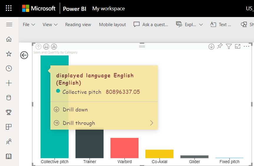
From API version 3.8.3 you can also create modern visual tooltips. Modern visual tooltips add data point drill actions to your tooltips, and update the style to match your report theme. To find out which version you’re using, check the apiVersion in the pbiviz.json file.
To manage report page modern tooltips support, add the supportEnhancedTooltips property to the tooltips object in the capabilities.json file.
For example:
{
    "tooltips": {
        ... ,
        "supportEnhancedTooltips": true
    }
}
See an example of the modern tooltips feature being used in the SampleBarChart code.
Note
Adding this feature to the capabilities.json file gives the user the possibility of enabling this feature for the report. Keep in mind that the user will still have to enable the modern tooltip feature in the report settings.
Related content
Feedback
Coming soon: Throughout 2024 we will be phasing out GitHub Issues as the feedback mechanism for content and replacing it with a new feedback system. For more information see: https://aka.ms/ContentUserFeedback.
Submit and view feedback for