Metric chart examples
The Azure platform offers over a thousand metrics, many of which have dimensions. By using dimension filters, applying splitting, controlling chart type, and adjusting chart settings you can create powerful diagnostic views and dashboards that provide insight into the health of your infrastructure and applications. This article shows some examples of the charts that you can build using Metrics Explorer, and explains the necessary steps to configure each of these charts.
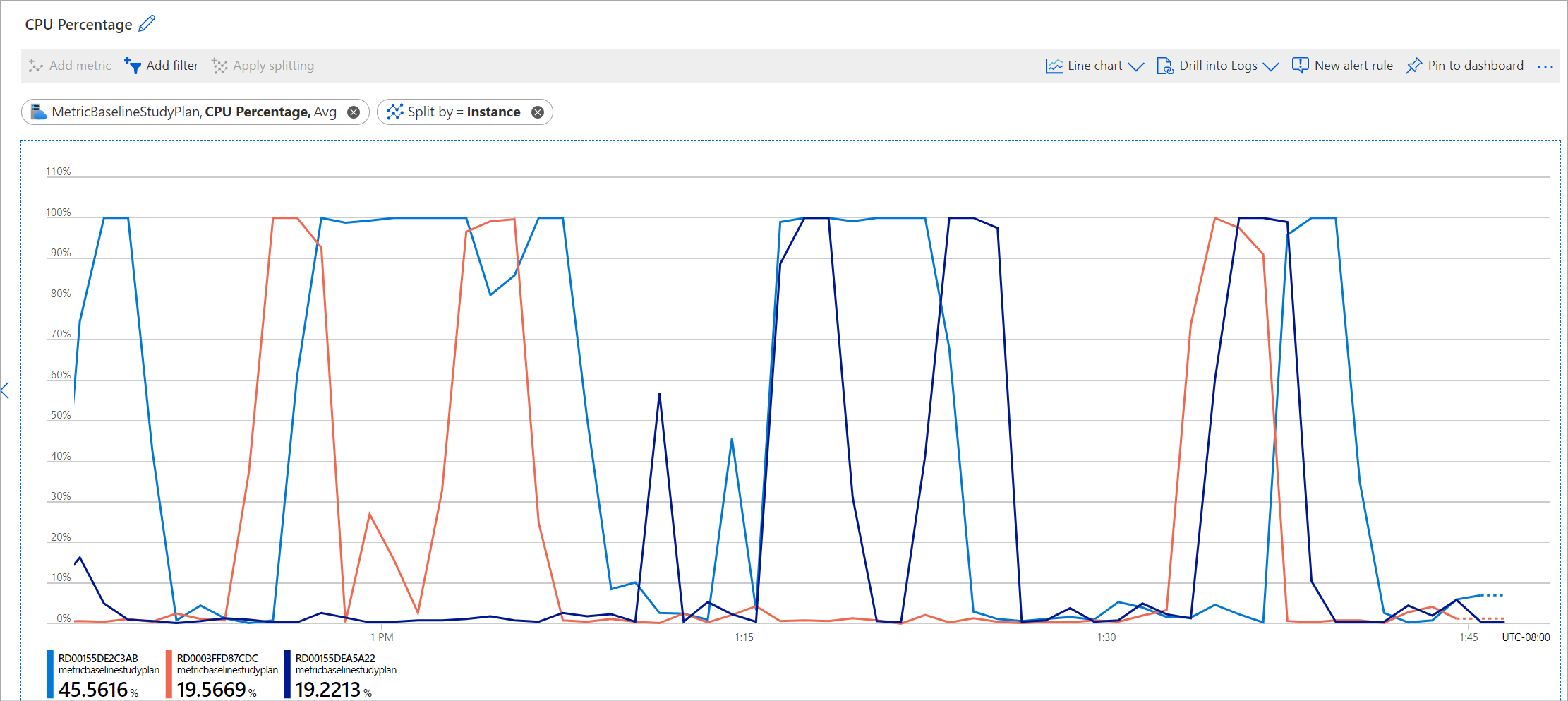
Website CPU utilization by server instances
This chart shows if the CPU usage for an App Service Plan was within the acceptable range and breaks it down by instance to determine whether the load was properly distributed.
How to configure this chart
- Select Metrics from the Monitoring section of your App service plan's menu
- Select the CPU Percentage metric.
- Select Apply splitting and select the Instance dimension.
Application availability by region
View your application's availability by region to identify which geographic locations are having problems. This chart shows the Application Insights availability metric. You can see that the monitored application has no problem with availability from the East US datacenter, but it's experiencing a partial availability problem from West US, and East Asia.
How to configure this chart
- You must turn on Application Insights availability monitoring for your website.
- Select your Application Insights resource.
- Select the Availability metric.
- Apply splitting on the Run location dimension.
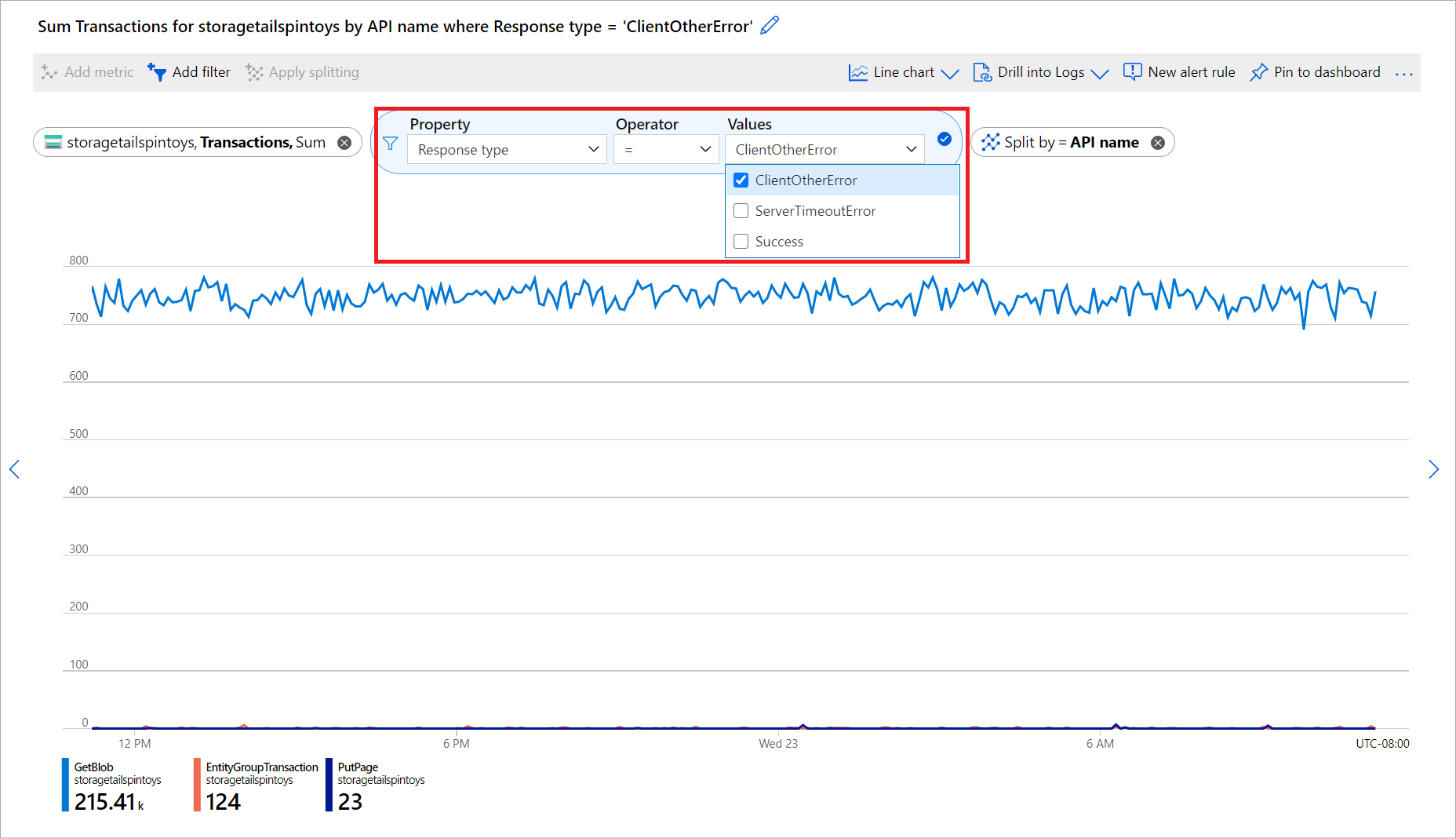
Volume of failed storage account transactions by API name
Your storage account resource is experiencing an excess volume of failed transactions. You can use the transactions metric to identify which API is responsible for the excess failure. Notice that the following chart is configured with the same dimension (API name) in splitting and filtered by failed response type:
How to configure this chart
- In the Scope dropdown, select your Storage Account
- In the metric dropdown, select the Transactions metric.
- Select Add filter and select Response type from the Property dropdown.
- Select CLientOtherError from the Values dropdown.
- Select Apply splitting and select API name from the values dropdown.
Total requests of Cosmos DB by Database Names and Collection Names
You want to identify which collection in which database of your Cosmos DB instance is having maximum requests to adjust your costs for Cosmos DB.
How to configure this chart
- In the scope dropdown, select your Cosmos DB.
- In the metric dropdown, select Total Requests.
- Select Apply splitting and select the DatabaseName and CollectionName dimensions from the Values dropdown.
Next steps
- Learn about Azure Monitor Workbooks
- Learn more about Metric Explorer
Feedback
Coming soon: Throughout 2024 we will be phasing out GitHub Issues as the feedback mechanism for content and replacing it with a new feedback system. For more information see: https://aka.ms/ContentUserFeedback.
Submit and view feedback for


