Introduction to dual-screen devices
Dual-screen devices are portable devices with two symmetric screens that work together in unique ways to provide productivity in a flexible form factor.
With dual-screen devices such as the Microsoft Surface Duo, people can get things done on-the-go faster than ever: take notes on one screen and review the full project proposal on the other while in transit; sit down at a table to write a thoughtful email using a software or hardware keyboard while waiting for lunch; and then watch a video, browse the web, or read a book as you get back to your life.

Although dual-screen devices unlock new possibilities for your apps, your existing apps will work as expected on the devices, and there are improvements that you will get without doing any work. This documentation will point those out, while also showing new ways to enhance your app experience by making your app aware of the dual-screen nature of the device.
While there are different dual-screen devices now in the market and more coming, we believe there can be a common way of approaching the design of apps for these devices. We hope this will help your app reach more devices without re-designing from scratch for every device.
In this article, we talk about common design patterns and concepts that are applicable regardless of the operating system you target or the development language you use. For platform specific information about developing apps for dual-screen devices, see Kotlin and Java, React Native, Xamarin, Unity game development, Web technologies, or Windows.
The technology is still evolving and our guidance here may change as we progress. Your feedback is welcome.
Dual-screen overview
Dual-screen devices can come in a range of hardware and industrial design variations. The recently released Surface Duo, along with other planned devices, are intended to help define the category, but other devices may come with larger displays or varying hinge designs. As you design your apps, keep in mind that you should avoid designing to the specifications of any specific devices available today.
All dual-screen devices can fold, flip, and rotate. Both screens can be used as displays, or one screen may act as a keyboard. The different form factors support a wide variety of activities and allow the user to fit the device to their situation. By taking advantage of the various modes with your app, you will help your users achieve more.
When the user launches an app, its core window opens maximized and occupies the full width and height of a single screen. Users can have multiple applications open at once this way, allowing for side-by-side use of apps and intuitive drag-and-drop scenarios.
An app can also appear across both screens, which is known as a spanned layout. By default, the app will act as if it is being displayed across a larger screen. You can modify your existing app layouts to accommodate the seam between the two screens, or you can go further and design your app using layout controls specifically created to take full advantage of dual-screen devices. This is discussed in more detail later in this article.

Embracing and improving existing features
There are many features that you may already take advantage of with your apps that will continue to work with little-to-no effort on dual-screen devices supported by Microsoft and will continue to provide a good app experience. We will cover those before discussing how to design your app specifically for dual-screen scenarios.
Responsive app layouts
If you design your app so that it uses responsive layouts, it will look great on every device, regardless of the device's screen size and orientation. Use existing layout techniques for the UI platform of your choice that automatically scale to fill the screen. If you have screen elements that depend on size and aspect ratio, use the APIs provided by your UI platform to adjust your layout when the size or aspect ratio changes.
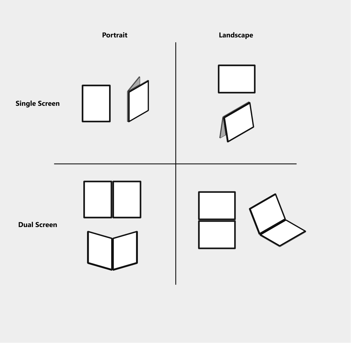
Because your app runs on many different devices, you've probably already developed it to handle various screen and window sizes, and it should continue to work seamlessly. However, keep in mind that you might need to account for new screen sizes and aspect ratios that are not typical for PCs and mobile devices, such as portrait (taller view), landscape (wider view), dual-portrait (double the width of portrait), and dual-landscape (double the height of landscape).
Consider all device orientations
We expect users to be creative in using dual-screen devices in the manner that works for them. This means your application might not always be used in the typical orientation; portrait for Android, or landscape for Windows. Consider supporting all orientations and screen configurations. For example, if your app is designed primarily for portrait orientation but supports a lot of text entry, users might be more likely to use it in landscape orientation on a dual-screen device, with the keyboard on the bottom screen.
Dual-screen layouts can provide a better environment for multi-tasking. You won't always know in what mode the user is going to hold the device; but knowing the potential modes lets you optimize your app for the modes that make the most sense for your app.
Our studies show that users are more comfortable typing or writing on a flat surface. If your app is heavily input oriented, like a note taking app, you can optimize it to be used in a landscape layout (if it's not already).

Support a variety of inputs
Many devices, including the new dual-screen devices, support a wide variety of inputs, including typing, touch, and pen. The flexibility of dual-screen devices lets a user quickly switch between modes to fit their task. To ensure a great user experience, make sure your app supports all available input types, so the user remains in control and can interact with your app in the way they prefer.
Drag-and-drop
Making sure your app supports drag-and-drop is another way to ensure a great user experience when using different types of input, not only for dual-screen devices, but also for all other device types.
Drag-and-drop is a feature you can already take advantage of. However, a dual-screen device that runs apps side-by-side especially lends itself to drag-and-drop interactions for a great app experience.
To enable drag-and-drop in your app, think of scenarios when users can directly manipulate text, links, images, or rich objects into and out of your app's experience, then:
- Anywhere you can cut, copy, and paste, enable drag-and-drop.
- Anywhere you can share content, consider enabling drag-and-drop.
Multi-instance for your app
Users may want to take advantage of the second screen to view different content from the same app. To enable this, consider supporting multi-instance, where multiple instances of your app run side-by-side.
Picture in picture experience for your media
If you are creating a media app that can benefit from continuing to play video in the foreground while another app is running, consider supporting picture-in-picture experiences. With more screen real-estate, this gives the user a chance to multi-task by watching the video and performing another task at the same time.
Dual-screen user experience considerations
In the previous section we talked about features you can support in your app that are not specific to dual-screen devices, but that can improve the user experience when your app runs on a dual-screen device. Now we'll look at things you can do to provide a unique experience only when your app runs on a dual-screen device.
On a dual-screen device, your app can run on a single screen, or across both screens. When a single app is presented across two screens, we say it is spanned. How your app responds to being in a spanned state can have a great impact on the user experience. The unique modes that a dual-screen device enables may unlock unprecedented ways your app can be used. For example, devices that have seams down the middle lend themselves well to productivity scenarios that benefit from the compartmentalization of content.
Here are some principles you should take into account before deciding which specific dual-screen design techniques might be appropriate for your app:
- Provide continuous value
- The spanned state should enrich the user's experience as part of the end-to-end flow of tasks they perform with your app. It shouldn't be a custom state that is only momentarily valuable. Rather than thinking about specific screens, think of the overall picture.
- It isn't all about spanning
- Apps shouldn't be great only when spanned. Don't bury fundamental functionality in the spanned state, so the user must span our app to be able to perform a basic task.
- Users are always in control
- In order to avoid unpredictable (or potentially destructive) experiences for your users, apps shouldn't automatically enter a spanned state without an intentional, user-initiated action. Let the user decide.
- Make spanning predictable
- Understand your user's intent to span and design for that. Make sure the outcome of spanning is predictable and adds value at any given time.
Spanning is the user's choice
Users are empowered to have full control over how they use your app, including when they want to span your app. Some apps, like calculators, may not look great or derive any benefit from this configuration, but it's still the user's choice. However, you might decide that since most users won't choose to span your app, it's okay to not do anything to accommodate the user's action.
While this article provides several different ideas as to how you might want to handle multi-screen layout, please make a choice that is right for your users and your app.
Consider user intent and device orientation
When you design your app's experience to take advantage of two screens, it's important to learn about your users' intent behind spanning, in both dual-landscape and dual-portrait configurations. While there are more studies to be done, we are starting to observe a tendency for these user preferences:
- In dual-landscape, users want to use more screen real-estate, so the two screens are used to expand the content area.
- In dual-portrait, users prefer multi-tasking or productivity activities, so the two screens are used to separate and group content.
Keep this in mind when deciding how to apply the dual-screen design patterns. Does the user benefit if you fully adapt your app's layout and experience, or can you support spanning by simply arranging your app's controls and elements so that they aren't obscured by the seam?
Consider all supported layouts
There are four layout scenarios to consider when designing your app experience for a dual-screen device, depending on whether the app is on single screen or spanned, and whether the view is default or full-screen.
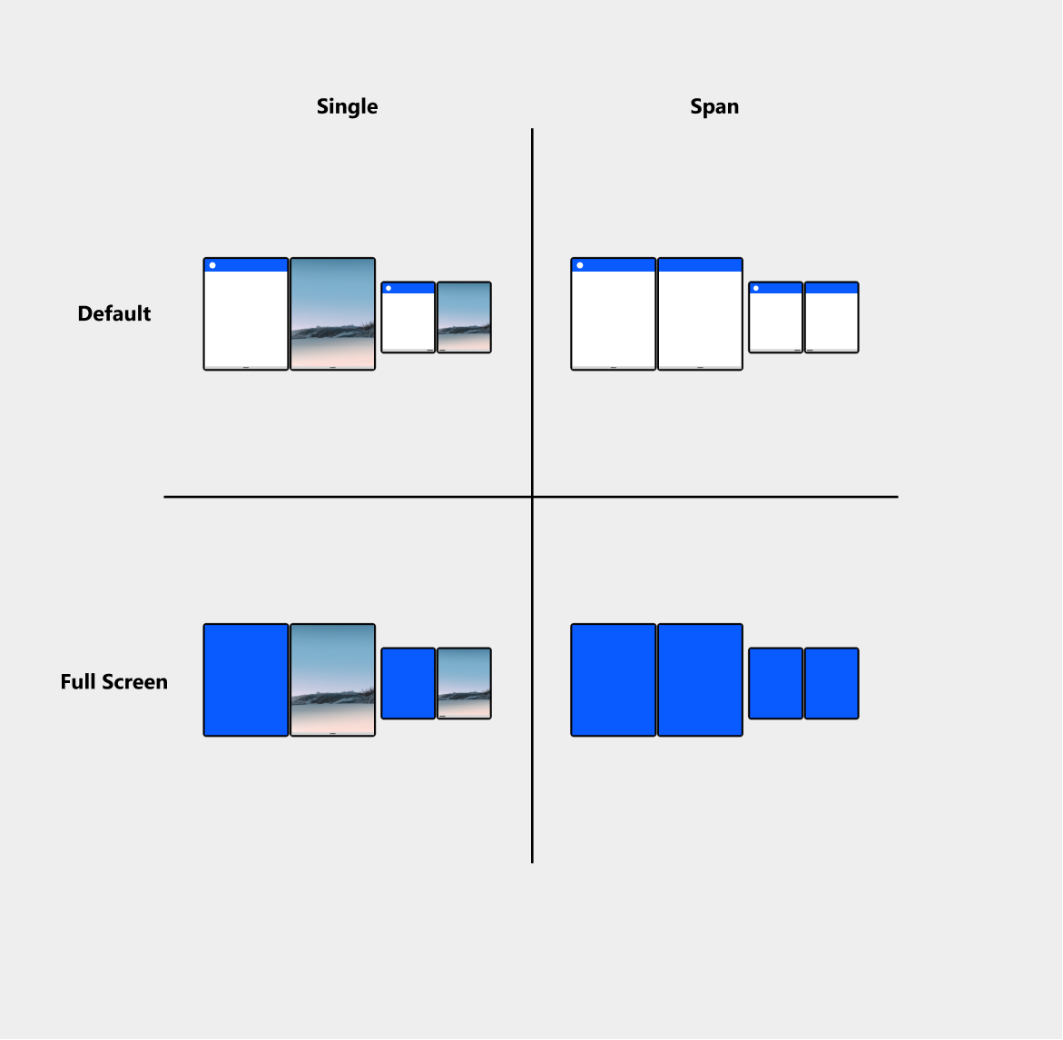
Single-Default
- By default, apps open in a maximized state and occupy a single screen. In dual-screen modes, users can run two apps beside each other to simultaneously compare, consume, or cross-reference content.
- Supported by default. If your app was designed to handle different screen sizes and portrait and landscape orientations as described earlier, there's nothing more you need to do.
Spanned-Default
- When the device is in a dual-screen modes (dual-portrait or dual-landscape), users can extend a single app across both screens, allowing more space for content. The user is responsible for spanning the app, it's not a state the app enters programmatically.
- Support is optional. Spanned mode is unique to dual-screen devices. If you don't make any modifications to your app, it will behave as if it is being displayed across one large screen. However, you can implement a range of layout optimizations to make your app take advantage of the unique features of dual-screen devices. These are covered in more detail later in this article.
Single-Full Screen
- This is similar to the default layout, except the system UI (Task Bar, System Tray, App Bar, App Title) are hidden to create a fully immersive experience, ideal for games and video playback.
- Support is optional. You can use available APIs to put your app in full screen mode.
Spanned-Full Screen
- You can programmatically expand your app to use full screen mode when spanned. If an app that is displayed on a single screen in full screen mode is spanned by the user, it will remain full screen.
- Support is optional. Consider the benefit of full screen in a spanned mode as well as single screen.
How to work with the seam
A spanned layout occurs when a single app is presented across two screens. By default, if an app is not customized for this scenario, the system notifies the app that it now occupies a greater screen width and height and the app's UI will resize itself to fit the new screen dimensions.
When an app is spanned across two screens, there is going to be a seam — the space between the two screens. This is a byproduct of making a dual-screen device. This section talks about some of the ideas and techniques you might consider to make your app work with the seam.
Do I always accommodate the seam?
Depending on your app, some UI may be perfectly fine to be used as is. If the user can manipulate the app content to avoid obstruction by the seam, you might decide to not do any special work to accommodate the seam.
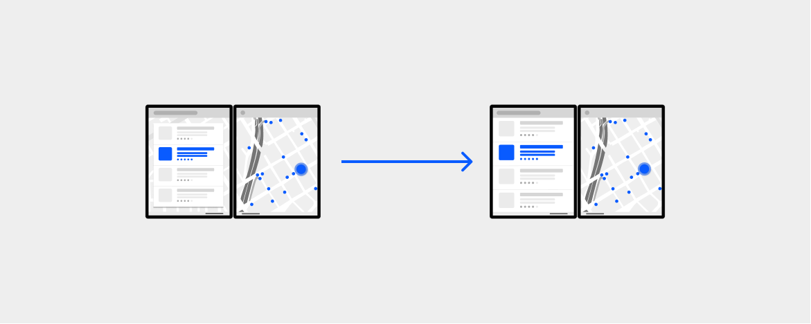
For example, a map app may span both screens to take advantage of the screen real-estate, but not do anything to handle the seam because the user can move the map content around to avoid the seam. This is discussed in more detail later in the Extended canvas section.
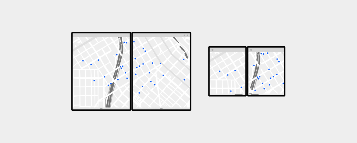
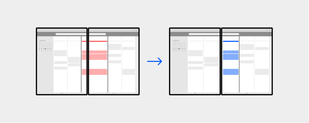
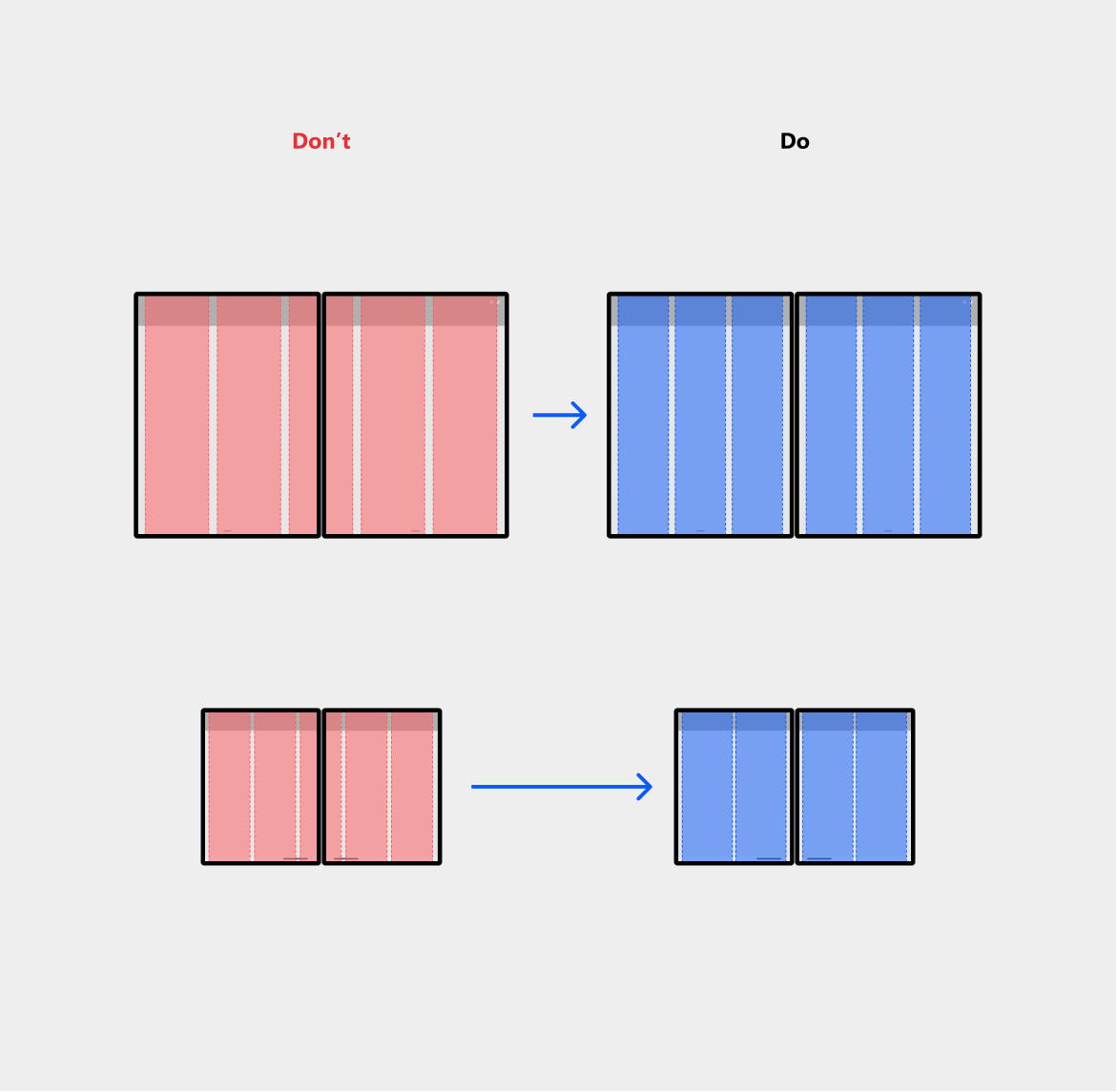
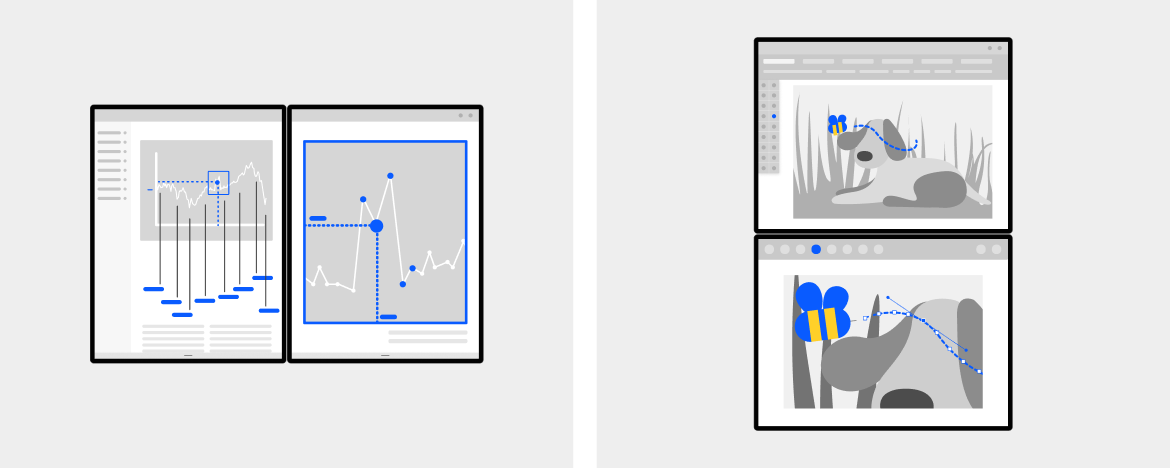
The following image shows a grid UI that the user can easily scroll to avoid the seam. However, if the UI does not scroll, like the toolbar above the grid, you might consider snapping to the boundary, which is one of the techniques we address later. We suggest that you test different design ideas with users to decide on the best option for your app.
Avoiding the seam
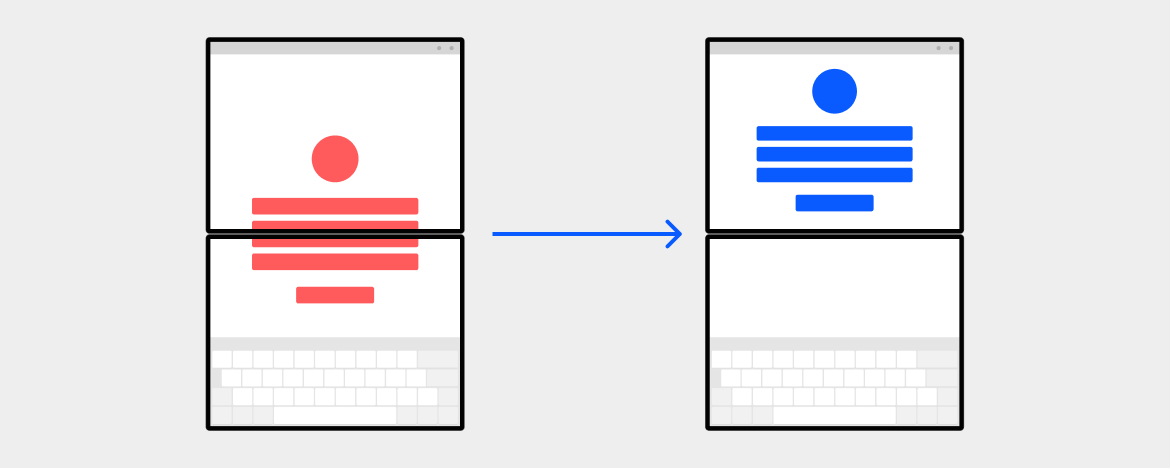
Move things to one side
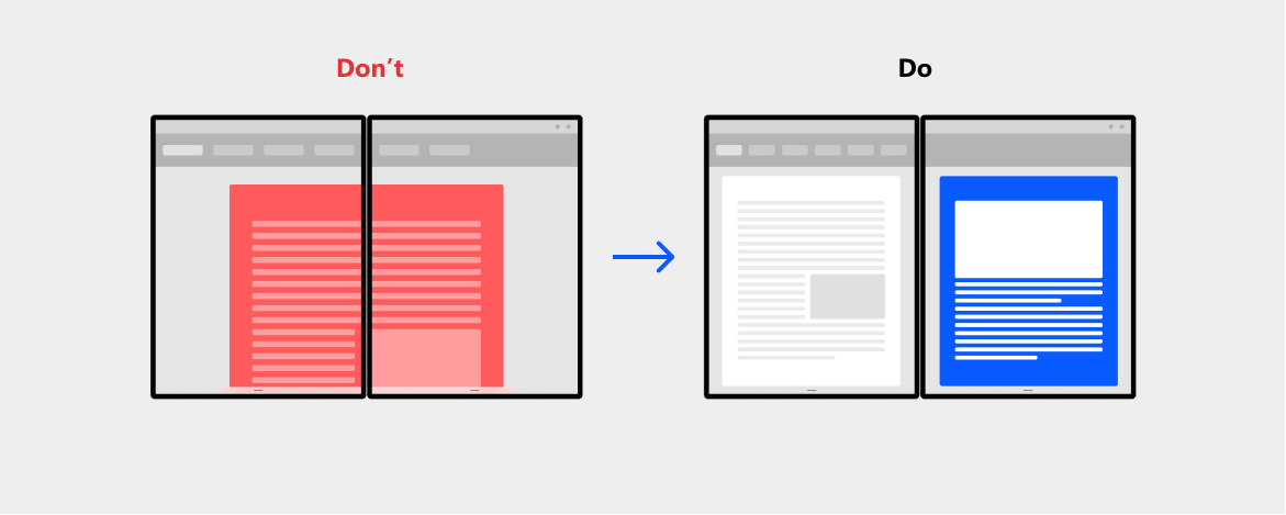
Because there is an obvious seam in the middle of the two screens, some UI—especially elements that are centered inside your app layout—could be obscured by the seam when the user spans your app. This doesn't cause any functional problems and the app will continue to work; however, it might provide a better experience if the UI were to be shifted to one side of the screen. It's a good rule of thumb to avoid having text or content display at the seam as it may impact the legibility and usability of your app.
App-launched dialogs should move to one of the screens instead of stretching across both, especially when there are buttons or actions users need to take.

A bottom menu should be moved to one side or the other instead of stretching across both screens.
User-invoked context menus should treat the seam as a boundary, especially if they are invoked close to the edge of the screen.

In-app drop down menus or expandable containers should change direction of expansion.

When the app is spanned, move UI to the center of the top or left screen instead of to the center of the entire app region.
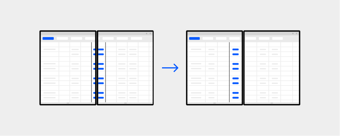
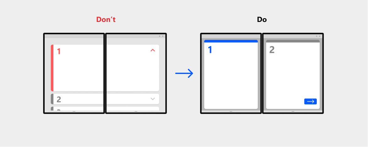
Snapping to the seam
Align to the edge of the seam with an even number of columns
When your UI has a grid or tabular layout, it may be easier for a user to view and use your app if the vertical or horizontal lines are aligned with the seam.
Use an even number of columns in your grid, especially for containers, tables, etc. and account for margins towards the seam.
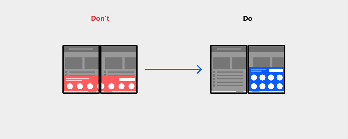
Moreover, many apps take advantage of partial-screen UI overlaid on top of the app content. Depending on its size, you might want to have the overlaid UI take up all of the second screen instead. This can make your app more usable and visually cleaner. Keep in mind that the overlaid partial UI may sometimes imply that it is collapsible or temporary, so be aware of the interaction implications when changing this behavior. This technique might be more appropriate for smaller sized devices.
Rearranging UI elements
Move to either side of the seam
One responsive layout technique you can use to optimize for dual-screen devices is to rearrange your content when the screen orientation or size changes. Instead of arbitrarily stretching elements of your app across the two screens, you may rearrange them with better groupings to adapt your app content more intentionally.
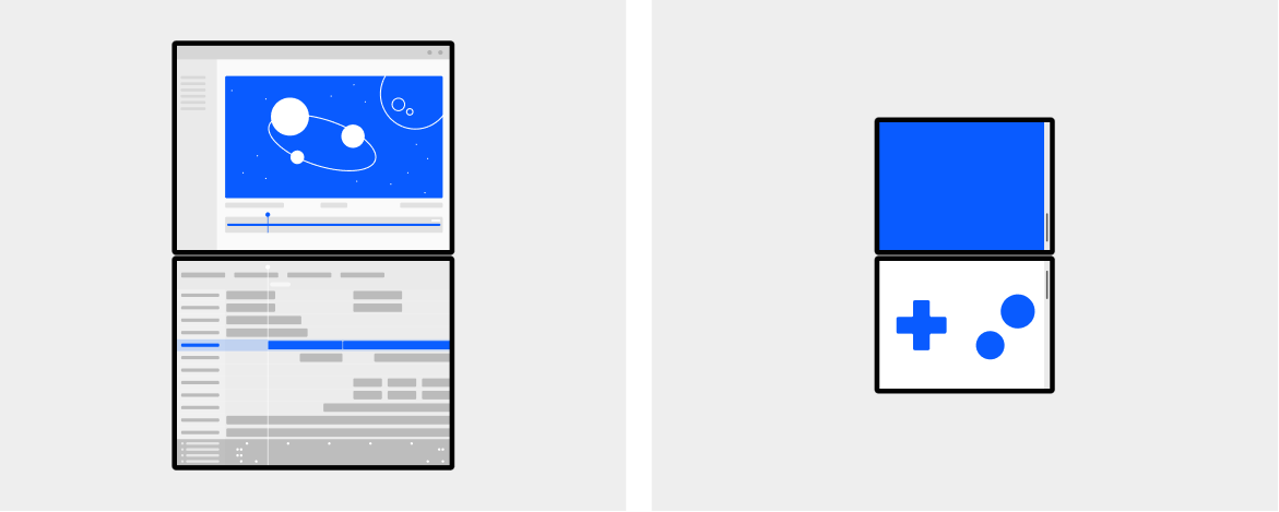
Masking and splitting
There are two ways the seam can be handled by the software. One is to mask, the other is to split.
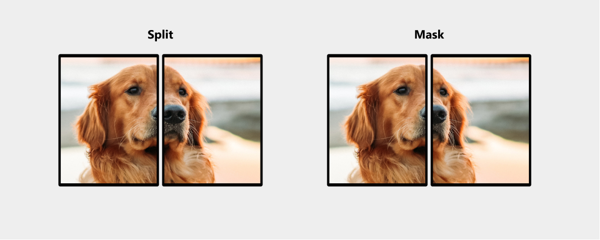
The mask technique renders the image behind the seam. When an image is partially obstructed, our brains naturally connect the "unseen" parts. This technique is typically better for media (video, photos, etc.) as well as for canvas-type scenarios where keeping the continuity of the image is more important than ensuring all the content is displayed.
The split technique renders the image by cutting it and pulling it apart. This is the same behavior you experience when an app is displayed across multiple monitors. This technique works well for apps that have many controls such as buttons that may appear in the middle of the two screens.
There are benefits to each option depending on the type of app being created, and we continue to learn about the best default behavior for different cases.
Dual-screen app patterns
The techniques previously discussed are mainly to accommodate the seam so that the app continues to provide value to users. The following patterns let you take advantage of the fact there are two screens.
Here are 5 dual-screen patterns for you to consider. These are not the only patterns for dual-screen devices, but are provided here as a starting point for your imagination to grow.
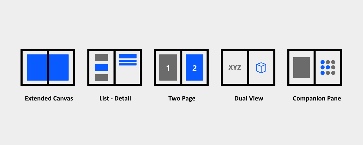
Extended canvas
The extended canvas pattern is the simplest dual-screen pattern, but it's powerful. You may consider this pattern if you need a bigger canvas for a task such as drawing, or if your app has a free-flowing canvas that the user can freely scroll to avoid the seam if some important content is obscured. This provides the benefit of giving your app more screen real-estate, rather than constricting it to one screen or another.
This pattern only applies to the canvas portion of the UI. You may still need to use one of the other techniques to accommodate the seam if it will obscure the non-canvas portion of the app.


Key value:
Extending the canvas allows users to take advantage of the larger screen real-estate provided by dual-screen devices.
Types of apps that may benefit from this pattern:
- Map apps
- Drawing canvas apps
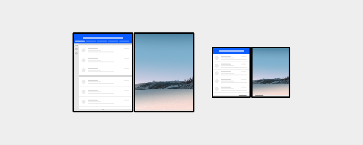
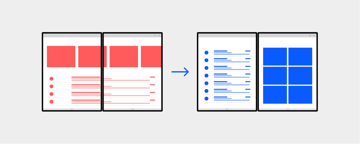
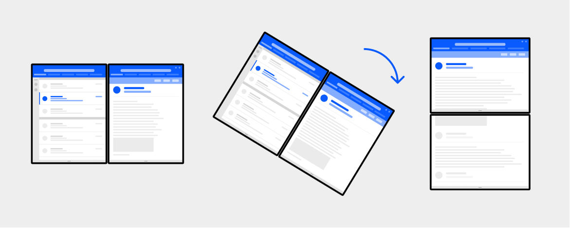
List-detail
The list-detail pattern has a main pane (usually with a list view) and a details pane for content. When an item in the list is selected, the details pane is updated. This pattern is naturally good for when you have a wider viewing area. It is frequently used for email and address books.
Taking advantage of the two distinct screens and snapping to the natural boundary, you could use one screen to show the "items" list and the other to show details of the selected item.
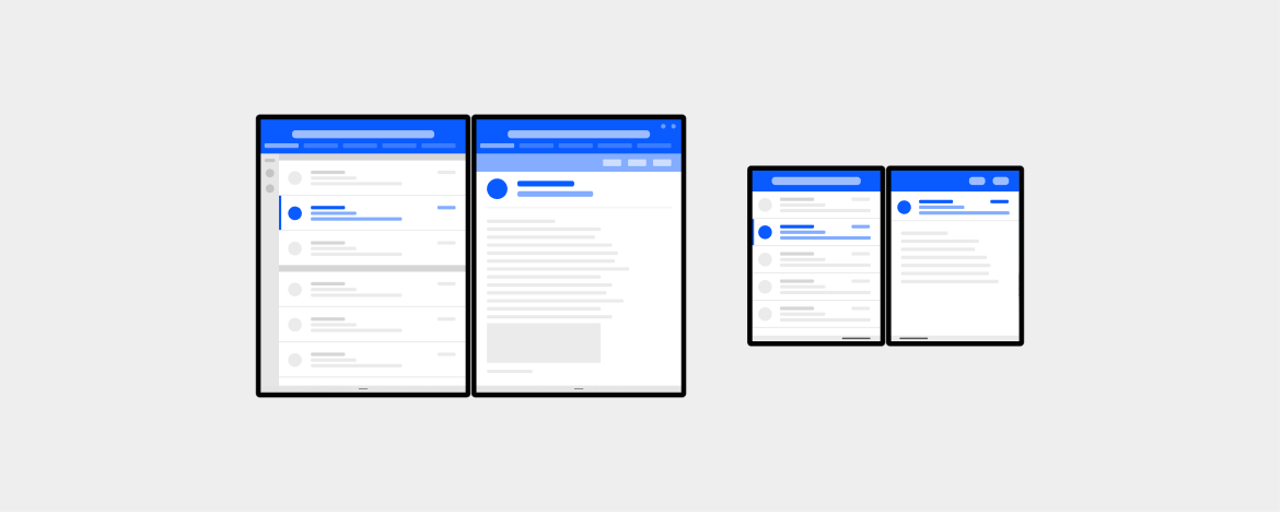

As mentioned previously, we are starting to observe a tendency of users to prefer using the dual-landscape view to utilize larger screen real estate. Because of this, you may consider showing list and detail views side-by-side in dual-portrait mode but changing to show only the list view or only detail view in dual-landscape mode.
Key value:
Separating navigation or overview from details allows users to drill deeper into content while staying grounded regarding their position in the overall list/aggregate.
Types of apps that may benefit from this pattern:
- Apps that have lists or galleries
- Mail apps
- Scheduling apps
- Photos or image curation apps
- Music apps with playlists and song details
- Apps with strong navigation structure
Two page
Some apps naturally tend to a book-like paging experience. You can use the natural boundary to show several items from a collection—like pages or pictures—which otherwise might have required the user to view one at a time.
Depending on your app, you could decide to paginate per 2 pages or advance one page at a time.
Key value:
Leveraging the skeuomorphic metaphor of a book to showcase one page on each screen, so it's more conducive to reading.
Types of apps that may benefit from this pattern:
- Document-oriented app
- Apps with content that is paginated
- Apps made for reading
- Apps with an itemized canvas (e.g. notes, art boards)
Dual view
Having two screens provides a natural affordance to compare and contrast two versions of the same type of content side-by-side, like two images, lists, or documents.
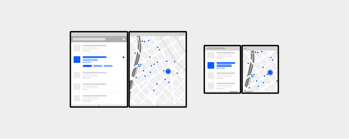
It can also be used to show the same information in two different ways at the same time, with each screen working seamlessly to provide more information to the user. For example, a list of restaurants on one screen, and a map with locations on the other.

If you want to achieve a dual view-like experience without designing two specific views, consider instead supporting multi-instance with your app to take advantage of the built-in support the OS provides. This could be useful for comparing two products opened on two tabs or other similar scenarios.

Key value:
Having multiple views of the same app in the same container, allowing comparison of similar-type content side by side.
Types of apps that may benefit from this pattern:
- Editing tools that benefit from having before/after states side-by-side (e.g. markdown code and preview)
- Content and context side-by-side (e.g. map and list of restaurants)
- Apps that let the user compare similar items
- Having two canvases with coordinated content but keeping each page separate (e.g. canvas on one side, note taking on the other)
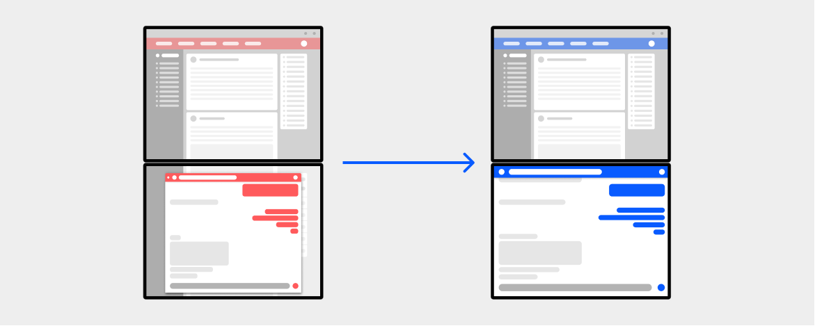
Companion pane
The companion pane pattern is a great opportunity to take advantage of added screen real-estate by taking second-level surfaces that are otherwise hidden and exposing them when the app is spanned.
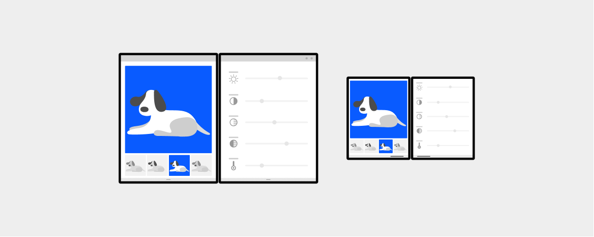
You can also take advantage of two screens by placing the app canvas on one screen and using the other to hold tools that manipulate the content of the canvas. When using the companion pane for a tooling scenario, due to the ergonomics, it is likely better suited for tools to be on the right or bottom, but test your app to see what works best for your app.
Key value:
Show complementary context to augment users' tasks, usually with a primary/secondary relationship, by elevating to the surface previously buried level 2 functionalities for quicker access.
Separating content for consumption from tools for interactions makes it easier for users to parse and focus on the content. It provides a more ergonomic experience by having tools closer to the hands, especially in dual-landscape modes.
Types of apps that may benefit from this pattern:
- Productivity apps that have supplemental information that appears next to the main content
- Creative tools like image drawing app
- Music or video editor apps
- Gaming apps
Next steps
Select a development platform to learn how to build dual-screen apps: