Horizontal container control in Power Apps
Horizontal container control determines the position of the child components so that you never have to set X, Y for a component inside the container.
Description
Horizontal container control distributes the available space to its child components based on the settings, as well as determines alignment of the child components.
Properties
BorderColor – The color of a control's border.
BorderStyle – Whether a control's border is Solid, Dashed, Dotted, or None.
BorderThickness – The thickness of a control's border.
Color - The color of the container control.
Drop shadow - Adds shadow effects around the control.
Fill – The background color of a control.
Height – The distance between a control's top and bottom edges.
Direction - Defines in what direction the container layouts its child components. Horizontal and Vertical.
Justify (vertical) - Defines how child elements are aligned with the primary axis. Start, End, Center, Space Between.
Align (Horizontal) - Defines how child components are positioned in the container, in the off axis (opposite from LayoutDirection). Start, Center, End, Stretch.
Gap - Defines the space between containers child components in pixels.
Horizontal Overflow - Defines whether the container shows scrollbars or remove content when it is too large to fit. Scroll and Hide.
RadiusBottomLeft – The degree to which the bottom-left corner of a control is rounded.
RadiusBottomRight – The degree to which the bottom-right corner of a control is rounded.
RadiusTopLeft – The degree to which the top-left corner of a control is rounded.
RadiusTopRight – The degree to which the top-right corner of a control is rounded.
Vertical Overflow - Defines whether the container shows scrollbars or remove content when it is too large to fit. Scroll and Hide.
Wrap - Defines whether the content wraps to a new row or column when it cannot fit.
Align in container - Defines how the individual component is aligned to the parent. The default value, Set by container, inherits the value from the parent’s LayoutAlignItems property, while other properties can be used to customize the alignment for the individual child component. Set by container, Start, End, Center, and Stretch.
Fill portions - Defines how the individual component grows when there is more screen real-estate assigned to its parent. The number represents the portion of the extra space given to the component out of all the available extra space claimed by children of its parent. For example, if child A has Fill portions set to 1 and child B has Fill portions set to 2, child A gets 1/3 of the extra space available while child B gets 2/3 of the extra available space.
Minimum width - Represent the minimum size of the component in the direction of the Fill portions (that is, the parent’s Direction).
PaddingBottom – The distance between text in a control and the bottom edge of that control.
PaddingLeft – The distance between text in a control and the left edge of that control.
PaddingRight – The distance between text in a control and the right edge of that control.
PaddingTop – The distance between text in a control and the top edge of that control.
Visible – Whether a control appears or is hidden.
Width – The distance between a control's left and right edges.
X – The distance between the left edge of a control and the left edge of its parent container (screen if no parent container).
Y – The distance between the top edge of a control and the top edge of the parent container (screen if no parent container).
Example
Create a blank canvas app with Tablet layout.
Select File > Settings > Screen size + orientation and disable Scale to fit, Lock aspect ratio, and Lock orientation and select Apply.
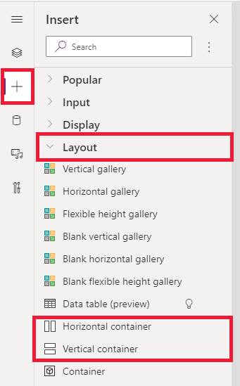
Now from the Insert panes in the left sidebar, under Layout tab, select Horizontal container.

Set the following properties to occupy the full available space of the screen:
- X = 0
- Y= 0
- Width = Parent.Width
- Height = Parent. Height
Add few buttons, text inputs, media, icons, and select F5 to see how the app adjusts to the screen changes.
Feedback
Coming soon: Throughout 2024 we will be phasing out GitHub Issues as the feedback mechanism for content and replacing it with a new feedback system. For more information see: https://aka.ms/ContentUserFeedback.
Submit and view feedback for