Take measurements in mixed reality
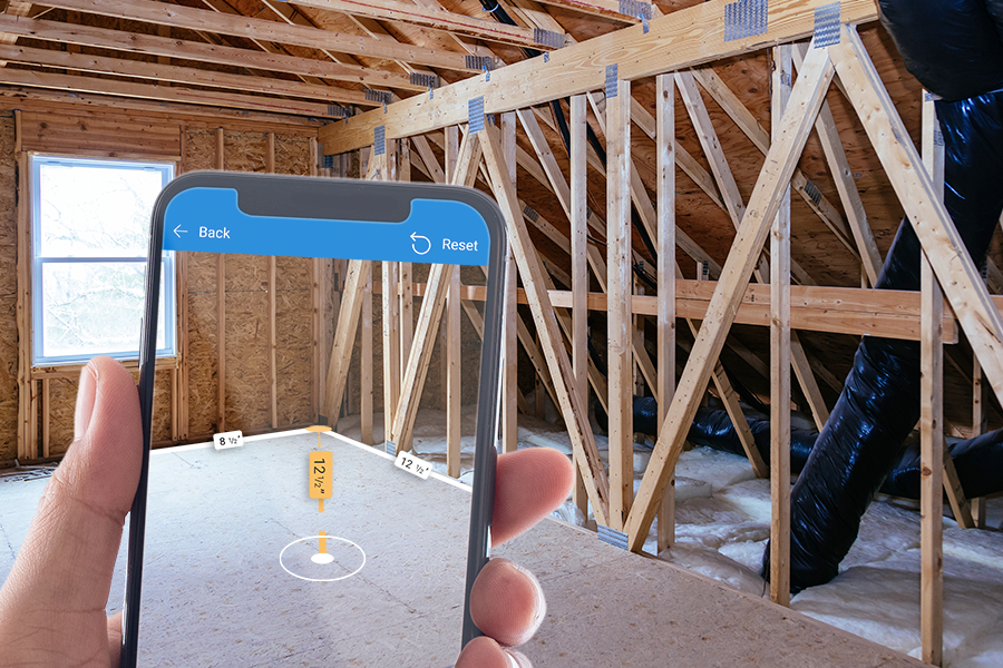
Use the Measuring camera control in a canvas app to measure distance, area, and volume in the real world. You can also create two- and three-dimensional freeform shapes and see how they fit in a real-world space.
The Measuring camera control adds a button to your app. When a user selects the button, the app shows a live feed from the device camera. On-screen instructions direct the user to establish tracking by slowly panning the device from right to left across the surface to be measured. The user identifies a starting point and adds segments as needed until the measurement is complete. Dimensions of the measured space are overlaid on the camera feed.
The user can submit the measurements for capture in the control's Measurements output properties. The user can also take screenshots while a space is measured. The screenshots are captured in the control's Photos output property.
Tip
The mixed-reality (MR) controls work best in well-lit environments with flat-textured surfaces. Tracking is better on LIDAR-enabled devices.
Add a Measuring camera button to an app screen
With your app open for editing in Power Apps Studio:
- Open the Insert tab and expand Media.
- Select Measuring camera to place the control in the app screen, or drag the control to the screen to position it more precisely.
The control is a button that's labeled with an icon of a cube and the text Measure. Change the label and hide the icon if you like in the Text and Display type properties.
Properties
Change the Measuring camera button's behavior and appearance using properties. Some properties are only available on the Advanced tab.
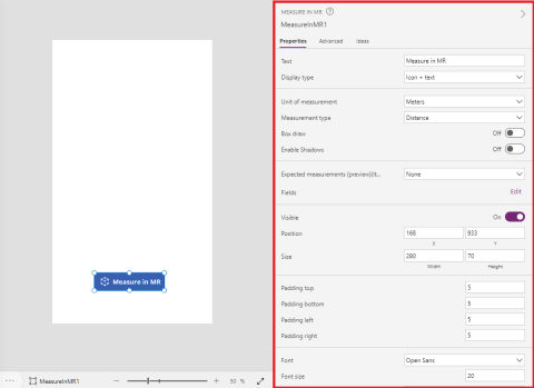
| Property | Description | Type | Location |
|---|---|---|---|
| Text | Sets the button label text. | String | Properties; Advanced: Text |
| Display type | Determines whether the button label shows an icon of a cube, text, or both. | Dropdown list | Properties; Advanced: DisplayType |
| Unit of measurement | Sets the unit used for the dimensions. | Dropdown list | Properties; Advanced: Units |
| Measurement type | Determines the kind of measurement the user can make, either Distance, Area, or Volume (area plus height or depth). | Dropdown list | Properties; Advanced: MeasurementType |
| Box draw | Locks captured measurements to rectangular shapes. | Boolean | Properties; Advanced: BoxDraw |
| Enable Shadows | Determines whether shadows are used to enhance the 3D effect when a shape is drawn. | Boolean | Properties; Advanced: EnableShadows |
| Expected measurements (Items) | Identifies a data source (Items) in the form of a table in an Excel workbook from which to get the measurements the user should capture. | Not applicable | Properties; Advanced: Items |
| Visible | Shows or hides the button. | Boolean | Properties; Advanced: Visible |
| Position | Places the upper-left corner of the button at the screen coordinates specified in x and y. | Floating point number | Properties; Advanced: X, Y |
| Size | Determines the size of the button using the pixel values provided in Width and Height. | Integer | Properties; Advanced: Width, Height |
| Padding top | Sets the distance between the button label text and the top of the button. | Floating point number | Properties; Advanced: PaddingTop |
| Padding bottom | Sets the distance between the button label text and the bottom of the button. | Floating point number | Properties; Advanced: PaddingBottom |
| Padding left | Sets the distance between the button label text and the left edge of the button. | Floating point number | Properties; Advanced: PaddingLeft |
| Padding right | Sets the distance between the button label text and the right edge of the button. | Floating point number | Properties; Advanced: PaddingRight |
| Font | Sets the name of the family of fonts used for the button label text. | Dropdown list | Properties; Advanced: Font |
| Font size | Sets the size of the button label text. | Floating point number | Properties; Advanced: FontSize |
| Font weight | Sets the weight of the button label text, either Bold, Lighter, Normal, or Semibold. | Dropdown list | Properties; Advanced: FontWeight |
| Text alignment | Sets the horizontal alignment of the label text in the button, either Center, Justify, Left, or Right. | Not applicable | Properties; Advanced: TextAlignment |
| Vertical alignment | Sets the vertical alignment of the label text in the button, either Bottom, Middle, or Top. | Dropdown list | Properties; Advanced: VerticalAlign |
| Font style | Sets the style of the button label text, either Italic, Underline, Strikethrough, or none. | Not applicable | Properties; Advanced: Italic, Underline, Strikethrough |
| Border radius | Determines the corner radius of the button border. | Floating point number | Properties; Advanced: BorderRadius |
| Color | Sets the colors of the button label text and the button background. | Not applicable | Properties; Advanced: FillColor, TextColor |
| Border | Determines the style, width, and color of the button border. | Not applicable | Properties; Advanced: BorderStyle, BorderThickness, BorderFillColor |
| Disabled | Turns off the button but leaves it visible. | Boolean | Properties; Advanced: Disabled |
| Disabled color | Sets the colors of the button label text, the button background, and the button border if DisplayMode is Disabled. | Not applicable | Properties; Advanced: DisabledContentColor, DisabledFillColor, DisabledBorderColor |
| Pressed color | Sets the colors of the button label text, the button background, and the button border when the user selects the button. | Not applicable | Properties; Advanced: PressedContentColor, PressedFillColor, PressedBorderColor |
| Hover color | Sets the colors of the button label text, the button background, and the button border when the user hovers the mouse pointer over it. | Not applicable | Properties; Advanced: HoverContentColor, HoverFillColor, HoverBorderColor |
| OnMixedRealitySelect | Contains code that runs when the user exits the measurement screen with new results. | Event | Advanced |
| OnChange | Contains code that runs when a button property is changed. | Event | Advanced |
| OnSelect | Contains code that runs when the user selects the button. | Event | Advanced |
| ItemsLabels | Identifies the column in Items that contains the labels for the measurements users should capture. | ColumnName | Advanced |
| ItemsMeasurementType | (Optional) Identifies the column in Items that contains a string (Distance, Area, Volume, or Freeform) that specifies the type of measurement users should capture. | ColumnName | Advanced; see MeasurementType |
| ItemsBoxDraw | (Optional) Identifies the column in Items that contains a string (True or False) that locks measurements to rectangular shapes. | ColumnName | Advanced; see BoxDraw |
| Tooltip | Determines the text to display when the user hovers over a visual. | String | Advanced |
| ContentLanguage | Determines the display language of the control, if it's different from the language used in the app. | String | Advanced |
| DisplayMode | Determines whether the control allows user input (Edit), only displays data (View), or is disabled (Disabled). | Enum | Advanced |
| TabIndex | Specifies the order the control is selected if the user navigates the app using the Tab key. | Integer | Properties; Advanced: Tab index |
Output properties
Your app can make use of more properties when a user interacts with the View in MR control. These are known as output properties. You can use these properties in other controls or to customize the app experience.
| Property | Description |
|---|---|
| Photos | Captures, in a collection, information about photos the user takes while a space is measured. Use the collection to upload mixed-reality photos to OneDrive and show them in a gallery. |
| Measurements | Captures, in a table, the measured distances, volumes, and areas. |
| Segments | Captures, in a table, information about segments in a measured object. |
The Measurements table has the following columns:
- Label: A string that identifies the measurement
- Id: A number that uniquely identifies the measurement
- Units: A string that identifies the unit of the measurement
- Height: A number that represents the height of the measured volume (0 if a 2D area was measured)
- Length: A number that represents the total length of the measured perimeter or path
- BoundingWidth: A number that represents the minimum width that bounds the shape
- BoundingDepth: A number that represents the minimum depth that bounds the shape
- Area: A number that represents the estimated area of the measured shape in units squared
- Volume: A number that represents the estimated volume of the measured shape in units cubed
The Segments table has the following columns:
- Length: A number that represents the total distance of a segment in the specified units
- DirectionX: A number that represents the X direction of the segment in world (3D) space
- DirectionY: A number that represents the Y direction of the segment in world(3D) space (typically 0)
- DirectionZ: A number that represents the Z direction of the segment in world (3D) space
Learn more about how to use output properties of the Measuring camera control in your apps: Validate measurements in mixed reality using a spatial test filter
Other mixed reality controls
- View 3D content with the 3D object control.
- View images and 3D content in the real world with the View in mixed reality control.
- Create and view predefined 3D shapes with the View shape in mixed reality control
- Paint 3D lines or draw 3D arrows to specify an area or asset in your environment with the Markup in MR control.
See also
Feedback
Coming soon: Throughout 2024 we will be phasing out GitHub Issues as the feedback mechanism for content and replacing it with a new feedback system. For more information see: https://aka.ms/ContentUserFeedback.
Submit and view feedback for