Select function
Applies to:  Canvas apps
Model-driven apps
Canvas apps
Model-driven apps
Simulates a select action on a control, causing the OnSelect formula to be evaluated.
Description
The Select function simulates a select action on a control as if the user had clicked or tapped the control. As a result, the OnSelect formula on the target control is evaluated.
Use Select to propagate a select action to a parent control. This type of propagation is the default behavior in, for example, galleries. By default, the OnSelect property of any control in a Gallery control is set to Select( Parent ). That way, you can set the value of the OnSelect property of the gallery control itself, and that formula will be evaluated regardless of where in the gallery a user might click or tap.
If you want one or more controls in the gallery to perform different actions from the gallery itself, set the OnSelect property for those controls to something other than the default value. You can leave the default values for the OnSelect properties of most controls in the gallery if you want them to perform the same action as the gallery itself.
Select queues the target OnSelect for later processing, which may happen after the current formula has finished being evaluated. Select doesn't cause the target OnSelect to evaluate immediately, nor does Select wait for OnSelect to finish being evaluated.
You can't use Select across screens.
You can use Select only with controls that have an OnSelect property.
You can use Select only in behavior formulas.
A control can't Select itself directly or indirectly through other controls.
The select function can also be used with a gallery. For example, it can be used to specify the row or column to select in a gallery and the control to select within that row or column of the gallery. When you select a row or column, the gallery selection changes and the OnSelect formula on the gallery control is evaluated. If a control within the row or column is provided, the OnSelect formula for the child control will be evaluated.
Syntax
Select( Control )
- Control – Required. The control to select on behalf of the user.
Select( Control, Row or column, Child Control )
- Control – Required. The control to select on behalf of the user.
- Row or column – Not required. The number of row or column (starting with 1) in a gallery control to select on behalf of the user.
- Child Control - Not required. The child control of the control identified in the 'control' parameter to select.
Examples
Button
Select(button1)Gallery
Select(Gallery1, 1)Simulates a user selecting row 1 or column 1 in Gallery1.
Gallery
Select(Gallery1, 1, ChildControl1)Simulates a user selecting ChildConttrol1 in row 1 or column 1 of Gallery1.
Basic usage
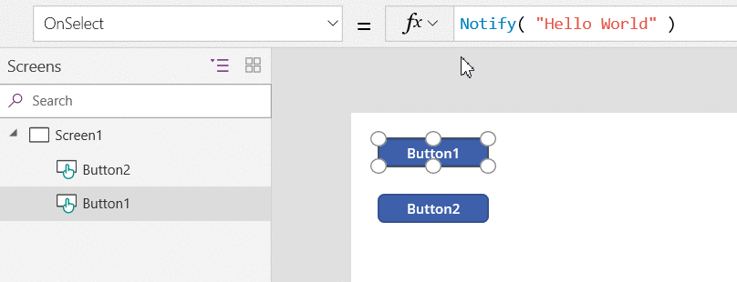
Add a Button control, and rename it Button1 if it has a different name.
Set the OnSelect property of Button1 to this formula:
Notify( "Hello World" )
On the same screen, add a second Button control, and set its OnSelect property to this formula:
Select( Button1 )
While holding down the Alt key, select the second button.
A notification appears across the top of your app. The OnSelect property of Button1 generated this notification.
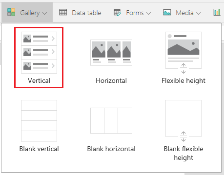
Gallery control
Add a vertical Gallery control that contains other controls.
Set the OnSelect property of the gallery to this formula:
Notify( "Gallery Selected" )
While holding down the Alt key, click or tap the background of the gallery or any control in the gallery.
All actions will show the Gallery Selected notification at the top of the app.
Use the gallery's OnSelect property to specify the default action to take when the user clicks or taps an item in the gallery.
Set the OnSelect property of the image control to this formula:
Notify( "Image Selected", Success )
While holding down the Alt key, click or tap the various elements of the gallery.
When you click or tap any control in the gallery except the image, Gallery Selected appears as before. When you click or tap the image, Image Selected appears.
Use individual controls in the gallery to take actions that differ from the gallery's default action.
On the same screen, add a Button control, and set its OnSelect property to this formula:
Select( Gallery1,2,Image1 )
While holding down the Alt key, select the button.
A Image Selected notification appears across the top of your app. The button click simulated selecting the image in row 2 of the gallery.
Feedback
Coming soon: Throughout 2024 we will be phasing out GitHub Issues as the feedback mechanism for content and replacing it with a new feedback system. For more information see: https://aka.ms/ContentUserFeedback.
Submit and view feedback for