Migrating from JSLink to SharePoint Framework extensions
Since Microsoft SharePoint 2013, most of the enterprise solutions built on top of Microsoft 365 and SharePoint Online leveraged the JSLink property of fields and list views to customize the rendering of fields.
Within the "modern" UI of SharePoint Online and SharePoint Server 2019, most of those customizations are no longer available. Fortunately, SharePoint Framework extensions enable you to provide similar functionality in the "modern" UI.
In this tutorial, you learn how to migrate from the old "classic" customizations to the new model based on SharePoint Framework extensions.
Note
For more information about how to build SharePoint Framework extensions, see Overview of SharePoint Framework extensions.
First, let's introduce the available options when developing SharePoint Framework extensions:
- Application Customizer: Extend the native "modern" UI of SharePoint by adding custom HTML elements and client-side code to pre-defined placeholders of "modern" pages. For more information on application customizers, see Build your first SharePoint Framework Extension (Hello World part 1).
- Command Set: Add custom Edit Control Block (ECB) menu items or custom buttons to the command bar of a list view for a list or a library. You can associate any client-side action to these commands. For more information on command sets, see Build your first ListView Command Set extension.
- Field Customizer: Customize the rendering of a field in a list view by using custom HTML elements and client-side code. For more information on field customizers, see Build your first Field Customizer extension.
The most useful option in our context is the Field Customizer extension.
Assume that you are in SharePoint Online, and you have a custom list with a custom field called "Color", which is of type Choice and which can assume the following values: Red, Green, Blue, Yellow. Assume that you have a custom value for the JSLink property of the list view rendering web part of the custom list.
In the following code snippet, you can see the JavaScript code referenced by the JSLink property (customColorRendering.js).
// Define a namespace for the custom rendering code
var customJSLinkRendering = customJSLinkRendering || {};

// Define a function that declare the custom rendering rules for the target list view
customJSLinkRendering.CustomizeFieldRendering = function () {

  // Define a custom object to configure the rendering template overrides
  var customRenderingOverride = {};
  customRenderingOverride.Templates = {};
  customRenderingOverride.Templates.Fields =
  {
    // Declare the custom rendering function for the 'View' of field 'Color'
    'Color':
    {
      'View': customJSLinkRendering.RenderColorField
    }
  };

  // Register the custom rendering template
  SPClientTemplates.TemplateManager.RegisterTemplateOverrides(customRenderingOverride);
};

// Declare the custom rendering function for the 'View' of field 'Color'
customJSLinkRendering.RenderColorField = function (context)
{
  var colorField = context.CurrentItem.Color;

  // Declare a local variable to hold the output color
  var color = '';

  // Evaluate the values of the 'Color' field and render it accordingly
  switch (colorField)
  {
    case 'Red':
      color = 'red';
      break;
    case 'Green':
      color = 'green';
      break;
    case 'Blue':
      color = 'blue';
      break;
    case 'Yellow':
      color = 'yellow';
      break;
    default:
      color = 'white';
      break;
  }

  // Render the output for the 'Color' field
  return "<div style='float: left; width: 20px; height: 20px; margin: 5px; border: 1px solid rgba(0,0,0,.2);background:" + color + "' />";
};

// Invoke the custom rendering function
customJSLinkRendering.CustomizeFieldRendering();
In the following screenshot you can see how the JSLink property is configured in the list view web part.
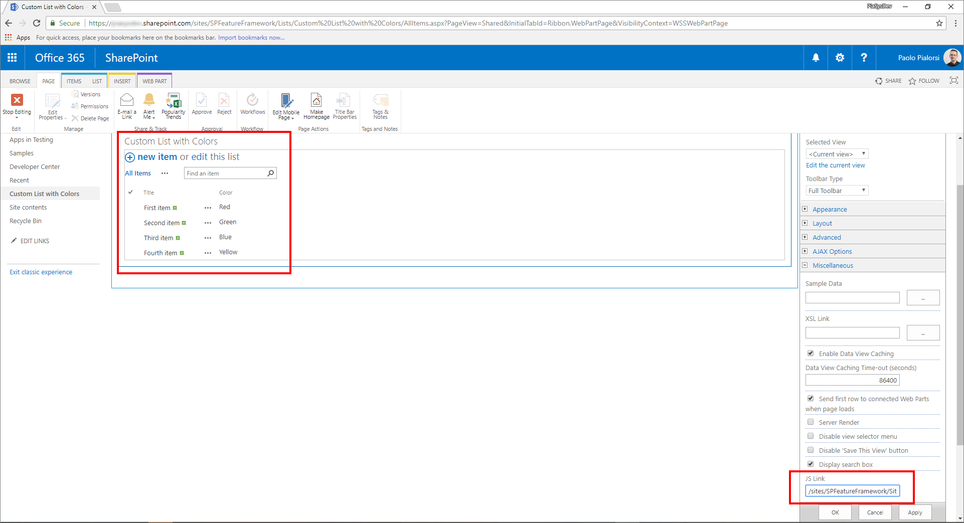
If you uploaded the JavaScript file into the Site Assets library, the value for the JSLink property can be "~site/SiteAssets/customColorRendering.js".
You can see how the custom rendering of the list works.
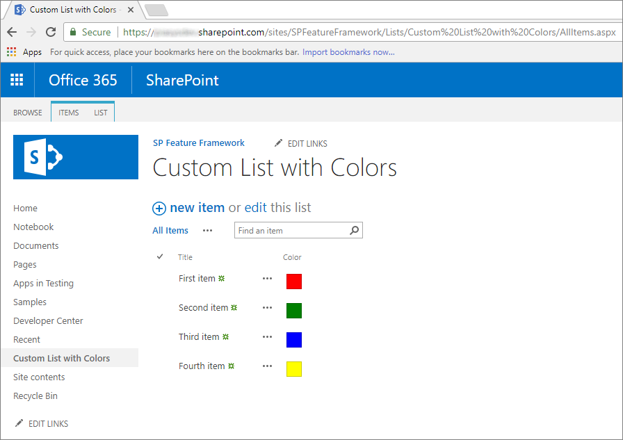
As you can see, Color fields render a colored box filled with the color selected at the item level.
Note
To provision this kind of solution in a "classic" site you can eventually use a PnP provisioning template, which can provision both the list with the custom field, and the JSLink property at once.
To migrate the previous solution to the SharePoint Framework, see the following steps.
Create a new SharePoint Framework solution
From the console, create a new folder for your project:
md spfx-custom-field-extensionGo to the project folder:
cd spfx-custom-field-extensionIn the project folder, run the SharePoint Framework Yeoman generator to scaffold a new SharePoint Framework project:
yo @microsoft/sharepointWhen prompted, enter the following values (select the default option for all prompts omitted below):
- What is your solution name?: spfx-custom-field-extension
- Which type of client-side component to create?: Extension
- Which type of client-side extension to create? Field Customizer
- What is your Field Customizer name? CustomColorField
- Which template would you like to use?: No JavaScript framework
Start Visual Studio Code (or the code editor of your choice) and start developing the solution. To start Visual Studio Code, you can execute the following statement.
code .
Define the new Field Customizer with JavaScript
To reproduce the same behavior of the JSLink custom field rendering, you need to implement the same logic by using client-side code within the new SharePoint Framework solution. To accomplish this task, complete the following steps.
Open the file ./src/extensions/customColorField/CustomColorFieldFieldCustomizer.manifest.json folder. Copy the value of the
idproperty and store it in a safe place because you need it later.Open the file ./src/extensions/customColorField/CustomColorFieldFieldCustomizer.ts, and edit the content according to the following code snippet:
import { Log } from '@microsoft/sp-core-library';
import { override } from '@microsoft/decorators';
import {
  BaseFieldCustomizer,
  IFieldCustomizerCellEventParameters
} from '@microsoft/sp-listview-extensibility';

import * as strings from 'CustomColorFieldFieldCustomizerStrings';
import styles from './CustomColorFieldFieldCustomizer.module.scss';

/**
* If your field customizer uses the ClientSideComponentProperties JSON input,
* it will be deserialized into the BaseExtension.properties object.
* You can define an interface to describe it.
*/
export interface ICustomColorFieldFieldCustomizerProperties {
  // This is an example; replace with your own property
  sampleText?: string;
}

const LOG_SOURCE: string = 'CustomColorFieldFieldCustomizer';

export default class CustomColorFieldFieldCustomizer
extends BaseFieldCustomizer<ICustomColorFieldFieldCustomizerProperties> {

  @override
  public onInit(): Promise<void> {
    // Add your custom initialization to this method.  The framework will wait
    // for the returned promise to resolve before firing any BaseFieldCustomizer events.
    Log.info(LOG_SOURCE, 'Activated CustomColorFieldFieldCustomizer with properties:');
    Log.info(LOG_SOURCE, JSON.stringify(this.properties, undefined, 2));
    Log.info(LOG_SOURCE, `The following string should be equal: "CustomColorFieldFieldCustomizer" and "${strings.Title}"`);
    return Promise.resolve();
  }

  @override
  public onRenderCell(event: IFieldCustomizerCellEventParameters): void {

    var colorField = event.fieldValue;

    // Declare a local variable to hold the output color
    var color = '';

    // Evaluate the values of the 'Color' field and render it accordingly
    switch (colorField)
    {
      case 'Red':
        color = 'red';
        break;
      case 'Green':
        color = 'green';
        break;
      case 'Blue':
        color = 'blue';
        break;
      case 'Yellow':
        color = 'yellow';
        break;
      default:
        color = 'white';
        break;
    }

    // Render the output for the 'Color' field
    event.domElement.innerHTML = "<div style='float: left; width: 20px; height: 20px; margin: 5px; border: 1px solid rgba(0,0,0,.2);background:" + color + "' />";
  }

  @override
  public onDisposeCell(event: IFieldCustomizerCellEventParameters): void {
    // This method should be used to free any resources that were allocated during rendering.
    // For example, if your onRenderCell() called ReactDOM.render(), then you should
    // call ReactDOM.unmountComponentAtNode() here.
    super.onDisposeCell(event);
  }
}
As you can see, the content of the method
onRenderCell()is almost the same as the previousRenderColorField()method in theJSLinkimplementation. The only differences are:- To retrieve the current field value, you need to read the
event.fieldValueproperty of the input argument of theonRenderCell()method. - To return the custom HTML code to render the field, you need to assign a value to the
innerHTMLproperty of theevent.domElementobject, which represents the output HTML container of the field rendering.
Aside from these small changes, you can reuse almost the same JavaScript code as before.
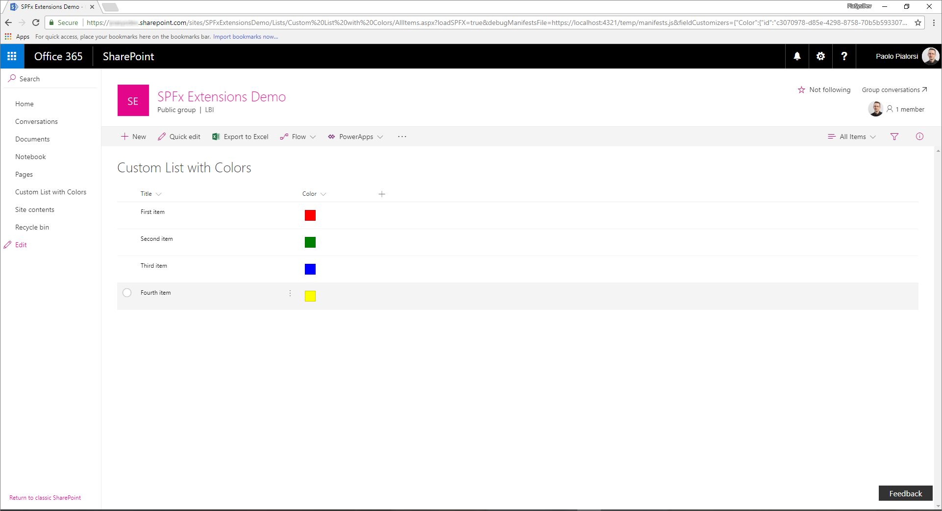
In the following figure, you can see the resulting output.
- To retrieve the current field value, you need to read the
Test the solution in debug mode
Go back to the console window and run the following command to build the solution and run the local Node.js server to host it.
gulp serve --nobrowserOpen your favorite browser, and go to a "modern" list, which has a custom field with the name Color and the type Choice with the same value options as before (Red, Green, Blue, Yellow). You can eventually use the list you created in the "classic" site, just viewing it with the new "modern" experience. Now, append the following query string parameters to the AllItems.aspx page URL.
?loadSPFX=true&debugManifestsFile=https://localhost:4321/temp/manifests.js&fieldCustomizers={"Color":{"id":"c3070978-d85e-4298-8758-70b5b5933076"}}In this query string, replace the GUID with the
idvalue you saved from the CustomColorFieldFieldCustomizer.manifest.json file, and the Color property name refers to the name of the field to customize. If you like, you can also provide a custom configuration object, serialized in JSON format, as an additional parameter for the field customizer construction.Notice that when executing the page request, you're prompted with a warning message box with the title "Allow debug scripts?", which asks your consent to run code from localhost for security reasons. If you want to locally debug and test the solution, you have to allow it to "Load debug scripts."
Note
Alternatively, you can create serve configuration entries in the config/serve.json file in your project to automate the creation of the debug query string parameters as outlined in this document: Debug SharePoint Framework solutions on modern SharePoint pages
Define the new Field Customizer with TypeScript
You're now ready to replace the JavaScript code with TypeScript to benefit from the fully typed approach of TypeScript.
Open the file ./src/extensions/customColorField/CustomColorFieldFieldCustomizer.module.scss. This file, which is a Sass CSS, represents the UI style for the field customizer. Replace the content of the SCSS file with the following.
.CustomColorField {
  .cell {
    float: left;
    width: 20px;
    height: 20px;
    margin: 5px;
    border: 1px solid rgba(0,0,0,.2);
  }

  .cellRed {
    background: red;
  }

  .cellGreen {
    background: green;
  }

  .cellBlue {
    background: blue;
  }

  .cellYellow {
    background: yellow;
  }

  .cellWhite {
    background: white;
  }
}
Replace the implementation of the
onRenderCell()method with the following code excerpt.@override public onRenderCell(event: IFieldCustomizerCellEventParameters): void { // Read the current field value let colorField: String = event.fieldValue; // Add the main style to the field container element event.domElement.classList.add(styles.CustomColorField); // Get a reference to the output HTML let fieldHtml: HTMLDivElement = event.domElement.firstChild as HTMLDivElement; // Add the standard style fieldHtml.classList.add(styles.cell); // Add the colored style switch(colorField) { case "Red": fieldHtml.classList.add(styles.cellRed); break; case "Green": fieldHtml.classList.add(styles.cellGreen); break; case "Blue": fieldHtml.classList.add(styles.cellBlue); break; case "Yellow": fieldHtml.classList.add(styles.cellYellow); break; default: fieldHtml.classList.add(styles.cellWhite); break; } }Notice that the new method implementation uses a fully typed approach, and assigns the
cellCSS class to theDIVelement child of the current field element, together with another custom CSS class to define the target color of theDIVbased on the currently selected value for the field.Run the Field Customizer one more time in debug mode and view the results.
Package and host the solution
If you're happy with the result, you're now ready to package the solution and host it in a real hosting infrastructure. Before building the bundle and the package, you need to declare an XML Feature Framework file to provision the extension.
Review Feature Framework elements
In the code editor, open the /sharepoint/assets/elements.xml file. In the following code excerpt, you can see how the file should look.
<?xml version="1.0" encoding="utf-8"?>
<Elements xmlns="http://schemas.microsoft.com/sharepoint/">
    <Field ID="{40475661-efaf-447a-a220-c992b20ec1c3}"
           Name="SPFxColor"
           DisplayName="Color"
           Title="Color"
           Type="Choice"
           Required="FALSE"
           Group="SPFx Columns"
           ClientSideComponentId="c3070978-d85e-4298-8758-70b5b5933076">
    </Field>
</Elements>
As you can see, it reminds us of a SharePoint Feature Framework file, but it defines a custom
Fieldelement with a field typeChoice, which uses theClientSideComponentIdattribute to reference theidof the Field Customizer, and there could be aClientSideComponentPropertiesattribute to configure the custom configuration properties required by the extension.Open the file ./config/package-solution.json. Within the file, you can see that there's a reference to the elements.xml file in the
assetssection.{ "$schema": "https://developer.microsoft.com/json-schemas/spfx-build/package-solution.schema.json", "solution": { "name": "spfx-custom-field-extension-client-side-solution", "id": "ab0fbbf8-01ba-4633-8498-46cfd5652619", "version": "1.0.0.0", "features": [{ "title": "Application Extension - Deployment of custom action.", "description": "Deploys a custom action with ClientSideComponentId association", "id": "090dc976-878d-44fe-8f8e-ac603d094aa1", "version": "1.0.0.0", "assets": { "elementManifests": [ "elements.xml" ] } }] }, "paths": { "zippedPackage": "solution/spfx-custom-field-extension.sppkg" } }
Bundle, package and deploy the solution
Next, you need to bundle and package solution bundle to the app catalog. To accomplish this task, follow these steps.
Prepare and deploy the solution for SharePoint Online tenant:
Execute the following task to bundle your solution. This creates a release build of your project:
gulp bundle --shipExecute the following task to package your solution. This command creates an *.sppkg package in the sharepoint/solution folder.
gulp package-solution --shipUpload or drag-and-drop the newly created client-side solution package to the app catalog in your tenant, and then select the Deploy button.
Install and run the solution
Open the browser and navigate to any target "modern" site.
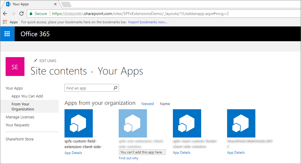
Go to the Site Contents page and select to add a new App.
Select to install a new app From Your Organization to browse the solutions available in the app catalog.
Select the solution called spfx-custom-field-extension-client-side-solution and install it on the target site.
After the application installation is completed, create a new custom list, edit the list settings, and add a new column from already existing site columns. Select the group of columns called SPFx Columns and add the Color field.
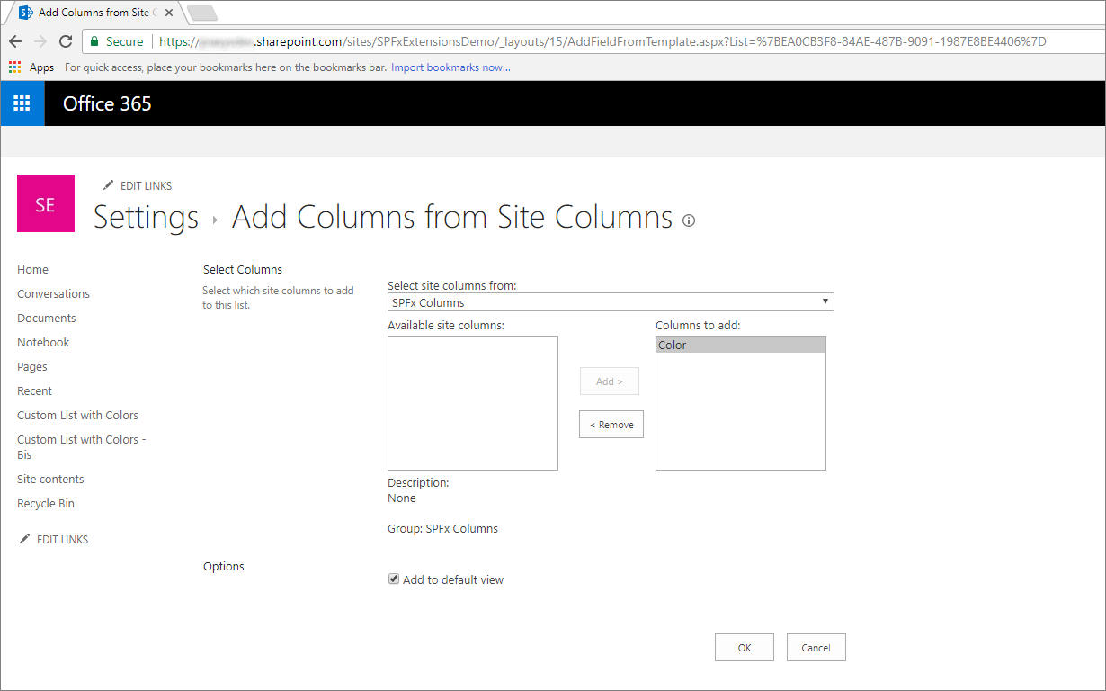
Edit the added field and configure some color values (such as Red, Green, Blue, Yellow), and then save the field settings.
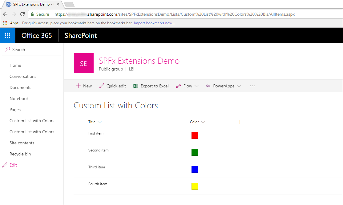
Add some items to the list and see the output in the list view. It should look like the one in the following screenshot.
Enjoy your new Field Customizer built by using the SharePoint Framework extensions!
See also
Feedback
Coming soon: Throughout 2024 we will be phasing out GitHub Issues as the feedback mechanism for content and replacing it with a new feedback system. For more information see: https://aka.ms/ContentUserFeedback.
Submit and view feedback for