Migrating from UserCustomAction to SharePoint Framework extensions
Many enterprise solutions built on top of Microsoft 365 and SharePoint Online leveraged the site CustomAction capability of the SharePoint Feature Framework to extend the UI of pages. In the current "modern" UI of SharePoint Server 2019 and SharePoint Online, most of those customizations are no longer available. Fortunately, with SharePoint Framework extensions, you can provide similar functionality in the "modern" UI.
In this tutorial, you learn how to migrate from the old "classic" customizations to the new model based on SharePoint Framework extensions.
First, let's introduce the available options when developing SharePoint Framework extensions:
- Application Customizer: Extend the native "modern" UI of SharePoint by adding custom HTML elements and client-side code to pre-defined placeholders of "modern" pages. For more information on application customizers, see Build your first SharePoint Framework Extension (Hello World part 1).
- Command Set: Add custom Edit Control Block (ECB) menu items or custom buttons to the command bar of a list view for a list or a library. You can associate any client-side action to these commands. For more information on command sets, see Build your first ListView Command Set extension.
- Field Customizer: Customize the rendering of a field in a list view by using custom HTML elements and client-side code. For more information on field customizers, see Build your first Field Customizer extension.
The most useful option in this context is the Application Customizer extension.
Assume that you have a CustomAction in SharePoint Online to have a custom footer in all of the site's pages.
In the following code snippet, you can see the XML code defining that CustomAction by using the SharePoint Feature Framework.
<?xml version="1.0" encoding="utf-8"?>
<Elements xmlns="http://schemas.microsoft.com/sharepoint/">
  <CustomAction Id="jQueryCDN"
                Title="jQueryCDN"
                Description="Loads jQuery from the public CDN"
                ScriptSrc="https://code.jquery.com/jquery-3.2.1.slim.min.js"
                Location="ScriptLink"
                Sequence="100" />
  <CustomAction Id="spoCustomBar"
                Title="spoCustomBar"
                Description="Loads a script to rendere a custom footer"
                Location="ScriptLink"
                ScriptSrc="SiteAssets/SPOCustomUI.js"
                Sequence="200" />
</Elements>
As you can see, the feature elements file defines a few elements of type CustomAction to include in the pages of the target site: jQuery, loaded through the public CDN, and a custom JavaScript file that renders the custom footer.
For the sake of completeness, you can see the JavaScript code that renders a custom footer, whose menu items are pre-defined in code for the sake of simplicity.
var SPOCustomUI = SPOCustomUI || {};
SPOCustomUI.setUpCustomFooter = function () {
if ($("#SPOCustomFooter").length)
return;
var footerContainer = $("<div>");
footerContainer.attr("id", "SPOCustomFooter");
footerContainer.append("<ul>");
$("#s4-workspace").append(footerContainer);
}
SPOCustomUI.addCustomFooterText = function (id, text) {
if ($("#" + id).length)
return;
var customElement = $("<div>");
customElement.attr("id", id);
customElement.html(text);
$("#SPOCustomFooter > ul").before(customElement);
return customElement;
}
SPOCustomUI.addCustomFooterLink = function (id, text, url) {
if ($("#" + id).length)
return;
var customElement = $("<a>");
customElement.attr("id", id);
customElement.attr("href", url);
customElement.html(text);
$("#SPOCustomFooter > ul").append($("<li>").append(customElement));
return customElement;
}
SPOCustomUI.loadCSS = function (url) {
var head = document.getElementsByTagName('head')[0];
var style = document.createElement('link');
style.type = 'text/css';
style.rel = 'stylesheet';
style.href = url;
head.appendChild(style);
}
SPOCustomUI.init = function (whenReadyDoFunc) {
// avoid executing inside iframes (used by SharePoint for dialogs)
if (self !== top) return;
if (!window.jQuery) {
// jQuery is needed for Custom Bar to run
setTimeout(function () { SPOCustomUI.init(whenReadyDoFunc); }, 50);
} else {
$(function () {
SPOCustomUI.setUpCustomFooter();
whenReadyDoFunc();
});
}
}
// The following initializes the custom footer with some fake links
SPOCustomUI.init(function () {
var currentScriptUrl;
var currentScript = document.querySelectorAll("script[src*='SPOCustomUI']");
if (currentScript.length > 0) {
currentScriptUrl = currentScript[0].src;
}
if (currentScriptUrl != undefined) {
var currentScriptBaseUrl = currentScriptUrl.substring(0, currentScriptUrl.lastIndexOf('/') + 1);
SPOCustomUI.loadCSS(currentScriptBaseUrl + 'SPOCustomUI.css');
}
SPOCustomUI.addCustomFooterText('SPOFooterCopyright', '© 2017, Contoso Inc.');
SPOCustomUI.addCustomFooterLink('SPOFooterCRMLink', 'CRM', 'CRM.aspx');
SPOCustomUI.addCustomFooterLink('SPOFooterSearchLink', 'Search Center', 'SearchCenter.aspx');
SPOCustomUI.addCustomFooterLink('SPOFooterPrivacyLink', 'Privacy Policy', 'Privacy.aspx');
});
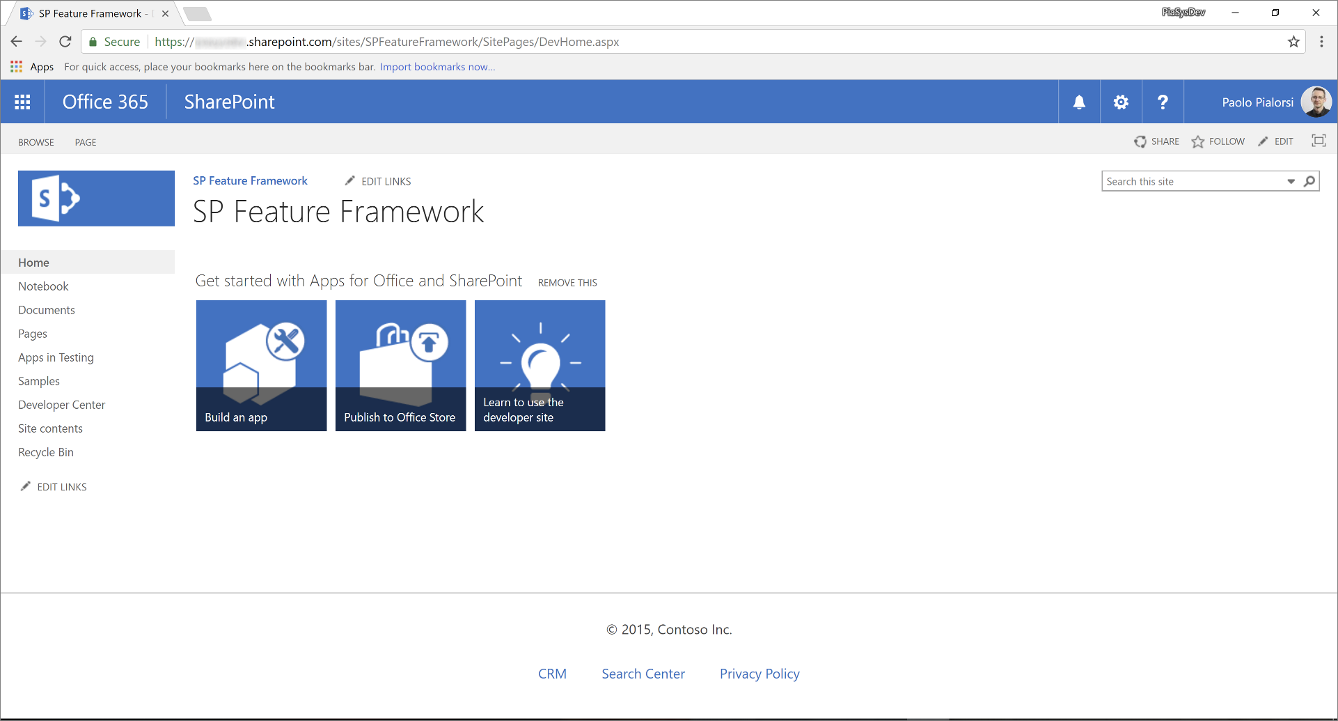
In the following figure you can see the output of the previous custom action, within the home page of a classic site.
To migrate the previous solution to the "modern" UI, see the following steps.
Create a new SharePoint Framework solution
From the console, create a new folder for your project:
md spfx-react-custom-footerGo to the project folder:
cd spfx-react-custom-footerIn the project folder, run the SharePoint Framework Yeoman generator to scaffold a new SharePoint Framework project:
yo @microsoft/sharepointWhen prompted, enter the following values (select the default option for all prompts omitted below):
- What is your solution name?: spfx-react-custom-footer
- Which baseline packages do you want to target for your component(s)?: SharePoint Online only (latest)
- Which type of client-side component to create?: Extension
- Which type of client-side extension to create? Application Customizer
- What is your Field Customizer name? CustomFooter
At this point, Yeoman installs the required dependencies and scaffolds the solution files and folders along with the CustomFooter extension. This might take a few minutes.
Start Visual Studio Code (or the code editor of your choice) and start developing the solution. To start Visual Studio Code, you can execute the following statement.
code .
Define the new UI elements
The UI elements of the custom footer are rendered using React and a custom React component. You can create the UI elements of the sample footer with whatever technology you like. In this tutorial, we use React to leverage the Office UI Fabric components for React.
Open the file ./src/extensions/customFooter/CustomFooterApplicationCustomizer.manifest.json folder. Copy the value of the
idproperty and store it in a safe place because you need it later.Open the file ./src/extensions/customFooter/CustomFooterApplicationCustomizer.ts, and import the types
PlaceholderContentandPlaceholderNamefrom the package @microsoft/sp-application-base.And, at the very beginning of the file, add the
importdirectives for React.In the following code excerpt, you can see the imports section of the CustomFooterApplicationCustomizer.ts file.
import * as React from 'react';
import * as ReactDom from 'react-dom';

import { override } from '@microsoft/decorators';
import { Log } from '@microsoft/sp-core-library';
import {
  BaseApplicationCustomizer,
  PlaceholderContent,
  PlaceholderName
} from '@microsoft/sp-application-base';
import { Dialog } from '@microsoft/sp-dialog';

import * as strings from 'CustomFooterApplicationCustomizerStrings';
import CustomFooter from './components/CustomFooter';
Locate the definition of the class
CustomFooterApplicationCustomizerand declare a new private member calledbottomPlaceholderof typePlaceholderContent | undefined.Within the override of the
onInit()method, invoke a custom function calledrenderPlaceHolders, and define that function.In the following code excerpt, you can see the implementation of the custom footer Application Customizer class.
/** A Custom Action which can be run during execution of a Client Side Application */
export default class CustomFooterApplicationCustomizer
extends BaseApplicationCustomizer<ICustomFooterApplicationCustomizerProperties> {

  // This private member holds a reference to the page's footer
  private _bottomPlaceholder: PlaceholderContent | undefined;

  @override
  public onInit(): Promise<void> {
    Log.info(LOG_SOURCE, `Initialized ${strings.Title}`);

    let message: string = this.properties.testMessage;
    if (!message) {
      message = '(No properties were provided.)';
    }

    // Call render method for rendering the needed html elements
    this._renderPlaceHolders();

    return Promise.resolve();
  }

  private _renderPlaceHolders(): void {

    // Handling the bottom placeholder
    if (!this._bottomPlaceholder) {
      this._bottomPlaceholder =
        this.context.placeholderProvider.tryCreateContent(PlaceholderName.Bottom);

      // The extension should not assume that the expected placeholder is available.
      if (!this._bottomPlaceholder) {
        console.error('The expected placeholder (Bottom) was not found.');
        return;
      }

      const element: React.ReactElement<{}> = React.createElement(CustomFooter);

      ReactDom.render(element, this._bottomPlaceholder.domElement);
    }
  }
}
The
renderPlaceHolders()method searches for the placeholder of typeBottom, and if any, it renders its content. In fact, at the very end of therenderPlaceHolders()method, the code creates a new instance of aCustomFooterReact component, and renders it within the placeholder of the pages' bottom (that is, where the footer should be rendered).Note
The React component is the replacement in the "modern" UI for the JavaScript file in the "classic" model. Of course, you can render the entire footer by using pure JavaScript code and reusing most of the code that you already have. However, it is better to consider to upgrade the implementation not only from a technology perspective, but also from a code perspective.
Add a new folder named components in the src/extensions/customFooter folder.
Create a new file within the new folder, and name it CustomFooter.tsx.
Add the following code to this file:
import * as React from 'react'; import { CommandButton } from 'office-ui-fabric-react/lib/Button'; export default class CustomFooter extends React.Component<{}, {}> { public render(): React.ReactElement<{}> { return ( <div className={`ms-bgColor-neutralLighter ms-fontColor-white`}> <div className={`ms-bgColor-neutralLighter ms-fontColor-white`}> <div className={`ms-Grid`}> <div className="ms-Grid-row"> <div className="ms-Grid-col ms-sm2 ms-md2 ms-lg2"> <CommandButton data-automation="CopyRight" href={`CRM.aspx`}>© 2017, Contoso Inc.</CommandButton> </div> <div className="ms-Grid-col ms-sm2 ms-md2 ms-lg2"> <CommandButton data-automation="CRM" iconProps={ { iconName: 'People' } } href={`CRM.aspx`}>CRM</CommandButton> </div> <div className="ms-Grid-col ms-sm2 ms-md2 ms-lg2"> <CommandButton data-automation="SearchCenter" iconProps={ { iconName: 'Search' } } href={`SearchCenter.aspx`}>Search Center</CommandButton> </div> <div className="ms-Grid-col ms-sm2 ms-md2 ms-lg2"> <CommandButton data-automation="Privacy" iconProps={ { iconName: 'Lock' } } href={`Privacy.aspx`}>Privacy Policy</CommandButton> </div> <div className="ms-Grid-col ms-sm4 ms-md4 ms-lg4"></div> </div> </div> </div> </div> ); } }Teaching you how to write a React component is out of scope for this document. Notice the
importstatements at the beginning, where the component imports React, and theCommandButtonReact component from the Office UI Fabric components library.In the
render()method of the component, it defined the output of theCustomFooterwith few instances of theCommandButtoncomponent for the links in the footer. All the HTML output is wrapped within a Grid layout of Office UI Fabric.Note
For more information about the grid layout of Office UI Fabric, see Responsive Layout.
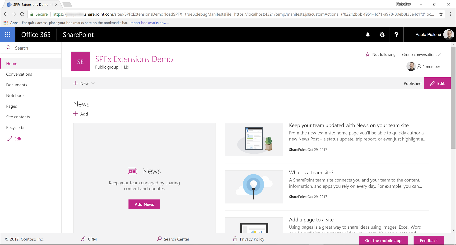
In the following figure, you can see the resulting output.
Test the solution in debug mode
Go back to the console window and run the following command to build the solution and run the local Node.js server to host it.
gulp serve --nobrowserNow open your favorite browser and go to a "modern" page of any "modern" team site. Now, append the following query string parameters to the page's URL.
?loadSPFX=true&debugManifestsFile=https://localhost:4321/temp/manifests.js&customActions={"82242bbb-f951-4c71-a978-80eb8f35e4c1":{"location":"ClientSideExtension.ApplicationCustomizer"}}In this query string, replace the GUID with the
idvalue you saved from the CustomFooterApplicationCustomizer.manifest.json file.Notice that when executing the page request, you're prompted with a warning message box with the title "Allow debug scripts?", which asks your consent to run code from localhost for security reasons. If you want to locally debug and test the solution, you have to allow it to "Load debug scripts."
Note
Alternatively, you can create serve configuration entries in the
config/serve.jsonfile in your project to automate the creation of the debug query string parameters as outlined in this document: Debug SharePoint Framework solutions on modern SharePoint pages
Package and host the solution
If you're happy with the result, you're now ready to package the solution and host it in a real hosting infrastructure.
Before building the bundle and the package, you need to declare an XML Feature Framework file to provision the extension.
Review Feature Framework elements
In the code editor, open the /sharepoint/assets/elements.xml file. In the following code excerpt, you can see how the file should look.
<?xml version="1.0" encoding="utf-8"?>
<Elements xmlns="http://schemas.microsoft.com/sharepoint/">
  <CustomAction
      Title="CustomFooter"
      Location="ClientSideExtension.ApplicationCustomizer"
      ClientSideComponentId="82242bbb-f951-4c71-a978-80eb8f35e4c1">
  </CustomAction>
</Elements>
As you can see, it reminds us of the SharePoint Feature Framework file that we saw in the "classic" model, but it uses the
ClientSideComponentIdattribute to reference theidof the custom extension. You can also add aClientSideComponentPropertiesattribute, if you need to provide custom settings to the extension, which isn't the case in this tutorial.Open the file ./config/package-solution.json folder of the solution. Within the file, you can see that there's a reference to the elements.xml file within the
assetssection.{ "$schema": "https://developer.microsoft.com/json-schemas/spfx-build/package-solution.schema.json", "solution": { "name": "spfx-react-custom-footer-client-side-solution", "id": "911728a5-7bde-4453-97b2-2eba59277ed3", "version": "1.0.0.0", "features": [ { "title": "Application Extension - Deployment of custom action.", "description": "Deploys a custom action with ClientSideComponentId association", "id": "f16a2612-3163-46ad-9664-3d3daac68cff", "version": "1.0.0.0", "assets": { "elementManifests": [ "elements.xml" ] } }] }, "paths": { "zippedPackage": "solution/spfx-react-custom-footer.sppkg" } }
Bundle, package, and deploy the solution
Next, you need to bundle and package solution bundle to the app catalog. To accomplish this task, follow these steps.
Prepare and deploy the solution for SharePoint Online tenant:
Execute the following task to bundle your solution. This creates a release build of your project:
gulp bundle --shipExecute the following task to package your solution. This command creates an *.sppkg package in the sharepoint/solution folder.
gulp package-solution --shipUpload or drag-and-drop the newly created client-side solution package to the app catalog in your tenant, and then select the Deploy button.
Install and run the solution
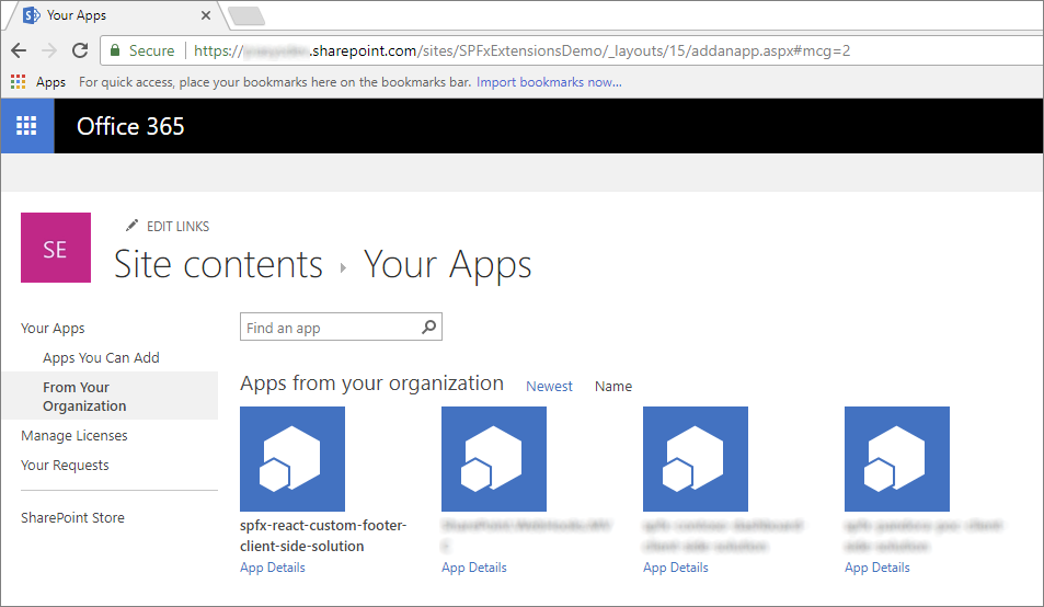
Open the browser and navigate to any target "modern" site.
Go to the Site Contents page and select to add a new App.
Select to install a new app From Your Organization to browse the solutions available in the app catalog.
Select the solution called spfx-react-custom-footer-client-side-solution and install it on the target site.
After the application installation is completed, refresh the page or go to the home page of the site. You should see the custom footer in action.
Enjoy your new custom footer built by using the SharePoint Framework extensions!
See also
Feedback
Coming soon: Throughout 2024 we will be phasing out GitHub Issues as the feedback mechanism for content and replacing it with a new feedback system. For more information see: https://aka.ms/ContentUserFeedback.
Submit and view feedback for