Tutorial: Analyze webpage data by using Power BI Desktop
As a long-time soccer fan, you want to report on the UEFA European Championship (Euro Cup) winners over the years. With Power BI Desktop, you can import this data from a web page into a report and create visualizations that show the data. In this tutorial, you learn how to use Power BI Desktop to:
- Connect to a web data source and navigate across its available tables.
- Shape and transform data in the Power Query Editor.
- Name a query and import it into a Power BI Desktop report.
- Create and customize a map and a pie chart visualization.
Connect to a web data source
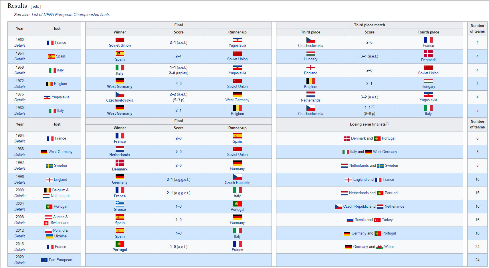
You can get the UEFA winners data from the Results table on the UEFA European Football Championship Wikipedia page at https://en.wikipedia.org/wiki/UEFA_European_Football_Championship.
Web connections are only established using basic authentication. Web sites requiring authentication might not work properly with the Web connector.
To import the data:
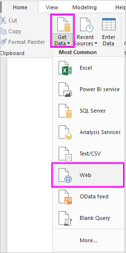
In the Power BI Desktop Home ribbon tab, drop down the arrow next to Get Data, and then select Web.
Note
You can also select the Get Data item itself, or select Get Data from the Power BI Desktop get started dialog, then select Web from the All or Other section of the Get Data dialog, and then select Connect.
In the From Web dialog, paste the URL
https://en.wikipedia.org/wiki/UEFA_European_Football_Championshipinto the URL text box, and then select OK.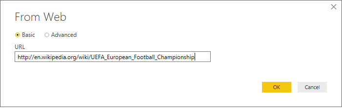
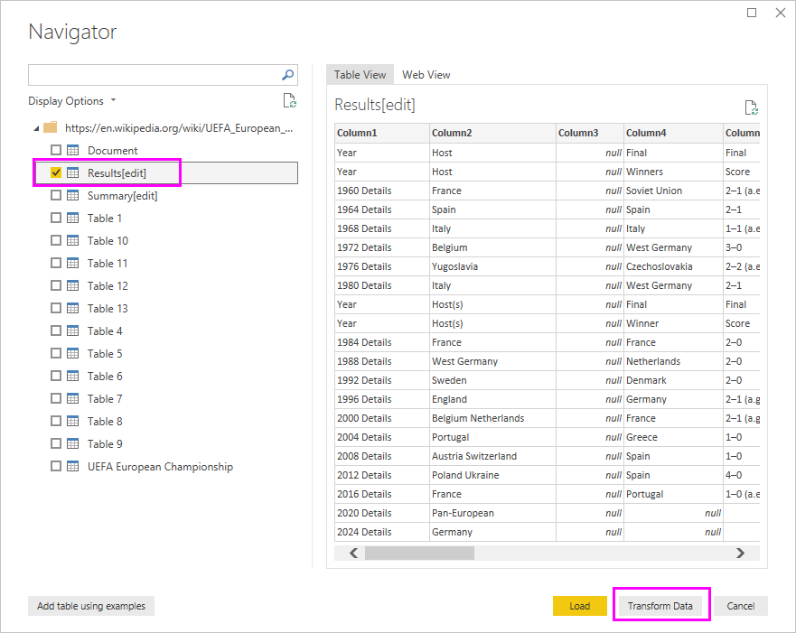
After you connect to the Wikipedia web page, the Navigator dialog shows a list of available tables on the page. You can select any of the table names to preview its data. The Results[edit] table has the data you want, although it's not exactly in the shape you want. You'll reshape and clean up the data before loading it into your report.
Note
The Preview pane shows the most recent table selected, but all selected tables load into the Power Query Editor when you select Transform Data or Load.
Select the Results[edit] table in the Navigator list, and then select Transform Data.
A preview of the table opens in Power Query Editor, where you can apply transformations to clean up the data.


Shape data in Power Query Editor
You want to make the data easier to scan by displaying only the years and the countries/regions that won. You can use the Power Query Editor to perform these data shaping and cleansing steps.
First, remove all the columns except for two from the table. Rename these columns as Year and CountryRegion later in the process.
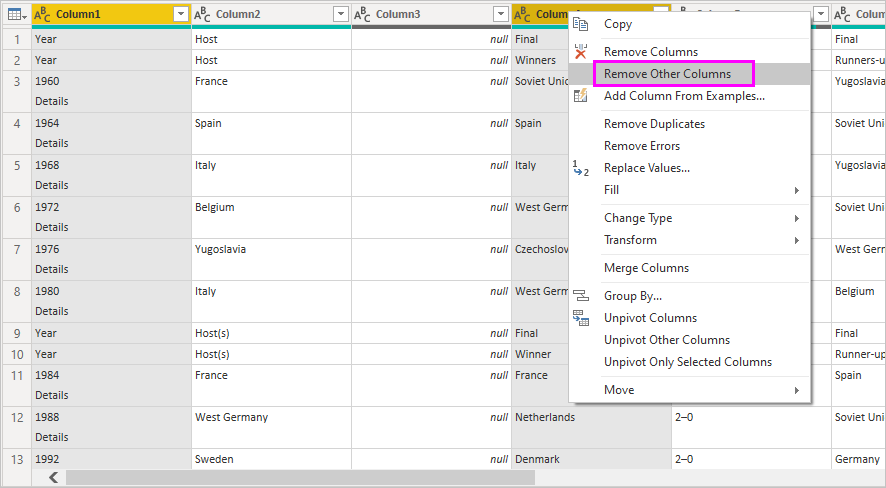
In the Power Query Editor grid, select the columns. Select Ctrl to select multiple items.
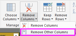
Right-click and select Remove Other Columns, or select Remove Columns > Remove Other Columns from the Manage Columns group in the Home ribbon tab, to remove all other columns from the table.
or
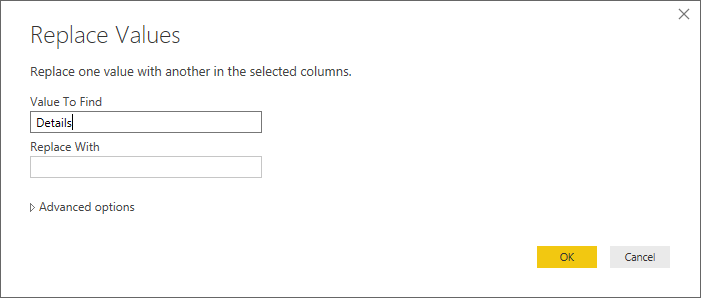
This version of the imported data has the word Details appended to the year. You can remove the extra word Details from the first column cells.
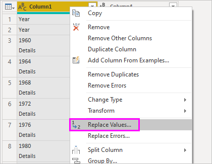
Select the first column.
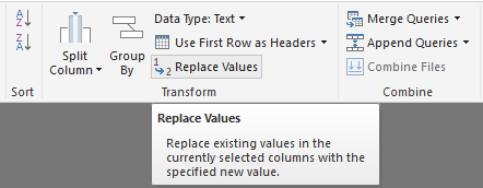
Right-click, and select Replace Values, or select Replace Values from the Transform group in the Home tab of the ribbon. This option is also found in the Any Column group in the Transform tab.
or
In the Replace Values dialog, type Details in the Value To Find text box, leave the Replace With text box empty, and then select OK to delete the word Details from this column.
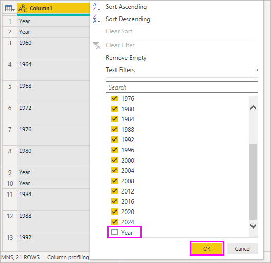
Some cells contain only the word "Year" rather than year values. You can filter the column to only display rows that don't contain the word "Year".
Select the filter drop-down arrow on the column.
In the drop-down menu, scroll down and clear the checkbox next to the Year option, and then select OK.
Since you're only looking at the final winners data now, you can rename the second column to CountryRegion. To rename the column:
Double-click or tap and hold in the second column header, or
- Right-click the column header, and select Rename, or
- Select the *column and select Rename from the Any Column group in the Transform tab of the ribbon.

or
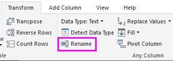
Type CountryRegion in the header and press Enter to rename the column.
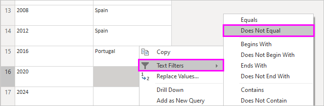
You also want to filter out rows that have null values in the CountryRegion column. You could use the filter menu as you did with the Year values, or you can:
Right-click on the CountryRegion cell in the 2020 row, which has the value null.
Select Text Filters > Does not Equal in the context menu to remove any rows that contain that cell's value.
Import the query into Report View
Now that you've shaped the data the way you want, you're ready to name your query "Euro Cup Winners" and import it into your report.
In the Query Settings pane, in the Name text box, enter Euro Cup Winners.
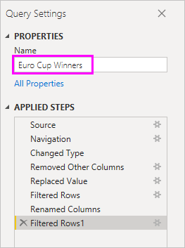
Select Close & Apply > Close & Apply from the Home tab of the ribbon.

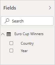
The query loads into the Power BI Desktop Report view, where you can see it in the Fields pane.
Tip
You can always get back to the Power Query Editor to edit and refine your query by:
- Selecting the More options ellipsis (...) next to Euro Cup Winners in the Fields pane, and selecting Edit query, or
- Selecting Transform data in the Queries group of the Home ribbon tab in Report view.
Create a visualization
To create a visualization based on your data:
Select the CountryRegion field in the Fields pane, or drag it to the report canvas. Power BI Desktop recognizes the data as country/region names, and automatically creates a Map visualization.
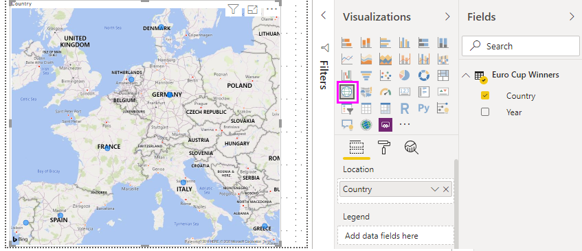
Enlarge the map by dragging the handles in the corners so all the winning country/region names are visible.
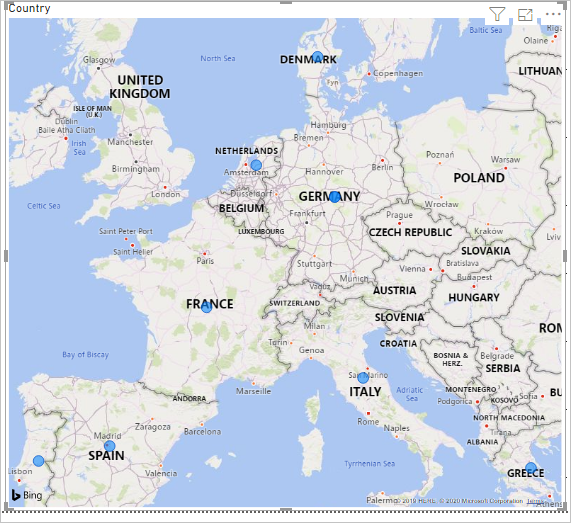
The map shows identical data points for every country/region that won a Euro Cup tournament. To make the size of each data point reflect how often the country/region has won, drag the Year field to Drag data fields here under Bubble size in the lower part of the Visualizations pane. The field automatically changes to a Count of Year measure, and the map visualization now shows larger data points for countries/regions that have won more tournaments.


Customize the visualization
As you can see, it's very easy to create visualizations based on your data. It's also easy to customize your visualizations to better present the data in ways that you want.
Format the map
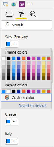
You can change the appearance of a visualization by selecting it and then selecting the Format (paint brush) icon in the Visualizations pane. For example, the "Germany" data points in your visualization could be misleading, because West Germany won two tournaments and Germany won one. The map superimposes the two points rather than separating or adding them together. You can color these two points differently to highlight this fact. You can also give the map a more descriptive and attractive title.
With the visualization selected, select the Format icon, and then select Visual > Bubbles > Colors to expand the data color options.
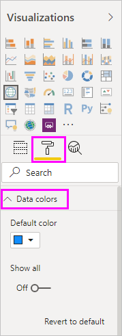
Turn Show all to On, and then select the drop-down menu next to West Germany and choose a yellow color.
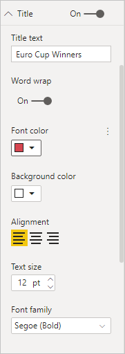
Select General > Title to expand the title options, and in the Text field, type Euro Cup Winners in place of the current title.
Change Text color to red, size to 12, and Font to Segoe UI (Bold).
Your map visualization now looks like this example:

Change the visualization type
You can change the type of a visualization by selecting it and then selecting a different icon at the top of the Visualizations pane. For example, your map visualization is missing the data for the Soviet Union, because that country/region no longer exists on the world map. Another type of visualization like a treemap or pie chart might be more accurate, because it shows all the values.
To change the map to a pie chart, select the map and then choose the Pie chart icon in the Visualizations pane.

Tip
- You can use the Data colors formatting options to make "Germany" and "West Germany" the same color.
- To group the countries/regions with the most wins together on the pie chart, select the ellipsis (...) at the upper right of the visualization, and then select Sort by Count of Year.
Power BI Desktop provides a seamless end-to-end experience, from getting data from a wide range of data sources and shaping it to meet your analysis needs, to visualizing this data in rich and interactive ways. Once your report is ready, you can upload it to Power BI and create dashboards based on it, which you can share with other Power BI users.
Related content
Feedback
Coming soon: Throughout 2024 we will be phasing out GitHub Issues as the feedback mechanism for content and replacing it with a new feedback system. For more information see: https://aka.ms/ContentUserFeedback.
Submit and view feedback for