Apply insights in Power BI to discover where distributions vary
APPLIES TO: ![]() Power BI Desktop
Power BI Desktop ![]() Power BI service
Power BI service
Often in visuals, you see a data point and wonder whether distribution would be the same for different categories. With insights in Power BI you can find out with just a few clicks.
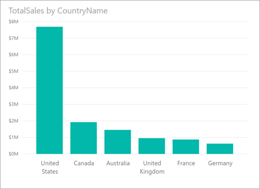
Consider the following visual, which shows TotalSales by CountryName. Most sales come from the United States, accounting for 57% of all sales with lesser contributions coming from other countries/regions. It's often interesting in such cases to explore whether that same distribution would be seen for different subpopulations. For example, is this the same for all years, all sales channels, and all categories of products? While you could apply different filters and compare the results visually, doing so can be time-consuming and error-prone.
You can tell Power BI to find where a distribution is different and get fast, automated, and insightful analysis about your data. Right-click on a data point and select Analyze > Find where this distribution is different, and an insight is delivered to you in an easy-to-use window.
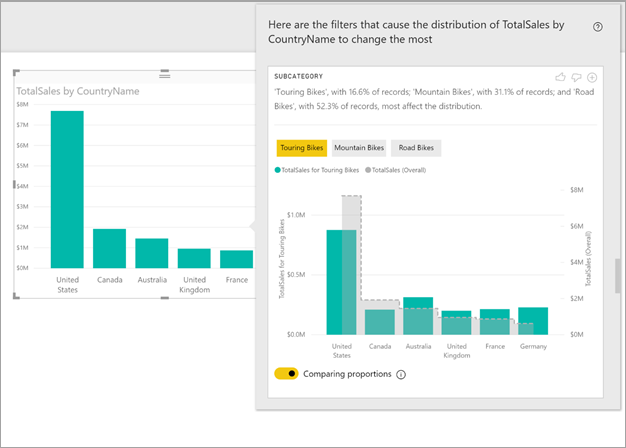
In this example, the automated analysis shows that the proportion of sales for Touring Bikes in the United States and Canada are lower than the proportion coming from the other countries/regions.
Use insights
To use insights to find where distributions seen on charts are different, just right-click on any data point or on the visual as a whole. Then select Analyze > Find where this distribution is different.

Power BI runs its machine learning algorithms over the data. It then populates a window with a visual and a description of which categories (columns) and which values of those categories result in the most significantly different distribution. Insights are provided as a column chart, as shown in the following image:

The values with the selected filter applied have the default color. The overall values, as seen on the original starting visual, are shown in grey for easy comparison. Up to three different filters might be included (Touring Bikes, Mountain Bikes, and Road Bikes in this example) and different filters can be chosen by selecting a data point or by using ctrl-click to select multiple.
For simple additive measures, like Total Sales in this example, the comparison is based on the relative, rather than absolute, values. The sales for Touring Bikes are lower than overall sales for all categories; however, the visual, by default, uses a dual axis to allow the comparison between the proportion of sales across different countries/regions. This is for Touring Bikes versus all categories of bikes. Switching the toggle below the visual allows the two values to be displayed in the same axis, allowing the absolute values to easily be compared, as shown in the following image:
The descriptive text also indicates the level of importance that might be attached to a filter value, given the number of records that match the filter. In this example, you see that while the distribution for Touring Bikes might be different, they account for only 16.6% of records.
The thumbs up and thumbs down icons at the top of the page exist so that you can provide feedback about the visual and the feature. However, doing so doesn't train the algorithm to influence the results returned next time you use the feature.
Importantly, the + button at the top of the visual lets you add the selected visual to your report as if you created the visual manually. You can then format or adjust the added visual just as you would to any other visual on your report. You can only add a selected insight visual when you're editing a report in Power BI.
You can use insights when your report is in reading or editing mode. This makes it versatile for both analyzing data and for creating visuals you can add to your reports.
Details of the returned results
You can think of the algorithm as taking all the other columns in the model and, for all of the values of those columns, applying them as filters to the original visual. The algorithm then finds which of those filter values produces the most different result from the original.
You likely wonder what different means. For example, say that the overall split of sales between the USA and Canada is the following:
| Country/Region | Sales ($M) |
|---|---|
| USA | 15 |
| Canada | 5 |
Then, for a particular category of product “Road Bike", the split of sales might be:
| Country/Region | Sales ($M) |
|---|---|
| USA | 3 |
| Canada | 1 |
While the numbers are different in each of those tables, the relative values between USA and Canada are identical: 75% and 25% overall and for Road Bikes. Therefore, these aren't considered different. For simple additive measures like this, the algorithm is looking for differences in the relative value.
By contrast, consider a measure like margin calculated as Profit/Cost. If the overall margins for the USA and Canada were the following:
| Country/Region | Margin (%) |
|---|---|
| USA | 15 |
| Canada | 5 |
Then, for a particular category of product “Road Bike", the split of sales might be:
| Country/Region | Margin (%) |
|---|---|
| USA | 3 |
| Canada | 1 |
Given the nature of such measures, this is interestingly different. For non-additive measures such as this margin example, the algorithm is looking for differences in the absolute value.
The visuals displayed are thus intended to show the differences found between the overall distribution, as seen in the original visual, and the value with the particular filter applied.
For additive measures, like Sales in the previous example, a column and line chart is used. There, the use of a dual axis with appropriate scaling is such that the relative values can be compared. The columns show the value with the filter applied, and the line shows the overall value. The column axis is on the left, and the line axis is on the right, as normal. The line is shown using a stepped style, with a dashed line, filled with grey. For the previous example, if the column axis maximum value is 4, and the line axis maximum value is 20, then it would allow easy comparison of the relative values between USA and Canada for the filtered and overall values.
Similarly, for non-additive measures like margin in the previous example, a column and line chart is used, where the use of a single axis means the absolute values can easily be compared. The line filled with grey shows the overall value. Whether comparing actual or relative numbers, the determination of the degree to which two distributions are different isn't simply a matter of calculating the difference in the values. For example:
When the size of the population is factored in, a difference is less statistically significant and less interesting when it applies to a smaller proportion of the overall population. For example, the distribution of sales across countries/regions might be different for a particular product. This wouldn't be interesting if there were thousands of products, so that particular product accounted for only a small percentage of the overall sales.
Differences for those categories where the original values were high or close to zero are weighted higher than others. For example, if a country or region overall contributes only 1% of sales, but for a particular type of product contributes 6%, that's more statistically significant, and therefore more interesting, than a country or region whose contribution changed from 50% to 55%.
Various heuristics select the most meaningful results, for example, by considering other relationships between the data.
After examining different columns and the values for each of those columns, the set of values that give the biggest differences are chosen. For ease of understanding, these are then output and grouped by column, with the column whose values give the biggest difference listed first. Up to three values are shown per column, but less might be shown either if there were fewer than three values that have a large effect, or if some values are much more impactful than others.
It isn't necessarily the case that all of the columns in the model will be examined in the time available, so it isn't guaranteed that the most impactful columns and values are displayed. However, various heuristics ensure that the most likely columns are examined first. For example, say that after examining all the columns, it's determined that the following columns/values have the biggest impact on the distribution, from most impact to least:
Subcategory = Touring Bikes
Channel = Direct
Subcategory = Mountain Bikes
Subcategory = Road Bikes
Subcategory = Kids Bikes
Channel = Store
These would get output in column order, as follows:
Subcategory: Touring Bikes, Mountain Bikes, Road Bikes (only three listed, with the text including “...amongst others” to indicate that more than three have a significant impact)
Channel = Direct (only Direct listed, if its level of impact was greater than Store)
Considerations and limitations
The following list is the collection of currently unsupported scenarios for insights:
- TopN filters
- Measure filters
- Non-numeric measures
- Use of "Show value as"
- Filtered measures – filtered measures are visual level calculations with a specific filter applied, for example, Total Sales for France, and are used on some of the visuals created by the insights feature
In addition, the following model types and data sources are currently not supported for insights:
- DirectQuery
- Live connect
- On-premises Reporting Services
- Embedding
Related content
For more information, see:
Feedback
Coming soon: Throughout 2024 we will be phasing out GitHub Issues as the feedback mechanism for content and replacing it with a new feedback system. For more information see: https://aka.ms/ContentUserFeedback.
Submit and view feedback for