Dashboard directions
This article is part of our "From the Trenches" collection. It describes some of the common challenges you may face when deciding to use dashboards in your EPM environment. It describes how the prettiness of a professional-looking dashboard might sometimes hide the need for users to look into the quality of the data — "pedigree" and updated data, for example. It mentions how data for dashboards should go through an approval process to ensure high data quality and completeness. It includes a few techniques to prevent people from skewing data under their control to misrepresent the data that is displayed in the dashboard. And finally, it states some basic rules you should take into consideration when you create dashboards for EPM.
To download the Word version of this article, see Dashboard directions.
To see more articles, see "From the Trenches" white papers.
Dashboard directions
There's no doubt about it. Dashboards are all the rage. Whether it's a bar chart, a histogram, a pie chart or a traffic light warning view, executives seem addicted to the instant response of a dashboard.
With more and more pressure in our business culture to deliver faster and faster results, the demand for dashboards is not likely to abate anytime soon.
The project management software industry is a poster child for this kind of display because project management data is perfect for dashboarding. When we look at what kind of data would be required for dashboards, we look at several qualities:
Is it grouped together in ways that it can be displayed and understood?
Is it timely?
Is there some approval or vetting process for the data?
Is there numeric or time/date data that can help make variances?
That's exactly what we find in project management data from an Enterprise Project Management (EPM) system like Microsoft Project Server.
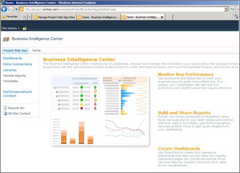
No surprise, then, that most EPM systems including Project Server have some dashboarding capabilities. In the case of Microsoft, the capabilities come courtesy of SharePoint Server in the Business Intelligence Center. This type of system can look into SQL-based data and generate an incredibly wide range of graphical displays. And, just like a kitten, there's nothing an executive likes better than a shiny new toy. The desire by senior management for instant feedback from projects can be so severe that many Project Management Offices are pressured to deliver the display before the underlying data is even ready.
"Can you make us an EPM Dashboard?" I was once asked by a senior IT executive while I was in their offices helping to design their EPM environment.
"Sure," I replied.
"Could we have it by Friday?" asked the exec to my surprise.
"Um, sure," I answered. "Well, not this Friday. But a Friday sometime in the future."
He wasn't at all amused by my humor.
It was not an unintelligent manager, but it underlies the pressure such people experience to enable rapid decision making.
Dashboards are so visually stimulating, we often forget that they are supposed to represent something that generates the display. So, before running out to find out how to make a dashboard and before you start spending too much time picking out color palettes of what color your icons should be, let's go through a few common challenges in the dashboard arena.
Wizard of Oz Syndrome
Remember the Wizard of Oz when they finally pulled back the curtain and found just a regular guy who was pulling the levers and turning the dials to generate all the impressive "magic"?

Beautiful displays that are driven by human intervention are something we see all the time in dashboards. A great deal of work goes into the design and presentation, including great graphics, great icons, great colors and even animation and sound effects. The problem is that no one has traced a path between the data and the dashboard and the result is that someone has to sit at a desk and decide manually what indicator to make which color.
When looking at an existing dashboard for the first time, it's always worthwhile to ask to see the raw data that made up the display. "What does this mean and can you show me where this indicator is driven from?" is a key question. Do a mini-audit of a few indicators, tracking them back to their component data.
The same principle holds if you're designing a dashboard. For every indicator, there has to be a trail back to some source and it is best if it's documented. If the dashboard is driven by Bob filling in a spreadsheet with how he feels about the projects, just have him tell you. It'll be faster.
Measure everything
"If we can measure it, we will put it on the dashboard," seems to be the mantra of some dashboard designers.
It's easy to get caught up in the technology of dashboarding and there's a certain visceral thrill when you locate some data that seems measurable and understandable and you make an indicator out of it. Suddenly instead of a boring old list of costs, you've got thermometers filling up with red or tachometers revving into the red-zone or arrows in different colors. Don't think this is fun? Give it a try in Excel for a half-hour by using the new Conditional Formatting functionality of Excel 2010 (or Excel 2013).
Problems happen when someone who's making an executive dashboard gets so caught up in their ability to make an indicator that they don't stop to look and see if they should be making it at all. It's not always "how do you do it?"; sometimes it's "should you do it?"
Once there's so many visually stimulating indicators on the page that it looks like the dashboard of the space shuttle, you know you're either going to need years of training like an astronaut or you're going to need to make life simpler.
Here's a basic rule that should make for fewer displays: Every indicator needs a potential action; every one. So, if you have a traffic light indicator and it's red, then there needs to be an appropriate action that someone is supposed to take when that happens. It might be a simple "When this light turns red, a project manager must show a detailed report to the head of the PMO." Regardless of what the action is, there needs to be one.
Half-baked plans
You wouldn't eat a cake that only had half the ingredients, especially if you didn't know which half were missing. On a dashboard, how do you know you have all the data?

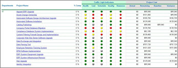
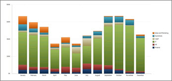
Let's take an example of looking at resource capacity reporting. The resource traffic light has become red for IT (isn't it always?) Now management wants to look at the problem and when they look at the detail, they see the obvious answer. The indicator must be red because IT is so over-staffed!
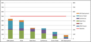
This first histogram shows the problem. The red line shows the capacity of the organization. The stacked histograms show the combined requirements projected by adding the requirements of all projects together. If this is the dashboard that we present to management, the decision to either accept a lot more work or to reduce our staffing levels immediately would be obvious.
Ah, but hold on a moment. Just before the reduction in staffing levels plan goes into effect, it occurs to someone to check to see if all projects were represented in the dashboard view.
They were not.
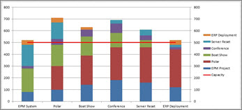
There were some projects that appeared in the legend but no results for these projects were displayed in the histogram. Where were the results? Perhaps these projects were not yet published. Perhaps the full project scope was still being determined. Perhaps the resource requirements had not been defined at the appropriate level. When the data is revised, we can see in the second histogram that in fact, there is now more work than people and we should be considering hiring more staff, adding some contract capacity or delaying some projects into the future; the exact opposite decision we would have made from looking at the same view with only part of the data.
The problem is not the design of the dashboard; nor is it the quality of the data. It is the completeness of the data that is the problem. In this obvious example, we can see the problem with our own eye, but imagine a project environment with hundreds or even thousands of projects or sub projects in the same dataset.
Making a decision with only part of the data is often going to result in an inappropriate decision. Making a decision where the decision maker doesn't even know the data is incomplete is, at best, disempowering to them.
We can solve this with a review of the data in some kind of approval process or, perhaps, with the combination of a validation process and a database-based indicator that tells us that we are only looking at a partial image of our indicator.
Best before dates
If you're like me you reach into the refrigerator and grab the closest cheese to you, but shouldn't you be checking the "best before" dates? While we're on the subject of the source data that made up that pretty picture on your dashboard, do you have any notion of how old the data is that is generating that indicator?
It's not uncommon to do an audit of a dashboard indicator only to find that the data that originates the indicator hasn't been updated in a long time. It's often a sharp executive who picks this up in a review meeting. This is the kind of person who brings not only their notes from the last review meeting but also copies of all the handouts that were given last time and their practiced eye looks over the last handouts and the new handouts and compares the data.
Identical indicators mean either that things haven't changed (unlikely in most project environments) or that the data hasn't been updated (much more likely in a lot of organizations). For those in Finance who often live and die from the results of their spreadsheet, or a massive spreadsheet farm made up of many sub-ledgers, this is a common error. Project managers and those who look at project data may be less likely to catch such errors without stringent care.
The worst case scenario is one where some of the data has been updated and is current and some of the data has not been updated at all. So, perhaps the forward plan was updated on half the projects, and the actuals for the last period were posted to those projects but the other half of the projects did not have actuals posted or have their plan updated. If decisions are going to be made on the dashboard view or the resulting data that it came from, how current that data is should be displayed somewhere.
This kind of problem can also be resolved with some basic checks and balances in the data which can then be displayed on the dashboard. For example, a simple test could ensure that:
All timesheets were collected for the displayed period; and
the total timesheet hours collected are roughly equivalent to the total hours displayed.
Data pedigree
The prettier the display, the less likely we are to ask, "Where did that data come from and how reliable is it?" There's something about neatness that counts when we put the data into a professional looking graphical display. For those who are creating data from a database, they can often be kept at a distance of where that data arrived from. A graphical designer finds a couple of useful looking fields and ways to calculate indicators from them and can easily neglect to ask if these fields are populated through a validated process, with any kind of oversight, by calculation or if the data is not considered "corporate quality" by the people entering it.
Perhaps we're working on a software development project and a list of outstanding and newly added software issues and there is a great SharePoint list of issues that are created by the QA department as a piece of software nears a release date. This kind of list can be a key indicator of how ready the software is for release. If, however, many different groups are using the same list for new functionality ideas and enhancement requests, just counting the list of issues will give an inappropriate indicator because the list has become polluted with data used for a different purpose.
Data that is going to show up on an indicator on a dashboard has to have some process and some validation of its quality.
Are we looking at the whole picture?
Let's go back to that dashboard traffic light report and look at the IT line again.
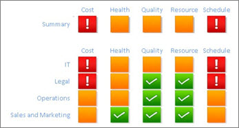
Let's imagine that IT has red lights for both the schedule and cost indicators on a particular year-long project because it's June and both indicators are off by more than 20%!
The Chief Financial officer has looked at the detailed results already and he's quite upset. The January - June actuals show the tale:
| ($,000s) | Jan | Feb | Mar | Apr | May | Jun |
|---|---|---|---|---|---|---|
| Budget |
80 |
100 |
120 |
120 |
120 |
120 |
| Actual |
100 |
120 |
140 |
140 |
140 |
140 |
| Variance |
20 |
20 |
20 |
20 |
20 |
20 |
| Cumulative Variance |
20 |
40 |
60 |
80 |
100 |
120 |
So far the project is already $120,000 over budget and it's only half-over! At this pace, says the CFO, the project will cost 18% more than its original $1.3 million budget and perhaps they should cut their losses and cancel the project.
If we look in more detail, however, the picture looks very different. The projected scheduled and costs until the end of the project look like this:
| (,000s) | Jan | Feb | Mar | Apr | May | Jun | Jul | Aug | Sep | Oct | Nov | Dec | Total |
|---|---|---|---|---|---|---|---|---|---|---|---|---|---|
| Budget |
80 |
100 |
120 |
120 |
120 |
120 |
120 |
120 |
120 |
120 |
100 |
80 |
1,320 |
| Actual |
100 |
120 |
140 |
140 |
140 |
140 |
120 |
100 |
80 |
40 |
0 |
0 |
1,120 |
| Variance |
20 |
20 |
20 |
20 |
20 |
20 |
0 |
(20) |
(40) |
(80) |
(100) |
(80) |
(200) |
| Cumulative Variance |
20 |
40 |
60 |
80 |
100 |
120 |
120 |
100 |
60 |
(20) |
(120) |
(200) |
Now we can see more of the story. The project is running faster than had been anticipated. In fact, it is going to finish in mid-October instead of in December and is projected to finish $200,000 under budget.
This is the challenge with simple dashboards and how they're interpreted. The dashboard was completely accurate but the reason it was red was good, not bad.
Dashboard indicators need to alert executives that action needs to be taken and where to look, but they should also lead that same executive to the more detailed data that will show the whole picture.
Gamers galore
Ok, so now you have a few things you can do to make sure your dashboards do not mislead management to inappropriate decisions, and that's a huge step. But, be advised, as soon as dashboard-type indicators are made available, people will use them to their own advantage. It's completely understandable that people will game the process if they can by skewing data under their control to have them not look bad.
There's no preventing people from trying to game the process, but there are a few techniques to avoid the events of these gamers:
Change the process
You can make it tough to game the process by changing it all the time; trying to stay ahead of those who think they have the process figured out. Everyone in the search engine business of Search Engine Optimization knows this one but the challenge with this is the enormous amount of work it takes to keep changing the process and training everyone in the changes.
No carrot, just stick
Another option is to discipline those caught gaming the process. This is a tough one. People who outright lie about their data should get into trouble, but punishing those who are just finding loopholes in the process is typically bad for morale.
Checks and balances
This is typically the most powerful tool against gamers. If you have data from different sources that has to balance against other data, it becomes extremely difficult for someone to manipulate just the data under their control and defeat the dashboard process in their favor. Of course it's not always possible to find such checks and balances within the data, so vigilance is always a good thing.
Some basic rules
Ok, let's wrap up some of what we've said. Creating powerful-looking dashboards is technically not difficult but there are some basic rules you can implement in your dashboard design and project management process that can ensure the decisions that come out of such dashboards are appropriate and effective.
Here is a summary of some of the basic concepts we've discussed above:
Indicators must trace back to source data
Make sure that indicators aren't just the manually entered opinions or feelings of someone, but that they actually represent something in the detailed data of your environment.
Every indicator needs an action
Every indicator needs an action; every one. Regardless of what the action is, there needs to be one. This will likely also help with keeping the number of indicators to a reasonable level.
The data must be complete or show that it's not
Make sure that it's is clear from the display that the data is either complete or incomplete so that inappropriate decisions aren't made while looking at only a partial picture.
The display must show its timeliness
If it is possible to have some data updated and other data not, then the refresh date of the data must show up on the dashboard in a way that inappropriate decisions based either on old data or on a mix of old and new data are avoided.
Check data quality in an ongoing fashion
A dashboard should have regular reviews of the data that drives the indicators and regular updates to avoid people from gaming the decision-making process. Some organizations will implement a regular auditing process that looks at key indicators and traces back from their results to the source data, checking the formulas and the quality of data to make sure it has not changed. You can't do this all the time, of course, but a regular review of what makes those pretty traffic lights turn green, red, or yellow is a healthy idea.
Happy dashboarding!
References
To learn more about how to do dashboards with Microsoft Project Server, I suggest reading a couple of great articles on TechNet:
Microsoft Project Server 2010 Reporting with Excel Services written by Jean-Francois LeSaux and Steven Haden from Microsoft Consulting Services (https://go.microsoft.com/fwlink/p/?LinkId=222672)
Creating Dashboards for Microsoft Project Server 2010 written by Blaise Novakovic, Jean-Francois LeSaux, Steven Haden, Microsoft Consulting Services (https://go.microsoft.com/fwlink/p/?LinkId=222669)
About the Author
Chris Vandersluis is the president and founder of Montreal, Canada-based HMS Software, a Microsoft Certified Partner. He has an economics degree from McGill University and over 30 years experience in the automation of project control systems. He is a long-standing member of the Project Management Institute (PMI) and helped found the Montreal, Toronto, and Quebec chapters of the Microsoft Project Users Group (MPUG). Publications for which Chris has written include Fortune, Heavy Construction News, Computing Canada magazine, and PMI's PMNetwork, and he is a regular columnist for Project Times. He teaches Advanced Project Management at McGill University and often speaks at project management association functions across North America and around the world. HMS Software is the publisher of the TimeControl project-oriented timekeeping system and has been a Microsoft Project Solution Partner since 1995.
Chris Vandersluis can be contacted by e-mail at: chris.vandersluis@hms.ca
If you would like to read more EPM-related articles by Chris Vandersluis, see HMS's EPM Guidance site (https://www.epmguidance.com/?page_id=39).