Xamarin
A Microsoft open-source app platform for building Android and iOS apps with .NET and C#.
5,294 questions
This browser is no longer supported.
Upgrade to Microsoft Edge to take advantage of the latest features, security updates, and technical support.

Recently I have installed Xamarin.CommunityToolkit (Version: 1.3.1) for implementing the BadgeView. Also updated the Xamarin.Forms (Version: 5.0.0.2291) to the latest version. After that, I am facing some weird issues on my project. After the login the app is not opening the home page, scroll view is not working, collectionview scroll is not working, even some icon taps are also not firing.
All these features are working fine before installing Xamarin.CommunityToolkit. I have only installed CommunityToolkit and XF latest version. Are there any other packages or initialization required for the proper working of CommunityToolkit?
Other Nuget Packages in the Project
<PackageReference Include="Acr.UserDialogs" Version="7.1.0.446" />
<PackageReference Include="DLToolkit.Forms.Controls.FlowListView" Version="2.0.11" />
<PackageReference Include="HtmlAgilityPack" Version="1.11.16" />
<PackageReference Include="Microsoft.Bcl" Version="1.1.10" />
<PackageReference Include="Microsoft.Bcl.Build" Version="1.0.21" />
<PackageReference Include="Microsoft.Net.Http" Version="2.2.29" />
<PackageReference Include="Newtonsoft.Json" Version="12.0.2" />
<PackageReference Include="PCLStorage" Version="1.0.2" />
<PackageReference Include="Plugin.MediaManager" Version="1.0.9" />
<PackageReference Include="Plugin.MediaManager.Forms" Version="0.8.11" />
<PackageReference Include="Rg.Plugins.Popup" Version="1.1.5.180" />
<PackageReference Include="SkiaSharp" Version="1.68.1-rc.147" />
<PackageReference Include="sqlite-net-pcl" Version="1.6.292" />
<PackageReference Include="Syncfusion.Xamarin.SfListView" Version="17.3.0.30" />
<PackageReference Include="Xam.Plugin.Connectivity" Version="3.2.0" />
<PackageReference Include="Xam.Plugin.HtmlLabel" Version="2.1.0" />
<PackageReference Include="Xam.Plugin.LatestVersion" Version="1.1.2" />
<PackageReference Include="Xam.Plugin.Media" Version="4.0.1.5" />
<PackageReference Include="Xam.Plugin.SimpleAudioPlayer" Version="1.3.1" />
<PackageReference Include="Xam.Plugins.Forms.ImageCircle" Version="3.0.0.5" />
<PackageReference Include="Xamarin.Essentials" Version="1.5.3.2" />
<PackageReference Include="Xamarin.FFImageLoading" Version="2.4.11.982" />
<PackageReference Include="Xamarin.FFImageLoading.Forms" Version="2.4.11.982" />
<PackageReference Include="Xamarin.FFImageLoading.Svg" Version="2.4.11.982" />
<PackageReference Include="Xamarin.FFImageLoading.Svg.Forms" Version="2.4.11.982" />
<PackageReference Include="Xamarin.FFImageLoading.Transformations" Version="2.4.11.982" />
<PackageReference Include="Xamarin.Forms" Version="4.8.0.1269" />
<PackageReference Include="XamForms.Enhanced.Calendar" Version="1.2.2" />
<PackageReference Include="Xamarin.Plugin.FilePicker" Version="2.1.34" />
Which package has compatibility issue with Xamarin.CommunityToolkit?
' cx='32' cy='32' r='32' /%3E%3Ctext x='50%25' y='55%25' dominant-baseline='middle' text-anchor='middle' fill='%23FFF' %3ELL%3C/text%3E%3C/svg%3E)
Hello,
Welcome to our Microsoft Q&A platform!
I need to show the count on badgeview itself. Is there any way to show the count on badgeview itself
I write a new badgeview.
Firstly, create CircleView.cs
   using System;
   using System.Collections.Generic;
   using System.Text;
   using Xamarin.Forms;

   namespace CatholicBrain
   {
       public partial class CircleView : BoxView
       {
           public static readonly BindableProperty CornerRadiusProperty = BindableProperty.Create(nameof(CornerRadius), typeof(double), typeof(CircleView), 0.0);

           public double CornerRadius
           {
               get { return (double)GetValue(CornerRadiusProperty); }
               set { SetValue(CornerRadiusProperty, value); }
           }

           public CircleView()
           {
              // InitializeComponent();
           }
       }
   }
Then create contentview called BadgeView.xaml . edit it to the Grid.
   <?xml version="1.0" encoding="UTF-8"?>

   <Grid      xmlns="http://xamarin.com/schemas/2014/forms"

              xmlns:x="http://schemas.microsoft.com/winfx/2009/xaml" xmlns:local1="clr-namespace:CatholicBrain"
              x:Class="CatholicBrain.BadgeView"
              HeightRequest="30"
              WidthRequest="30">
       <local1:CircleView x:Name="BadgeCircle" HeightRequest="30" WidthRequest="30" CornerRadius="30" VerticalOptions="Center" HorizontalOptions="Center" />
       <Label x:Name="BadgeLabel" TextColor="White" VerticalOptions="Center" HorizontalOptions="Center" VerticalTextAlignment="Center" HorizontalTextAlignment="Center" FontSize="15"/>
   </Grid>
Here is BadgeView.xaml.cs.
   using System;
   using System.Collections.Generic;
   using System.Linq;
   using System.Text;
   using System.Threading.Tasks;

   using Xamarin.Forms;
   using Xamarin.Forms.Xaml;

   namespace CatholicBrain
   {
       [XamlCompilation(XamlCompilationOptions.Compile)]
       public partial class BadgeView : Grid
       {
           public static BindableProperty TextProperty = BindableProperty.Create("Text", typeof(string), typeof(BadgeView), "0", propertyChanged: (bindable, oldVal, newVal) =>
           {
               var view = (BadgeView)bindable;
               view.BadgeLabel.Text = (string)newVal;
           });

           public static BindableProperty BadgeColorProperty = BindableProperty.Create("BadgeColor", typeof(Color), typeof(BadgeView), Color.Blue, propertyChanged: (bindable, oldVal, newVal) =>
           {
               var view = (BadgeView)bindable;
               view.BadgeCircle.BackgroundColor = (Color)newVal;
           });

           public string Text
           {
               get
               {
                   return (string)GetValue(TextProperty);
               }
               set
               {
                   SetValue(TextProperty, value);
               }
           }
           public Color BadgeColor
           {
               get
               {
                   return (Color)GetValue(BadgeColorProperty);
               }
               set
               {
                   SetValue(BadgeColorProperty, value);
               }
           }
           public BadgeView()
           {
               InitializeComponent();
               BadgeLabel.Text = Text;
               BadgeCircle.BackgroundColor = BadgeColor;
           }
       }
   }
Then you need to create a custom renderer for this CircleView in android.
   using Android.App;
   using Android.Content;
   using Android.Graphics;
   using Android.OS;
   using Android.Runtime;
   using Android.Util;
   using Android.Views;
   using Android.Widget;
   using CatholicBrain;
   using CatholicBrain.Droid;
   using System;
   using System.Collections.Generic;
   using System.Linq;
   using System.Text;
   using Xamarin.Forms;
   using Xamarin.Forms.Platform.Android;

   [assembly: ExportRenderer(typeof(CircleView), typeof(CircleViewRenderer))]
   namespace CatholicBrain.Droid
   {
       public class CircleViewRenderer : BoxRenderer
       {
           private float _cornerRadius;
           private RectF _bounds;
           private Path _path;

           public CircleViewRenderer(Context context) : base(context)
           {
           }

           protected override void OnElementChanged(ElementChangedEventArgs<BoxView> e)
           {
               base.OnElementChanged(e);

               if (Element == null)
               {
                   return;
               }
               var element = (CircleView)Element;

               _cornerRadius = TypedValue.ApplyDimension(ComplexUnitType.Dip, (float)element.CornerRadius, Context.Resources.DisplayMetrics);

           }

           protected override void OnSizeChanged(int w, int h, int oldw, int oldh)
           {
               base.OnSizeChanged(w, h, oldw, oldh);
               if (w != oldw && h != oldh)
               {
                   _bounds = new RectF(0, 0, w, h);
               }

               _path = new Path();
               _path.Reset();
               _path.AddRoundRect(_bounds, _cornerRadius, _cornerRadius, Path.Direction.Cw);
               _path.Close();
           }

           public override void Draw(Canvas canvas)
           {
               canvas.Save();
               canvas.ClipPath(_path);
               base.Draw(canvas);
               canvas.Restore();
           }
       }
   }
For iOS renderer.
   [assembly: ExportRenderer(typeof(CircleView), typeof(CircleViewRenderer))]
   namespace CatholicBrain.iOS
   {
       public class CircleViewRenderer : BoxRenderer
       {
           protected override void OnElementChanged(ElementChangedEventArgs<BoxView> e)
           {
               base.OnElementChanged(e);

               if (Element == null)
                   return;

               Layer.MasksToBounds = true;
               Layer.CornerRadius = (float)((CircleView)Element).CornerRadius / 2.0f;
           }

       }
   }
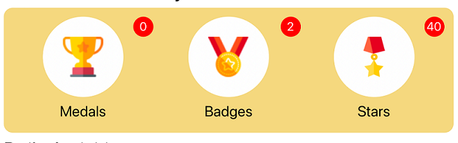
In the end, we can use it in your HomePage1.cs Find the <!--Badgeview code--> tag copy following code
<Grid Grid.Row="0"
>
<Grid.ColumnDefinitions>
<ColumnDefinition Width="33*" />
<ColumnDefinition Width="34*" />
<ColumnDefinition Width="33*" />
</Grid.ColumnDefinitions>
<StackLayout Grid.Column="0">
<Grid>
<Grid TranslationY="-15">
<Grid.RowDefinitions>
<RowDefinition Height="*" />
<RowDefinition Height="Auto" />
</Grid.RowDefinitions>
<Image
Grid.Row="0"
Source="ic_white_dot_xx.png">
<Image.HeightRequest>
<OnIdiom x:TypeArguments="x:Double">
<OnIdiom.Phone>120</OnIdiom.Phone>
<OnIdiom.Tablet>240</OnIdiom.Tablet>
<OnIdiom.Desktop>120</OnIdiom.Desktop>
</OnIdiom>
</Image.HeightRequest>
<Image.WidthRequest>
<OnIdiom x:TypeArguments="x:Double">
<OnIdiom.Phone>120</OnIdiom.Phone>
<OnIdiom.Tablet>240</OnIdiom.Tablet>
<OnIdiom.Desktop>120</OnIdiom.Desktop>
</OnIdiom>
</Image.WidthRequest>
</Image>
<Image
HorizontalOptions="CenterAndExpand"
VerticalOptions="CenterAndExpand"
Source="ic_medal_xx.png" >
<Image.WidthRequest>
<OnIdiom x:TypeArguments="x:Double">
<OnIdiom.Phone>60</OnIdiom.Phone>
<OnIdiom.Tablet>90</OnIdiom.Tablet>
<OnIdiom.Desktop>60</OnIdiom.Desktop>
</OnIdiom>
</Image.WidthRequest>
<Image.HeightRequest>
<OnIdiom x:TypeArguments="x:Double">
<OnIdiom.Phone>60</OnIdiom.Phone>
<OnIdiom.Tablet>90</OnIdiom.Tablet>
<OnIdiom.Desktop>60</OnIdiom.Desktop>
</OnIdiom>
</Image.HeightRequest>
</Image>
</Grid>
<views:BadgeView x:Name="medals_badge" Text="30" BadgeColor="Red" VerticalOptions="Start" HorizontalOptions="End"/>
</Grid>
</StackLayout>
<StackLayout Grid.Column="1">
<Grid>
<Grid TranslationY="-15">
<Grid.RowDefinitions>
<RowDefinition Height="*" />
<RowDefinition Height="Auto" />
</Grid.RowDefinitions>
<Image
Grid.Row="0"
Source="ic_white_dot_xx.png">
<Image.HeightRequest>
<OnIdiom x:TypeArguments="x:Double">
<OnIdiom.Phone>120</OnIdiom.Phone>
<OnIdiom.Tablet>240</OnIdiom.Tablet>
<OnIdiom.Desktop>120</OnIdiom.Desktop>
</OnIdiom>
</Image.HeightRequest>
<Image.WidthRequest>
<OnIdiom x:TypeArguments="x:Double">
<OnIdiom.Phone>120</OnIdiom.Phone>
<OnIdiom.Tablet>240</OnIdiom.Tablet>
<OnIdiom.Desktop>120</OnIdiom.Desktop>
</OnIdiom>
</Image.WidthRequest>
</Image>
<Image
HorizontalOptions="CenterAndExpand"
VerticalOptions="CenterAndExpand"
Source="ic_badge_xx.png" >
<Image.WidthRequest>
<OnIdiom x:TypeArguments="x:Double">
<OnIdiom.Phone>60</OnIdiom.Phone>
<OnIdiom.Tablet>90</OnIdiom.Tablet>
<OnIdiom.Desktop>60</OnIdiom.Desktop>
</OnIdiom>
</Image.WidthRequest>
<Image.HeightRequest>
<OnIdiom x:TypeArguments="x:Double">
<OnIdiom.Phone>60</OnIdiom.Phone>
<OnIdiom.Tablet>90</OnIdiom.Tablet>
<OnIdiom.Desktop>60</OnIdiom.Desktop>
</OnIdiom>
</Image.HeightRequest>
</Image>
</Grid>
<views:BadgeView x:Name="badges_badge" Text="30" BadgeColor="Red" VerticalOptions="Start" HorizontalOptions="End"/>
</Grid>
</StackLayout>
<StackLayout Grid.Column="2">
<Grid>
<Grid TranslationY="-15">
<Grid.RowDefinitions>
<RowDefinition Height="*" />
<RowDefinition Height="Auto" />
</Grid.RowDefinitions>
<Image
Grid.Row="0"
Source="ic_white_dot_xx.png">
<Image.HeightRequest>
<OnIdiom x:TypeArguments="x:Double">
<OnIdiom.Phone>120</OnIdiom.Phone>
<OnIdiom.Tablet>240</OnIdiom.Tablet>
<OnIdiom.Desktop>120</OnIdiom.Desktop>
</OnIdiom>
</Image.HeightRequest>
<Image.WidthRequest>
<OnIdiom x:TypeArguments="x:Double">
<OnIdiom.Phone>120</OnIdiom.Phone>
<OnIdiom.Tablet>240</OnIdiom.Tablet>
<OnIdiom.Desktop>120</OnIdiom.Desktop>
</OnIdiom>
</Image.WidthRequest>
</Image>
<Image
HorizontalOptions="Center"
VerticalOptions="Center"
Source="ic_star_xx.png" >
<Image.WidthRequest>
<OnIdiom x:TypeArguments="x:Double">
<OnIdiom.Phone>60</OnIdiom.Phone>
<OnIdiom.Tablet>90</OnIdiom.Tablet>
<OnIdiom.Desktop>60</OnIdiom.Desktop>
</OnIdiom>
</Image.WidthRequest>
<Image.HeightRequest>
<OnIdiom x:TypeArguments="x:Double">
<OnIdiom.Phone>60</OnIdiom.Phone>
<OnIdiom.Tablet>90</OnIdiom.Tablet>
<OnIdiom.Desktop>60</OnIdiom.Desktop>
</OnIdiom>
</Image.HeightRequest>
</Image>
</Grid>
<views:BadgeView x:Name="star_badge" Text="30" BadgeColor="Red" VerticalOptions="Start" HorizontalOptions="End"/>
</Grid>
</StackLayout>
</Grid>
In the end, open your layout background code, you can find the GetUserMedals method. Set it directly.
   Medals_label.Text = "Medals: " + urlDetails.medals;
                       Badges_label.Text = "Badges: " + urlDetails.badges;
                       Stars_label.Text = "Stars: " + urlDetails.stars;


                       //Issue is on this part, if we comment the below code everything will work fine like collectionview,scrollview
                       medals_badge.Text = urlDetails.medals;
                       badges_badge.Text = urlDetails.badges;
                       star_badge.Text = urlDetails.stars;
Best Regards,
Leon Lu
If the answer is the right solution, please click "Accept Answer" and kindly upvote it. If you have extra questions about this answer, please click "Comment".
Note: Please follow the steps in our documentation to enable e-mail notifications if you want to receive the related email notification for this thread.
@Sreejith Sree May I know if you have got any chance to check my answer? I am glad to help if you have any other questions
Thank you very much for your awesome solution
You are welcome, happy new year.
Happy new year
Just now I check this on an iPad device and on there it is breaking. The circle is not touching the layout. Could you please help me to solve this?
Hello,
Welcome to our Microsoft Q&A platform!
I test with Xamarin.Forms 5.0.0.2291 and Xamarin.CommunityToolkit 1.3.1 With following code. ScrollView could scroll normally. And I test with CollectionView, it worked as well. You need put your Scrollview ro CollectionView in the <xct:BadgeView> tag. You can create a new project. copy my code to it, if it worked.
   <StackLayout Orientation="Vertical">
           <xct:BadgeView

               BackgroundColor="Red"
               FontAttributes="Bold"
               FontSize="Medium"
               TextColor="White"
               Text="12222">


               <ScrollView VerticalOptions="FillAndExpand">
                   <StackLayout>
                       <Label FontSize="Header" Text="FOR the most wild, yet most homely narrative which I am about to pen, I neither expect nor solicit belief. Mad indeed would I be to expect it, in a case where my very senses reject their own evidence. Yet, mad am I not -- and very surely do I not dream. But to-morrow I die, and to-day I would unburthen my soul. My immediate purpose is to place before the world, plainly, succinctly, and without comment, a series of mere household events. In their consequences, these events have terrified -- have tortured -- have destroyed me. Yet I will not attempt to expound them. To me, they have presented little but Horror -- to many they will seem less terrible than barroques. Hereafter, perhaps, some intellect may be found which will reduce my phantasm to the common-place -- some intellect more calm, more logical, and far less excitable than my own, which will perceive, in the circumstances I detail with awe, nothing more than an ordinary succession of very natural causes and effects." />
                       <!-- More Label objects go here -->
                   </StackLayout>
               </ScrollView>
           </xct:BadgeView>


       </StackLayout>
==================
Update======================
I test your project, I find this issue is related to the BadgeView's width, if you set the star_badge.Text = "1"; directly, Your project could normally without issue. But in your demo, you get the value is 33, the width is bigger. BadgeView cannot get the enough width, so we can get this behaviror. Based on your Gird's ColumnDefinitions like following code
   <Grid.ColumnDefinitions>
                                   <ColumnDefinition Width="33*" />
                                   <ColumnDefinition Width="34*" />
                                   <ColumnDefinition Width="33*" />
                               </Grid.ColumnDefinitions>
and if you want to meet the width of BadgeView, If the value(urlDetails.medals, urlDetails.badges,urlDetails.stars) is bigger than 10, we can use "*" to replace it. Here is simiple code add to the GetUserMedals method, Please notice: For protect your private information. I
   Medals_label.Text = "Medals: " + urlDetails.medals;
                       Badges_label.Text = "Badges: " + urlDetails.badges;
                       Stars_label.Text = "Stars: " + urlDetails.stars;


                       //Issue is on this part, if we comment the below code everything will work fine like collectionview,scrollview

                       if (int.Parse(urlDetails.medals)>10)
                       {
                           medals_badge.Text = "*";
                       }
                       else
                       {
                           medals_badge.Text = urlDetails.medals;
                       }
                       if (int.Parse(urlDetails.badges) > 10)
                       {
                           badges_badge.Text = "*";
                       }
                       else
                       {
                           badges_badge.Text = urlDetails.badges;
                       }
                       if (int.Parse(urlDetails.stars) > 10)
                       {
                           star_badge.Text = "*";
                       }
                       else
                       {
                           star_badge.Text = urlDetails.stars;
                       }
                   }
Best Regards,
Leon Lu
If the answer is the right solution, please click "Accept Answer" and kindly upvote it. If you have extra questions about this answer, please click "Comment".
Note: Please follow the steps in our documentation to enable e-mail notifications if you want to receive the related email notification for this thread.
I removed the XCT and everything is working fine now. i will give you a sample project ASAP.
Meanwhile, I have added the other packages used in the project, could you please check them and suggest which package has the compatibility issue with Xamarin.CommunityToolkit?
Sure, I will try to reproduce this issue. And check if Xamarin.CommunityToolkit issue.
@Sreejith Sree May I know if you have got any chance to check my answer? I am glad to help if you have any other questions.
I tried to create a new demo with my issue. But in the demo, everything is working fine. Still working on it to reproduce the issue.
Please compare nuget package version and the VS version between demo and your project. Make your project to the same version as your demo. Happy new year.
And you need to remove nuget packages one by one at a time, to find the conflict nuget packages.
Happy new year. I created the demo project from the main project. So NuGet and vs versions are the same. I copied the project and removed all the other pages and keep the homepage only. I am facing the issue on the home page. After removing all the other pages the home page is working fine on the demo project.
I will try this and update you.
Which xmlns:xct do we need to use: 1 or 2?
I use xmlns:xct="http://xamarin.com/schemas/2020/toolkit"
I check this, with your code there are no issues. But how I can show the medals if it is more than 10? Currently, we are setting * when it is more than 10.
But how I can show the medals if it is more than 10? Currently, we are setting * when it is more than 10.
You have Label blew the xct:BadgeView, Label will show it when it is more than 10. And If you count's xct:BadgeView increase. Layout of Gird will be adjusted(will caused issue like you met), So I advice you use * to replace of the count that over 10.
For testing purposes only I have added count on the below label, I need to show the count on badgeview itself. Is there any way to show the count on badgeview itself even if it is has 3 digits?
@Sreejith Sree Please see my new answer, write a new BadgeView to replace the BadgeView from community tools
I will check this and update you soon.
Thank you very much