SQL Server Reporting Services
A SQL Server technology that supports the creation, management, and delivery of both traditional, paper-oriented reports and interactive, web-based reports.
2,807 questions
This browser is no longer supported.
Upgrade to Microsoft Edge to take advantage of the latest features, security updates, and technical support.
' cx='32' cy='32' r='32' /%3E%3Ctext x='50%25' y='55%25' dominant-baseline='middle' text-anchor='middle' fill='%23FFF' %3ERA%3C/text%3E%3C/svg%3E)
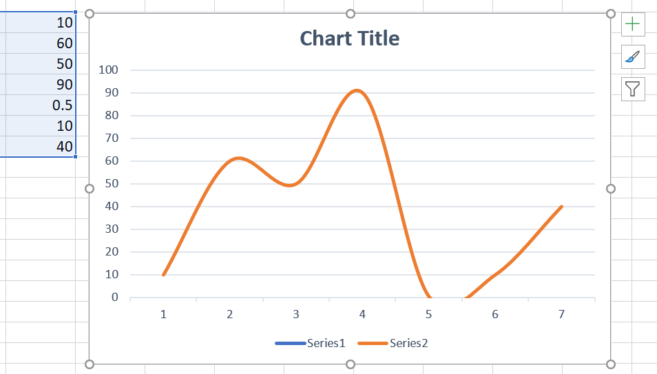
Hi, I am plotting a smooth line graph for the following coordinates {(1,10),(2,60),(3,50),(4,90),(5,0.5),(6,10),(7,40)}.
The drawn plot appears as though the there were some coordinates for which the y values were negative. Is there a way to avoid the curve from going less than a minimum value say 0.

@Rao, Avinash
I am working on this thread, any updates, I will post back.
Based on my tests, there is no related option to set the the range of series values for Scatter with Smooth Lines, as it is automatically calculated from the data source.
We can only set the rang for Y-axis as you do for the chart above.
The workaround is to use Scatter with Straight Lines Chart, it just connects the data points.
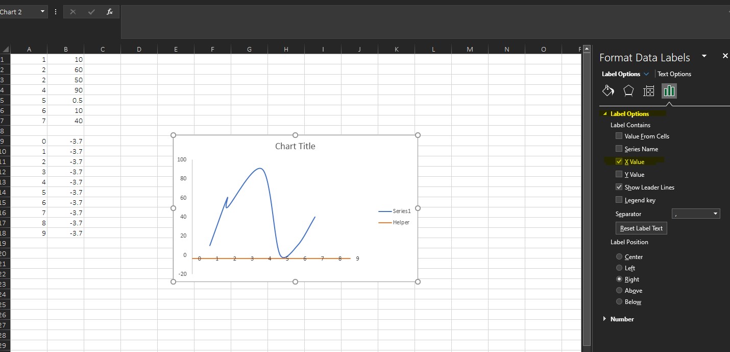
Besides, if the negative values are not too large, you can try to add auxiliary columns to create a line in place of the X-axis.
Hope the infromation could be helpful.
If the answer is helpful, please click "Accept Answer" and kindly upvote it. If you have extra questions about this answer, please click "Comment".
Note: Please follow the steps in our documentation to enable e-mail notifications if you want to receive the related email notification for this thread.
I am checking thread, if there is any update or issue, welcome to post back.
@Emily Hua-MSFT , Thanks for your response.
The problem with moving the axes crossing is that, I only know the minimum value in the series data points. But it can also happen that the min value in the series that I am supplying to the chart greater than the actual points in the plot because of the smooth curve algo.
As far as using the straight line graph is concerned, the plot doesn't look visually good as there are only few data points in the series that I am trying to plot. So using Straight line graph is not an option.
Thanks for your reply.
But your issue is mainly related to algorithm used for Smoothed line: Bezier curves, Excel will use a cubic equation to fit the relationship between two adjacent points, and use this equation function to draw the curve between the two points.
We are unable to adjust the internal algorithm, as it is by design.
In my opinion, you can try to add additional data points and reduce the distance between points to improve the accuracy of the chart.
Such as I add the (5.1,0.4) under (5,0.5) on your sample.
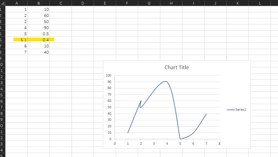
(Please note, you can hide the row where the new data is added, and then set the chart to display the data of the hidden row.)
If you have a chance to be back, please check whether the information above is helpful to you.
If it does not meet your request, I would like to suggest you submit the issue on Microsoft Feedback forum.
This way, you can help Excel engineers have a better visibility on what issues that you’re experiencing and which features are most important to you.
Thanks for your understandings.