Capacity vs. Velocity
My team just completed a discussion - at times a rather passionate discussion - about what work items we should be tracking in TFS. Sanjeev, our PM, argued in favor of tracking everything we do - except meetings. I, lead dev and agile purist that I am, argued in favor of only tracking those work items that directly contributed functionality to the software we are building. But, ultimately, we decided to track both. Here's why:
The argument for tracking everything is that unless we track all activity, we might miss some task that we are required to do. For example, the development process used in Developer Division at Microsoft requires us to pass several "quality gates" (such as a security review) before we integrate our work into the central repository. This work must be done, in order to satisfy the process. And, there are several different tasks that fall out of this work. Tracking them all makes sure we don't miss any required steps.
The argument for tracking only those things that directly contribute to the software is that by tracking everything, we will not be able to accurately predict when we will be done with our backlog. Non-backlog items would be given equal weight to backlog items. So, it would be impossible to set priorities. And, it would be impossible to accurately predict when we will be "done" with our backlog.
Needless to say, both Sanjeev and I felt strongly about our positions. (We had to break out the "talking stick" in order to keep from talking over each other.) But, ultimately, we decided that we were both right. So, we're going to track everything (capacity) and flag those items that directly contribute to reducing the backlog (velocity).
Our hope is that this will give us meaningful information about the taxes our development process imposes on us, as well as a way of prioritizing work that directly relates to reducing the backlog. Once we have both numbers, we will begin trying to squeeze as much velocity into our capacity as possible. Ultimately, I would like to see a burn-down chart that looks something like this:
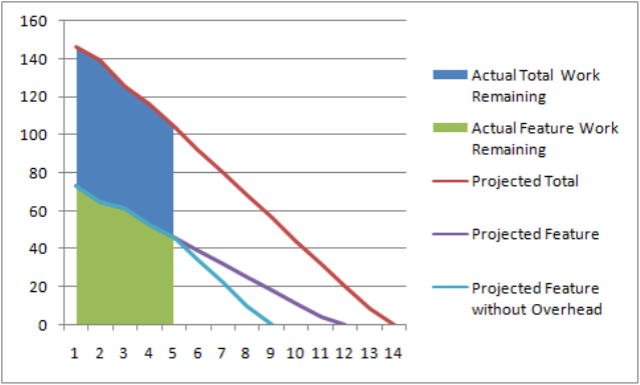
Where:
- Total Work = All work, including features & overhead
- Feature Work = All feature work (sans overhead)
- Overhead Work = All non-feature work, including "infrastructure" or "process" imposed work items that do not directly contribute functionality to the resulting software.
Calling attention to the overhead (as this chart does) allows the team (and their managers) to think about how much more productive they could be without it. Some of it will be out of the team's control - like the "quality gates" here at Microsoft. But, other bits of it will be within the team's control - like sending everyone to group status meetings when a single representative might suffice.
In other words, the three trend lines could be restated as:
- Projected Total = This is when we think we will finish everything.
- Projected Feature = This is when we think we will finish the features.
- Projected Feature without Overhead = This is the soonest we could possibly finish the backlog, assuming all overhead items were to disappear.
So, in the example chart, the team in question expects to be done in iteration 14. They also believe that they will be finished with their feature work in iteration 12. And, if they were to drop everything but the feature work, the soonest they could finish would be iteration 9. So, the overhead is costing this team a full 5 iterations!
Ultimately, what we hope to accomplish with this data is to understand what our overhead looks like, and what impact it is having on our ability to deliver. We hope this will be incredibly useful feedback to the process about the process.
Now, how do I get TFS to produce this chart?!?! Where did I put that book on on MDX?