Handling Fullscreen, Snapped and Filled states in Windows 8 Metro Style apps using CSS3 and JavaScript
Overview
Attention – the code in this post has been updated to work with Windows 8 Release Preview. To find out more details on migrating your app from CP to RP read my post here.
In my last blog post I discussed the importance of supporting the numerous shapes and sizes Windows 8 devices will be in our Metro Style Apps. This post will cover how to handle viewstate changes in our game which happens when the user runs our app side by side with another Metro Style App.
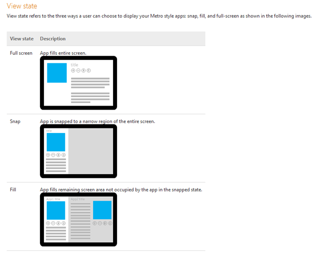
The Guidelines for snapped and fill views define three states we will need to handle. The first, full screen, is the default state for all Metro Style Apps. When a user drags another window onto the screen they have the option of having it become the current running app, snapping the new app to the side, or running it filled. In the case of a full screen app only one application would be visible so if the user dragged another app onto the screen our application would go into suspend mode after 10 seconds of inactivity (more on app lifecycle in another post). If they snapped the app our game would go into filled mode. If they snapped our game then the app they dragged over would move into snapped mode.
Here are what the three different states look like:
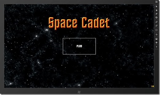
In the below example my game is running full screen as a normal Metro Style App.
Full screen
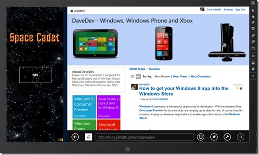
In the snap example I dragged over Internet Explorer onto the screen and was given a slider bar in between both apps. By moving the slider over to the left I was able to have the game run in a small window and our browser in a larger window. In this scenario our game will report a snapped Viewstate and Internet Explorer will report Filled.
Snap
If I wanted more screen space for my game I could drag the slider bar over to the right. This would then send our game into a Filled state and our Internet Explorer window into a Snapped state.
Fill
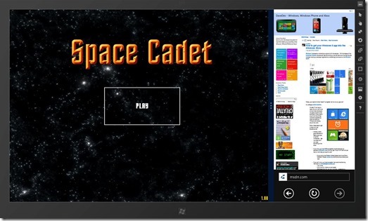
It is important to point out I can also rearrange these windows by grabbing the snapped Internet Explorer window and moving it to the left. This will automatically move our game filled window to the right. Grabbing either window and moving it off of the bottom of the screen will return the remaining app to full screen mode.
Detecting Viewstate changes
The first thing we need to do is define how wide these new screen states will be. The good news is that Snapped view will always be 320px in width which will make adjusting our game coordinate system much easier. Filled state will always be the width of the screen minus 320px and snapped state will always be 320px wide. Let’s go ahead and add a variable to handle the size of snapped view in our calculations.
var SNAPPED_VIEW = 320;
Next we need to set up the event handler for any Viewstate changes. This is done via the ApplicationView class for the current view. In the below example I am assigning the viewstatechanged event of the current application view to my own onViewStateChanged function. This got a lot simpler for the Windows 8 Release Preview. We need only add an event listener to the window resize event like so:
window.addEventListener("resize", onViewStateChanged);
When onViewStateChanged runs it enumerates through all available viewstates and passes the current view state to a custom function I call showMenu.
 function onViewStateChanged(eventArgs) {
         var viewStates = Windows.UI.ViewManagement.ApplicationViewState, msg;
         var newViewState = Windows.UI.ViewManagement.ApplicationView.value;
         if (newViewState === viewStates.snapped) {
             showMenu('snapped');
         } else if (newViewState === viewStates.filled) {
             showMenu('filled');
         } else if (newViewState === viewStates.fullScreenLandscape) {
             showMenu('landscape');
         } else if (newViewState === viewStates.fullScreenPortrait) {
             //Currently not supported
         }

     }
Handling layout changes
showMenu is the same function I call when my game is first loaded or the user clicks on the AppBar to return to the menu. This will pause the game for our user when they are dragging in another app to work with. They can then continue game play when they are ready. The full updated showMenu function is as follows:
 //Set Up Menu Screen UI Elements
  function showMenu(event) {
      menuEnabled = true;

      txtPlayerName.style.visibility = "hidden";
      txtScore.style.visibility = "hidden";
      imgPlayer.style.visibility = "hidden";
      imgMenu.style.visibility = "visible";
      btnStart.style.visibility = "visible";
      txtVersion.innerHTML = GAME_VERSION;
      txtVersion.style.visibility = "visible";
      txtLevel.style.visibility = "hidden";

      //Detect View State
      if (event === 'snapped') {
          canvas.width = SNAPPED_VIEW;
      }
      else if (event === 'filled') {
          canvas.width = FULLSCREEN_WIDTH - SNAPPED_VIEW;
      }
      else {
          canvas.width = FULLSCREEN_WIDTH;
      }
      //Readjust canvas for Snapped/Filled modes
      canvas.height = window.innerHeight;
      SCREEN_HEIGHT = canvas.height;
      SCREEN_WIDTH = canvas.width;

      //Set boundries to be one ship size
      MAX_X = canvas.width - (SHIP_WIDTH + 20);
      MAX_Y = canvas.height - (SHIP_HEIGHT + 50);


      var menuX, btnX, btnY;
      menuX = (SCREEN_WIDTH - imgMenu.width) / 2;
      btnX = (SCREEN_WIDTH - btnStart.clientWidth) / 2;
      btnY = (SCREEN_HEIGHT - btnStart.clientHeight) / 2;

      imgMenu.style.posLeft = menuX;
      btnStart.style.posLeft = btnX;
      btnStart.style.posTop = btnY;

      //clear screen
      ctx.clearRect(0, 0, SCREEN_WIDTH, SCREEN_HEIGHT);

      musicGame.pause();
      musicMenu.play();

  }
Specifically this function changes the width of our game screen and then re-calculates the size of the screen so that our ships will disappear when they hit the edge. This is done by grabbing the width of the current screen and then calculating in SNAPPED_VIEW.
 //Detect View State
 if (event === 'snapped') {
     canvas.width = SNAPPED_VIEW;
 }
 else if (event === 'filled') {
     canvas.width = FULLSCREEN_WIDTH - SNAPPED_VIEW;
 }
 else {
     canvas.width = FULLSCREEN_WIDTH;
 }
 //Readjust canvas for Snapped/Filled modes
 canvas.height = window.innerHeight;
 SCREEN_HEIGHT = canvas.height;
 SCREEN_WIDTH = canvas.width;
Now that we are properly handling viewstate changes and adjusted our coordinate system correctly we need to update our game user interface. All Metro Style Apps will have predefined layouts for their viewstates thanks to CSS3 Media Queries. If you haven’t worked with CSS3 Media Queries much before I highly recommend Responsive Web Design by Ethan Marcotte. He takes you through designing a website application that adapts its screen layout based on different screen sizes and device form factors.
The default Metro Style App templates automatically do this for us by seting up media queries inside the default.css file. This is where you can adjust layout for all viewstates as well as portrait and landscape.
 @media screen and (-ms-view-state: fullscreen-landscape) {
 }

 @media screen and (-ms-view-state: filled) {
 }

 @media screen and (-ms-view-state: snapped) {
     #imgMenu {
         -ms-transform: translate(0px, 0px) rotate(0deg) scale(0.50);
     }

     #btnStart {
         -ms-transform: translate(0px, 0px) rotate(0deg) scale(0.60);
     }

     #txtNewLevel {
         -ms-transform: translate(0px, 0px) rotate(0deg) scale(0.30);
     }

     #imgPlayer {
         opacity: 0;
     }

     #txtLevel {
         -ms-transform: translate(-120px, 0px) rotate(0deg) scale(0.30);
     }

     #txtPlayerName {
         -ms-transform: translate(70px, 0px) rotate(0deg) scale(0.30);
     }

     #txtScore {
         -ms-transform: translate(0px, 0px) rotate(0deg) scale(0.30);
     }

 }

 @media screen and (-ms-view-state: fullscreen-portrait) {
 }
Due to Filled viewstate only shrinking by 320px I found all of my on screen elements to look fine as is.
Snapped mode presented some challenges as I needed to shrink both the gamescore, player name, and level texts. A lot of what you will do here is through trial and error. I kept tweaking the scale until it “felt right.” I chose to use CSS3 2D Transforms to scale out the text so that it filled the screen correctly at the same time remaining readable. I chose to drop the player image when in this mode as it became too small to be of any value. Here is a screenshot of the new snapped user interface layout while the game is being played.
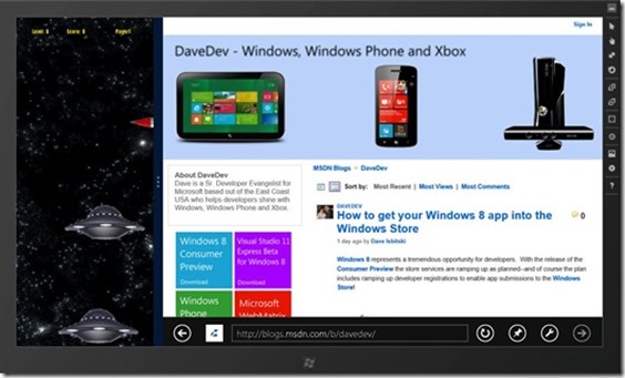
You will notice I kept the sizes of the ships the same. I am currently debating whether I should scale them down or change the direction of the ships to vertical. This would almost give a different game experience when in snapped mode. That is the beauty of CSS3 Media Queries in action as we can completely change what elements look like based on the screen size.
Conclusion
I hope this post has given you an idea of how easy it is to handle Viewstate changes in your Metro Style App using CSS3 and JavaScript. If you are currently working on a Windows 8 app and want to get into the Windows Store I would love to hear about it!
You may also want to check out my previous Windows 8 Metro Style Development Tips:
- Accessing the Accelerometer in a Windows 8 Metro Style App using HTML and JavaScript
- Accessing the Camera in a Windows 8 Metro Style App using HTML and JavaScript
- Using KnockoutJS in Windows 8 Metro Style Apps
- Illegal characters in path when deploying a Metro Style App
- Playing Music and Sound Effects in a Windows 8 Metro Style App using HTML and JavaScript
- Connecting to WCF RIA Services in a Windows 8 Metro Style App using Upshot.js and Knockout.js
- Help! Visual Studio 11 Beta Dark Theme incorrectly using White Background
- Adding Touch support to a Windows 8 Metro Style App using HTML and JavaScript
- Defining Layout in a Windows 8 Metro Style App using CSS3, HTML and JavaScript

