Using Blend to Design HTML5 Windows 8 Application (Part II): Style, Layout and Grid
In the previous blog, Using Blend to Design HTML5 Windows 8 Application (Part I), it helps you to get start with, in the next few blogs, I am going to show you step by step how now to you can created a lightweight, dynamic version of the memory game in Blend.
Many thanks for Christian Schormann, Josh Pepper and Ryan Salva from Blend team to provide the content for this project.
First, let’s take a look of the starting project with all the references and resources included already. If you want to start from scratch, you can create a new project in Blend and choose Blank template just like you have seen in Part I: Hello World demo. Then add the resources into it.
The project folder
Open the starting project. If you look in the Projects panel, you can see the default files and folders that are automatically generated when you create a new project:
· References – Contains the read-only CSS and Windows Libraries for JavaScript.
· css – Contains any custom CSS files used by your app.
· images – Contains image assets for your app.
· js – Contains your customized JavaScript files.
· photos– This folder includes the source images for the game. This is not generated by the Blank template, so you need to add it manually.
· default.html – The default starting page of your app.
· package.appxmanifest – Lists your app and its assets. This file also defines the starting page of your app.
Developer notes
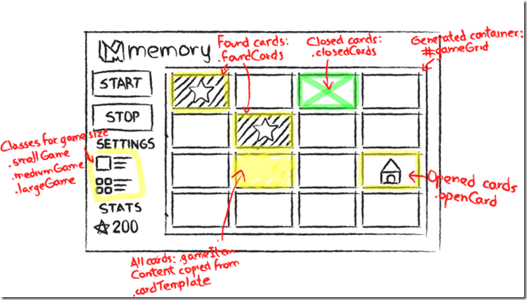
The developer notes below contain details about the code and suggestions about how to style elements of the game. See the sketch diagram below to get better idea how they will look like visually in the completed game.
· The gameGrid element is a container that holds the game cards. The cards are generated by JavaScript.
· Each card is a clone of the content of the cardTemplate element, which is only used as a template for the game cards. The code looks inside the template and sets the source property of any img element it finds to a card image for the game. Also, if it finds a <p> tag, it sets the content to the URL of the image.
· Every game card has a class name gameItem assigned to it. Use the gameItem class to style against the card.
· Each card also has three class names assigned to it at run time, depending on its state:
o closedCard – The face-down state.
o openCard – The face-up state.
o foundCard – The matched state.
· The game logic supports three sizes for the game board:
o smallGame – Uses 16 cards (8 pairs).
o mediumGame – Uses 36 cards (18 pairs).
o largeGame – Uses 64 cards (32 pairs).
· The image view popup is defined in the div popupHolder:
o openImagePopup –The class assigned when the pop-up image is displayed.
o closeImagePopup –The class assigned when the pop-up image is hidden.
Create and Define a Style Rule
We will create and define the style rule for gameBody element (represented by the blue border) to match the art board. We will show step by step how we do it in the following demo. You can get start project here.
You can get the project for this demo here.
Create Grid Layout
This game is designed to run on different devices with different resolutions and different aspect ratios. For this reason, it needs to resize properly. The content area must be resized on larger screens but the frames that hold the logo, title, and UI should keep a fixed size. This capability requires the use of CSS grid layout.
There is another factor to consider when resizing UI. Because you want the game to respond to touch, you want the UI (for example, the buttons) to remain large enough for fingers. Windows 8 automatically adds scaling factors for high-pixel-density displays and Blend provides the ability to preview how your design looks and behaves when the app is resized.
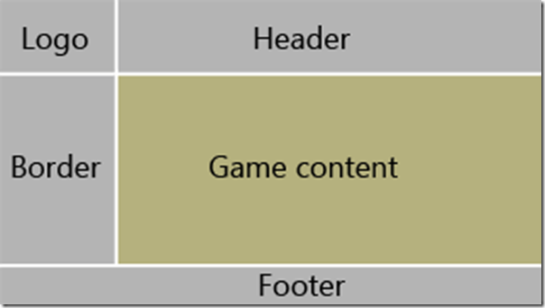
The basic layout for the game is one that follows a common layout pattern for Windows 8 style apps: A C-shaped border around the content in landscape mode.
You can create a layout that can adapt easily to different screen resolutions and give precise control over which parts resize and which don’t by using the CSS grid.
Like HTML table layouts, CSS grids are based on rows and columns. Unlike the HTML table element, the rows and columns for grid layout are defined in CSS, not in HTML, keeping your semantic markup free from markup devoted to layout. In addition, CSS grid layout offers precise control over grid behavior during resize events.
Rows and columns can be defined to have a fixed size, in other words, a size that doesn't change when the grid is resized. Alternatively, rows or columns can be defined to have a fractional size, causing them to resize relative to a size change of the grid. For example, if one row is defined 1fr and another 2fr, the grid will size the two rows so that the second one is twice as big as the first one, no matter what the size of the grid. You can also define rows or columns to size to fit their content by using Auto. Grid layout can be applied to any block element by using the display property -ms-grid.
In the following demo, I will show you how to create a flexible grid layout.
You can get the project for this demo here.
Align Content
Now that the precision grid is complete, the next step is to arrange content within the grid.
We define the grid positioning by creating a series of CSS rules by using the CSS Properties panel in Blend. The Applied Rules list in the CSS Properties panel also includes an additional entry labeled Winning Properties. This is a virtual rule that collects the properties that have the highest order of precedence and specificity across all other rules and their values. The Winning Properties rule is a convenient way to quickly adjust properties that are already set in their appropriate places, without having to search for the right rule, or to worry about modifying the wrong rule.
If the Winning Properties rule is selected, the write target for the new property is determined as follows:
- A property that is already set is written to the same rule where it was originally defined.
- A new property is written to the rule with the associated ID selector. In the case of the gameBody element, this would be #gameBody.
- If there is no ID selector defined, Blend writes the style to the inline rule if the inline rule is accessible for writing.
- If the element is dynamically generated by JavaScript, Blend cannot store properties for the inline style.
In the demo below, I will show you how to fill the grid cell and align the content in the grid layout.
You can get the project for this demo here.
In the next blog, we will continue working on the Memory Game project. We will style the game board, the image cards, and design for different view states: Using Blend to Design HTML5 Windows 8 Application (Part III): Style Game Board, Cards, Support Different Device, View States

