Cascading Filters in PerformancePoint Services
One long-awaited and much-requested feature for PerformancePoint, Cascading Filters, is available in SharePoint Server 2010 SP1. I wanted to go through the deployment of a dashboard using Cascading Filters to show both the ease and a little of the power this feature provides.
The concept of cascading filters is that the output of one filter becomes the input of another; or more precisely, the choices made in one filter limit the choices available in another. Typically, this would be filters in the same hierarchy: time, geography, or organization, for example.
Before showing how to set up a dashboard with cascading filters, I'd like to show you a working example, focusing on just the filters.
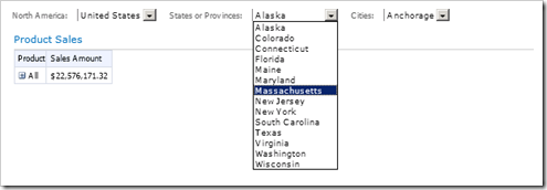
In this example, using the Contoso Retail DW database's Sales cube, we have a geography-based (country, state/province, and city) filter cascade. With everything in place, the filter zone of the dashboard looks like this.
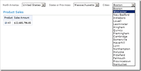
Changing the “States or Provinces” filter selection to another state makes the choices for the Cities filter change.
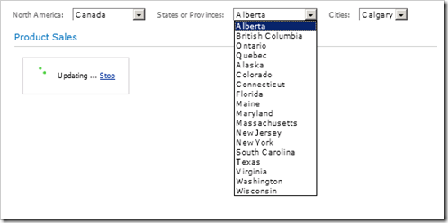
Suppose we change the “North America” filter choice.
If we pull down the "States or Provinces" filter, notice that it shows only the Canadian Provinces.
If we disconnect the "North America" filter from the "States or Provinces" filter and re-deploy, notice how the list grows.
By "uncascading" the filters, we see the benefit we were getting with cascading filters – refining the choices in one filter based on choices made in another filter.
Let's look at how this dashboard was made, and add in a report to better visualize the filter cascade's output.
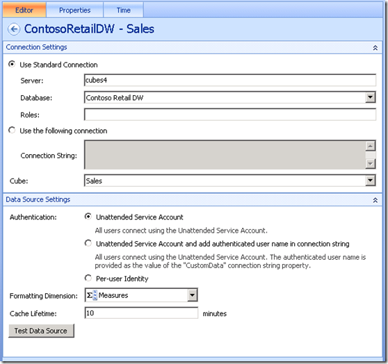
After firing up Dashboard Designer, we create the data connection. The above shows the dialog that will supply the data connection to the Analysis Services server for this example. (If you're following along creating this content, your Server will be different.) Once the data connection is saved, we can create the filters.
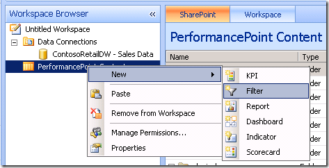
With the selection in the PerformancePoint Content section of the Workspace Browser, tell Dashboard Designer to create a filter.
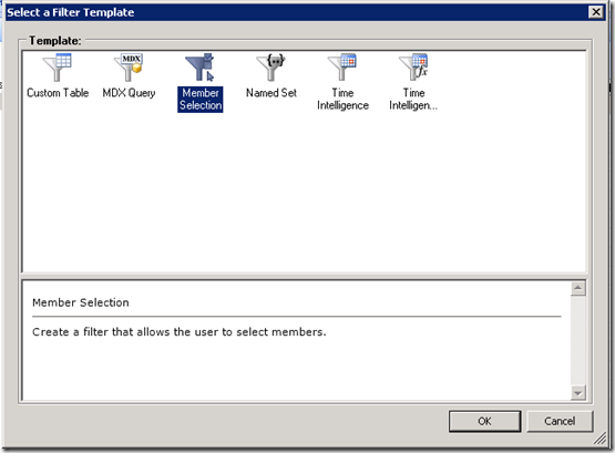
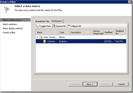
Let's use the Member Selection filter template and, of course, the data connection we just created.
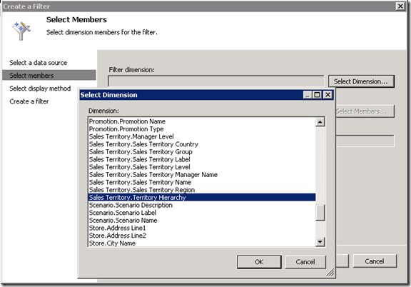
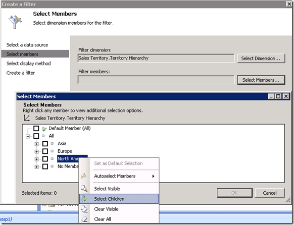
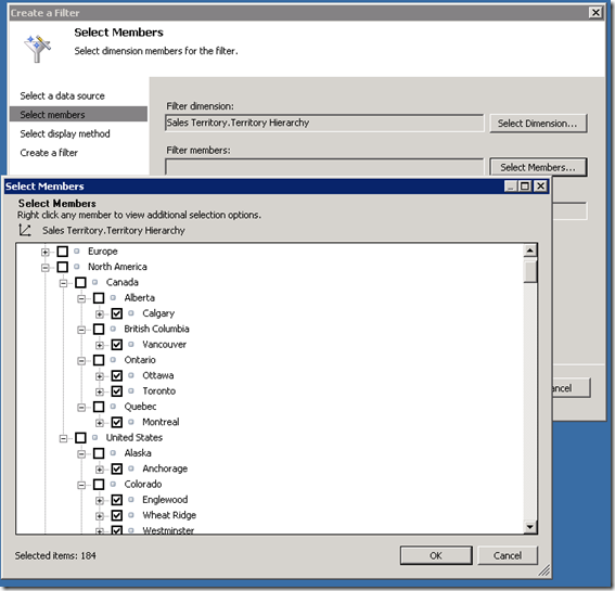
We want filters based on geography. The “Sales Territory” has several levels of geographic data. For this example, let’s just use the “Sales Territory.Territory Hierarchy”, which contains all of the geographies represented, but focus on the country level and slice off just the countries represented in its “North America” section. First, the Filter dimension:
Then, pick the members of interest.
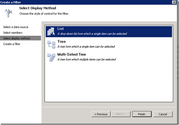
Set the display method. The simplest type is the list.
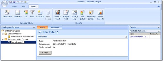
We can name the filter “North America”.
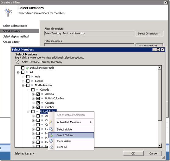
The next level of interest in the Sales Territory hierarchy is the state/province. Repeat the above process to create a filter for it from the dimension “Sales Territory.Territory Hierarchy” dimension, but this time, select only the children of Canada and United States.
Make this a List type filter, too, and name it "States or Provinces".
The final filter to be created is Cities, and will need the children of each Canadian Province and United States State.
Hint: A Select Grandchildren would come in handy. There is a shortcut you could take here: Use “Sales Territory.Sales Territory Name”, which corresponds closely to the city level in the Hierarchy, as a dimension and select all the items The cascading functionality will pick the children of the upstream filter correctly.
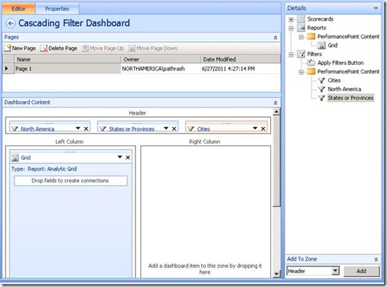
Now, create a dashboard, one with several zones, and a scorecard and/or a report. Drag the filters and the reports and scorecards onto the dashboard. Try to arrange the filters in a natural flow from the highest level to the lowest for the best experience for the dashboard user.
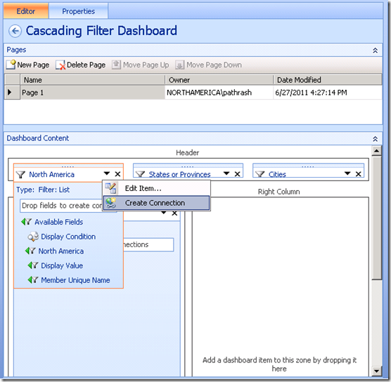
Now, the magic. To connect the “North America” filter to the “States or Provinces” filter, either
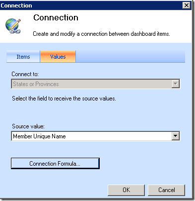
· Drag and drop the Member Unique Name from the “North America” filter onto the “States or Provinces” filter
--or--
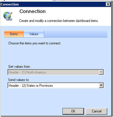
· Use Create Connection for the “North America” filter (from the Ribbon's Edit section or its triangle menu) to send values to the “States or Provinces” filter, with a source value of "Member Unique Name".
Similarly, connect the "States or Provinces" to the Cities filter, using Member Unique Name.
Connect the Cities filter to any desired reports and scorecards. Deploy the dashboard, and the whole system will be ready for use.
The Apply Filters Button, or Paint it Once
One seemingly minor part of the SP1 upgrade—the ability to add the Apply Filters button to a dashboard from within Dashboard Designer—ties in very closely well with Cascading Filters.
What really makes the Apply Filters button a good addition to Cascading Filters is that it lets you settle all the filter choices before the scorecards and reports "repaint", so you aren't waiting for the scorecards and reports during every adjustment of the filters.
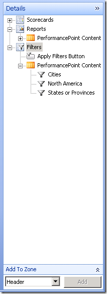
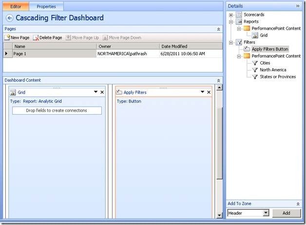
Adding the button couldn't be simpler. It's sitting at the top of the list of filters in the Dashboard Designer's dashboard editor's Details pane.
Select it and use the Add To Zone control or just drag it onto the dashboard.
Now, when the user of the deployed dashboard changes a filter setting, other filters that are "downstream in the cascade" (dependent on that filter) will update, but reports and scorecards won't, letting the user find the exact filter settings desired, at which point the user can click the button and get all the filter values applied at once.
Here, for example, is the dashboard we've been building with the filters all applied. The Apply Filters button is inactive, because there are no pending filter changes.
Now, change the “States or Provinces” filter to Ontario. The Cities filter adjusts to the new upstream values (I opened it to show the new choices available) and the Apply Filters button turns on, but the report doesn't change at all.
Clicking the Apply Filters button makes the report update to the new value and the button go back to its inactive state.
So, that's one path through the wonderful land of Cascading Filters! Appropriate deployment of Cascading filters will improve the efficiency and reduce frustration and wait times for the users of your dashboards. If you would like more information, be sure to visit this TechNet article.
Happy Dashboarding!
Paul Thrasher,
Office BI Test Engineer

