Some notes on the New ‘Res’ Hints, aka Smart Hinting.
The newest versions of Visual TrueType include a new set of instructions called ‘Res’ hints. (Rendering Environment Specific). Unlike old-style hints, which always round to a full pixel, ‘Res’ hints adjust to fractional pixels, when this option is available. The ‘Res’ hints adjust automatically to take advantage of whatever antialiasing mode an operating system is using, from 1990s-style black and white rendering, to the latest vertically and horizontally antialiased versions of ClearType.
To better understand the flexibility ‘Res’ instructions have, it’s worth reviewing how old-style hints worked.
Older Style Hints
When working with the traditional set of TrueType instructions, you need to use a different set of hints for each rendering environment, that support different rounding granularity’s. For example, in Black-and-White rendering, the strokes of the fonts’ letterforms typically have a width onscreen that is a multiple of a full pixel, because in black-and-white rendering, a pixel is either fully on or fully off. As the type size on-screen increases, features in the y-direction, such as y-round features on the lowercase ‘n’ and ‘o’, must break from one full pixel to two, two to three, three to four, and so on.
The first release of ClearType (ClearType GDI rendering), did not change the rounding granularity for y-direction features. While the x-direction features, such as stems, increased in resolution, the y-direction features were still restricted to having a width that was a multiple of a full pixel.
ClearType DirectWrite, (now used in most modern Web Browsers on Windows) introduced y-direction antialiasing, which changed this rounding granularity. A pixel in DirectWrite, can assume an intermediate shade of grey or color. The intermediate shade is related to the fractional area of the pixel that is considered as being “inside” a letterform.
Using older hinting methods, in previous versions of VTT, you would need one set of hints for black & white and ClearType GDI, where “hints”, such as ‘YLink’ or ‘YDist’ would constrain parts of the letterforms’ outlines to a full pixel boundary. This was the correct rounding for these rendering conditions. However, for ClearType in DirectWrite, a different set of hints would be needed for the same parts of the outlines, so that the same features rounded to a fractional pixel value, allowing for a more accurate and subtle rendering of type onscreen.
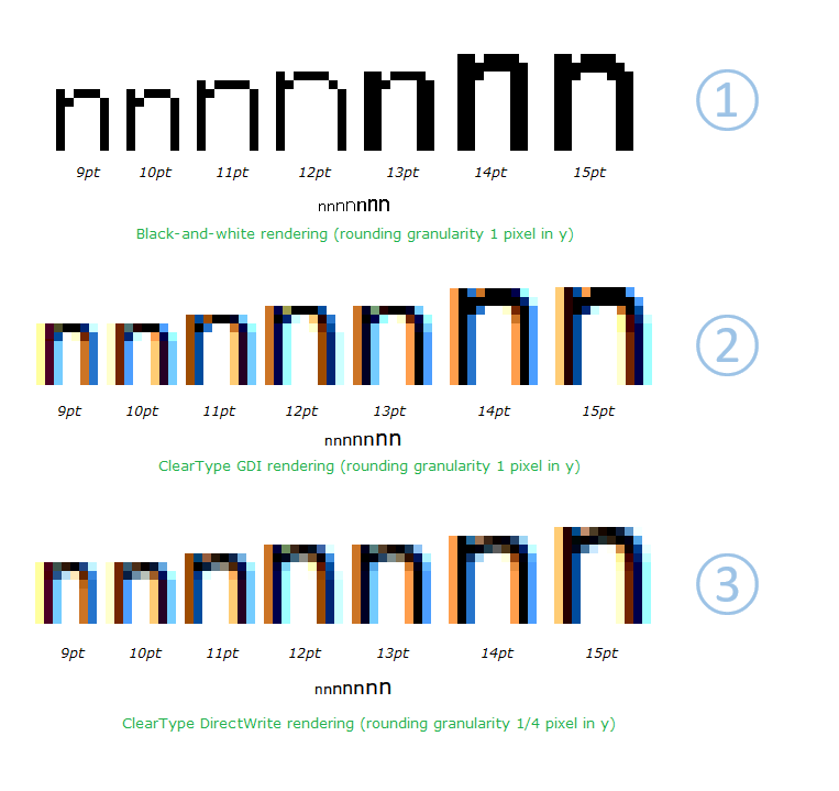
The new ‘Res’ instructions solves this problem by defining a new set of hints in VTT Talk, allowing the appropriate rounding to happen automatically for a variety of rendering environments. Unlike VTT Talk’s existing hints, which map to a series of TrueType instructions, the new ‘Res hints’ map to a set of TrueType functions. These functions determine the correct rounding granularity dynamically. In the example above the ‘y-round’ of the lowercase ‘n’ is hinted using a ‘ResYdist’ command. In Black and White rendering and ClearType GDI rendering, the feature will round to a full pixel or pixels. (Note, the y-round of the ‘n’ in (1) and (2) above, breaks from one to two pixels, at 13 to 14 point, in both the Black and White and ClearType GDI. In ClearType DirectWrite, (3) which has support for y-direction antialiasing, the feature will round to a fractional pixel, allowing for a smoother transition at these break points.
Using Older Hinting commands v new ‘Res’ hints
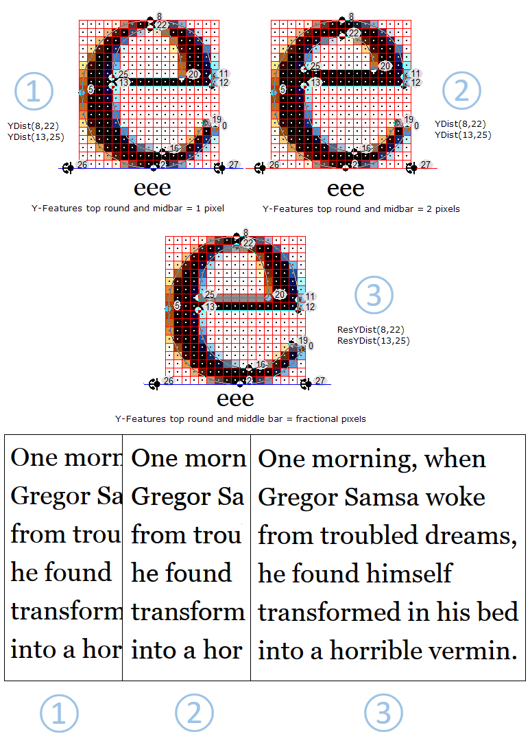
When using the traditional set of hinting commands, such as YLink or YDist, to control y-direction features, a difficult decision is always to decide at what size the hairline features or y-Rounds in a font should break from one pixel to two, and two to three, etc. As the size onscreen increases, there are more pixels available. However, even with the introduction of additional y-smoothing in DirectWrite, which allows for a more fine grained fractional rounding, the older hinting commands were designed to round to a full pixel. At these critical pixel break sizes, one pixel can often look too light, while two full pixels can make these fine features appear too heavy. The example below, shows the Georgia font at 38ppem. 38ppem can be both a larger Display size on screen at 96dpi, or 9 point on a 300 dpi screen.
- The illustrated examples below, are shown using DirectWrite Rendering. (1) & (2) both use the older ‘YDist’ command, to control the y-rounds, while (3) uses the new ‘ResYdist’ command.
(1) The rounds of the lowercase characters, such as, the top round on the ‘a’, top and bottom rounds of the ‘o’ and ‘s’, and top round and middle bar of the ‘e’, all round to one full pixel. Although this may appear sharp, the weight is not correct. On a lower DPI screen, where 38ppem is a Display size, these features will look too light. On a 300 dpi screen, 38ppem is equal to 9 point. In this case the physical pixels are much smaller, and when these features are only one pixel in width, they can almost disappear on screen, and can cause the text onscreen to have an uneven look, causing the text to ‘sparkle’ .
(2), In this example all of the same features render as two full pixels. While this may help strengthen the appearance of the text on screen, the features now look too heavy and clunky.
(3) The best solution is to use ‘Res’ hints, where these features can round to a fraction of a pixel. (Illustrated below, see the top round and middle bar of the lowercase ‘e’.) This allows for these fine features of the font, to be displayed onscreen, both at lower resolution and higher, at the correct weight. On higher resolution screens, because the pixels are so small, the effect is that the features appear to be the correct weight, and any additional blur is not noticeable. The overall typographic color of the text is much improved in both cases.
The following are the ‘Res’, Y-Direction hinting commands added automatically by the VTT 6.10 Light Latin Autohinter.
- ResYAnchor
- ResYDist
When a font is hinted using cvt ’ s, ResYlink can be used See the font VTTDemo.ttf, that ships with VTT 6.10, as a reference.
Note: Adding the new ‘Res’ commands is not supported when using the GUI (Graphical User Interface) for Hinting. If you are hinting a font using the GUI, ‘Res’ will need to be appended to the existing Hinting commands. This can be done by editing in the VTT talk window and compiling.
The Light Latin Autohinter, will add the ‘Res’ commands automatically. You can then continue to edit the hints in the font, via the GUI, and VTT will preserve the ‘Res’ hint commands.
Mike