Using XAML to write Windows 8 Games - Part 2
If I was a cheesy marketing-type person, I'd said that "XAML stands for 'XAML Assists My Life', but thankfully I'm not and I'd be much happier if you never mentioned that in my presence. No, XAML is the "eXtensible Application Mark-up Language", and we use it when writing Windows 8 Apps to define the controls that make up our user interface. Think of it like the XIB files used in Xcode when writing iOS apps, but you get to be a lot more 'hands on' with it.
In the previous blog entry I was bemoaning the fact that I couldn't find a way to apply the same XAML to multiple XAML controls. Of course, within a few minutes I'd worked out how to do it (the hardest part was walking over to the XAML expert on my team here at MS HQ. Thanks, Karl!). The trick is to use Control Templates, which allow you to define a style which your other XAML controls can inherit. Let's get into some sample code to make that more obvious.
Let's say you want to create a button that looks like this:

Now, if you are coming from an iOS background like me, you'll immediately break out Photoshop and create a bitmap. You'd probably be smart and create two: one for the background texture, and one for the foreground image. And if you are thinking clearly, you would create an extra version at double the size, saved with the @2x.png extension to support devices with Retina displays, right?
However, now we're in Windows world, and you don't have the same kind of control over screen resolutions. People insist on buying all kinds of computers and connecting them to all kinds of monitors. Windows 8 apps actually support three resolutions of bitmap, rather than two, but a far better approach is to go Vector. Have you see the PaintCode app for Mac? It very cleverly takes your image designs and outputs Objective-C code which recreates them programmatically at run-time. This means your images are automatically going to render at their best no matter what screen size your app is running on, and you don't need to store bitmaps in your app. Windows 8 provides the same feature, but uses XAML to do all the drawing. Which all means I can create a version of the example button in XAML without opening a single paint program. Here's the code I came up with:
<Button x:Name="myCoolButton1" Height="55" Width="104" BorderThickness="0" Margin="0,34,0,679" >
<Grid>
<Rectangle Width="104" Height="55">
<Rectangle.Fill>
<LinearGradientBrush StartPoint="0,0" EndPoint="0,1">
<GradientStop Color="Black" Offset="0.0" />
<GradientStop Color="Gray" Offset="0.03" />
<GradientStop Color="Black" Offset="0.25" />
</LinearGradientBrush>
</Rectangle.Fill>
</Rectangle>
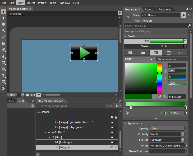
<Polygon Points="25,3,25,39,55,21">
<Polygon.Fill>
<LinearGradientBrush StartPoint="0,0" EndPoint="0,1">
<GradientStop Color="LightGreen" Offset="0.0" />
<GradientStop Color="DarkGreen" Offset="1.0" />
</LinearGradientBrush>
</Polygon.Fill>
</Polygon>
</Grid>
</Button>
This creates a button which looks like this (it's the less pixelly version on the left):

You can of course use Blend if your control is a little more complicated, as you can then create it graphically:
Now, what I wanted was to create a style that would let me use the same background on several buttons without having to retype it every time.. And to do this, I created a new <style> in the <Page.Resources> section of the page's XAML file. The style looks like this:
<Style x:Name="graduatedButton" TargetType="Button">
<Setter Property="Template">
<Setter.Value>
<ControlTemplate TargetType="Button">
<Grid>
<Rectangle >
<Rectangle.Fill >
<LinearGradientBrush StartPoint="0,0" EndPoint="0,1">
<GradientStop Color="Black" Offset="0.0" />
<GradientStop Color="Gray" Offset="0.03" />
<GradientStop Color="Black" Offset="0.25" />
</LinearGradientBrush>
</Rectangle.Fill>
</Rectangle>
<ContentPresenter />
</Grid>
</ControlTemplate>
</Setter.Value>
</Setter>
</Style>
And the only really cunning part is the use of <ContentPresenter/> which is a placeholder for anything else you wanted to add to the control when you create a specific version. In our case, this would be the triangle code that overlays the graduated background.
To use this style in your button, you would use code like this:
<Button x:Name="myPlayButton" Style="{StaticResource graduatedButton}" Margin="290,153,0,471" Height="44" Width="100" >
<Grid>
<Polygon Points="50,5,50,39,86,21">
<Polygon.Fill>
<LinearGradientBrush StartPoint="0,0" EndPoint="0,1">
<GradientStop Color="Yellow" Offset="0.0" />
<GradientStop Color="YellowGreen" Offset="0.5" />
</LinearGradientBrush>
</Polygon.Fill>
</Polygon>
</Grid>
</Button>
First we assign the style, and then we add the extra triangle image on top. Of course what I really wanted to do was apply an animation to multiple buttons; when you tap on the button I wanted something to happen, and I didn't want to have to create a Storyboard animation script object for each button individually. Styles to rescue again! By making use of something called the VisualStateManager I was able to provide a Storyboard for specific events: such as when the user taps on the button, and because this was part of the style, every button inherits the animation too. Here's the updated style which includes the animation effect:
<Style x:Name="graduatedButton" TargetType="Button">
<Setter Property="Template">
<Setter.Value>
<ControlTemplate TargetType="Button">
<Grid x:Name="grid" RenderTransformOrigin="0.5,0.5">
<Grid.RenderTransform>
<CompositeTransform/>
</Grid.RenderTransform>
<VisualStateManager.VisualStateGroups>
<VisualStateGroup x:Name="CommonStates">
<VisualState x:Name="Normal"/>
<VisualState x:Name="Pressed">
<Storyboard >
<DoubleAnimation Duration="0" To=" 0.9" Storyboard.TargetProperty="(UIElement.RenderTransform).(CompositeTransform.ScaleX)" Storyboard.TargetName="grid"/>
<DoubleAnimation Duration="0" To=" 0.9" Storyboard.TargetProperty="(UIElement.RenderTransform).(CompositeTransform.ScaleY)" Storyboard.TargetName="grid"/>
</Storyboard>
</VisualState>
</VisualStateGroup>
</VisualStateManager.VisualStateGroups>
<Rectangle >
<Rectangle.Fill >
<LinearGradientBrush StartPoint="0,0" EndPoint="0,1">
<GradientStop Color="Black" Offset="0.0" />
<GradientStop Color="Gray" Offset="0.03" />
<GradientStop Color="Black" Offset="0.25" />
</LinearGradientBrush>
</Rectangle.Fill>
</Rectangle>
<ContentPresenter />
</Grid>
</ControlTemplate>
</Setter.Value>
</Setter>
</Style>
When defined with this style, a button will animated when tapped. No need to create a separate Storyboard for each one.
In the next installment, I'll start looking at moving the XAML controls around the screen - something that will make any game a lot more interesting :-)