Silverlight Arc Control in 5 Easy Steps
Whilst working on a proof of concept, we came up with an idea for an interesting menu that would form an arc around a company logo at the top-left corner of the UI:
When a user moves the mouse over one of the icons it would be magnified, much like a fish eye control. These icons could then also be dragged onto the main area of the screen to display a new window with more information.
A similar project also required an innovative menu that would be displayed around the users cursor when a button is pressed on the keyboard, giving the user quick and easy access to the whole menu structure of the application from where-ever they are.
I created a control that has solved both of these problems in a simple and elegant way, by displaying icons in either an arc or circle around a central point. Although this control is quite simple for those familiar with XAML it makes a great example of how to create a custom control.
1. Create a custom control based on a panel
First, create a new class called ArcPanel.cs which inherits from Panel.
 namespace Controls
{
    using System;
    using System.ComponentModel;
    using System.Windows;
    using System.Windows.Controls;

    public class ArcPanel : Panel
    {
        public ArcPanel()
        {
        }
    }
}
2. Add some dependency properties
Dependency Properties will be added so that you can control the distance from the origin (either a pointer or logo) that given icons will be displayed, along with the start and end position in degrees if you are wanting to create an arc.
 public static readonly DependencyProperty DistanceProperty
  = DependencyProperty.RegisterAttached("Distance",
  typeof(double), typeof(ArcPanel), null);

public static readonly DependencyProperty StartAngleProperty
  = DependencyProperty.RegisterAttached("StartAngle",
  typeof(double), typeof(ArcPanel), null);

public static readonly DependencyProperty EndAngleProperty
  = DependencyProperty.RegisterAttached("EndAngle",
  typeof(double), typeof(ArcPanel), null);
 public double Distance
{
    get
    {
        return (double)GetValue(DistanceProperty);
    }
    set
    {
        SetValue(DistanceProperty, value);
        this.ArrangeItems();
    }
}

public double StartAngle
{
    get
    {
        return (double)GetValue(StartAngleProperty);
    }
    set
    {
        SetValue(StartAngleProperty, value);
        this.ArrangeItems();
    }
}

public double EndAngle
{
    get
    {
        return (double)GetValue(EndAngleProperty);
    }
    set
    {
        SetValue(EndAngleProperty, value);
        this.ArrangeItems();
    }
}
We also need a few local variables.
 private int childrenCount;
private double currentWidth;
private double currentHeight;
3. Arrange the elements
Next we need to write a method to arrange the elements around the origin of the control. This method takes into account the distance, start angle and end angle properties.
 private void ArrangeItems()
{
  this.childrenCount = this.Children.Count;
  double currentAngle = this.StartAngle;
  double angleInterval = (this.EndAngle
           - this.StartAngle) / this.childrenCount;

    foreach (UIElement element in this.Children)
  {
     double angle = Math.PI / 180 * (currentAngle - 90);
     currentAngle += angleInterval;

       double x = this.Distance * Math.Cos(angle);
     double y = this.Distance * Math.Sin(angle);

       element.Arrange(new Rect(x, y,
        this.currentWidth, this.currentHeight));
   }
}
4. Set up defaults and add size changed event handler
In the constructor we can set some default values in case these aren’t specified as properties. The following values arrange the elements in a full circle with radius of 50 pixels:
 public ArcPanel()
{
    this.SizeChanged +=
        new SizeChangedEventHandler(this.ArcPanelSizeChanged);

    this.Distance = 50.0;
    this.StartAngle = 0.0;
    this.EndAngle = 359.9;
}
We also need to add an event handler to rearrange the panel if it’s size changes:
 private void ArcPanelSizeChanged(object sender,
                            SizeChangedEventArgs e)
{
    if (this.currentWidth != e.NewSize.Width ||
        this.currentHeight != e.NewSize.Height)
    {
        this.currentWidth = e.NewSize.Width;
        this.currentHeight = e.NewSize.Height;
        this.ArrangeItems();
    }
}
5. Override some methods
A couple of methods from the inherited Panel class need to be overridden. It will still work without these but it won’t have a proper width / height. First we override the MeasureOverride method:
 protected override Size MeasureOverride(Size availableSize)
{
    Size idealSize = new Size(0, 0);

    Size size = new Size(Double.PositiveInfinity,
        Double.PositiveInfinity);
    foreach (UIElement child in Children)
    {
        child.Measure(size);
        idealSize.Width += child.DesiredSize.Width;
        idealSize.Height = Math.Max(idealSize.Height,
            child.DesiredSize.Height);
    }

    if (double.IsInfinity(availableSize.Height) ||
        double.IsInfinity(availableSize.Width))
    {
        return idealSize;
    }

    return availableSize;
}
Next we need to override the ArrangeOverride method:
 protected override Size ArrangeOverride(Size finalSize)
{
    if (this.Width != finalSize.Width || this.Height
        != finalSize.Height || this.childrenCount
        != this.Children.Count)
    {
        this.currentWidth = finalSize.Width;
        this.currentHeight = finalSize.Height;
        this.ArrangeItems();
    }

    return base.ArrangeOverride(finalSize);
}
We’re done. Try it out…
That’s all that is needed to create the custom control for the layout panel.
To use it, we can add some XAML code to a page:
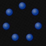
 <Controls:ArcPanel Distance="70" StartAngle="0" EndAngle="359">
    <Ellipse />
    <Ellipse />
    <Ellipse />
    <Ellipse />
    <Ellipse />
    <Ellipse />
    <Ellipse />
    <Ellipse />
</Controls:ArcPanel>
The above code arranges the ellipses in a circle:
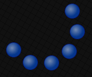
We can alter the angles to give an arc effect:
 <Controls:ArcPanel Distance="70" StartAngle="30" EndAngle="240">
    <Ellipse />
    <Ellipse />
    <Ellipse />
    <Ellipse />
    <Ellipse />
    <Ellipse />
    <Ellipse />
</Controls:ArcPanel>
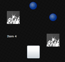
We can also add any type of UI element to the panel:
 <Controls:ArcPanel Distance="70" StartAngle="0" EndAngle="359">
    <Ellipse />
    <Ellipse />
    <Image />
    <Button />
    <TextBlock />
    <Image/>

</Controls:ArcPanel>
Written by Stuart McCarthy


