Windows 10 SplitView – Build Your First Hamburger Menu
With all of the new and exciting features coming out with Windows 10 development, the SplitView control is a new addition to XAML. For a quick intro to the SplitView, you can check out my previous post here. This post covers the basics of implementing a SplitView in XAML, some of the key properties, etc. Regalrdess, it’s basic use is to display a side menu, such as the one usually called “hamburger menu”. This is something that you have probably seen before on other platforms and maybe even some custom implementations on Windows, but now we, the developers, have access to it for the first time on the Windows platform. So, let’s take a look at how we actually build one of these menus!
The first thing you need to do it make sure you are running some version of Windows 10, which you can find here. You also need to have Visual Studio 2015 community installed as well, which you can find here. Those are the only two things that you need to ensure that you have installed. If you have those installed, let’s continue!
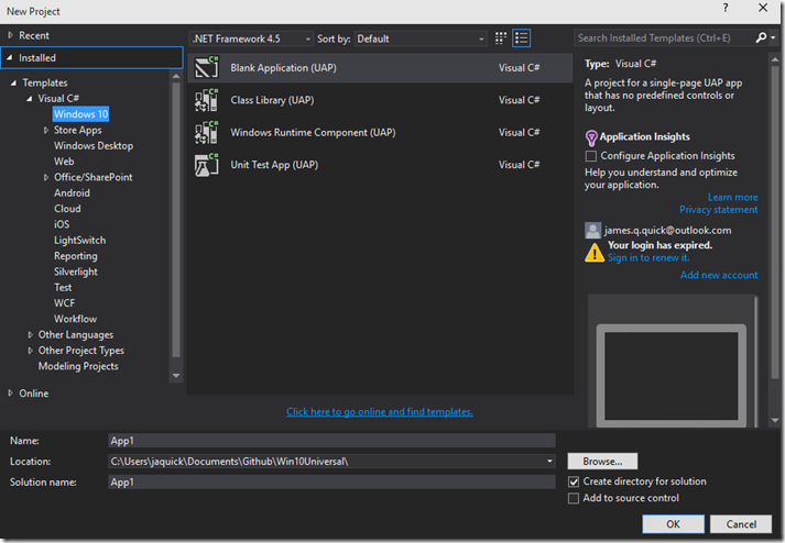
Open up Visual Studio and create a new blank Windows 10 Application. Give it a name and click OK.
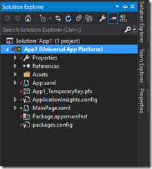
Now that we have our project created let’s take a quick look at the Project Architecture in the Project Explorer. Notice that unlike Universal Windows Applications for Windows 8.1 and Windows Phone 8.1, we only have one project head now instead of three different ones. They key here is that Windows 10 applications use the SAME BINARY regardless of the device they are being run on. This is super important, and SUPER AWESOME!
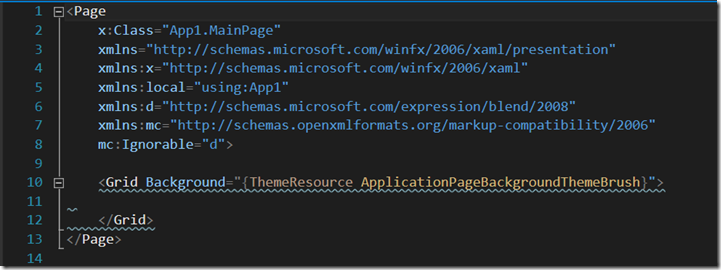
Go ahead and open up your MainPage.xaml file so we can get started created out SplitView! You don’t start with much here just an empty grid.
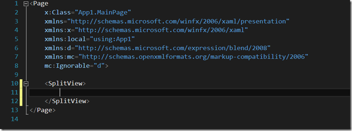
Let’s scrap the grid, and just ad a simple blank SplitView.
Now that we have our SplitView created we can add its two main elements, the pane and the content. The pane represents the menu that you want to be able to interact with, and the content represents the main content of your page.
 <SplitView>
        <SplitView.Pane>

        </SplitView.Pane>
        <SplitView.Content>

        </SplitView.Content>
 </SplitView>
Ignore the Blue squigglies above. It’s just tell us that we need to fill in the definition of the pane and the content. Let’s start with the content as it is the easiest. I just want to add a TextBlock here centered inside of a grid that says “SplitView”.
 <SplitView>
        <SplitView.Pane>

        </SplitView.Pane>
        <SplitView.Content>
            <Grid>
                <TextBlock Text="SplitView Basic" FontSize="54" Foreground="White"
                           HorizontalAlignment="Center" VerticalAlignment="Center"/>
            </Grid>
        </SplitView.Content>
 </SplitView>
Ok, so we have some content there. It’s enough for this simple demo, but obviously in the future, use your typical XAML there to create whatever kind of page you want. Next step is obviously to fill in the SplitView Pane, which will be the menu. I am going to start by adding some properties to the definition of the SplitView. For reference, you can again look back to my SplitView Intro post. Really quickly, I am going to give a name, set the DisplayMode to Compact Overlay, set the pane to not be open by default, and set the open and company panel lengths like so.
 <SplitView x:Name="MySplitView" DisplayMode="CompactOverlay"  IsPaneOpen="False"
                CompactPaneLength="50" OpenPaneLength="150">
Now, we can go in and actually create our menu. Since I want our menu to be vertical, as you might expect, I am simply going to create a vertical StackPanel as the container for all of our buttons with a background of Gray. Our whole XAML should look like this now.
 <SplitView x:Name="MySplitView" DisplayMode="CompactOverlay"  IsPaneOpen="False"
               CompactPaneLength="50" OpenPaneLength="150">
        <SplitView.Pane>
            <StackPanel Background="Gray">
            </StackPanel>
        </SplitView.Pane>
        <SplitView.Content>
            <Grid>
                <TextBlock Text="SplitView Basic" FontSize="54" Foreground="White"
                           HorizontalAlignment="Center" VerticalAlignment="Center"/>
            </Grid>
        </SplitView.Content>
 </SplitView>
Inside of our stack panel, I want to add our hamburger button, and below that a couple of dummy buttons just for reference. To see how to build a hamburger button (because it isn’t all that obvious), you can follow me previous post, Creating a Hamburger Button. In addition to simply create the hamburger button, I am also going to add its Click Handler. As a hint, if you start typing in the Click property you get some intellisense that gives you the option to auto generate the name and then the method in the code behind. Regardless, it looks like this.
<Button x:Name="HamburgerButton" FontFamily="Segoe MDL2 Assets" Content=""
Width="50" Height="50" Background="Transparent" Click="HamburgerButton_Click"/>
We can take a look at the code behind for the HamburgerButton click handler shortly, but first let’s finish our menu. The next thing we will do is at a couple of more buttons. In addition to simply adding a couple of buttons, i want each of those buttons to have text to the right of them explaining what each button does. Therefore, for each new button, I am going to add a horizontal StackPanel to hold a button and text. All in all it looks like this.
<StackPanel Orientation="Horizontal">
<Button x:Name="MenuButton1" FontFamily="Segoe MDL2 Assets" Content=""
Width="50" Height="50" Background="Transparent"/>
<TextBlock Text="Button 1" FontSize="18" VerticalAlignment="Center" />
</StackPanel>
<StackPanel Orientation="Horizontal">
<Button x:Name="MenuButton2" FontFamily="Segoe MDL2 Assets" Content=""
Width="50" Height="50" Background="Transparent"/>
<TextBlock Text="Button 2" FontSize="18" VerticalAlignment="Center" />
</StackPanel>
<StackPanel Orientation="Horizontal">
<Button x:Name="MenuButton3" FontFamily="Segoe MDL2 Assets" Content=""
Width="50" Height="50" Background="Transparent"/>
<TextBlock Text="Button 3" FontSize="18" VerticalAlignment="Center" />
</StackPanel>
Now, our total XAML Page looks like this.
<Page
x:Class="App1.MainPage"
xmlns="https://schemas.microsoft.com/winfx/2006/xaml/presentation"
xmlns:x="https://schemas.microsoft.com/winfx/2006/xaml"
xmlns:local="using:App1"
xmlns:d="https://schemas.microsoft.com/expression/blend/2008"
xmlns:mc="https://schemas.openxmlformats.org/markup-compatibility/2006"
mc:Ignorable="d">
<SplitView x:Name="MySplitView" DisplayMode="CompactOverlay" IsPaneOpen="False"
CompactPaneLength="50" OpenPaneLength="150">
<SplitView.Pane>
<StackPanel Background="Gray">
<Button x:Name="HamburgerButton" FontFamily="Segoe MDL2 Assets" Content=""
Width="50" Height="50" Background="Transparent" Click="HamburgerButton_Click"/>
<StackPanel Orientation="Horizontal">
<Button x:Name="MenuButton1" FontFamily="Segoe MDL2 Assets" Content=""
Width="50" Height="50" Background="Transparent"/>
<TextBlock Text="Button 1" FontSize="18" VerticalAlignment="Center" />
</StackPanel>
<StackPanel Orientation="Horizontal">
<Button x:Name="MenuButton2" FontFamily="Segoe MDL2 Assets" Content=""
Width="50" Height="50" Background="Transparent"/>
<TextBlock Text="Button 2" FontSize="18" VerticalAlignment="Center" />
</StackPanel>
<StackPanel Orientation="Horizontal">
<Button x:Name="MenuButton3" FontFamily="Segoe MDL2 Assets" Content=""
Width="50" Height="50" Background="Transparent"/>
<TextBlock Text="Button 3" FontSize="18" VerticalAlignment="Center" />
</StackPanel>
</StackPanel>
</SplitView.Pane>
<SplitView.Content>
<Grid>
<TextBlock Text="SplitView Basic" FontSize="54" Foreground="White"
HorizontalAlignment="Center" VerticalAlignment="Center"/>
</Grid>
</SplitView.Content>
</SplitView>
</Page>
Our last and final step is to add the logic to our Hamburger Button to open and close the menu. Go ahead and open up the MainPage.XAML.cs. Notice the handler has already been created for me. If it hasn’t for you then, go ahead and create it.
Inside of the handler we simply want to set pane to closed if it is open and visa versa like this.
MySplitView.IsPaneOpen = !MySplitView.IsPaneOpen;
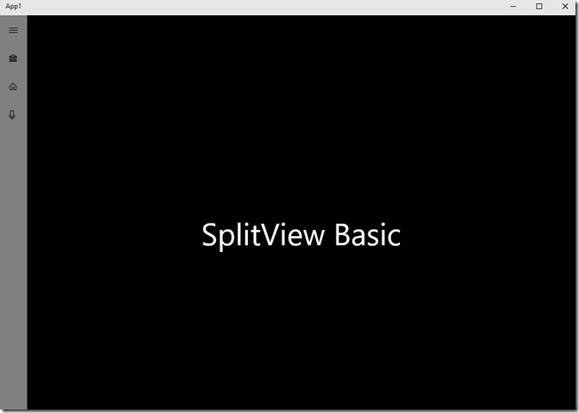
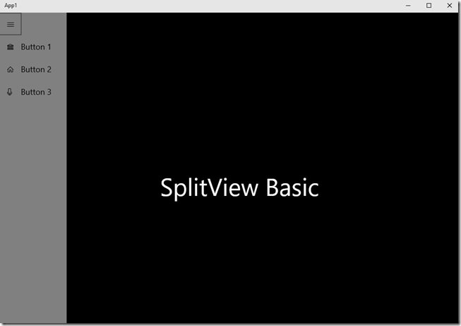
That should be everything. Go ahead and run your project and should be able to open and close your menu with the hamburger buton.
Closed
Open
