The Ultimate Guide to Color Scales / Conditional Formatting
I recently provided a tip to my Australian colleague David Lean to successfully solve a small report design challenge with tables and charts that use conditional formatting.
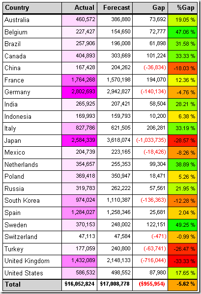
The specific goal was to dynamically calculate and assign a color shade so that the minimum value present in the data is shown red, the average value yellow, and the maximum value green, with automatically calculated red-yellow-green shades for numeric values in between.
As it turns out, Dave integrated and expanded this into a great four part blog post series on using conditional formatting and color scales in Reporting Services (applicable to both, RS 2005 and RS 2008):
- Part 1: Conditional Color: The Basics. Report Expressions & Custom Code
- Part 2: Creating Color Ranges and Shades in Tables and Charts
- Part 3: Continuous Color Functions
- Part 4: Effectively Using Color for Charts and Multi-Dimensional Analysis
Enjoy!