[Editor's Update - 8/27/2004: The WinFS content in this article is out-of-date. Microsoft will deliver a Windows storage subsystem, code-named "WinFS," after the "Longhorn" release. The new storage system provides advanced data organization and management capabilities and will be in beta testing when the "Longhorn" client becomes available. For more information, please refer to Microsoft Announces 2006 Target Date for Broad Availability Of Windows "Longhorn" Client Operating System.]
Code Name Longhorn
A First Look at Writing and Deploying Apps in the Next Generation of Windows
Dino Esposito
Code download available at:Longhorn.exe(113 KB)
This article was based on a pre-PDC build of Microsoft Windows Code Name "Longhorn" and all information contained herein is subject to change.
Note: This document was developed prior to the product's release to manufacturing and, as such, we cannot guarantee that any details included herein will be exactly the same as those found in the shipping product. The information represents the product at the time this document was printed and should be used for planning purposes only. Information subject to change at any time without prior notice.
SUMMARY
The next version of the Microsoft Windows operating system, code-named "Longhorn," marks a significant change not only in terms of how the operating system works, but also in the way in which applications are built. The Longhorn version of Windows includes a new storage system, natural search technology, and an increased emphasis on security and trustworthy computing. Here the author provides an overview of Longhorn, focusing on the build-once, deploy n-times application model. In addition, he discusses the new language, code-named "XAML," that's used to create UI elements, then presents some working samples.
Contents
The Longhorn Application Model
Understanding Longhorn Applications
The XAML Language
Building a Sample Application
Conclusion
The next release of the Microsoft® Windows® operating system, code-named "Longhorn," is an essential milestone for many reasons. It is the first operating system built with managed code and the first to host a new storage subsystem (code-named "WinFS") that revolutionizes the concept of a file system. It is also the first operating system to support a natural search technology (Natural UI) that automatically resolves many of the ambiguities inherent in query text. In addition, Longhorn is the first operating system designed from the ground up with security and trustworthy computing at the core. These and other features suggest that Longhorn will change the way applications are built—not something that happens every day. Since the advent of Windows, I remember two similar milestones—the move to 32-bit Windows and the dawn of the managed environment of the Microsoft .NET Framework.
One of the most important changes in Longhorn is that this operating system makes it possible to write an application one time and use it in multiple deployment scenarios. To achieve this ambitious goal, Longhorn-based applications are completely object-oriented and based on a central Application object that provides all key services that are needed for running the application. In this article, I'll examine the Longhorn application model in some depth and apply it to a few basic scenarios, including the classic Hello World application.
The Longhorn Application Model
The Application object is the heart of the Longhorn application model. Through its set of properties, methods, and events, the object enables you to arrange a collection of markup pages—a sort of enhanced version of HTML—into a coherent and classic Windows-based application. The Application object is the root application object available in Longhorn. It provides basic application support and will typically be used by those applications that need low overhead and don't use page navigation and state management. More complex Longhorn applications will use the closely related NavigationApplication object, which inherits from Application but adds support for navigation.
A typical Longhorn application can be thought of as a set of pages scripted with some procedural code. The Application object controls the execution of the program and raises events to the user code. Pages are written in a new declarative markup language, code-named "XAML" (Extensible Application Markup Language). With XAML elements you control the layout of each page, including the display of text and images and the insertion of interactive components such as buttons and textboxes. In summary, XAML is the language used to declaratively render the user interface of the pages that make up the application. In addition to using XAML, you can also write applications for Longhorn entirely with procedural code. In general, successful Longhorn-based applications have two ingredients—XAML pages and managed procedural code. How you combine them is up to you, but any combination of the two is acceptable.
By using a combination of XAML and C# (or Visual Basic® .NET) code, you can build various types of output files including traditional Windows desktop executables, DLL libraries, and console applications. In addition, if your application is simple enough, it can be rendered using freestanding XAML markup, thus producing another type of application to add to the list. Standalone XAML files are runnable within the Longhorn shell and the browser as long as they don't reference some codebehind class. Finally, it is worth noting that Windows executables can be hosted in a window (by default) as well as in the browser. In both cases, the code remains the same and only needs to be compiled again with a different project property.
For Longhorn, desktop executables are the next version of today's Windows Forms client-side apps. On the other hand, XAML and browser-hosted applications represent an evolution of today's client-side programming model to work over the Web. Right now, existing client-side applications can rarely be deployed over the Web. If you want to embed a Windows Forms form into a browser page, you'll get a reduced feature set and have to tweak bits and pieces of your code. With Longhorn, the common application model will let you write one application and deploy it over the Web. However, the final application is Longhorn-specific—very different from a traditional Web application like ASP.NET.
When you compile an application, the next version of Visual Studio® and the .NET Framework, code-named "Whidbey" (or the underlying MSBuild.exe tool) will produce an .exe file, an application manifest (.manifest), and a deployment manifest (.deploy). If you click on an .exe file, the application runs as expected. If configured to run within a browser, an instance of Internet Explorer starts up and hosts the application. As an alternative, you can also deploy an application from a remote server. The steps to accomplish this are as follows. First, you copy the deployment manifest to the appropriate location on your server. It can be an FTP or HTTP path. Next, you copy the compiled application files and manifests to the appropriate locations on your server. The server-side location of the deployment manifest and the application's files and manifests are not necessarily the same. If they're different, you edit the deployment manifest manually so that it points to the location of the application manifest. Manifest files are plain XML files. When users point their browser to the specified deployment location, Longhorn automatically downloads and installs the application and its manifests on the client computer and creates a shortcut to the .deploy file. At the end of the process, users run the application by clicking on the .deploy file.
All Longhorn applications have a common structure—XAML pages with procedural code either inline or codebehind—and the root object derives from Application. The Application object acts as a controller; its lifetime coincides with the lifetime of the application. The Application object allows you to handle top-level events and sometimes share code and state among pages. It is also responsible for letting the user navigate among pages according to the logic of the application. In a typical Longhorn program, the user performs tasks and progresses through the app by navigating from one page to the next. Navigation is usually accomplished by replacing the old page with the new one. However, you also have the option of opening a new pop-up window to display the new page. Navigation is not necessary in all Longhorn applications; simple apps that consist of a single page aren't going to need it.
As mentioned, XAML pages can contain procedural code in addition to markup elements. Procedural code is needed, for example, to handle an event that is raised by one of the XAML elements on the page. Procedural code can either be placed inline in the body of the XAML file or in a separate codebehind file.
Programming in Longhorn is based on managed code. However, only a few .NET-compatible languages can be used to write XAML-based applications. Today the list includes C#, Visual Basic .NET, and JScript® .NET. By the time Longhorn is released, other .NET-compatible languages are expected to be added to the list. The current three-language limit is due to the fact that the source code of a XAML file must be parsed and compiled on the fly, hence a compiler and a related code document object model must be available beforehand. Note, though, that if you write an application entirely in procedural code, you can use any .NET-compatible language for which you can get a valid compiler. Note that only XAML-based apps are lmited to those three languages. If procedural code is embedded in a XAML page, then you must compile the application before you can run it; if there is no procedural code in the XAML page, it can be displayed by double-clicking just as HTML pages are. Longhorn doesn't process uncompiled code, nor does it have the ability to compile code on the fly. Can't wait to see what a Longhorn "Hello World" application looks like? Here's a sample of the simplest XAML code you can write:
<Canvas xmlns="https://schemas.microsoft.com/2003/xaml" Background="LightCyan" Width="100%" Height="100%"> <Image Source="lh.bmp" Canvas.Left="5" Canvas.Top="5" /> <Text Canvas.Left="90" Canvas.Top="20" FontSize="36">Hello, Longhorn! </Text> </Canvas>
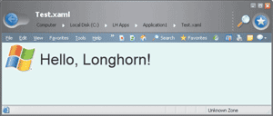
Figure 1** Simple XAML Page **
Save this snippet to a text file with the .xaml extension and point your Longhorn browser to it or just double-click it from within the shell. Figure 1 shows the results. The <Canvas> node defines the area of the application's user interface—basically, the drawing surface. The Background attribute indicates the background color of the area, whereas Width and Height indicate the size of the surface. The <Image> and <Text> elements define the contents of the page. Both elements define their absolute position using the Left and Top attributes of the parent Canvas object.
Understanding Longhorn Applications
Longhorn provides a set of framework classes that extend and enhance the .NET Framework 1.1. Extensions available in Longhorn range from XAML support to the storage system, and from the application model to trustworthy computing and advanced Web Services. Longhorn and Whidbey represent two distinct milestones in the Microsoft roadmap. Whidbey is expected to ship several months before Longhorn, so that when Longhorn is released, an updated version of Whidbey will be included that provides core services in Longhorn.
Let's take a closer look at the common substrate of all Longhorn applications—the XAML language. XAML is an XML-based language specifically designed to describe your application's user interface. Programmers familiar with Win32® and the .NET Framework will recognize a distinct similarity between XAML tags and traditional Windows controls. However, the suite of XAML markup tags is more abstract and broader than the set of Win32 common controls or Windows Forms controls. To get an immediate grasp of what XAML represents and how you should look at it, think of ASP.NET pages. Or, more specifically, think of a particular ASP.NET page in which you only find server-side controls (runat="server") and no literal text.
Each and every XAML tag corresponds to a .NET Framework class and comes with a collection of methods, properties, and events. You can set properties and wire events declaratively in the XAML script, as well as use procedural code packed into a codebehind class. The control behind each tag is instantiated at run time and given an area of the screen on which to render its output. At the highest level of abstraction, the model looks a lot like ASP.NET, only abstracted to work for a generic, richer Windows platform.
Every element in XAML uses an underlying class, but there are many classes that do not have corresponding XAML elements. These are often abstract classes that are mostly used for inheritance. Anything you can create in XAML can be created in procedural code. For example, to create a button element in XAML, you can use the following code:
<Canvas xmlns="https://schemas.microsoft.com/2003/xaml"> <Button Canvas.Left="10" Canvas.Top="10" Width="90px" Height="32px">Click Me</Button> </Canvas>
In procedural C# code, you create the same button as follows:
Button btn = new Button(); btn.Width = new Length(90); btn.Height = new Length(32); Canvas.SetTop(btn, new Length(10)); Canvas.SetLeft(btn, new Length(10)); btn.Content = "Click Me";
In XAML files you cannot use methods, but you can set attributes. Attributes usually correspond to properties, but a few properties of a class don't have a XAML attribute. You can set class properties individually or rely on styles. Styles are named collections of style attributes that the compiler automatically applies to a control that uses the style. All XAML pages have at least one panel element that acts as a container window and controls the positioning of child content and global properties such as the background color and the font. The elements of an XAML page are organized in a hierarchical manner, with a single root element. Typically, this is a Panel-derived class such as DockPanel or Canvas, or a Decorator-derived class such as Border. The Canvas element is used to position content according to absolute coordinates. Elements are normally drawn in a unique location; if elements occupy the same coordinates, the order in which they appear in markup determines the order in which elements are drawn.
In addition to properties and methods, XAML elements may supply a number of events. You can make the page respond dynamically to those notifications by creating event handlers. The way in which Longhorn event handlers are created and wired to the element is nearly identical to the way you do it today in .NET-based applications. The event handler is declared through an attribute, and the handler is then incorporated in the application through the codebehind class:
<Button Width="90px" Height="25px" Click="OnHandleClick"> Click Me </Button>
The elements in the page form the application tree, which is an object model that encompasses all runtime components of the application and is programmatically accessible. Each control exposes its own way of accessing children. The major patterns are: panel.Children.Add(element), listbox.Items.Add(object), button.Content = object, and textbox.TextRange.Text = string.
Controls that support children also support arbitrary objects as children—strings, elements, or some completely random object (in which case you call ToString). Each control has a Parent property to provide access to its parent in the tree. Notice that only direct children, not descendants, are returned by the various properties accessing the tree. The object model allows you to manipulate every aspect of the elements on a page. It also provides some additional capabilities that cannot be implemented through XAML. For example, you can create elements dynamically, but you can also create them on the fly based on runtime conditions.
To make some of this clearer, let's take a look at a second sample application. As I mentioned earlier, any serious Longhorn application will include procedural code as well as an XAML script. Let's see how to go beyond the initial Hello World application and handle some events.
Figure 2 shows the full source of a new application in which the XAML is bound to some procedural code stored in a codebehind class. If you compare the XAML solution with an ASP.NET Web Forms page, you won't notice any significant difference aside from the syntax. The def:CodeBehind and def:Class attributes wrap the C# code in much the same way that a Visual Studio codebehind class encloses ASP.NET code. Let's name the XAML file in Figure 2 events.xaml and name the codebehind class also shown in Figure 2 events.xaml.cs. If you point your browser to it, a run-time error is raised, as shown in Figure 3. The error message isn't very clear in the build I used, but the reason for the error is quite clear. It has to do with the fact that XAML code can't be dynamically compiled. Unlike ASP.NET, Longhorn requires that you explicitly compile any procedural code that's embedded, or simply referenced, by the XAML script. This feature may significantly change in future builds, but for now it forces you to arrange a Longhorn project file in Visual Studio or, as an alternative, become familiar with MSBuild, whose executable is named msbuild.exe. Longhorn solution and project files have the same extensions and structure as in Visual Studio 2003. A Longhorn project file may look like the code that's listed in Figure 4.
Figure 4 Longhorn Project File
<Project DefaultTargets="Build"> <PropertyGroup> <Property Language="C#" /> <Property DefaultClrNameSpace="LonghornApp" /> <Property TargetName="Events" /> </PropertyGroup> <!--Imports the target which contains all the common targets--> <Import Project="$(LAPI)\WindowsApplication.target" /> <ItemGroup> <!-- Application markup --> <Item Type="ApplicationDefinition" Include="eventsApplication.xaml" /> <!-- Compiled Xaml Files list --> <Item Type="Pages" Include="events.xaml"/> </ItemGroup> </Project>
Figure 2 XAML Plus Procedural Code
<!-- XAML file --> <Window xmlns="https://schemas.microsoft.com/2003/xaml" xmlns:def="Definition" def:Class="Application1.Window1" def:CodeBehind="Window1.xaml.cs" Text="Application1" Visible="True" > <DockPanel xmlns="https://schemas.microsoft.com/2003/xaml" xmlns:def="Definition" def:Language="C#" Background="White"> <FlowPanel ID="sourceFlowPanel" MouseLeftButtonDown="OnLeftMouseDown" Margin="10,10,0,0" Background="cyan" Width="150px" Height="150px"> <Text ID="caption" Margin="10,10,20,20" FontSize="16">Click on Me</Text> </FlowPanel> </DockPanel> </Window> // C# Codebehind class using System; using MSAvalon.Windows; using MSAvalon.Windows.Input; using MSAvalon.Windows.Controls; using MSAvalon.Windows.Documents; using MSAvalon.Windows.Navigation; using MSAvalon.Windows.Shapes; using MSAvalon.Windows.Data; namespace Application1 { public partial class Window1 : Window { private bool expanded = false; private void OnLeftMouseDown(object sender, MouseButtonEventArgs e) { if (expanded) { sourceFlowPanel.Width = new Length(sourceFlowPanel.Width.Value/2); sourceFlowPanel.Height = new Length(sourceFlowPanel.Height.Value/2); caption.TextRange.Text = "Click on Me"; expanded = false; } else { sourceFlowPanel.Width = new Length(2 * sourceFlowPanel.Width.Value); sourceFlowPanel.Height = new Length(2 * sourceFlowPanel.Height.Value); caption.TextRange.Text = "Thanks for clicking"; expanded = true; } } } }
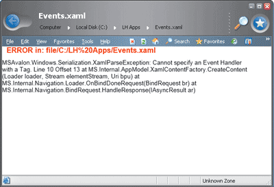
Figure 3** XAML Error **
The project file contains important information about the project. The <Project> tag indicates the type of the package that the compiler must generate. Project properties and items are grouped in nested tags—<ProjectGroup> and <ItemGroup>. Each element is named to make it human-readable. A project file is passed to the msbuild.exe utility on the command line. MSBuild resides in the Framework folder under Windows\ Microsoft .NET. The following simple command generates an executable based on the Events.proj project file:
msbuild.exe Events.proj
Unless you want to practice with the MSBuild tool, you shouldn't care that much about it. As mentioned, the Whidbey version of Visual Studio integrates very well with the Longhorn SDK and lets you build Longhorn applications by clicking the usual toolbar buttons or hitting F5. Figure 5 shows the code of Figure 2 in action. In the application tree, only a blue panel is visible and marked with text. The application tree is slightly more complex than you would expect just looking at Figure 5. The root node is a window which contains a DockPanel object. The DockPanel is the outermost container of all user interface elements and contains one child, a FlowPanel, which in turn contains a Text object. The text is represented by an instance of the Text class. You should notice that XAML tags can have several attributes to control their appearance. More importantly, they support the ID attribute, which provides runtime identification. The MouseLeftButtonDown event associated with the FlowPanel class is raised whenever you click within the area assigned to the control. When this happens, the OnLeftMouseDown event handler code is called. The width and height of the flow panel are doubled and the text is then changed. By clicking again, the original size is restored.
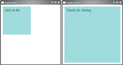
Figure 5** Running the App **
Although nothing prevents you from writing purely procedural applications, the XAML file makes it easier to describe and templatize the user interfaces of your applications.
The XAML Language
There are four main categories of elements that form the XAML vocabulary—panels, interactive controls, document-related elements, and graphic shapes. The Border element is also important, although it doesn't really fall into any of those categories. Technically it's a "decorator" that provides trivial layout, hosting only one child, but adding rendering effects. In XAML, panels handle the page layout and act as containers for other elements. Panels are components that govern the rendering of contained elements, their size and position, and the arrangement of their content. There are six built-in panel classes provided in Longhorn, but developers can create their own panels with custom rendering behaviors. The predefined panels are Canvas, DockPanel, FlowPanel, GridPanel, Table, and TextPanel. These panel types are described in Figure 6.
Figure 6 Panel Classes
| Panel Class | Description |
|---|---|
| Canvas | Defines an area in which you can position child elements using a system of coordinates relative to the Canvas area. |
| DockPanel | Defines an area in which you can arrange child elements relative to each other (docking). |
| FlowPanel | In this area child elements are rendered one after the next, proceeding in the specified direction. When the boundary is reached, the next element wraps accordingly. |
| GridPanel | Defines a grid area consisting of columns and rows. It has a limited set of features. |
| Table | Defines an area that displays complex data in a tabular format. It supports advanced capabilities such as header, footer, column, and row grouping. |
| TextPanel | Defines an area optimized to display text. It provides support for multiple lines of text and more complicated text formatting. |
| Text | Like TextPanel, but more lightweight. For simpler unformatted text. |
The Canvas panel is the only one in the group to support explicit positioning. All of its child elements begin rendering at a fixed location and extend for the specified dimensions. If two elements overlap, the last to render wins and overwrites the underlying area. Notice that the coordinates are relative to the canvas, meaning that (0,0) indicates the top-left pixel of the area. Here's an example of a canvas object:
<Canvas xmlns="https://schemas.microsoft.com/2003/xaml" Height="600" Width="800"> <Border Background="red" Canvas.Top="0px" Canvas.Left="0px" Height="100px" Width="100px" /> <Border Background="green " Canvas.Top="100px" Canvas.Left="100px" Height="100px" Width="100px" /> <Border Background="blue" Canvas.Top="50px" Canvas.Left="50px" Height="100px" Width="100px" /> </Canvas>
The same concept of containment is developed differently by the DockPanel component. All children of this panel are docked to each other either horizontally or vertically. In this case, positioning is relative to the previous control and no coordinates are ever needed. The DockPanel is ideal for creating a strip of buttons like a toolbar would display. Here's an example:
<Border xmlns="https://schemas.microsoft.com/2003/xaml" Background="black" > <DockPanel> <Button DockPanel.Dock="Left" Width="50px" Height="32px"> Open </Button> <Button DockPanel.Dock="Left" Width="50px" Height="32px"> Save </Button> <Button DockPanel.Dock="Left" Width="50px" Height="32px"> Print </Button> </DockPanel> </Border>
The first button is positioned on the left side of the panel and each additional button is aligned next to the previous one in a horizontal line (see Figure 7).
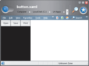
Figure 7** Button Layout **
The FlowPanel element makes child components flow in the available area in various directions. The panel also contains the logic to handle situations in which the content exceeds the width of the panel. In this case, according to the configuration of the object, the exceeding content can wrap to the next line or be clipped. The following XAML example demonstrates how the FlowPanel breaks and wraps content logically designed to fit on a single line. Four square elements are contained by one larger element. The aggregate width of the smaller squares is greater than the width of the container. Because all of the smaller squares do not fit on a single line, the line breaks and the last square wraps to a second line. Notice that the default directional flow of the panel is from left to right and top to bottom:
<FlowPanel xmlns="https://schemas.microsoft.com/2003/xaml" Width="250px" Height="250px"> <Border Background="red" Width="75px" Height="75px" /> <Border Background="green" Width="75px" Height="75px" /> <Border Background="blue" Width="75px" Height="75px" /> <Border Background="orange" Width="75px" Height="75px" /> </FlowPanel>
GridPanel is a lightweight element for laying out objects in a grid-like fashion and subsequently building relatively simple tables. The GridPanel allows you to populate a matrix of rows and columns with any combination of controls, but has a limited feature set overall. More complex tables, characterized by advanced functions, can be built using the Table panel. The structure of the Table panel consists of groups of rows. You can define a group of rows for the header or the footer and insert groups of rows having different settings. The layout capabilities of the panel let you create quite sophisticated tabular representations of data.
Finally, the TextPanel is ideal when complex text layout support is required. However, the Text element is a better choice for basic text support because it has less overhead (and fewer capabilities).
The MSAvalon.Windows.Controls namespace groups all the user controls that are responsible for user interaction. Examples of classes belonging to this namespace are old acquaintances like Button, ComboBox, ListBox, and CheckBox, but also new entries like ContextMenu, PageViewer, and RadioButtonList. The base class for user-interactive elements is Control, which supplies a common set of properties and methods.
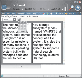
Figure 8** Page Viewer **
In particular, the PageViewer control provides the user interface for viewing online documents and encompasses pagination and page navigation functionalities. The following example generates a page viewer (shown in Figure 8) that takes up the entire client area. The page viewer paginates and displays text from the file specified in the PageViewer tag's Source attribute:
<DockPanel ID="root" xmlns="https:// schemas.microsoft.com/2003/xaml" xmlns:def="Definition"> <Text DockPanel.Dock="Top">See a PageViewer control in action below. </Text> <PageViewer DockPanel.Dock="Top" Source="Sample.xaml" Height="80%" Width="80%"/> <Button DockPanel.Dock="Top" Width="50%">OK</Button> </DockPanel>
It is interesting to note that the source file viewed through a PageViewer control can't be pure text, RTF, or HTML. At least at this time, it has to be an XAML file that contains plain ASCII text wrapped by an Avalon control that supports pagination. Avalon is the code name for a new presentation sybsystem in Longhorn (see the article by Charles Petzold in this issue). For example, take a look at the TextPanel class:
<TextPanel ID="root" xmlns="https://schemas.microsoft.com/2003/xaml"> text to show goes here </TextPanel>
Save this code snippet to sample.xaml in order to run the previous example. Bear in mind that the xmlns namespace is necessary.
The classes in the MSAvalon.Windows.Documents namespace handle document presentation. Taken altogether, these classes may look to you like a superset of advanced HTML tags. You will find classes such as Block, Column, Heading, and Footer, as well as ColumnGroup, RowGroup, HyperLink, List, and more.
The Text class that you saw earlier belongs to the System.Windows.Controls namespace as of this prerelease version of Longhorn. The Text class supports multiple lines and a variety of text formatting specs, including bold and italic, font size, as well as nested child elements. In cases where relatively simple text is required, Text is the preferred class because of its lightweight nature and range of features.
The Longhorn presentation model renders graphics content through the use of XAML panel elements. Panels provide a number of size and alignment properties, as well as control over borders, background color, and fill.
Graphic contents in Longhorn are rendered using Windows Vector Graphics, which provides a number of benefits over GDI and GDI+. Windows Vector Graphics is an XML-based graphical markup system that is easy to use and reuse. If you're a fan of Scalable Vector Graphics, you'll love this, too. Windows Vector Graphics provides predefined shapes including Ellipse, Line, Path, Polygon, Polyline, and Rectangle, which inherit from the Shape class. These elements inherit a number of common attributes from Shape, including Stroke and StrokeThickness, along with Fill, plus some attributes to specify coordinates and vertices. Shapes can be skewed, rotated, translated, and scaled by applying transformations. Just as you can specify solid color fills and backgrounds for shapes, you can specify gradients. The following example sets a horizontal gradient as the Fill property of a Rectangle, with Red as the start color and Blue as the end color:
<Rectangle xmlns="https://schemas.microsoft.com/2003/xaml" Canvas.Top="10" Canvas.Left="10" Fill="HorizontalGradient Red Blue" RectangleLeft="0" RectangleTop="0" Width="50" Height="50"/>
Building a Sample Application
Using the XAML language you can prototype a user interface quickly and efficiently. I'll bet that by the time Longhorn ships, a wealth of development tools will be updated (or built from scratch) to fully support XAML with WYSIWYG features. The Tech Preview edition of Longhorn already includes some extensions to the Whidbey version of Visual Studio .NET. Let's take a look at a more serious, interactive application. You'll quickly discover that it is not very different from writing a Windows Forms app, and you'll be pleasantly surprised to discover how applicable your existing .NET skills are to Longhorn. In Figure 9, you can see the UI for a small sample application involving a textbox and a context menu. The textbox is defined in the XAML; the context menu is created on the fly. The full source code for this app is shown in Figure 10.
Figure 10 The Context Menu App
<Window xmlns="https://schemas.microsoft.com/2003/xaml" xmlns:def="Definition" def:Class="Application2.Window1" def:CodeBehind="Window1.xaml.cs" Text="Application2" Visible="True"> <FlowPanel DockPanel.Dock="Fill"> <TextBox ID="input" Margin="10,10" Background="LightCyan" BorderBrush="black" FontFamily="verdana" FontSize="16" BorderThickness="1" ContextMenuEvent="OnContextMenu" Height="40" Width="360">Right-click to see a context menu</TextBox> </FlowPanel> </Window> // C# source file for the application namespace MsdnLHSample { public partial class MyApp : Application { void AppStartingUp(object sender, StartingUpCancelEventArgs e) { Window mainWindow = new Window1(); mainWindow.Show(); } } } // C# source file for the window using System; using MSAvalon.Windows; using MSAvalon.Windows.Media; using MSAvalon.Windows.Controls; using MSAvalon.Windows.Documents; using MSAvalon.Windows.Navigation; using MSAvalon.Windows.Shapes; using MSAvalon.Windows.Data; namespace MsdnLHSample { // input is the textbox declared in the XAML public partial class Window1 : Window { private void OnContextMenu(object sender, ContextMenuEventArgs e) { CreateMenu(); } private void CreateMenu() { ContextMenu cm = new ContextMenu(); cm.FontFamily = "verdana"; cm.Background = Brushes.LightYellow; MenuItem mi0 = new MenuItem(); mi0.Header = "Lower case"; mi0.FontSize = new FontSize(16); mi0.Click += new ClickEventHandler(LowerCase); cm.Items.Add(mi0); MenuItem mi1 = new MenuItem(); mi1.FontSize = new FontSize(16); mi1.Header = "Upper case"; mi1.Click += new ClickEventHandler(UpperCase); cm.Items.Add(mi1); MenuItem mi2 = new MenuItem(); mi2.Header = "Select All"; mi2.FontSize = new FontSize(16); mi2.Click += new ClickEventHandler(SelectAll); cm.Items.Add(mi2); input.ContextMenu = cm; } public void LowerCase(Object sender, ClickEventArgs args) { MenuItem mi = (MenuItem) args.Source; ContextMenu menu = (ContextMenu) mi.Parent; TextBox thisTextBox = (TextBox) menu.PlacementTarget; thisTextBox.Text = thisTextBox.Text.ToLower(); } public void UpperCase(Object sender, ClickEventArgs args) { MenuItem mi = (MenuItem)args.Source; ContextMenu menu = (ContextMenu)mi.Parent; TextBox thisTextBox = (TextBox)menu.PlacementTarget; thisTextBox.Text = thisTextBox.Text.ToUpper(); } public void SelectAll(Object sender, ClickEventArgs args) { MenuItem mi = (MenuItem)args.Source; ContextMenu menu = (ContextMenu)mi.Parent; TextBox thisTextBox = (TextBox)menu.PlacementTarget; thisTextBox.SelectAll(); } } }
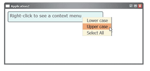
Figure 9** Context Menu **
In Longhorn, all applications are represented by an instance of the Application class. This object is at the core of the Longhorn application model. However, the Application object provides only basic application support and will typically used only by applications that need low overhead and do not use navigation. In the real world, most Longhorn applications will use the closely related NavigationApplication object, which inherits from Application and adds support for navigation.
The NavigationApplication object supports a variety of methods, properties, and events that enable you to make a collection of XAML pages that fit into a single application. In a certain sense, Longhorn applications based on the simpler Application class are comparable to dialog-based Win32 applications. Likewise, you can compare navigation-enabled applications to full-fledged Win32 applications in which a variety of windows and forms contribute to the overall functionality. The following code shows an example of such navigation:
myApp = NavigationApplication.Current; win = (Navigation.NavigationWindow) myApp.Windows[0]; ••• private void Button_Back(Object sender, ClickEventArgs e) { // If possible, go to the previous window if(win.CanGoBack()) win.GoBack(); }
You get the reference to the application object by using the static Current property on the Application (or NavigationApplication) navigation object. The previous example demonstrates how to obtain a reference to the first window in the stack. The Button_Back event handler checks to see if a previous window object exists and, if so, jumps back to it in a browser-like manner.
The next example describes how to customize the start-up behavior of a navigation application by deriving a new class and overriding the OnStartingUp method. The following code fragment overrides OnStartingUp to create and display a navigation window when the application starts up:
public class MyApp : NavigationApplication { NavigationWindow win; ••• protected override void OnStartingUp(StartingUpCancelEventArgs e) { win = new NavigationWindow(); // Add elements to the window ••• navWin.Show(); } ••• }
Let's switch back to the sample application shown in Figure 9. In light of the considerations I just discussed, you could either use Application or NavigationApplication as the base class because the application is going to use a single window, dialog-based application. The working class—named Sample1—overrides OnStartingUp and defines quite a few event handlers. Overriding the OnStartingUp method is a necessity because it represents the initialization step of the application startup and therefore it is the ideal location in which to perform your own manipulations before the window opens.
The operation accomplished in OnStartingUp is the creation of the window. The contents of the window are described in the XAML file and its codebehind class. The XAML page itself is constructed of controls and other components organized in a hierarchical tree. It is the relationship between these various components, called elements, that accounts for much of how a page renders and behaves. The sample page in Figure 9 has a TextBox control with a given size and font. The textbox is bound to the ContextMenuEvent event. The event is raised whenever the user right-clicks the client area of the control.
The event handler creates a ContextMenu object (see Figure 10). The context menu is populated and graphically configured, then bound to its parent object, which is a TextBox. It is worth noting that Longhorn allows you to easily customize the appearance of the menu (as well as that of all controls) by choosing background and foreground colors, borders, and fonts. Don't be fooled by the fact that this was also possible in previous versions of Windows and, of course, in the .NET Framework. In Win32, this sort of customization required a lot of programming work and was anything but simple. In the .NET Framework, wrapper classes buried only the necessary code in the folds of the Framework, exposing only a few properties to the user. In Longhorn, on the other hand, the user interface of a control is as simple as it looks.
The elements of a context menu are created from the MenuItem class. The way to wire them to event handlers is nearly identical to that of a Framework-based application:
mia = new MenuItem[3]; for (int i=0; i<3; i++) { mia[i] = new MenuItem(); cm.Items.Add(mia[i]); mia[i].Foreground = Brushes.Black; } mia[0].Header = "Lower Text"; mia[1].Header = "Upper case"; mia[2].Header = "Select all"; mia[0].Click += new ClickEventHandler(LowerCase); mia[1].Click += new ClickEventHandler(UpperCase); mia[2].Click += new ClickEventHandler(SelectAll);
When a particular menu item is clicked, the event handler executes and retrieves a reference to its source object using the first argument that gets passed:
public void LowerCase(Object sender, ClickEventArgs args) { MenuItem mi = (MenuItem) args.Source; ContextMenu menu = (ContextMenu) mi.Parent; TextBox thisTextBox = (TextBox) menu.PlacementTarget; thisTextBox.Text = thisTextBox.Text.ToLower(); }
To retrieve the TextBox, you have to walk your way up to the tree. First, get to the MenuItem, then to the ContextMenu, and finally you can access its owner, the TextBox. At this point, modifying the contents of the TextBox is straightforward.
Conclusion
Longhorn represents a landmark in the history of the Windows operating system. It will be the first version of Windows designed specifically around managed code. Further establishing the significance of Longhorn is its new application model; its design and implementation is the culmination of previous experience in application modeling for .NET Framework-based applications and ASP.NET applications in particular.
Longhorn applications are built around the Application object and enable you to make a collection of markup pages into a coherent application. The presence of the XAML language behind Longhorn apps is also a sign of the abstraction level around which the Longhorn application model has been designed. The ultimate goal of Longhorn is to let you write applications once and deploy them in a variety of scenarios, both Web- and client-based.
Introducing the application model of a new platform that very few people have experimented with is not an easy task. It is even more difficult if you consider the likelihood that some aspects will change significantly in the future. In light of this, think of this article as snapshot of where Longhorn is now and a glimpse at where it is going.
I've included a sample project as a code download to help you get up and running with Longhorn. You can get this project from the link at the top of this article.
Dino Esposito is an instructor and consultant based in Rome, Italy. Author of Programming ASP.NET, for Microsoft Press, he spends most of his time teaching classes on ADO.NET and ASP.NET and speaking at conferences. Get in touch with Dino at cutting@microsoft.com.