March 2009
Volume 24 Number 03
Foundations - Writing More Efficient ItemsControls
By Charles Petzold | March 2009
Contents
An ItemsControl Scatter Plot
The Performance Disappointment
Hidden Loops
Using Value Converters
Watch Out for Freezables!
An Intermediary Presenter
Custom Data Element
Biting the Bullet
The DrawingVisual Solution
There comes a time in the life of every Windows Presentation Foundation (WPF) programmer when the true power of the DataTemplate suddenly becomes evident. This epiphany is usually accompanied by the realization, "Hey, I can use a DataTemplate to create a bar chart or a scatter plot with virtually no coding."
A DataTemplate is most commonly created in conjunction with an ItemsControl or a class that derives from ItemsControl, which includes ListBox, ComboBox, Menu, TreeView, ToolBar, StatusBar—in short, all the controls that maintain a collection of items. The DataTemplate defines how each item in the collection is displayed. The DataTemplate consists mostly of a visual tree of one or more elements, with data bindings that link the items in the collection with properties of these elements. If the items in the collection implement some kind of property-change notification (most often by implementing the INotifyPropertyChanged interface), the Items-Control can dynamically respond to changes in the items.
The disappointment might come a little later. If you need to display lots of data, you might discover that the ItemsControl and DataTemplate don't scale well. This column is about what you can do to combat those performance issues.
An ItemsControl Scatter Plot
Let's create a scatter plot from an ItemsControl and a DataTemplate. The first step is to create a business object representing the data item. Figure 1shows a simple class with the generic name DataPoint (slightly abridged). DataPoint implements the INotifyPropertyChanged interface, which means that it contains an event named PropertyChanged that the object fires whenever a property has changed.
Figure 1 The DataPoint Class Represents a Data Item
public class DataPoint : INotifyPropertyChanged { int _type; double _variableX, _variableY; string _id; public event PropertyChangedEventHandler PropertyChanged; public int Type { set { if (_type != value) { _type = value;
OnPropertyChanged("Type"); } } get { return _type; } } public double VariableX [...] public double VariableY [...] public string ID [...] protected virtual void OnPropertyChanged(string propertyName) { if (PropertyChanged != null)
PropertyChanged(this, new PropertyChangedEventArgs(propertyName)); } }
The VariableX and VariableY properties indicate the point's position in a Cartesian coordinate system. (For this column, the values range from 0 to 1.) The Type property can be used to group data points (it will have values from 0 through 5 and be used to display information in six different colors), and the ID property identifies each point with a text string.
In a real-life application, the following DataCollection class might contain more properties, but for this example it has only one, DataPoints, of type ObservableCollection<DataPoint>:
public class DataCollection { public DataCollection(int numPoints) { DataPoints = new ObservableCollection<DataPoint>(); new DataRandomizer<DataPoint>(DataPoints, numPoints, Math.Min(1, numPoints / 100)); } public ObservableCollection<DataPoint> DataPoints { set; get; } }
ObservableCollection has a CollectionChanged property that is fired whenever items are added to or removed from the collection.
This particular DataCollection class creates all the data items in its constructor by using a class named DataPointRandomizer that generates random data for testing purposes. The DataPointRandomizer object also sets a timer. Every tenth of a second, the timer-tick method changes the VariableX or VariableY property in 1% of the points. Therefore, on average, all the points change every 10 seconds.
Now let's write some XAML that displays this data in a scatter plot. Figure 2shows a UserControl that contains an ItemsControl. The DataContext of this control will be set in code to an object of type DataCollection. The ItemsSource property of the ItemsControl is bound to the DataPoints property of the DataCollection, which means that the ItemsControl will be filled with items of type DataPoint.
Figure 2 The DataDisplay1Control.xaml File
<UserControl x:Class="DataDisplay.DataDisplayControl" xmlns="https://schemas.microsoft.com/winfx/2006/xaml/presentation" xmlns:x="https://schemas.microsoft.com/winfx/2006/xaml" xmlns:data="clr-namespace:DataLibrary;assembly=DataLibrary"> <ItemsControl ItemsSource="{Binding DataPoints}"> <ItemsControl.ItemTemplate> <DataTemplate DataType="data:DataPoint"> <Path> <Path.Data> <EllipseGeometry RadiusX="0.003"
RadiusY="0.003"> <EllipseGeometry.Transform> <TranslateTransform X="{Binding VariableX}" Y="{Binding VariableY}" /> </EllipseGeometry.Transform> </EllipseGeometry> </Path.Data> <Path.Style> <Style TargetType="Path"> <Setter
Property="Fill" Value="Red" /> <Style.Triggers> <DataTrigger Binding="{Binding Type}" Value="1"> <Setter Property="Fill" Value="Yellow" /> </DataTrigger> <DataTrigger Binding="{Binding Type}" Value="2"> <Setter Property="Fill"
Value="Green" /> </DataTrigger> <DataTrigger Binding="{Binding Type}" Value="3"> <Setter Property="Fill" Value="Cyan" /> </DataTrigger> <DataTrigger Binding="{Binding Type}" Value="4"> <Setter Property="Fill" Value="Blue" />
</DataTrigger> <DataTrigger Binding="{Binding Type}" Value="5"> <Setter Property="Fill" Value="Magenta" /> </DataTrigger> </Style.Triggers> </Style> </Path.Style> <Path.ToolTip> <StackPanel Orientation="Horizontal"> <TextBlock
Text="{Binding ID}" /> <TextBlock Text=", X=" /> <TextBlock Text="{Binding VariableX}" /> <TextBlock Text=", Y=" /> <TextBlock Text="{Binding VariableY}" /> </StackPanel> </Path.ToolTip> </Path> </DataTemplate>
</ItemsControl.ItemTemplate> <ItemsControl.ItemsPanel> <ItemsPanelTemplate> <Grid Background="Azure" LayoutTransform="300 0 0 300 0 0" IsItemsHost="True" /> </ItemsPanelTemplate> </ItemsControl.ItemsPanel>
</ItemsControl> </UserControl>
The ItemTemplate property of the ItemsControl is set to a DataTemplate that defines a visual tree for the display of each item. This tree consists of just a Path element with its Data property set to an EllipseGeometry. It's really just a little dot—and I mean a very little dot—with a radius of 0.003 units. But it's not as tiny as it seems because the ItemPanel property of the ItemsControl is set to an ItemsPanelTemplate containing a single-cell Grid to display all the dots. This Grid is given a LayoutTransform that scales it by a factor of 300, which makes the data dots almost 1 unit in radius.
This odd manipulation is mandated by the data bindings of the VariableX and VariableY properties to the X and Y properties of a TranslateTransform. The VariableX and VariableY properties only range from 0 to 1, so it's necessary to increase the size of the Grid to occupy an area on the screen 300 units square.
The Fill property of the Path element is set in a Style to a Brush based on the value of the Type property in each DataPoint object. The Path object is also assigned a ToolTip that displays the information about each data point.
The Performance Disappointment
The source code that accompanies this column consists of one Visual Studio solution containing seven projects: six applications and one library. The library named DataLibrary contains most of the shared code, including DataPoint, DataCollection, and DataPointRandomizer.
The first application project is named DataDisplay1. It contains a MainWindow class that is shared among the other applications, and the DataDisplay1Control.xaml file shown in Figure 2. MainWindow accesses the control for displaying the scatter plot but also includes a TextBox to enter an item count, a button to begin creating the collection, and TextBlock objects that display elapsed time during three stages of the processes that culminate in the display of the chart.
By default, the number of items is 1,000, and the program seems to work fine. But set the number of items to 10,000, and there's a delay before the display shown in Figure 3, which also illustrates very much the artificiality of the generated data.
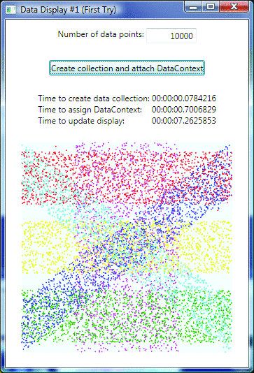
Figure 3 The DataDisplay1 Display
Three elapsed times are displayed. When you click the button, the Click handler in MainWindow.xaml.cs begins by creating an object of type DataCollection with the specified number of data points. The first elapsed time is for the creation of this collection. The collection is then set to the DataContext of the window. That's the second elapsed time. The third elapsed time is the time required for the ItemsControl to display the resultant data points. To compute this third elapsed time, I used the LayoutUpdated event for lack of a better alternative.
As you can see, the bulk of the time involves updating the display; on my machine the average of three trials was 7.7 seconds. This is rather disturbing, particularly considering that this program really has nothing wrong with it. It is using WPF features in the way they were intended. What exactly is going on here?
When the program sets the DataContext property to an object of type DataPointCollection, the ItemsControl receives a property-change notification for the ItemsSource property. The ItemsControl enumerates through the collection of DataPoint objects, and for each DataPoint object it creates a ContentPresenter object. (The ContentPresenter class derives from FrameworkElement; this is the same element that ContentControl derivatives such as Button and Window use to display the control's content.)
For each ContentPresenter object, the Content property is set to the corresponding DataPoint object, and the ContentTemplate property is set to the ItemTemplate property of the ItemsControl. These ContentPresenter objects are then added to the panel used by the ItemsControl to display its items—in this case, a single-cell Grid.
This part of the process goes fairly quickly. The time-consuming part comes when the ItemsControl must be displayed. Because the panel has accumulated new children, its MeasureOverride method is called, and it is this call that requires 7.7 seconds to execute for 10,000 items.
The panel's MeasureOverride method calls the Measure method of each of its ContentPresenter children. If the ContentPresenter child has not yet created a visual tree to display its content, it must now do so. The ContentPresenter creates this visual tree based on the template stored in its ContentTemplate property. The ContentPresenter must also set up the data bindings between the properties of the elements in that visual tree and the properties of the object stored in its Content property (in this example, the DataPoint object). The ContentPresenter then calls the Measure method of the root element of this visual tree.
If you're interested in exploring this process in more detail, the DataLibrary DLL includes a class named SingleCellGrid that lets you probe inside the panel. In the DataDisplay1Control.xaml file, you can just replace Grid with data:SingleCellGrid.
When a ListBox contains many items but displays only a few, it bypasses a lot of this initial work because by default it uses a VirtualizingStackPanel that creates children only as they are being displayed. This is not possible with a scatter plot, however.
Hidden Loops
The loop is the fundamental construct of computer programming. The only reason we use computers is to write loops that perform repetitive chores. Yet loops seem to be disappearing from our programming experience. In functional programming languages such as F#, loops are relegated to old-style programming and are often replaced with operations that work over entire arrays, lists, and sets. Similarly, query operators in LINQ perform operations over collections without explicit looping.
This move away from explicit looping is not just a change in programming style but an essential evolutionary development to keep pace with computer hardware changes. New computers today routinely have two or four processors; in the years ahead we may see machines with hundreds of processors that perform in parallel. Loops that are handled behind the scenes in programming languages or development frameworks can more easily take advantage of parallel processing without any special work by the programmer.
Until that magical future, however, we must remain aware that the loops still exist even though we can't see them, and as a wise programmer once noted, "There ain't no such thing as a free loop."
The DataTemplate defined within the ItemTemplate section of an ItemsControl is inside a hidden loop. That DataTemplate is invoked for the creation of potentially thousands of elements and other objects, as well as the establishment of data bindings.
If we actually had to code the loop, we would all probably be much more careful designing that DataTemplate. Because of its impact on performance, fine-tuning the DataTemplate is well worth the time and effort. Just about anything you do to it will probably have a perceptible impact on performance. Often, just how much impact (and in what direction) can be hard to predict, so you'll probably want to experiment with several approaches.
In general, you'll want to simplify the visual tree in the DataTemplate. Try to minimize the number of elements, objects, and data bindings.
Go to DataDisplay1Control.xaml and try eliminating the data bindings on the TextBlock items in the ToolTip. (You can simply insert any character in front of the left curly brackets.) You should shave a couple tenths of a second off the previous time of 7.7 seconds.
Now comment out the whole ToolTip section, and you'll see the display time drop down to 4.7 seconds. Set a Fill property in the Path element to some color, and comment out the whole Style section, and now the display time drops down to 3.5 seconds. Remove the transform from the Path element, and it will come down to about 1 second.
Of course, now it's worthless because it's not displaying the data, but you can probably see how you can begin to get a feel for the impact of these items. It's just a little bit of markup, but it's worth a lot of experimentation.
Here's a change that improves both performance and readability without hurting functionality: replace the content of the Path.ToolTip tags with the following:
<TextBlock> <TextBlock.Text> <MultiBinding StringFormat="{}{0}, X={1}, Y={2}"> <Binding Path="ID" /> <Binding Path="VariableX}" /> <Binding Path="VariableY}" /> </MultiBinding> </TextBlock.Text> </TextBlock>
The StringFormat option on bindings is new in .NET 3.5 SP1, and using it here gets the display time down from 7.7 seconds to 6.4.
Using Value Converters
Data bindings can optionally reference little classes called value converters, which implement either the IValueConverter or IMultiValueConverter interface. Methods in the value converters named Convert and ConvertBack perform data conversion between the binding source and destination.
Converters are often generalized to be applicable in a variety of applications; one example is the handy BooleanToVisibilityConverter used to convert true and false to Visibility.Visible and Visibility.Collapsed, respectively. But converters can be as ad hoc as you need them to be.
To simplify the DataTemplate and reduce the number of data bindings, two converters could be created. The converter shown in Figure 4is named IndexToBrushConverter (included in the DataLibrary DLL) and converts a non-negative integer into a Brush. The converter has a public property named Brushes of type Brush array, and the integer is simply an index into that array.
Figure 4 The IndexToBrushConverter Class
public class IndexToBrushConverter : IValueConverter { public Brush[] Brushes { get; set; } public object Convert(object value, Type targetType, object parameter, CultureInfo culture) { return Brushes[(int)value]; } public object
ConvertBack(object value, Type targetType, object parameter, CultureInfo culture) { return null; } }
In a resource section of a XAML file, the converter can be instantiated with an x:Array group like so:
<data:IndexToBrushConverter x:Key="indexToBrush"> <data:IndexToBrushConverter.Brushes> <x:Array Type="Brush"> <x:Static Member="Brushes.Red" /> <x:Static Member="Brushes.Yellow" /> <x:Static Member="Brushes.Green" /> <x:Static Member="Brushes.Cyan" /> <x:Static Member="Brushes.Blue" /> <x:Static Member="Brushes.Magenta" /> </x:Array> </data:IndexToBrushConverter.Brushes> </data:IndexToBrushConverter>
You can then replace the whole Style section shown in Figure 2with a binding that references this converter:
<Path Fill="{Binding Type, Converter={StaticResource indexToBrush}}">
The second converter in DataLibrary is called DoublesToPointConverter. This converter implements the IMultiValueConverter interface to create a Point from two doubles, X and Y. Note that using this converter allows the Center property of the EllipseGeometry to be set directly, eliminating the need for the TranslateTransform.
The DataDisplay2 project includes these converters and uses the StringFormat approach to the ToolTip, but the times are disappointing: 7.7 seconds with the ToolTip, 4.4 seconds without, and 3.4 with a constant Fill brush.
Normally, I would expect the converters to improve performance. I'm not sure why that's not the case here, but I wouldn't be surprised if it were a boxing and unboxing issue. In the DoublesToPointConverter, for example, the incoming double values have to be boxed and unboxed, and the outgoing Point has to be boxed and unboxed.
Watch Out for Freezables!
If you want to see performance of DataDisplay2 really degrade, try replacing these x:Static members in the Brush:
<x:Static Member="Brushes.Red" />
with SolidColorBrush objects:
<SolidColorBrush Color="Red" />
The display time leaps up to 20 seconds and beyond! Yet the x:Static and SolidColorBrush elements seem pretty much the same. The static Brushes.Red property returns a SolidColorBrush with Color set to Red.
But keep in mind that SolidColorBrush derives from Freezable. The Brushes.Red property returns a SolidColorBrush that is frozen and thread safe. The value cannot be changed. When this brush is passed into the visual composition system, it can be treated as a constant.
The explicit SolidColorBrush, however, is not frozen. It remains alive in the visual composition system and will respond to changes in its Color property. That dynamic potentiality is more complex for the system to handle, and that reveals itself in performance degradation.
As a result, note that you should freeze any freezable object that will no longer be altered. In code, you call the Freeze method; in XAML, you can use the PresentationOptions:Freeze option. Very often you'll find that the difference will be negligible, but with the use of unfrozen brushes in 10,000 graphics objects, obviously it's a crucial factor.
An Intermediary Presenter
In many common application architectures, it is customary to have some kind of intermediary between the user interface and the actual business objects (in this example, DataPoint and DataCollection). Out of respect for tradition, I'll call this intermediary a "presenter" (although traditional presenters do rather more than the one I'll be showing here).
One of the roles of this presenter might be to make information from the business object more amenable to bindings to the user interface. For example, the DataPoint business object has properties named VariableX and VariableY of type double. The DataPointPresenter class (as I'll call it) might instead have a property named Variable of type Point.
For performance purposes I wrote DataPointPresenter to derive from DataPoint. Besides the Variable property, it also defines properties named Brush (of type Brush) and ToolTip (of type string). Figure 5shows a lightly abbreviated version of the DataPointPresenter class.
Figure 5 The DataPointPresenter Class
public class DataPointPresenter : DataPoint { static readonly Brush[] _brushes = { Brushes.Red, Brushes.Yellow, Brushes.Green, Brushes.Cyan, Brushes.Blue, Brushes.Magenta }; Point _variable; Brush _brush; string _tooltip; public
Point Variable [...] public Brush Brush [...] public string ToolTip [...] protected override void OnPropertyChanged(string propertyName) { switch (propertyName) { case "VariableX": case "VariableY": Variable = new Point(VariableX, VariableY);
goto case "ID"; case "ID": ToolTip = String.Format("{0}, X={1}, Y={2}", ID, VariableX, VariableY); break; case "Type": Brush = _brushes[Type]; break; } base.OnPropertyChanged(propertyName); } }
The DataLibrary DLL also contains a DataCollectionPresenter class that is identical to DataCollection except it maintains a collection of DataPointPresenter objects.
The DataDisplay3 project incorporates these presenter classes. The entire DataTemplate looks like this:
<DataTemplate DataType="data:DataPointPresenter"> <Path Fill="{Binding Brush}" ToolTip="{Binding ToolTip}"> <Path.Data> <EllipseGeometry Center="{Binding Variable}" RadiusX="0.003" RadiusY="0.003" /> </Path.Data> </Path> </DataTemplate>
This approach works much better than the converters, bringing the display time down to 3.3 seconds with all the features, including the ToolTip. The big drawback here—and you might shrug it off or consider it a severe deficiency—is that the various brushes are now hardcoded in the DataPointPresenter class. This is not optimal. In WPF programming it's always nice to be able to close the code files while continuing to fine-tune the XAML.
Having those brushes in the XAML file is preferred, particularly if the Type values were ever to increase beyond the number 5. One approach might be to store the array of brushes in the Resources section of the Application XAML file and have the first instance of the DataPointPresenter access them and store them in a static variable. Now that you've seen how much impact the presenter has in this example, I won't be using it in the remaining approaches.
Custom Data Element
To draw the little dots in the scatter plot, I've been using a Path element with its Data property set to an EllipseGeometry. Because EllipseGeometry has a Center property of type Point, I've had to create a converter or a presenter to obtain a Point object from two properties of type double.
Another solution is to replace this Path and EllipseGeometry combination with a custom FrameworkElement derivative that draws a dot. Since we're writing it ourselves, it can have CenterX and CenterY properties of type double instead of a Center property of type Point. Rather than a Fill property of type Brush, it can have a FillIndex property of type int that indexes a Brushes property of type Brush array.
Such a class (called DataDot in the DataLibrary project) is fairly trivial, consisting mostly of dependency properties and CLR properties that wrap those dependency properties. MeasureOverride consists of one line:
return new Size(CenterX + RadiusX, CenterY + RadiusY);
OnRender is nearly as simple:
if (Brushes != null) dc.DrawEllipse(Brushes[FillIndex], null, new Point(CenterX, CenterY), RadiusX, RadiusY);
In the DataDisplay4 project, DataDot appears in the DataTemplate like this:
<data:DataDot CenterX="{Binding VariableX}" CenterY="{Binding VariableY}" Brushes="{StaticResource brushes}" FillIndex="{Binding Type}" RadiusX="0.003" RadiusY="0.003">
The brushes resource key references an x:Array element containing the six colors.
The DataDisplay4 project that uses this custom element displays itself in 3.3 seconds with the ToolTip and in 2.5 seconds without, which is an excellent performance improvement considering the trivial nature of the DataDot class.
Biting the Bullet
If you've stripped the DataTemplate down to the tiniest number of elements and objects and reduced the data bindings to the minimum possible, and you've done everything else you can think of and performance is still not good enough for you, maybe it's time to bite the bullet.
And by that I mean, maybe it's time to acknowledge that the combination of an ItemsControl and a DataTemplate is indeed powerful but perhaps not quite the solution you need for this particular application. This acknowledgment does not constitute an abandonment of WPF: you're still going to be using WPF to implement your solution. It is simply a recognition that the behind-the-scenes creation of 10,000 FrameworkElement derivatives is perhaps not the most efficient use of resources. The alternative is a custom FrameworkElement derivative that does the whole thing—one element rather than 10,000 elements.
The ScatterPlotRender class in the DataLibrary DLL derives from FrameworkElement and has three dependency properties: ItemsSource of type ObservableNotifiableCollection<DataPoint>, Brushes of type Brush array, and Background of type Brush.
You might remember the ObservableNotifiableCollection class from my column " Dependency Properties and Notifications" in the September 2008 issue of MSDN Magazine. This class requires that its members implement the INotifyPropertyChanged interface. The class fires an event not only when objects are added to or removed from the collection but when properties of objects in the collection change. This is how ScatterPlotRender will be alerted when the VariableX and VariableY properties of the DataPoint objects change.
The ScatterPlotRender class handles all these events in a very simple way. Whenever the ItemsSource property changes, or the collection changes, or a property of the DataPoint objects in the collection changes, ScatterPlotRender calls InvalidateVisual. This generates a call to OnRender, which draws the entire scatter plot. The code is shown in Figure 6.
Figure 6 OnRender
protected override void OnRender(DrawingContext dc) { dc.DrawRectangle(Background, null, new Rect(RenderSize)); if (ItemsSource == null || Brushes == null) return; foreach (DataPoint dataPoint in ItemsSource) {
dc.DrawEllipse(Brushes[dataPoint.Type], null, new Point(RenderSize.Width * dataPoint.VariableX, RenderSize.Height * dataPoint.VariableY), 1, 1); } }
Notice that the VariableX and VariableY values are multiplied by the width and height of the element, which would probably be set in the XAML file. The DataDisplay5 project has a XAML file that instantiates a ScatterPlotRender object, like so:
<data:ScatterPlotRender Width="300" Height="300" Background="Azure" ItemsSource="{Binding DataPoints}" Brushes="{StaticResource brushes}" />
The brushes resource key references an array of frozen SolidColorBrush objects.
The good news is that this scatter plot pops up on the screen very quickly. Drawing in its OnRender method is the fastest way a WPF element can be presented visually. The bad news is that the element continues to entirely redraw itself whenever the VariableX or VariableY property changes, and this happens every tenth of a second. Earlier versions used about 10% of CPU time for updating themselves (on my machine). This one is up in the 30% region. If your application displays frequently updated data, you might want to refine the way you perform the drawing (coming up next).
The other big drawback is that there is now no ToolTip. A ToolTip is not impossible in this class, but it's rather messy. I'll have a ToolTip in the next version.
The DrawingVisual Solution
A class that derives from FrameworkElement generally draws itself in the OnRender method, but it can also have a visual appearance by maintaining a collection of visual children. These children appear on top of whatever the OnRender method draws.
Visual children can be anything that derives from Visual, which includes FrameworkElement and Control, but a FrameworkElement derivative can also create comparatively lightweight visual children in the form of DrawingVisual objects.
If a FrameworkElement derivative creates DrawingVisual objects, it usually stores them in a VisualChildren collection, which handles some of the overhead involved in maintaining visual children. The class still needs to override VisualChildrenCount and GetVisualChild, however.
The ScatterPlotVisual class works by creating a DrawingVisual object for each DataPoint. When the properties of a DataPoint object change, the class only needs to alter the DrawingVisual associated with that DataPoint.
Like the ScatterPlotRender class, the ScatterPlotVisual class defines dependency properties named ItemsSource, Brushes, and Background. It also maintains a VisualChildren collection that must be kept synchronized with the ItemsSource collection. If an item is added to the ItemsSource collection, a new visual must be added to the VisualChildren collection. If an item is removed from the ItemsSource collection, the corresponding visual must be removed from the VisualChildren collection. If the VariableX or VariableY property of an item in the ItemsSource collection changes, the corresponding item in the VisualChildren collection must change.
To help with this synchronization, the VisualChildren collection does not actually store objects of type DrawingVisual but instead maintains objects of type DrawingVisualPlus, which is defined internal to the ScatterPlotVisual class like this:
class DrawingVisualPlus : DrawingVisual { public DataPoint DataPoint { get; set; } }
This additional property makes it easy to find a particular DrawingVisualPlus object in the VisualChildren collection corresponding to a particular DataPoint object.
The DataDisplay6 project that implements this approach is the best overall approach. I'm sure the startup creation time is slightly greater than DataDisplay5, but it's barely noticeable, and the update overhead is considerably reduced.
If you jump up to 100,000 data points, however, WPF again buckles under the strain. At this level of graphics output, I'm afraid I've run out of suggestions. (Perhaps get a faster machine?)
Send your questions and comments to mmnet30@microsoft.com.
Charles Petzold is a longtime Contributing Editor to MSDN Magazine. His most recent book is The Annotated Turing: A Guided Tour through Alan Turing's Historic Paper on Computability and the Turing Machine(Wiley, 2008). His Web site is www.charlespetzold.com.