March 2009
Volume 24 Number 03
Usability in Practice - Strategies For Designing Application Navigation
By Dr. Charles Kreitzberg, Ambrose Little | March 2009
Contents
THE COGNITIVE VIEW
Navigation Is a Metaphor
Why Users Get Confused
Group Multiple Pages into Logical Sections
Create a Frame
Use Navigational Aids
Take Aways
THE SOFTWARE VIEW
Copying the Big Guys
Card Sorting
UX Design Patterns
Clear Entry Points
Implementation
Controls
Testing, Tracking, and Tweaking
In Summary
THE COGNITIVE VIEW

Dr. Charles B. Kreitzberg
Getting the navigation right is one of the most important aspects of design. Navigation is the framework within which screens, interaction, and the visual appearance are designed. The most basic axiom of usability is that one should make interaction with the software as easy as possible, allowing users to focus on the tasks that brought them to the software in the first place. To the extent that navigation is confusing and requires the user's attention to figure it out, usability will suffer.
Navigation Is a Metaphor
The term "navigation" conveys the idea of traveling from place to place. It suggests that there are paths you follow to get from point to point and an underlying framework that directs (and restricts) how you get there. Yet, although we talk freely about navigating through a software product, we never actually go anywhere. We stay in one place while the image on the screen changes in response to our interactions with it. So "navigation" is really a metaphor, a mental game we play to get our minds around the design.
When most people think about navigation, they focus on menus as the way to move from screen to screen. But it is quite possible to write powerful programs built around a single screen. Think about Microsoft Word, for example. Despite its extensive and powerful functionality, almost the entire program is built around a single screen, as you see in Figure 1.
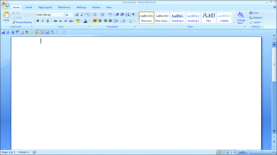
Figure 1 Deconstructing Word—It’s All in One Screen
The document being worked on is central in the screen design. Tools selected from the Ribbon are applied to the document and change its content or appearance. When a tool requires a complex interaction, it typically pops up a child window over the document. The child window may be a modal one in which the user must complete the interaction and dismiss the child window before returning to the document—an example is the insert picture command. It might be a wizard that walks the user through a process. Alternatively, the child window may be modeless, like the Thesaurus command, in which case it is docked on the side where it can remain open while the user works on the document.
The advantage of a simple, one-screen navigational approach is that the user never becomes disoriented. The document remains in plain view all the time. The user still needs to learn where to find the tools and how they work but will never get lost in cyberspace or wonder where his document went. In addition to its almost universal use in word processing programs, the one-screen paradigm has been used successfully in graphics programs like Microsoft Paint and spreadsheet programs like Microsoft Excel. Excel demonstrates a powerful way to maintain the metaphor of a single screen with multiple documents by switching the active document when the user clicks on the associated tab, which you can see on the bottom left corner of Figure 2.
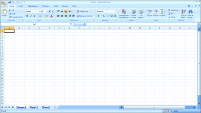
Figure 2 Excel Also Uses a Single Screen
There is a great deal of value in the simplicity of the single screen metaphor. But most programs are built around the metaphor of multiple screens (or pages). Once you decide to design your presentation layer around multiple pages, you can generate a lot of confusion. As a result of observing many usability tests, I've come to realize that every time you take users to a new page, you run the risk of disorienting them.
Why Users Get Confused
When you think about it, it's not surprising that navigating from screen to screen is disorienting. Disorientation means that the user has lost direction. Look at the two users in Figure 3. Bob is working with a program designed around a single screen. Sally is working with a program designed around multiple screens.
Looking at this diagram, it's clear that Sally has a more difficult cognitive task. Not only does she have to think about where she is and where she needs to go, but the tricky process of developing an internal roadmap is further complicated by the fact that Sally is only seeing one screen at a time. Lacking a bird's eye view of the terrain, she needs to piece her mental model together at the same time she is learning unfamiliar software. That's a lot of extra work, and it can lead to a steep learning curve.
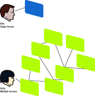
Figure 3 Getting the User Confused
The site or product's navigation serves to frame the entire design of the presentation layer. If you get it right you will go a long way to increasing the usability of the product. Consider the following suggestions as you begin designing the navigation:
Feature Single Page Navigation Wherever Possible
The single page metaphor is simple and powerful. Putting more functionality on a page can improve usability a lot, provided you're careful with the screen design so that the user is not confused or overwhelmed. What is powerful about the single screen design is that people don't lose the context while they are looking at the new information.
As a result of the document-orientation of the Web, the frequency with which search engines lead a user to an internal page, the restrictions of search engine optimization SEO techniques, and the clunky page redrawing characteristics of HTML and its primitive UI controls, it has become common to create lots of Web pages as a standard design practice. There are situations in which it's okay to have lots of pages and drop the user anywhere, but these are rare. The gratuitous linking that is the joy and power of the World Wide Web is great for browsing but does not translate well to situations in which task flow is involved.
The failure to realize how disorienting it can be to move a user from page to page often leads to designing more pages than are needed. I've had users tell me in usability tests that they go directly to the search box to find the page they want, rather than try to contend with the site's navigation.
Today we have the ability to create rich Web pages with sophisticated UI controls. Tabs, carousels, accordions, tooltips, and child windows are readily available and can reduce the amount of screen-to-screen navigation needed.
A design idea that I take seriously is to avoid screen-to-screen navigation when I can. A simple example will show you why. Figure 4 shows a typical Web navigation design.
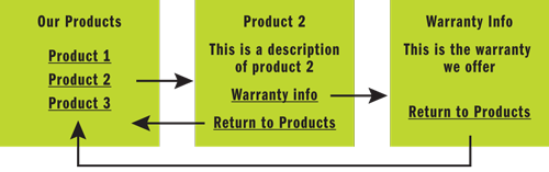
Figure 4 Typical Web Navigation
Here the company has a series of products that are presented as a list on the first page. Clicking on the desired product name takes the user to a product information page from which he can either return to the product list or go to a third page and view the warranty.
Now let's look at a single screen version of the navigation (see Figure 5). In this version the three products are presented in a tab control. Clicking on the tab reveals the product description. If the user clicks on the "Warranty Information" link, a modal pop-up window displays the information. When the user closes the pop-up, he or she is back at the initial page.
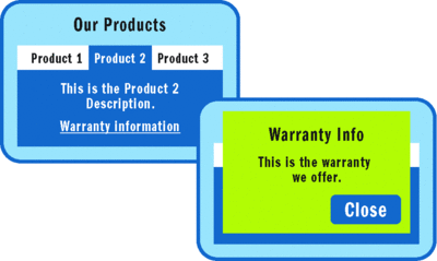
Figure 5 A Single-Screen Navigation Model
Of course, tabs don't scale well if you need to handle many choices, so you might consider a list view control or a more exciting control like a carousel. Just from the diagrams, you can see how much simpler the second navigational model is. And it has the advantage that you can have lots of links on the product tabs and bring up a separate window (or wizard) for each. You always return to your base with a single click, and it's got the same product showing as when you brought up the pop-up window. Users will find it a lot simpler because it maintains context. The user never leaves the page to get the details.
Of course, most of the products I design have multiple pages. After all, there are limits to the amount of functionality you can fit onto a single page. And used carefully, multiple pages can simplify the UI by grouping functionality in a meaningful way. The trick is to realize that every time you take a user to a new page you risk losing context and disorienting the user, so I use them sparingly and carefully. And I think hard about the right way to segment the pages.
Group Multiple Pages into Logical Sections
My navigational nightmare is the humble HTML link. (It's actually a nightmare my colleague Ben Shneiderman and I helped perpetrate with HyperTies, a pre-Web hypertext browser—but that's a story for another time.) Every time a user clicks a link, they are transported to a new page. Without careful design, navigating can easily feel like being lost in a forest.
When you are designing a multipage product, think hard about how you choose to aggregate the pages into sections. Figure 6 shows a typical navigational design that groups the pages into subsections.
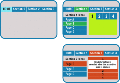
Figure 6 A Typical Navigational Design
The main menu is a series of tabs, starting with the home page and offering three sections. When you enter a section, a section menu allows you to navigate around the pages in that section. In the content area, or well, I've shown a multistate content control. Section 1 has a tab control and Section 2 has an accordion control.
A design like this can manage a lot of pages. For example, if you had seven main menu sections, and each section had seven pages, and each page had a multistate content control with seven panes, you would effectively be controlling 73 or 343 unique pages. And since each content pane can bring up an unlimited number of pop-ups, you can manage a great deal of cyber real estate. If you needed more pages, you could extend the menus using slide-out and cascading menus.
Where you need to be especially careful is in situations when you find a need to create off-menu navigation. It is frequently tempting to plant a link or button in the content of the page that takes the user somewhere else. I've seen it create problems many times. Whenever possible, keep navigation through the menu and use embedded links or buttons to change the state of a control or create a pop-up.
The navigational model shown in Figure 6 has an implicit hierarchy. You can see that clearly if you diagram the paths.
From the diagram in Figure 7, you can see the horizontal navigation from section to section and the navigation within a section. There are several questions that need to be addressed.
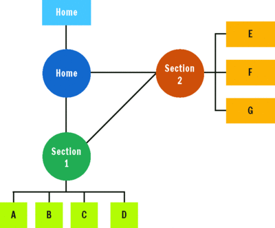
Figure 7 Navigation Between Sections
- When you navigate from section to section where do you land? It depends on the flow you are trying to achieve. In most cases the least confusing option would be to land the user on the first page of the section (for example, Page A in the diagram) on the first visit of the session. You might design that page as an entryway to a section (that is a section "home" page). Then I'd retain the state of the sidebar menu so that if the user left the section and returned, he or she would be on the same page.
- What if you need to get from (for example) Page B to Page G?
Be really careful because if you break the navigational model you'll end up confusing the user. The first question to ask is why you need to make the jump between two interior pages. If the user needs to get to both sections to complete a task, the design may need adjustment. Splitting a task between two interior pages is awkward and inefficient.
I recently ran into this with a file transfer program that writes both a data file and a log file. Because I was in an environment in which the mapped disk letters changed daily as a result of USB drives being plugged in and out, I needed to reset the disk letters every time I used the program. I had to go to "section A" to set the location of the data file and "section B" to set the location of the log file. It was quite inconvenient and time consuming.
The solution for a situation like this is to place all the disk information on a single page or, if that can't be done, bring up a "shadow copy" of the second disk in a pop-up window so that the user can fill it in without navigating to the second page.
If it's just a matter of convenience, you have to decide if the added complexity is worth the click you're saving the user. That depends on how often the user will need to make the shift. If it's occasional, I'd go with the simpler navigation and extra mouse click. If it's frequent, I'd consider using a drop-down menu of pages in the horizontal menu bar so that the user can get to an interior page in one step. I can't think of circumstances in which I'd simply transport the user from one interior page to another. That works great on Star Trek but tends to be quite disorienting in software.
Create a Frame
The final area I want to focus on is how the visual design can support ease of navigation. First, consider what elements you want for the page frame—the elements that appear consistently from page to page. One of the best ways to keep the user oriented is to have consistent elements in predictable locations. These become visual anchors for the user.
An important element for most frames is a page title. Not only does this help the user associate the page with a name but it facilitates discussions with support personnel.
Consider color coding as well. In the previous example, I used light blue to color code the home section, green for section 1 and orange for section 2. These colors help the users learn which section he or she is in. I would also use shape and texture in the visual design to support color-blind users.
Use Navigational Aids
Two common navigational aids worth including are breadcrumbs and a site map. Just don't rely on them to solve design problems. Many users do not see or understand breadcrumbs. But for those who do, they are a useful aid. On usability guru Jakob Nielsen's Web site, useit.com, he notes that more and more users rely on breadcrumbs. He also makes the point (with which I fully agree) that breadcrumbs should reflect the navigational hierarchy, not the history of page visits.
Site maps can help a user get a sense of the navigational layout, but they are rarely used. Nonetheless, they should be included because they help the user get the needed bird's eye view of the navigation. Just don't expect them to compensate for design problems.
One of the standing jokes in the usability community is that every usability question has the same answer: "it depends." Sadly, that is true of navigation as well. There are few design rules; most are guidelines and heuristics. That's why it's so important to study the users and understand the context of use before designing the UI.
With that caveat in mind, here are some suggested best practices:
- Minimize the effort required to understand and make decisions about navigational choices. The less effort it takes to use the UI, the better usability.
- Make use of single-screen designs when you can. Use rich, multipane controls, pop-ups, and wizards to enable the user to perform as much of the task as possible without resorting to sideways navigation.
- As you create multiple pages, combine them into sections. Make it simple to jump from section to section with a main navigational control and use a secondary control to navigate within the sections. Try not to go deeper if you can avoid it. The simpler the navigation, the more quickly users will achieve proficiency.
- Make certain that key elements such as menus, titles, and other information that is displayed on all pages are presented consistently from a visual standpoint. The user should have the sense that some elements of the screen are stable and be able to use them to maintain orientation.
- Be very careful with navigational elements that transport users from the interior page of one section to the interior page of another. It can be done, but it's easy to disorient the user.
- Use secondary navigation aids such as breadcrumbs and site maps but do not rely on them.
- 7.Always think about future expansion. If you expect the product to incorporate new functionality in the future, decide in the beginning how you will expand the navigation to seamlessly incorporate new screens.
Getting navigation right is one of the most important things you can do to ensure the usability of your product. Take the time to get it right, confirm your design with usability testing, and you'll get the results you want.
THE SOFTWARE VIEW

Ambrose Little
Navigation is one of those things most software folks take for granted, and as with most design questions, we tend to just look at what others are doing and follow their lead. We get imperatives from managers—"Make it look like Office" or "Make it look like Amazon.com"—but I think as developers focused on making programs work, we don't spare much time to really think about design.
Some of us are fortunate enough to have actual information architects work with us (or other jack-of-all-trades UX folks). But sometimes we expect graphics designers to handle navigation as part of their design, even though many of them do not have the expertise or background. Thankfully, there are many good resources out there that address the sticky problem of navigation, and I'd like to touch on a few here.
Copying the Big Guys
First of all, it's not always bad to follow what the industry leaders are doing. There's a good chance that they have actually spent a lot of time and resources on the information architecture to get it right, and thus set the tone for what people have come to expect. In a sense, they create conventions and set standards, consequently altering expectations about the way software should work.
That said, as Charlie points out, it is much better to actually understand the people who are using your solution and the elements you are dealing with. These elements include the information and content for a Web site or the objects in your domain. A core part of understanding the people is to understand their goals for interacting with your solution, and if you get that right, it will go a long way toward helping you structure your application correctly.
You can learn a lot from the big guys, but you don't want to blindly follow because their audience may be different. Maybe you have a much smaller audience or maybe your content or products are too dissimilar to theirs. One of the best examples I've seen of this difference is the attempt to mimic the Microsoft Office Ribbon (see Figure 8).
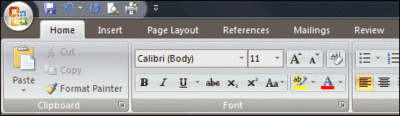
Figure 8 Microsoft Word Ribbon (Part of the Office Fluent UI)
As the latest in the line of Office UI schemes, the Ribbon tends to be mimicked by a lot of developers. The problem is that the Ribbon seems to magnify bad navigation design. If you poorly execute standard menus, tabs, and other controls, you can get away with bad navigation design, but if you mess up the Ribbon, you break the metaphor.
The tabs should be based on user goals and tasks. Thus there's a tab for inserting elements, a tab for page layout, a tab for reviewing a document. Then, within tabs, there are command groups (like Clipboard and Font in Figure 8), which are again user focused and grouped based on related tasks and actions. The Ribbon uses buttons of various sizes based on usage data (the big Paste icon versus smaller Cut and Copy) to help people more easily discover and use the more common functions.
In short, a lot of effort is required to design effective Ribbon-style elements. Therefore, you should not adapt it blindly for your application as a navigation mechanism.
So, before you mimic other applications, you have to decide if their design makes sense in your situation. Do you have the same scale? (Amazon.com and Netflix use recommendations based on lots of user data, which takes a good bit of scale to get right.) Office has tons of commands that benefit from the multilayered organization of the Ribbon, but if you only have a handful of commands, a typical menu is probably better.
Do you have the same kind of content? What works for an e-commerce site like Amazon may not be the right choice for an informational site on the environment. What works for an informational site may not work for an application. As Charlie discussed, when people are trying to complete a task, the informal navigation model common on the Web probably won't be appropriate—you want to help people achieve their goals, not distract or lead them down rabbit holes.
So where does that leave you? Don't despair! Even if you don't have UX experts to consult, there are techniques you can employ to help make your navigation better. One such technique is called card sorting.
Card Sorting
Card sorting is a way to get people, preferably from your target audience, to participate in helping you organize your content (Figure 9 shows an example). It bears some similarities to other stakeholder-involvement techniques, such as class-responsibility-collaboration (CRC) cards (an object-oriented design, or OOD, technique), user stories, and the like, in that it relies on the stakeholders to actively participate in the solution design (and it uses cards). Typically, it is used for organizing information on Web sites, but the techniques can be used to help organize commands within an application.

Figure 9 Example of Card Sorting from Usability.gov/ design/cardsort.html
It is a user-centered rather than solution-centered (or domain-centered) approach, and thus helps uncover design that makes sense to someone who will actually interact with the solution. I won't go into depth on the actual technique. Suffice it to say that it involves users categorizing your material for you. There are many resources freely available online (such as usability.gov/how-to-and-tools/methods/card-sorting.html), and in fact there are a number of software packages to help with it, such as OptimalSort. But before using software, consider the index card approach. Experts agree that getting real folks together in person and using actual cards will generally produce good results.
UX Design Patterns
Probably one of the best resources in UX design is patterns. It's no surprise that there are a lot of design patterns for navigation, ranging from Breadcrumb, which helps users orient themselves, to Faceted Navigation, which uses facets (metadata) about search results to actively filter them, to Modal Panel, which dives into the familiar modal dialog, and lots of stuff in between. As an example, Figure 10 illustrates a sampling of the Clear Entry Points pattern.
Clear Entry Points
It may not be obvious what people can or should do when starting an application or visiting a site. You need to give people a set of clear entry points into the application or Web site based on their most common tasks or destinations.
Figure 10 Clear Entry Points Primary Example
Without clear entry points, new or infrequent users can feel lost immediately upon opening an application or site. By guiding people with clear entry points, you take the burden to figure out what they can or should do off of them.
This pattern works only if you have or can discover a set of the most common tasks or destinations for a large segment of your target audience. If you can't do this, the pattern actually causes more trouble because it gets in the way and doesn't really guide people to what they want to do.
It's important that most of your users be new or infrequent users because, unless the tasks in question are the only relevant tasks, regular users may find that clear entry points get in the way.
Don't be deceived into thinking that it's obvious what people should do. Many home pages are a smorgasbord of everything the organization behind it has to offer, and people are left confused and not knowing what to do or where to go. Clear entry points eliminate the confusion.
Implementation
The trick to the clear entry points pattern is to successfully identify the top tasks or destinations. If you employed user-centric design, you should have already identified these as the tasks that address the key goals for your users. Use that information to design your clear entry points.
If you didn't follow user-centric design, you need to do some research, probably both internally and externally, to determine users' key tasks and destinations. If your app or site already exists, looking at usage logs is a great help. You can also usually distill key tasks even from functional specs, but you should try to validate those with users or at least business stakeholders to ensure that the tasks you're selecting are in line with the key goals that the application or site serves.
Once you've nailed down your key tasks, you should consider how they need to be presented. If you have more than a handful, you should think about how you might group them visually, but remember, this should not be a replica of your main navigation—it really must represent key tasks.
Display the tasks very clearly and centrally on the starting view of your app or site. Be sure to phrase them in terms of the tasks the user is trying to complete, rather than using branded terminology like tool names or other terminology that users are not familiar with. If you can communicate the task in a few words, that is ideal, but you probably should supplement names with helpful descriptions that make it abundantly clear what people can accomplish by choosing that task or destination.
Make sure you're not creating trap doors through which users are suddenly dropped into the middle of your solution structure. The destination they reach by choosing the task should be clearly connected to the task; this is a good start to a wizard, but it doesn't have to be wizard-based—just make a strong connection between the selected task and the view users reach by selecting the task.
If there are subtasks that people can jump directly into, you can consider having those be revealed when the main task is selected. But remember, this should not be a full menu or navigational scheme.
It's good practice to visually emphasize the most common tasks over the less common ones, automatically drawing users to them. This main entry point view should not be surrounded by the usual navigational structure or ancillary tools/information. Hide those away to keep the focus on the entry points.
If you think about it, you'll see that controls are usually just implementations of patterns, formalized into reusable code. If you've tried to do any Silverlight development, especially Silverlight 1.0 (or heavy-duty desktop UI development), you've probably come to a greater appreciation of what controls do for you. Having to manually draw and handle even the basic interactions of a text box is not exactly easy.
Plus, controls, especially platform controls such as those in the HTML spec, create implicit standard UI pattern conventions. There are many other options for multiple selection, but the HTML SELECT control has become the de facto control for that task on the Web. With rich Internet application (RIA) platforms, the choices are greater, but no doubt that the controls provided in the box will eventually form conventions (which will, of course, be influenced by prior platform control usage). There are many more complex and often useful patterns you can implement with custom controls, or you can take advantage of controls from one of the third-party vendors such as Infragistics.
For navigation, of course, the most common control is the hyperlink, which as Charlie points out, needs to be used wisely and even sparingly in task-oriented applications. There are tab controls that facilitate the grouping of similar items, navigation between the groups, and an implicit way of indicating which stuff a user is looking at (via the currently selected tab). There are fly-out menu controls on both Web and desktop platforms: if you use these, be careful to go no more than three levels deep (preferably two), because it takes a good bit of mouse dexterity to use them (as the user tries desperately to quickly move sideways from one menu to the other), which probably comes as a surprise to techies who live and breathe menus. There are tag cloud controls that facilitate the implementation of that pattern, paging controls that help with that pattern, dialog controls to help with those, and so forth.
Tagging and tag clouds are great ways to create a flexible organization to aid people in finding what they are looking for. They can complement a more formal organizational scheme such as menus. Figure 11 shows an example.
.gif)
Figure 11 Tag Cloud from Flickr
Just remember—think about the control (pattern) you pick. Don't just use it because it's the easiest or because you are most familiar with it. Consult a pattern catalog to get a better understanding of when to use which patterns, and you can also use the patterns to help guide your choice of which implementation (if there are any) to select.
Testing, Tracking, and Tweaking
No matter what navigational and organizational scheme you devise, it will be wrong—at least in part. Even if it is right for now, it is likely that your needs will change over time. So you need to invest in making a scalable navigation design, as Charlie said, as well as a flexible one.
You don't want to regularly make substantial changes to your navigational structures, but you should fine-tune them based on actual usage data and usability testing. Usability testing is a good option because you can track down problems before releasing the application; just be sure to leave room in the project schedule to do it and to make changes based on the results.
If you have usage data (such as from Web logs or feature-usage tracking), use it to help you understand how people are using the existing design and make changes accordingly. Search logs are especially informative because they can indicate weaknesses in your navigation scheme as users resort to search for navigation. If you're not using Web-based tracking, consider creating a usage-tracking infrastructure so that you will have data to back up and inform future modifications.
Creating good navigation can seem a little overwhelming when you have so much else to worry about as a developer. If you don't have experts at your disposal, you can take matters into your own hands following some of the suggestions we've outlined here.
Navigation is extremely important; it is worth the time and resources you'll invest. You can do it incrementally with the help of patterns, and you can use great, easy-to-read primers like Steve Krug's Don't Make Me Think and Peter Morville's Ambient Findability, among others. The people who have to use your software will be happier for it.
Dr. Charles Kreitzberg is CEO of Cognetics Corporation (www.cognetics.com), which offers usability consulting and user experience design services. His passion is creating intuitive interfaces that engage and delight users while supporting the product's business goals. Charles lives in Central New Jersey where he moonlights as a performing musician.
Ambrose Little lives with his wife and four children in central New Jersey. He's been designing and developing software for more than 10 years and is honored to be an INETA speaker and Microsoft MVP. Lately, he's shifted from technical design to designing for people and is now a user experience designer for Infragistics.