Basic styles for your widgets
Azure DevOps Services | Azure DevOps Server 2022 - Azure DevOps Server 2019
We recommend you use the basic styles provided via the Widget SDK. Using these styles helps you quickly and easily create a widget that's consistent with the rest of the widgets on the dashboard.
To use these styles, add the below line inside the VSS.require block in the JavaScript code for your widget.
Tip
Check out our newest documentation on extension development using the Azure DevOps Extension SDK.
WidgetHelpers.IncludeWidgetStyles();
This pulls a stylesheet by the name sdk-widget.css and include it in the iframe for your widget. It includes styles for font-family, font-size, margin and paddings for your widget. It also includes styles for headings (h1, h2, h3 etc.), links, and more.
Similarly, to use common styles in the widget configuration, include the line below inside the VSS.require block in the JavaScript code for your widget configuration.
WidgetHelpers.IncludeWidgetConfigurationStyles();
This pulls a stylesheet by the name sdk-widget-configuration.css and include it in the iframe for your widget configuration. It includes styles for font-family, font-size and styles for common form elements like input, textarea, and select.
Note
For these styles to apply to your widget, you need to add a "widget" class on the HTML element that contains your widget. All styles from the sdk-widgets.css are scoped to this class. Similarly, add a "widget-configuration" class on the HTML element that contains your widget configuration. All styles from the sdk-widget-configuration.css are scoped to this class.
Download the extension sample.
Widget body, title and description
By adding the class "widget" on the HTML element that contains your widget, you automatically get padding, font, and color for widget contents.
You should always have a title for your widget. This helps the user identify your widget and its functionality at a glance.
Use <h2> with class "title". This also helps people using screen readers to quickly identify the different widgets on the dashboard.

Design principle: Widgets should have a title. Use the
<h2>tag with the "title" class.
Sometimes you might want to provide a small description about your widget or how to use it. In such cases, use the class "description" on the HTML element you wish to use for widget description.
Design principle: Use the "description" class for the widget description. Descriptions should make sense even when read out of the widget context.
	<div class="widget">
	    <h2 class="title">Widget title</h2>
		<div class="description">The widget description is used to describe the widget. It makes sense even when read outside of the widget context.</div>
		<p>Place widget content here.</p>
	</div>
Widget titles and subtitles
Subtitles are text that supplement the title. They may not always make sense when read out of context without reading the title.
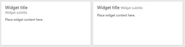
Design principle: Use the "subtitle" class to provide more information about the widget. It may not make sense out of the widget context.
Use the below structure and classes "title", "inner-title" and "subtitle" to get the right font, color and margins for a title and subtitle combination. The title gets a greater font-size than the subtitle. The subtitle has a subdued color relative to the title or rest of the widget.
	<div class="widget">
	    <h2 class="title">
			<div class="inner-title">Widget title</div>
			<div class="subtitle">Widget subtitle</div>
		</h2>
		<div class="content">
			Place widget content here.
		</div>
	</div>
You can use any html element for the title and subtitle combination. Here are some tips:
- When you need the subtitle to appear in the same line as the title, use an inline element like
<span> - When you need the subtitle to appear in the next line from the title, use a block element like
<div>
Display hyperlinks, icons, text, and subtext in a widget
Some widgets have links which have an icon, text and subtext per link.
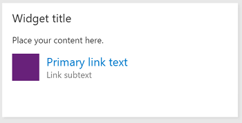
Design principle: Use links with an icon and subtext to make the purpose of the link obvious to the user. Ensure that the icon symbolizes the link's target.
To get the same look and feel, use the below HTML structure and classes.
	<div class="widget">
	    <h2 class="title">Widget title</h2>
		<div class="content">
			<p>Place your content here.</p>
			<a class="link-with-icon-text" href="http://bing.com" target="_blank">
				<span class="icon-container" style="background-color: #68217A"></span>
				<div class="title">
					Primary link text
					<div class="subtitle">Link subtext</div>
				</div>
			</a>
		</div>
	</div>
Display counters in a widget
The primary purpose of some widgets is to display the count of some data. The Query Tile and the Code Tile widgets are examples in this category of widgets. To use the same styles as these widgets, add the "big-count" class on the HTML element holding the number to get the big font that is used by the Query Tile and the Code Tile widgets.
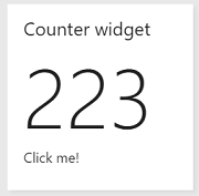
Design principle: Use the "big-count" class to present the user with numbers in large font. It should not be used with non-numeric characters.
<div class="widget">
    <h2 class="title">Counter widget</h2>
	<div class="big-count">223</div>
	<div>Additional text</div>
</div>
Make a widget a hyperlink
Clicking anywhere on some widgets redirects the user to another page. To have your widget do the same, you can:
- Add an anchor tag as a child to the HTML element that acts as your widget container.
- Put all your widget content inside the anchor tag.
- Since your widget is hosted in an iframe, add the attribute "target" with value "_blank" to the anchor tag so that the link opens in a new tab/window instead of inside the same iframe.
- In addition to the "widget" class, add the "clickable" class to the widget container.
Your widget content gets the correct colors even though they are inside an anchor tag. Without the "clickable" class, the default blue color is forced on all text inside the widget. The widget also gets a custom visual cue on focus to help users who use the keyboard to navigate the dashboard.
Design principle: Use the "clickable" class and the
<a>tag to make the entire widget clickable. This is ideal when your widget is a summary of data available on another page.
<div class="widget clickable">
    <a href="https://bing.com"  target="_blank">
		<h2 class="title">Counter widget</h2>
		<div class="big-count">223</div>
		<div>Click me!</div>
	</a>
</div>
Styles for common form elements in widget configuration
To use basic styles from the widget sdk for common form elements in widget configuration, follow these guidelines:
| Form element | Wrapping element | Guidelines |
|---|---|---|
| Simple text box | div with class "single-line-text-input". |
Use a label element to add text next to the text box. Use the input element to create a text box. Use the placeholder attribute to provide placeholder text. |
| Checkbox | fieldset with class "checkbox" |
Use a label element to add text next to each checkbox. Use a legend element to caption the group of checkboxes. Use the for attribute on each label element to help screen readers understand the form element. |
| Radio button | fieldset with class "radio" |
Use a label element to add text next to each radio button. Use a legend element to caption the group of radio buttons. Use the for attribute on each label element to help screen readers understand the form element. |
| Dropdown | div with class "dropdown" |
Use a label element to add text next to the dropdown. If you want a dropdown occupying half the width, add class "half" to the wrapping div element. If you want to use the standard arrow icon from the sdk instead of the one provided by the browser, wrap the select element with another div with class "wrapper". |
| Multi-line text box | div with class "multi-line-text-input". |
Use label element to label the textarea element used as multi-line text box. |
The example below uses each of the form elements listed in the table.
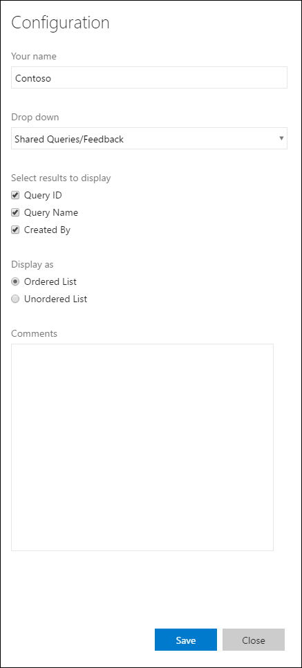
<div class="widget-configuration">

    <div class="single-line-text-input" id="name-input">
        <label>Your name</label>
        <input type="text" value="Contoso"></input>
    </div>

    <div class="dropdown" id="query-path-dropdown">
        <label>Drop down</label>
        <div class="wrapper">
            <select>
				<option value="Shared Queries/Feedback">Shared Queries/Feedback</option>
				<option value="Shared Queries/My Bugs">Shared Queries/My Bugs</option>
				<option value="Shared Queries/My Tasks">Shared Queries/My Tasks</option>
			</select>
        </div>

        <fieldset class="checkbox" id="select-results">
            <legend>Select results to display</legend>
            <input type="checkbox" id="check-option1" value="id" name="check" checked="true">
            <label for="check-option1">Query ID</label><br/>
            <input type="checkbox" id="check-option2" value="name" name="check" checked="true">
            <label for="check-option2">Query Name</label><br/>
            <input type="checkbox" id="check-option3" value="createdBy" name="check" checked="true">
            <label for="check-option3">Created By</label><br/>
        </fieldset>

        <fieldset class="radio" id="display-options">
            <legend>Display as </legend>
            <input type="radio" id="radio-option1" value="ordered" name="radio" checked="true">
            <label for="radio-option1">Ordered List</label><br/>
            <input type="radio" id="radio-option2" value="unordered" name="radio">
            <label for="radio-option2">Unordered List</label><br/>
        </fieldset>

        <div class="multi-line-text-input">
            <label>Comments</label>
            <textarea></textarea>
        </div>
    </div>
</div>
Display validation errors below a form element
We recommend providing validation errors below the relevant form elements. To display these messages in a manner consistent with 1st party widgets, add the following code snippet under each form element for which you want to show the error message.
<span class="validation-error">
	<span class="icon-error-exclamation"></span>
	<span class="validation-error-text"></span>
</span>
The previous code snippet has the visibility hidden by default. Whenever you want to display an error message, find the corresponding "validation-error-text", add text to it and set visibility:visible on its parent.
Example: There is a simple text box where the user needs to type in a string. You need to show an error message if the text box is empty.
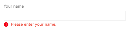
The html for this would be:
<div class="widget-configuration">
	<div class="single-line-text-input">
		<label>Your name</label>
		<input type="text">Type Here</input>

		<span class="validation-error">
			<span class="icon-error-exclamation"></span>
			<span class="validation-error-text"></span>
		</span>
	</div>
</div>
And the JavaScript code behind this would be:
var $singleLineInput = $(".single-line-text-input input");
var $errorSingleLineInput = $(".single-line-text-input input .validation-error-text");

$singleLineInput.on("input", function(){
		if ($singleLineInput.val() == ""){
			$errorSingleLineInput.text("Please enter your name.");
			$errorSingleLineInput.parent().css("visibility", "visible");
			return;
		}
		$errorSingleLineInput.parent().css("visibility", "hidden");
	});
Feedback
Coming soon: Throughout 2024 we will be phasing out GitHub Issues as the feedback mechanism for content and replacing it with a new feedback system. For more information see: https://aka.ms/ContentUserFeedback.
Submit and view feedback for