How to use data explorer to analyze device data
Azure IoT Central provides rich analytics capabilities to analyze historical trends and correlate telemetry from your devices. To get started, select Data explorer on the left pane.
Note
Only users in a role that have the necessary permissions can view, create, edit, and delete queries. To learn more, see Manage users and roles in your IoT Central application.
To learn how to query devices by using the IoT Central REST API, see How to use the IoT Central REST API to query devices.
Understand the data explorer UI
The analytics user interface has three main components:
Data configuration panel: On the configuration panel, select the device group for which you want to analyze the data. Next, select the telemetry that you want to analyze and select the aggregation method for each telemetry. The Group By control helps to group the data by using device properties as dimensions.
Tip
If your device uses organizations, the device groups you see depend on your organization membership.
Time control: Use the time control to select the duration for which you want to analyze the data. You can drag either end of the time slider to select the time span. The time control also has an Interval size slider that controls the bucket or the interval size used to aggregate the data.
Chart control: The chart control visualizes the data as a line chart. You can toggle the visibility of specific lines by interacting with the chart legend.


Query your data
Choose a Device group to get started and then the telemetry you want to analyze. When you're done, select Analyze to start visualizing your data:
Device group: A device group is a user-defined group of your devices. For example, All Refrigerators in Oakland, or All version 2.0 wind turbines.
Telemetry: Select the telemetry that you want to analyze and explore. You can select multiple telemetry types to analyze together. The default aggregation method is set to Average for numerical data types and Count for strings. Aggregation methods for numeric data types are Average, Maximum, Minimum, Count and, Sum. Count is the only aggregation method for strings.
Note
Historical data points are only shown when the conditions of the query are true. For example, a device was upgraded from Template1 to Template2 yesterday. Today, if you query device groups that contain Template1 devices, you see device data from yesterday and before. If you query device groups that contain Template2 devices, you see the device and data from when it was upgraded going forward.
Group by: The Group by control helps to group the data by using the device properties as dimensions. Device telemetry and properties are combined with cloud properties when the device sends data. If the cloud or device property is updated, then you see the telemetry grouped by different values on the chart.
Tip
To view data for each device separately, select Device Id in the Group by control.
Interact with your data
After you query your data, you can visualize it on the line chart. You can show or hide telemetry, change the time duration, or view the data in a grid.
Select Save to save an analytics query. Later, you can retrieve any queries you saved.
Time editor panel: By default you see data from the last day. You can drag either end of the slider to change the time duration. You can also use the calendar control to select one of the predefined time buckets or select a custom time range. The time control also has an Interval size slider that controls the interval size used to aggregate the data.

Inner date range slider tool: Use the two endpoint controls to highlight the time span you want. The outer date range slider control constrains the inner date range.
Outer date range slider control: Use the endpoint controls to select the outer date range that's available for your inner date range control.
Increase and decrease date range buttons: Increase or decrease your time span by selecting either button for the interval you want.
Interval-size slider: Use the slider to zoom in and out of intervals over the same time span. This control gives more precise control of movement between large slices of time. You can use it to see granular, high-resolution views of your data, even down to milliseconds. The default start point of the slider gives you an optimal view of the data from your selection. This view balances resolution, query speed, and granularity.
Timeframe: Use this control, to select the date and time ranges you want. You can also use the control to switch between different time zones. After you make the changes to apply to your current workspace, select Save.
Tip
Interval size is determined dynamically based on the selected time span. Smaller time spans let you aggregate the data into very granular intervals of up to a few seconds.
Chart Legend: The chart legend shows the selected telemetry on the chart. Hover over an item on the legend to bring it into focus on the chart. When you use Group by, the telemetry is grouped by the values of the selected dimension. You can toggle the visibility of each telemetry type or clicking on the group name to toggle the group visibility.
Y-axis format control: The y-axis mode cycles through the available y-axis view options. This control is available only when you're visualizing multiple telemetry types. The three modes are:
- Stacked: A graph for each telemetry type is stacked and each graph has its own y-axis. This mode is the default.
- Shared: A graph for each telemetry type is plotted against the same y-axis.
- Overlap: Use this mode to stack multiple lines on the same y-axis, with the y-axis data changing based on the selected line.

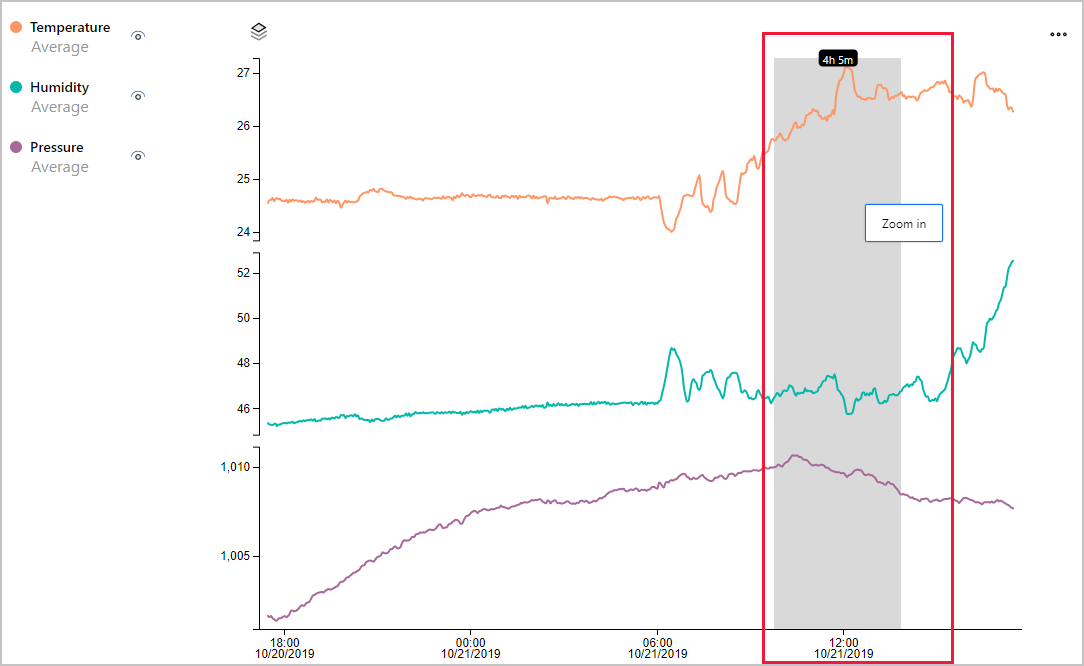
Zoom control: The zoom control lets you drill further into your data. If you find a time period you'd like to focus on within your result set, use your mouse pointer to highlight the area. Then select Zoom in.


Select the ellipsis, for more chart controls:
View Data as Table: Display your results in a table format that lets you view the value for each data point.
Download as CSV: Export your results as a comma-separated values (CSV) file. The CSV file contains data for each device. Results are exported by using the interval and timeframe specified.
Drop a Marker: The Drop Marker control lets you anchor certain data points on the chart. It's useful when you're trying to compare data for multiple lines across different time periods.


Feedback
Coming soon: Throughout 2024 we will be phasing out GitHub Issues as the feedback mechanism for content and replacing it with a new feedback system. For more information see: https://aka.ms/ContentUserFeedback.
Submit and view feedback for