Customer retention dashboard
This article describes the Customer retention dashboard in Partner Center. This dashboard displays information about your retained customers, including offer performance, valuable customers, and monthly cohort views, all presented in a graphical and downloadable format. It is currently only available for virtual machine offers.
The following illustration shows the offer usage timeline of two customers and introduces the concept of retention days (Day 0, Day 1, … Day n). Retention day is a normalized concept, meaning customer 1 can start their usage journey on Jan 1st (absolute date) and customer 2 can start theirs on March 1st (absolute date). Still, each specific date refers to as normalized "Day 0" for both customer 1 and 2. The same convention is extended to other customers. The following image illustrates customer offer usage across time:

Note
This feature is currently only available for virtual machine offers. It includes data for both trial and paid VM offers. Filters to perform retention analysis on trial and paid customers will be available in the dashboard by June 2022.
The dashboard uses the 18 months of data prior to the current system date to plot different widgets and a monthly cohort view. The raw data for these widgets can also be downloaded or accessed via programmatic API access.
Access the Customer retention dashboard
Sign in to Partner Center.
On the Home page, select the Insights tile.
In the left menu, select Marketplace insights.

Elements of the Customer retention dashboard
The following sections describe how to use the Customer retention dashboard and how to read the data.
Download
To download the data for this dashboard, in the upper-left of the page, select Download as PDF from the Download list.
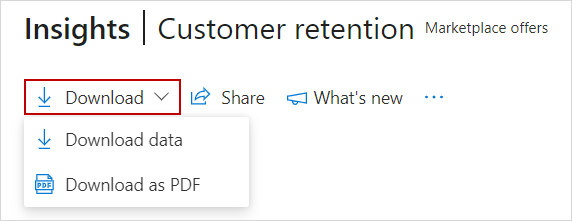
Alternatively, you can go to the Downloads dashboard to download the report.
Share
To share the dashboard widgets data via email, in the top menu, select Share.
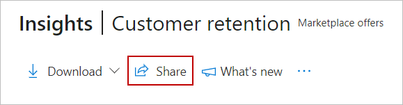
In the dialog box that appears, provide the recipient email address and message. To share the report URL, select the Copy link or Share to Teams button. To take a snapshot of the charts data, select the Copy as image button.
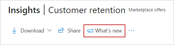
What's new
To learn about changes and enhancements that were made to the dashboard, select What's new. The What's new side panel appears.
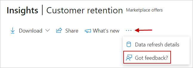
About data refresh
To view the data source and the data refresh details, such as the frequency of the data refresh, select the ellipsis (three dots) and then select Data refresh details.

Got feedback
To provide instant feedback about the report/dashboard, select the ellipsis (three dots), and then select the Got feedback? link.
Provide your feedback in the dialog box that appears.
Note
A screenshot is automatically sent to us with your feedback.
Filters for category and marketplace offer
Select the Category for an offer from the Category list, and then select one of your offers from the Marketplace offer list.

Note
The analysis is currently available at offer level, not at offer plan level.
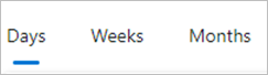
Granularity for retention analysis
Select a time range to analyze customer retention across days, weeks, and months. This analysis uses the 18 months of usage data prior to the current system date to calculate retained customers and retention scores across daily, weekly, and monthly views.
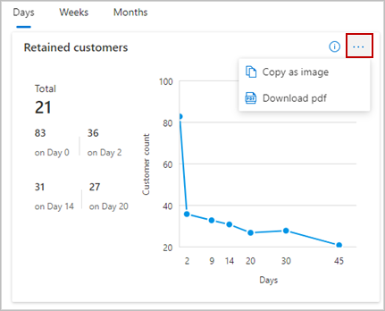
Retained customers
This widget shows the count of retained customers on a specific day (Day 0, Day 1, Day 2, …, Day n) after their first offer usage. Customer offer usage data is considered for a time range of 45 days to 18 months prior to the current day. View usage on specific days in the offer usage journey to understand where most customers become dormant or inactive.
Widget insights
- Insights capture deployed VM usage data aggregated over the billed account of customers.
- Usage data is normalized for the last 18 months on a rolling basis and updated daily.
- Total represents the customer count normalized at Day 45 of using the category offer.
- Hover on the line graph to display the customer count on specific days since first usage.
Select the ellipsis (three dots) to copy the widget image and download the image as a .PDF.
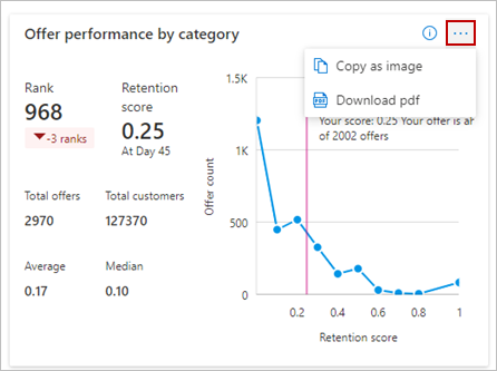
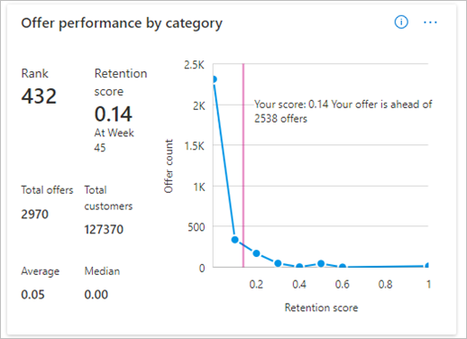
Offer performance by category
This section shows the performance of a selected offer compared to other offers within the same selected category in the list. It compares retention scores of offers at day 45 within a category and assigns a rank. Offers with higher retention scores are ranked higher than other offers. If any retention scores match, customer count at Day 0 breaks the tie.
The left portion of the widget contains information on the current rank, offer rank based on the time granularity selected (day, week, month), and change in offer rank based on the last data refresh. Total offers shows the count of all offers under the selected category, including offers from all partners in the marketplace with an offer listed under the selected category. Total customers indicates the count of all customers of these total offers.
The right portion of the widget plots a line between the offer count on the Y-axis against retention score (at day 45) separate intervals on the X-axis. The following example shows how to read offer performance by category widget.
Example – If you select Contoso test offer listed under the Storage category, the offer is currently ranked 125 among a total of 608 marketplace offers in the storage category. Your offer has a retention score of 0.4 calculated on day 45 of customers using Contoso test offer, meaning your selected offer would retain only 40% of customers who used this offer in the last 18 months. The retention score for all marketplace offers under the Storage category has an average score of 0.19 and a median score of 0.10.
The offer rank, indicating the relative offer performance, has slipped by 9 ranks since the last data refresh happened for all partners in the marketplace. Hovering over the line graph shows the Offer count: the number of marketplace offers at different retention scores on the x-axis. In this example, 72 offers have a retention score of 0.2. The total offers (608) is the sum of all the offer counts (Y-axis) on the line graph at different retention score intervals (X-axis).

Daily level analysis
Select the ellipsis (three dots) to copy the widget image, download aggregated widget data as .CSV file, and download the image as a .PDF.
Weekly level analysis
Note
A higher retention score indicates your offer is performing well in its marketplace category. A lower retention score and relative offer rank indicates the offer requires your attention.
Widget insights
- Retention score is the ratio of retained customers at day 45 to day 0.
- Rank represents an offer's relative rank in the category based on retention score at day 45.
- The line graph plots retention scores on the X-axis and total offers on the Y-axis.
- Total offers and Total customers values are for the selected Azure marketplace category.
- The vertical line shows the retention score at day 45 of the selected offer and its relative performance with other offers.
Daily Retention
This widget shows offer retention scores at different days of customer usage and benchmarks it with the aggregated retention scores of all offers listed under the selected category. This shows how well your offer is performing and positioned among other offers:
- Good – offer retention score is above category benchmark
- Neutral – offer retention score equals category benchmark
- Bad – offer retention score is below category benchmark
The retention curve gives you an idea of major checkpoints at which a customer might stop using your offer. Use this information to help retain existing, inactive, or dormant customers.
Widget insights
- Table shows retention score of an offer relative to other offers in selected category across different normalized days.
- Sort based on the offer and category benchmark retention scores.
- Hover over the bar graph to view the count of retained customers for specific days.
- Hover over the line graph to view retention scores for specific days.
Select the ellipsis (three dots) to copy the widget as an image, download aggregated widget data as a .CSV file, and download the image as a .PDF.

Customers
This widget uses offer usage and generated revenue to identify the value of retained and dormant customers. Use this information to engage with customers dormant for longer durations to reactivate their offer usage.
Widget insights
- Select the Normalized day dropdown to check retained and dormant customers.
- Toggle between the Retained and Dormant tabs to analyze customer information.
- Revenue generated (USD) is accumulated value until the retained day selected in the dropdown.
- Revenue generated per day (USD) is the revenue for the specific day selected in dropdown.
- Sort on different columns as needed.
View additional pages of data using the page links at the bottom right.
Retained customer information
Select the ellipsis (three dots) to copy the widget image, download aggregated widget data as a .CSV file, and download the image as a .PDF.

Dormant customer information
Select the ellipsis (three dots) to copy the widget image, download aggregated widget data as a .CSV file, and download the image as a .PDF.

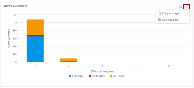
Active customers
This widget displays the total count of active or retained customers based on the number of marketplace offers used. The stacked bar graph categorizes and shows the different number of days a customer is retained by an offer.
Widget insights
- Offers per customer is on the X-axis and active customer count is on the Y-axis.
- The colored bar represents different buckets of active or retained customers.
- Hover over the graph to see the active customer count on different days.
Select the ellipsis (three dots) to copy the widget image, download aggregated widget data as a .CSV file, and download the image as a .PDF.
Recommendations

This shows next steps. Select the Click here button to open the offer product description page in Microsoft AppSource or Azure marketplace.
Widget insights
- Click here on the left opens the product description page for your offer.
- Click here on the right opens the customer dashboard in Marketplace Insights.
Retention heat map
This section shows the retention scores of customers acquired in a cohort. The retention scores are based starting on specific month start date. The Month column denotes the first usage month (Month 0). The cohort column indicates the cohort size, defined as count of customers within a cohort starting on a specific month.
Use this information to analyze the retention rates of an offer across months and determine the offer usage behavior and engagement of customers in a cohort.
Note
The retention scores in the heatmap are calculated for absolute month dates. It might differ with the retention scores calculated based on normalized days and weeks.
Widget insights
- Month column is the start month for the selected offer usage.
- Cohort column is the size of the customer cohort acquired for the specific start month.
- Successive months are shown as 0M, 1M, 2M, ... 17M after start month.
- Hover over each cell of the heatmap to view the retention score in percentages.
- Darker blue cells indicate higher retention score, lighter blue cells indicate lower retention scores.

Customer retention details section
This table lists the 500 top orders by retained date.
- Each column in the grid is sortable.
- The data can be exported to a .CSV or .TSV file if the number of records is less than 500.
- If records number over 500, exported data is regularly placed in a downloads page for the next 30 days.

Dictionary of data terms
Customer retention details table
| Column name | Definition |
|---|---|
| OfferCategory | Azure Marketplace category for the offer |
| OfferName | The name of the commercial marketplace offer. |
| ProductId | Unique identifier for the offer in the marketplace |
| Sku | The plan associated with the offer. |
| SkuBillingType | Indicates offer has a free or paid plan |
| CustomerId | The unique identifier assigned to a customer. A customer can have zero or more Azure Marketplace subscriptions. |
| CustomerName | Name of the customer using the offer |
| CustomerCompanyName | The company name provided by the customer. The name could be different than the name in a customer's Azure subscription. |
| CustomerCountryName | The country/region name provided by the customer. Country/region could be different than the country/region in a customer's Azure subscription. |
| CustomerCountryCode | Unique code associated with customer country/region |
| CustomerCurrencyCode | Unique code associated with the currency used by the customer for the usage transaction. |
| FirstUsageDate | Calendar date when the customer first started using the offer |
| AzureLicenseType | The type of licensing agreement used by customers to purchase offers. Also known as the channel. The possible values are:
|
| OfferType | Indicates the available offer types listed in the marketplace |
| Offset | Number of days since the customer first started using the offer |
| Customer provided e-mail | |
| RevenueGenerated(USD) | Total revenue accumulated from first usage until today |
| RevenueGeneratedPerDay(USD) | Revenue generated for the specific day value in the Days from first usage column |
Next steps
- Sign in to Partner Center.
- For an overview of analytics reports available in the commercial marketplace, see Access analytic reports for the commercial marketplace in Partner Center.
- For frequently asked questions about commercial marketplace analytics and for a comprehensive dictionary of data terms, see Commercial marketplace analytics terminology and common questions.
Feedback
Coming soon: Throughout 2024 we will be phasing out GitHub Issues as the feedback mechanism for content and replacing it with a new feedback system. For more information see: https://aka.ms/ContentUserFeedback.
Submit and view feedback for