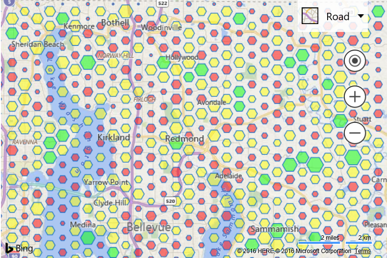
Bivariant Data Binning
Since the size and the color can both be customized based on an aggregate value it is possible to have a single data bin represent two data metrics (bivariant).
In this example, each pushpin in the data set has a custom 'sales' metadata value which is assigned a random number. The color of each data bin is based on the total relative sum of sales in all pushpins the data bin contains. The scale of each data bin is based on the total number of pushpins in each bin. This is an example of a bivariate data binning layer which uses two types of visualizations to represent two variables; color and scale. If we assume that each pushpin represented a customer. A data bin that is red would indicate that the total sales in that area is low, however, if the bin was also small, this would indicate that there isn't a lot of pushpins in that data bin which could explain why the total sales in that bin is low.
<!DOCTYPE html>
<html>
<head>
    <title></title>
    <meta charset="utf-8" />
    <script type='text/javascript' src='https://www.bing.com/api/maps/mapcontrol?callback=GetMap' async defer></script>

    <script type='text/javascript'>
    var map;

    function GetMap()
    {
        map = new Microsoft.Maps.Map('#myMap', {
            credentials: 'Your Bing Maps Key'
        });

        //Generate 10,000 random pushpins within the current map view.
        var pins = Microsoft.Maps.TestDataGenerator.getPushpins(10000, map.getBounds());

        //Add a custom metadata value to each pushpin to simulate real data.
        for (var i = 0, len = pins.length; i < len; i++) {
            pins[i].metadata = {
                sales: Math.random() * 100
            };
        }

        //Load the Data Binning module.
        Microsoft.Maps.loadModule('Microsoft.Maps.DataBinning', function () {
            //Create the data binning layer. Specify a callback for both the color and scale.
            var layer = new Microsoft.Maps.DataBinningLayer(pins, {
                dataBinType: Microsoft.Maps.DataBinType.hexagon,
                aggregationProperty: 'sales', //Specify the name of the custom property to aggregate over.
                colorCallback: CustomBinColorLogic,
                scaleCallback: CustomBinScalingLogic
            });
            map.layers.insert(layer);
        });
    }

    function CustomBinColorLogic(bin, min, max) {
        //Specify custom logic to colorize a data bin based on the information it contains.

        //In this case, calculate twhat percentage the sum of this bin is compared to the max bin sum.
        //If the value is geater than 75% make the bin green, >50% yellow, below 50% red.
        var percentageSum = bin.metrics.sum / max.sum * 100;

        if (percentageSum >= 75) {
            //Green
            return 'rgba(0,255,0,0.5)';
        } else if (percentageSum > 50) {
            //Yellow
            return 'rgba(255,255,0,0.5)';
        } else {
            //Red
            return 'rgba(255,0,0,0.5)';
        }
    }

    function CustomBinScalingLogic(bin, min, max) {
        //Specify custom logic to scale a data bin based on the information it contains.

        //In this case, scale the size of the bin based on the number of pushpins in the bin
        //relative to the maximum pushpins in a single bin in the layer.
        return bin.metrics.count / max.count;
    }
    </script>
</head>
<body>
    <div id="myMap" style="position:relative;width:600px;height:400px;"></div>
</body>
</html>
Running this code will render a map covered in hexagons of different sizes and color, based on the pushpin data each bin contains.