Image Editor for Icons (C++)
When you select an image file (such as .ico, .bmp, .png) in Solution Explorer, the image opens in the Image Editor in the same way that code files open in the Code Editor. When an Image Editor tab is active, you see toolbars with many tools for creating and editing images. Along with bitmaps, icons, and cursors, you can edit images in GIF or JPEG format using commands on the Image menu and tools on the Image Editor toolbar.
Graphical resources are the images you define for your application. You can draw freehand or draw using shapes. You can select parts of an image for editing, flipping or resizing, or you can create a custom brush from a selected part of an image and draw with that brush. You can define image properties, save images in different formats, and convert images from one format to another.
Note
Using the Image Editor, you can view 32-bit images, but you can't edit them.
You can also use the Image Editor and the Binary Editor to work with resource files in managed projects. Any managed resources you want to edit must be linked resources. The Visual Studio resource editors don't support editing embedded resources.
In addition to creating new graphical resources, you can import existing images for editing and then add them to your project. You can also open and edit images that are not part of a project for stand-alone image editing.
For information on the Image Editor, see how to Create an Icon or Other Image, Edit an Image, Use a Drawing Tool, Work with Color, and Accelerator Keys.
Note
Download at no cost the Visual Studio Image Library that contains many animations, bitmaps, and icons that you can use in your applications. For more information about how to download the library, see the Visual Studio Image Library.
Image Menu
The Image menu, which appears only when the Image Editor is active, has commands for editing images, managing color palettes, and setting Image Editor window options. Also, commands for using device images are available when working with icons and cursors.
| Command | Description |
|---|---|
| Invert Colors | Inverts your colors. |
| Flip Horizontal | Flips the image or selection horizontally. |
| Flip Vertical | Flips the image or selection vertically. |
| Rotate 90 Degrees | Rotates the image or selection 90 degrees. |
| Show Colors Window | Opens the Colors window, in which you can choose the colors to use for your image. |
| Use Selection as Brush | Enables you to create a custom brush from a portion of an image. Your selection becomes a custom brush that distributes the colors in the selection across the image. Copies of the selection are left along the dragging path. The more slowly you drag, the more copies are made. |
| Copy and Outline Selection | Creates a copy of the current selection and outlines it. If the background color is contained in the current selection, it will be excluded if you have transparent selected. |
| Adjust Colors | Opens the Custom Color Selector, which allows you to customize the colors you use for your image. |
| Load Palette | Opens the Load Color Palette dialog box, which enables you to load palette colors previously saved to a .pal file. |
| Save Palette | Saves the palette colors to a .pal file. |
| Draw Opaque | When selected, makes the current selection opaque. When cleared, makes the current selection transparent. |
| Toolbar Editor | Opens the New Toolbar Resource dialog box. |
| Grid Settings | Opens the Grid Settings dialog box in which you can specify grids for your image. |
| New Image Type | Opens the New <Device> Image Type dialog box. A single icon resource can contain several images of different sizes and windows can use the appropriate icon size depending on how it's going to be displayed. A new device type doesn't modify the size of the icon, but rather creates a new image within the icon. Only applies to icons and cursors. |
| Current Icon/Cursor Image Type | Opens a submenu that lists the first nine available cursor or icon images. The last command on the submenu, More, opens the Open <Device> Image dialog box. |
| Delete Image Type | Deletes the selected device image. |
| Tools | Launches a submenu that contains all the tools available from the Image Editor toolbar. |
The Grid Settings dialog box allows you to specify the grid settings for your image and displays grid lines over the edited image. The lines are useful for editing the image, but aren't saved as part of the image itself.
| Property | Description |
|---|---|
| Pixel grid | When checked, displays a grid around each pixel in the Image Editor. The grid appears only at 4× and higher resolutions. |
| Tile grid | When selected, displays a grid around blocks of pixels in the Image Editor, specified by the grid spacing values. |
| Width | Specifies the width of each tile block. This property is useful when drawing bitmaps containing multiple images that are arranged at regular intervals. |
| Height | Specifies the height of each tile block. This property is useful when drawing bitmaps containing multiple images that are arranged at regular intervals. |
Toolbar
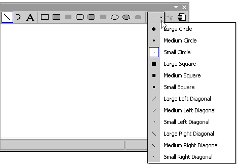
The Image Editor toolbar contains tools for drawing, painting, entering text, erasing, and manipulating views. It also contains an option selector, with which you can select options for using each tool. For example, you can choose from various brush widths, magnification factors, and line styles.
All tools available on the Image Editor toolbar are also available from the menu Image > Tools. To use the Image Editor toolbar and Option selector, select the tool or option that you want.

Image Editor toolbar
Tip
Tool tips appear when you hover your cursor over a toolbar button. These tips can help you identify the function of each button.
Since many of the drawing tools are available from the keyboard, it's sometimes useful to hide the Image Editor toolbar.
- To display or hide the Image Editor toolbar, go to menu View > Toolbars and choose Image Editor.
Note
Elements from this toolbar will appear unavailable when an image file from the current project or solution isn't open in the Image Editor.
Option selector
With the Option selector you can specify the width of a line, brush stroke, and more. The icon on the Option selector button changes depending on which tool you've selected.
Option selector on the Image Editor toolbar
Text tool
Use the Text Tool dialog box to add text to a cursor, bitmap, or icon resource.
To access this dialog box, open the Image Editor and go to menu Image > Tools, then select the Text Tool command.
Tip
You can right-click on the Text Tool dialog box to access a default shortcut menu that contains a list of standard Windows commands.
Open the Text Tool Font dialog box to change the font, style, or size of the cursor font. Changes are applied to the text displayed in the Text area.
To access this dialog box, select the Font button in the Text Tool dialog box. The properties available are:
| Property | Description |
|---|---|
| Font | Lists the available fonts. |
| Font Style | Lists the available styles for the specified font. |
| Size | Lists the available point sizes for the specified font. |
| Sample | Shows a sample of how text will appear with the specified font settings. |
| Script | Lists the available language scripts for the specified font. When you select a different language script, the character set for that language becomes available for creating multilingual documents. |
To change the font of text on an image
Here is an example of how to add text to an icon in a Windows application and manipulate the font of your text.
Create a C++ Windows Forms Application. For details, see How to: Create Windows Forms Applications. An app.ico file is added to your project by default.
In Solution Explorer, double-click the file app.ico. The Image Editor will open.
Go to menu Image > Tools and select Text Tool.
In the Text Tool dialog box, type C++ in the empty text area. This text will appear in a resizable box located in the upper left corner of app.ico in the Image Editor.
In the Image Editor, drag the resizable box to the center of app.ico to improve the readability of your text.
In the Text Tool dialog box, select the Font button.
In the Text Tool Font dialog box:
Select Times New Roman from the list of available fonts that are listed in the Font list box.
Select Bold from the list of available font styles listed in the Font style list box.
Select 10 from the list of available point sizes listed in the Size list box.
Choose OK. The Text Tool Font dialog box will close and the new font settings will apply to your text.
Choose Close on the Text Tool dialog box. The resizable box around your text will disappear from the Image Editor.
The text area displays the text that appears as part of the resource. Initially this area is empty.
Note
If Transparent Background is set, only the text will be placed into the image. If Opaque Background is set, a bounding rectangle, filled with the background color, will be placed behind the text.
Window Panes
The Image Editor window shows two views of an image, with a split bar separating the two panes. You can drag the split bar from side to side to change the relative sizes of the panes. The active pane displays a selection border.
One view is actual size and the other is enlarged by a default enlargement factor of 6. The views in these two panes are updated automatically, any changes you make in one pane are immediately shown in the other. The two panes make it easy for you to work on an enlarged view of your image, in which you can distinguish individual pixels and, at the same time, observe the effect of your work on the actual-size view of the image.
The left pane uses as much space as is needed (up to half of the Image window) to display the default 1:1 magnification view of your image. The right pane displays a default 6:1 magnification zoomed image. You can change the magnification in each pane using the Magnify tool on the Image Editor toolbar or by using the accelerator keys.
You can enlarge the smaller pane of the Image Editor window and use the two panes to show different regions of a large image. Select inside the pane to choose it.
You can change the relative sizes of the panes by positioning the pointer on the split bar and moving the split bar to the right or left. The split bar can move all the way to either side if you want to work on only one pane.
If the Image Editor pane is enlarged by a factor of 4 or greater, you can display a pixel grid that delimits the individual pixels in the image.
To change the magnification factor
By default, the Image Editor displays the view in the left pane at actual size and the view in the right pane at 6 times actual size. The magnification factor (seen in the status bar at the bottom of the workspace) is the ratio between the actual size of the image and the displayed size. The default factor is 6 and the range is from 1 to 10.
Select the Image Editor pane whose magnification factor you want to change.
On the Image Editor toolbar, select the arrow to the right of the Magnify tool and select the magnification-factor from the submenu: 1X, 2X, 6X, or 8X.
Note
To select a magnification factor other than those listed in the Magnify tool, use the accelerator keys.
To display or hide the pixel grid
For all Image Editor panes with a magnification factor of 4 or greater, you can display a grid that delimits the individual pixels in the image.
Go to menu Image > Grid Settings.
Select the Pixel Grid check box to display the grid, or clear the box to hide the grid.
Requirements
None
See also
Feedback
Coming soon: Throughout 2024 we will be phasing out GitHub Issues as the feedback mechanism for content and replacing it with a new feedback system. For more information see: https://aka.ms/ContentUserFeedback.
Submit and view feedback for