Data binding overview (WPF .NET)
Data binding in Windows Presentation Foundation (WPF) provides a simple and consistent way for apps to present and interact with data. Elements can be bound to data from different kinds of data sources in the form of .NET objects and XML. Any ContentControl such as Button and any ItemsControl, such as ListBox and ListView, have built-in functionality to enable flexible styling of single data items or collections of data items. Sort, filter, and group views can be generated on top of the data.
The data binding in WPF has several advantages over traditional models, including inherent support for data binding by a broad range of properties, flexible UI representation of data, and clean separation of business logic from UI.
This article first discusses concepts fundamental to WPF data binding and then covers the usage of the Binding class and other features of data binding.
Important
The Desktop Guide documentation for .NET 7 and .NET 6 is under construction.
What is data binding?
Data binding is the process that establishes a connection between the app UI and the data it displays. If the binding has the correct settings and the data provides the proper notifications, when the data changes its value, the elements that are bound to the data reflect changes automatically. Data binding can also mean that if an outer representation of the data in an element changes, then the underlying data can be automatically updated to reflect the change. For example, if the user edits the value in a TextBox element, the underlying data value is automatically updated to reflect that change.
A typical use of data binding is to place server or local configuration data into forms or other UI controls. In WPF, this concept is expanded to include binding a broad range of properties to different kinds of data sources. In WPF, dependency properties of elements can be bound to .NET objects (including ADO.NET objects or objects associated with Web Services and Web properties) and XML data.
Basic data binding concepts
Regardless of what element you're binding and the nature of your data source, each binding always follows the model illustrated by the following figure.
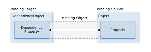
As the figure shows, data binding is essentially the bridge between your binding target and your binding source. The figure demonstrates the following fundamental WPF data binding concepts:
Typically, each binding has four components:
- A binding target object.
- A target property.
- A binding source.
- A path to the value in the binding source to use.
For example, if you bound the content of a
TextBoxto theEmployee.Nameproperty, you would set up your binding like the following table:Setting Value Target TextBox Target property Text Source object EmployeeSource object value path NameThe target property must be a dependency property.
Most UIElement properties are dependency properties, and most dependency properties, except read-only ones, support data binding by default. Only types derived from DependencyObject can define dependency properties. All UIElement types derive from
DependencyObject.Binding sources aren't restricted to custom .NET objects.
Although not shown in the figure, it should be noted that the binding source object isn't restricted to being a custom .NET object. WPF data binding supports data in the form of .NET objects, XML, and even XAML element objects. To provide some examples, your binding source may be a UIElement, any list object, an ADO.NET or Web Services object, or an XmlNode that contains your XML data. For more information, see Binding sources overview.
It's important to remember that when you're establishing a binding, you're binding a binding target to a binding source. For example, if you're displaying some underlying XML data in a ListBox using data binding, you're binding your ListBox to the XML data.
To establish a binding, you use the Binding object. The rest of this article discusses many of the concepts associated with and some of the properties and usage of the Binding object.
Data context
When data binding is declared on XAML elements, they resolve data binding by looking at their immediate DataContext property. The data context is typically the binding source object for the binding source value path evaluation. You can override this behavior in the binding and set a specific binding source object value. If the DataContext property for the object hosting the binding isn't set, the parent element's DataContext property is checked, and so on, up until the root of the XAML object tree. In short, the data context used to resolve binding is inherited from the parent unless explicitly set on the object.
Bindings can be configured to resolve with a specific object, as opposed to using the data context for binding resolution. Specifying a source object directly is used when, for example, you bind the foreground color of an object to the background color of another object. Data context isn't needed since the binding is resolved between those two objects. Inversely, bindings that aren't bound to specific source objects use data-context resolution.
When the DataContext property changes, all bindings that could be affected by the data context are reevaluated.
Direction of the data flow
As indicated by the arrow in the previous figure, the data flow of a binding can go from the binding target to the binding source (for example, the source value changes when a user edits the value of a TextBox) and/or from the binding source to the binding target (for example, your TextBox content is updated with changes in the binding source) if the binding source provides the proper notifications.
You may want your app to enable users to change the data and propagate it back to the source object. Or you may not want to enable users to update the source data. You can control the flow of data by setting the Binding.Mode.
This figure illustrates the different types of data flow:
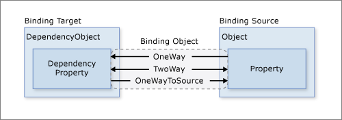
OneWay binding causes changes to the source property to automatically update the target property, but changes to the target property are not propagated back to the source property. This type of binding is appropriate if the control being bound is implicitly read-only. For instance, you may bind to a source such as a stock ticker, or perhaps your target property has no control interface provided for making changes, such as a data-bound background color of a table. If there's no need to monitor the changes of the target property, using the OneWay binding mode avoids the overhead of the TwoWay binding mode.
TwoWay binding causes changes to either the source property or the target property to automatically update the other. This type of binding is appropriate for editable forms or other fully interactive UI scenarios. Most properties default to OneWay binding, but some dependency properties (typically properties of user-editable controls such as the TextBox.Text and CheckBox.IsChecked default to TwoWay binding.
A programmatic way to determine whether a dependency property binds one-way or two-way by default is to get the property metadata with DependencyProperty.GetMetadata. The return type of this method is PropertyMetadata, which doesn't contain any metadata about binding. However, if this type can be cast to the derived FrameworkPropertyMetadata, then the Boolean value of the FrameworkPropertyMetadata.BindsTwoWayByDefault property can be checked. The following code example demonstrates getting the metadata for the TextBox.Text property:
public static void PrintMetadata()
{
    // Get the metadata for the property
    PropertyMetadata metadata = TextBox.TextProperty.GetMetadata(typeof(TextBox));

    // Check if metadata type is FrameworkPropertyMetadata
    if (metadata is FrameworkPropertyMetadata frameworkMetadata)
    {
        System.Diagnostics.Debug.WriteLine($"TextBox.Text property metadata:");
        System.Diagnostics.Debug.WriteLine($"  BindsTwoWayByDefault: {frameworkMetadata.BindsTwoWayByDefault}");
        System.Diagnostics.Debug.WriteLine($"  IsDataBindingAllowed: {frameworkMetadata.IsDataBindingAllowed}");
        System.Diagnostics.Debug.WriteLine($"        AffectsArrange: {frameworkMetadata.AffectsArrange}");
        System.Diagnostics.Debug.WriteLine($"        AffectsMeasure: {frameworkMetadata.AffectsMeasure}");
        System.Diagnostics.Debug.WriteLine($"         AffectsRender: {frameworkMetadata.AffectsRender}");
        System.Diagnostics.Debug.WriteLine($"              Inherits: {frameworkMetadata.Inherits}");
    }

    /*  Displays:
     *
     *  TextBox.Text property metadata:
     *    BindsTwoWayByDefault: True
     *    IsDataBindingAllowed: True
     *          AffectsArrange: False
     *          AffectsMeasure: False
     *           AffectsRender: False
     *                Inherits: False
    */
}
Public Shared Sub PrintMetadata() Dim metadata As PropertyMetadata = TextBox.TextProperty.GetMetadata(GetType(TextBox)) Dim frameworkMetadata As FrameworkPropertyMetadata = TryCast(metadata, FrameworkPropertyMetadata) If frameworkMetadata IsNot Nothing Then System.Diagnostics.Debug.WriteLine($"TextBox.Text property metadata:") System.Diagnostics.Debug.WriteLine($" BindsTwoWayByDefault: {frameworkMetadata.BindsTwoWayByDefault}") System.Diagnostics.Debug.WriteLine($" IsDataBindingAllowed: {frameworkMetadata.IsDataBindingAllowed}") System.Diagnostics.Debug.WriteLine($" AffectsArrange: {frameworkMetadata.AffectsArrange}") System.Diagnostics.Debug.WriteLine($" AffectsMeasure: {frameworkMetadata.AffectsMeasure}") System.Diagnostics.Debug.WriteLine($" AffectsRender: {frameworkMetadata.AffectsRender}") System.Diagnostics.Debug.WriteLine($" Inherits: {frameworkMetadata.Inherits}") ' Displays: ' ' TextBox.Text property metadata: ' BindsTwoWayByDefault: True ' IsDataBindingAllowed: True ' AffectsArrange: False ' AffectsMeasure: False ' AffectsRender: False ' Inherits: False End If End SubOneWayToSource is the reverse of OneWay binding; it updates the source property when the target property changes. One example scenario is if you only need to reevaluate the source value from the UI.
Not illustrated in the figure is OneTime binding, which causes the source property to initialize the target property but doesn't propagate subsequent changes. If the data context changes or the object in the data context changes, the change is not reflected in the target property. This type of binding is appropriate if either a snapshot of the current state is appropriate or the data is truly static. This type of binding is also useful if you want to initialize your target property with some value from a source property and the data context isn't known in advance. This mode is essentially a simpler form of OneWay binding that provides better performance in cases where the source value doesn't change.
To detect source changes (applicable to OneWay and TwoWay bindings), the source must implement a suitable property change notification mechanism such as INotifyPropertyChanged. See How to: Implement property change notification (.NET Framework) for an example of an INotifyPropertyChanged implementation.
The Binding.Mode property provides more information about binding modes and an example of how to specify the direction of a binding.
What triggers source updates
Bindings that are TwoWay or OneWayToSource listen for changes in the target property and propagate them back to the source, known as updating the source. For example, you may edit the text of a TextBox to change the underlying source value.
However, is your source value updated while you're editing the text or after you finish editing the text and the control loses focus? The Binding.UpdateSourceTrigger property determines what triggers the update of the source. The dots of the right arrows in the following figure illustrate the role of the Binding.UpdateSourceTrigger property.

If the UpdateSourceTrigger value is UpdateSourceTrigger.PropertyChanged, then the value pointed to by the right arrow of TwoWay or the OneWayToSource bindings is updated as soon as the target property changes. However, if the UpdateSourceTrigger value is LostFocus, then that value only is updated with the new value when the target property loses focus.
Similar to the Mode property, different dependency properties have different default UpdateSourceTrigger values. The default value for most dependency properties is PropertyChanged, which causes the source property's value to instantly change when the target property value is changed. Instant changes are fine for CheckBox and other simple controls. However, for text fields, updating after every keystroke can diminish performance and denies the user the usual opportunity to backspace and fix typing errors before committing to the new value. For example, the TextBox.Text property defaults to the UpdateSourceTrigger value of LostFocus, which causes the source value to change only when the control element loses focus, not when the TextBox.Text property is changed. See the UpdateSourceTrigger property page for information about how to find the default value of a dependency property.
The following table provides an example scenario for each UpdateSourceTrigger value using the TextBox as an example.
| UpdateSourceTrigger value | When the source value is updated | Example scenario for TextBox |
|---|---|---|
LostFocus (default for TextBox.Text) |
When the TextBox control loses focus. | A TextBox that is associated with validation logic (see Data Validation below). |
PropertyChanged |
As you type into the TextBox. | TextBox controls in a chat room window. |
Explicit |
When the app calls UpdateSource. | TextBox controls in an editable form (updates the source values only when the user presses the submit button). |
For an example, see How to: Control when the TextBox text updates the source (.NET Framework).
Example of data binding
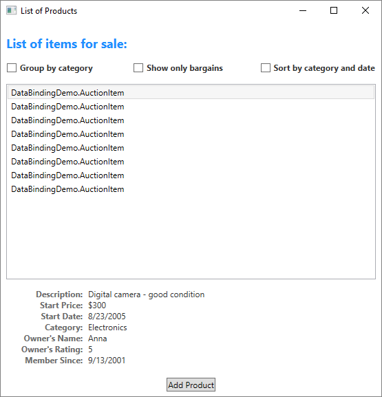
For an example of data binding, take a look at the following app UI from the Data Binding Demo, which displays a list of auction items.
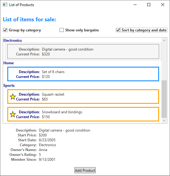
The app demonstrates the following features of data binding:
The content of the ListBox is bound to a collection of AuctionItem objects. An AuctionItem object has properties such as Description, StartPrice, StartDate, Category, and SpecialFeatures.
The data (AuctionItem objects) displayed in the
ListBoxis templated so that the description and the current price are shown for each item. The template is created by using a DataTemplate. In addition, the appearance of each item depends on the SpecialFeatures value of the AuctionItem being displayed. If the SpecialFeatures value of the AuctionItem is Color, the item has a blue border. If the value is Highlight, the item has an orange border and a star. The Data Templating section provides information about data templating.The user can group, filter, or sort the data using the
CheckBoxesprovided. In the image above, the Group by category and Sort by category and dateCheckBoxesare selected. You may have noticed that the data is grouped based on the category of the product, and the category name is in alphabetical order. It's difficult to notice from the image but the items are also sorted by the start date within each category. Sorting is done using a collection view. The Binding to collections section discusses collection views.When the user selects an item, the ContentControl displays the details of the selected item. This experience is called the Master-detail scenario. The Master-detail scenario section provides information about this type of binding.
The type of the StartDate property is DateTime, which returns a date that includes the time to the millisecond. In this app, a custom converter has been used so that a shorter date string is displayed. The Data conversion section provides information about converters.
When the user selects the Add Product button, the following form comes up.
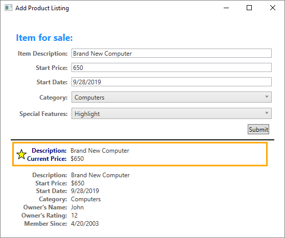
The user can edit the fields in the form, preview the product listing using the short or detailed preview panes, and select Submit to add the new product listing. Any existing grouping, filtering and sorting settings will apply to the new entry. In this particular case, the item entered in the above image will be displayed as the second item within the Computer category.
Not shown in this image is the validation logic provided in the Start Date TextBox. If the user enters an invalid date (invalid formatting or a past date), the user will be notified with a ToolTip and a red exclamation point next to the TextBox. The Data Validation section discusses how to create validation logic.
Before going into the different features of data binding outlined above, we will first discuss the fundamental concepts that are critical to understanding WPF data binding.
Create a binding
To restate some of the concepts discussed in the previous sections, you establish a binding using the Binding object, and each binding usually has four components: a binding target, a target property, a binding source, and a path to the source value to use. This section discusses how to set up a binding.
Binding sources are tied to the active DataContext for the element. Elements automatically inherit their DataContext if they've not explicitly defined one.
Consider the following example, in which the binding source object is a class named MyData that is defined in the SDKSample namespace. For demonstration purposes, MyData has a string property named ColorName whose value is set to "Red". Thus, this example generates a button with a red background.
<DockPanel xmlns="http://schemas.microsoft.com/winfx/2006/xaml/presentation"
           xmlns:x="http://schemas.microsoft.com/winfx/2006/xaml"
           xmlns:c="clr-namespace:SDKSample">
    <DockPanel.Resources>
        <c:MyData x:Key="myDataSource"/>
    </DockPanel.Resources>
    <DockPanel.DataContext>
        <Binding Source="{StaticResource myDataSource}"/>
    </DockPanel.DataContext>
    <Button Background="{Binding Path=ColorName}"
            Width="150" Height="30">
        I am bound to be RED!
    </Button>
</DockPanel>
For more information on the binding declaration syntax and examples of how to set up a binding in code, see Binding declarations overview.
If we apply this example to our basic diagram, the resulting figure looks like the following. This figure describes a OneWay binding because the Background property supports OneWay binding by default.
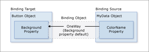
You may wonder why this binding works even though the ColorName property is of type string while the Background property is of type Brush. This binding uses default type conversion, which is discussed in the Data conversion section.
Specifying the binding source
Notice that in the previous example, the binding source is specified by setting the DockPanel.DataContext property. The Button then inherits the DataContext value from the DockPanel, which is its parent element. To reiterate, the binding source object is one of the four necessary components of a binding. So, without the binding source object being specified, the binding would do nothing.
There are several ways to specify the binding source object. Using the DataContext property on a parent element is useful when you're binding multiple properties to the same source. However, sometimes it may be more appropriate to specify the binding source on individual binding declarations. For the previous example, instead of using the DataContext property, you can specify the binding source by setting the Binding.Source property directly on the binding declaration of the button, as in the following example.
<DockPanel xmlns="http://schemas.microsoft.com/winfx/2006/xaml/presentation"
           xmlns:x="http://schemas.microsoft.com/winfx/2006/xaml"
           xmlns:c="clr-namespace:SDKSample">
    <DockPanel.Resources>
        <c:MyData x:Key="myDataSource"/>
    </DockPanel.Resources>
    <Button Background="{Binding Source={StaticResource myDataSource}, Path=ColorName}"
            Width="150" Height="30">
        I am bound to be RED!
    </Button>
</DockPanel>
Other than setting the DataContext property on an element directly, inheriting the DataContext value from an ancestor (such as the button in the first example), and explicitly specifying the binding source by setting the Binding.Source property on the binding (such as the button the last example), you can also use the Binding.ElementName property or the Binding.RelativeSource property to specify the binding source. The ElementName property is useful when you're binding to other elements in your app, such as when you're using a slider to adjust the width of a button. The RelativeSource property is useful when the binding is specified in a ControlTemplate or a Style. For more information, see Binding sources overview.
Specifying the path to the value
If your binding source is an object, you use the Binding.Path property to specify the value to use for your binding. If you're binding to XML data, you use the Binding.XPath property to specify the value. In some cases, it may be applicable to use the Path property even when your data is XML. For example, if you want to access the Name property of a returned XmlNode (as a result of an XPath query), you should use the Path property in addition to the XPath property.
For more information, see the Path and XPath properties.
Although we have emphasized that the Path to the value to use is one of the four necessary components of a binding, in the scenarios that you want to bind to an entire object, the value to use would be the same as the binding source object. In those cases, it's applicable to not specify a Path. Consider the following example.
<ListBox ItemsSource="{Binding}"
         IsSynchronizedWithCurrentItem="true"/>
The above example uses the empty binding syntax: {Binding}. In this case, the ListBox inherits the DataContext from a parent DockPanel element (not shown in this example). When the path isn't specified, the default is to bind to the entire object. In other words, in this example, the path has been left out because we are binding the ItemsSource property to the entire object. (See the Binding to collections section for an in-depth discussion.)
Other than binding to a collection, this scenario is also useful when you want to bind to an entire object instead of just a single property of an object. For example, if your source object is of type String, you may simply want to bind to the string itself. Another common scenario is when you want to bind an element to an object with several properties.
You may need to apply custom logic so that the data is meaningful to your bound target property. The custom logic may be in the form of a custom converter if default type conversion doesn't exist. See Data conversion for information about converters.
Binding and BindingExpression
Before getting into other features and usages of data binding, it's useful to introduce the BindingExpression class. As you have seen in previous sections, the Binding class is the high-level class for the declaration of a binding; it provides many properties that allow you to specify the characteristics of a binding. A related class, BindingExpression, is the underlying object that maintains the connection between the source and the target. A binding contains all the information that can be shared across several binding expressions. A BindingExpression is an instance expression that cannot be shared and contains all the instance information of the Binding.
Consider the following example, where myDataObject is an instance of the MyData class, myBinding is the source Binding object, and MyData is a defined class that contains a string property named ColorName. This example binds the text content of myText, an instance of TextBlock, to ColorName.
// Make a new source
var myDataObject = new MyData();
var myBinding = new Binding("ColorName")
{
    Source = myDataObject
};

// Bind the data source to the TextBox control's Text dependency property
myText.SetBinding(TextBlock.TextProperty, myBinding);
' Make a New source
Dim myDataObject As New MyData
Dim myBinding As New Binding("ColorName")
myBinding.Source = myDataObject

' Bind the data source to the TextBox control's Text dependency property
myText.SetBinding(TextBlock.TextProperty, myBinding)
You can use the same myBinding object to create other bindings. For example, you can use the myBinding object to bind the text content of a check box to ColorName. In that scenario, there will be two instances of BindingExpression sharing the myBinding object.
A BindingExpression object is returned by calling GetBindingExpression on a data-bound object. The following articles demonstrate some of the usages of the BindingExpression class:
- Get the binding object from a bound target property (.NET Framework)
- Control When the TextBox text updates the source (.NET Framework)
Data conversion
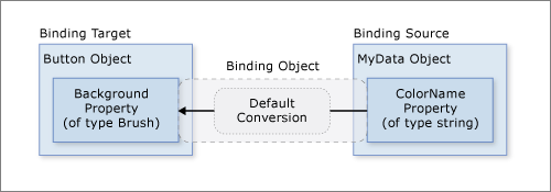
In the Create a binding section, the button is red because its Background property is bound to a string property with the value "Red". This string value works because a type converter is present on the Brush type to convert the string value to a Brush.
Adding this information to the figure in the Create a binding section looks like this.
However, what if instead of having a property of type string your binding source object has a Color property of type Color? In that case, in order for the binding to work you would need to first turn the Color property value into something that the Background property accepts. You would need to create a custom converter by implementing the IValueConverter interface, as in the following example.
[ValueConversion(typeof(Color), typeof(SolidColorBrush))]
public class ColorBrushConverter : IValueConverter
{
    public object Convert(object value, Type targetType, object parameter, System.Globalization.CultureInfo culture)
    {
        Color color = (Color)value;
        return new SolidColorBrush(color);
    }

    public object ConvertBack(object value, Type targetType, object parameter, System.Globalization.CultureInfo culture)
    {
        return null;
    }
}
<ValueConversion(GetType(Color), GetType(SolidColorBrush))>
Public Class ColorBrushConverter
    Implements IValueConverter
    Public Function Convert(ByVal value As Object, ByVal targetType As Type, ByVal parameter As Object, ByVal culture As System.Globalization.CultureInfo) As Object Implements IValueConverter.Convert
        Dim color As Color = CType(value, Color)
        Return New SolidColorBrush(color)
    End Function

    Public Function ConvertBack(ByVal value As Object, ByVal targetType As Type, ByVal parameter As Object, ByVal culture As System.Globalization.CultureInfo) As Object Implements IValueConverter.ConvertBack
        Return Nothing
    End Function
End Class
See IValueConverter for more information.
Now the custom converter is used instead of default conversion, and our diagram looks like this.

To reiterate, default conversions may be available because of type converters that are present in the type being bound to. This behavior will depend on which type converters are available in the target. If in doubt, create your own converter.
The following are some typical scenarios where it makes sense to implement a data converter:
Your data should be displayed differently, depending on culture. For instance, you might want to implement a currency converter or a calendar date/time converter based on the conventions used in a particular culture.
The data being used isn't necessarily intended to change the text value of a property, but is instead intended to change some other value, such as the source for an image, or the color or style of the display text. Converters can be used in this instance by converting the binding of a property that might not seem to be appropriate, such as binding a text field to the Background property of a table cell.
More than one control or multiple properties of controls are bound to the same data. In this case, the primary binding might just display the text, whereas other bindings handle specific display issues but still use the same binding as source information.
A target property has a collection of bindings, which is termed MultiBinding. For MultiBinding, you use a custom IMultiValueConverter to produce a final value from the values of the bindings. For example, color may be computed from red, blue, and green values, which can be values from the same or different binding source objects. See MultiBinding for examples and information.
Binding to collections
A binding source object can be treated either as a single object whose properties contain data or as a data collection of polymorphic objects that are often grouped together (such as the result of a query to a database). So far we've only discussed binding to single objects. However, binding to a data collection is a common scenario. For example, a common scenario is to use an ItemsControl such as a ListBox, ListView, or TreeView to display a data collection, such as in the app shown in the What is data binding section.
Fortunately, our basic diagram still applies. If you're binding an ItemsControl to a collection, the diagram looks like this.
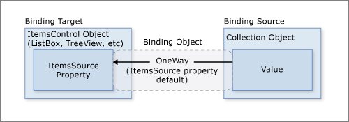
As shown in this diagram, to bind an ItemsControl to a collection object, ItemsControl.ItemsSource property is the property to use. You can think of ItemsSource as the content of the ItemsControl. The binding is OneWay because the ItemsSource property supports OneWay binding by default.
How to implement collections
You can enumerate over any collection that implements the IEnumerable interface. However, to set up dynamic bindings so that insertions or deletions in the collection update the UI automatically, the collection must implement the INotifyCollectionChanged interface. This interface exposes an event that should be raised whenever the underlying collection changes.
WPF provides the ObservableCollection<T> class, which is a built-in implementation of a data collection that exposes the INotifyCollectionChanged interface. To fully support transferring data values from source objects to targets, each object in your collection that supports bindable properties must also implement the INotifyPropertyChanged interface. For more information, see Binding sources overview.
Before implementing your own collection, consider using ObservableCollection<T> or one of the existing collection classes, such as List<T>, Collection<T>, and BindingList<T>, among many others. If you have an advanced scenario and want to implement your own collection, consider using IList, which provides a non-generic collection of objects that can be individually accessed by the index, and thus provides the best performance.
Collection views
Once your ItemsControl is bound to a data collection, you may want to sort, filter, or group the data. To do that, you use collection views, which are classes that implement the ICollectionView interface.
What Are collection views?
A collection view is a layer on top of a binding source collection that allows you to navigate and display the source collection based on sort, filter, and group queries, without having to change the underlying source collection itself. A collection view also maintains a pointer to the current item in the collection. If the source collection implements the INotifyCollectionChanged interface, the changes raised by the CollectionChanged event are propagated to the views.
Because views do not change the underlying source collections, each source collection can have multiple views associated with it. For example, you may have a collection of Task objects. With the use of views, you can display that same data in different ways. For example, on the left side of your page you may want to show tasks sorted by priority, and on the right side, grouped by area.
How to create a view
One way to create and use a view is to instantiate the view object directly and then use it as the binding source. For example, consider the Data binding demo app shown in the What is data binding section. The app is implemented such that the ListBox binds to a view over the data collection instead of the data collection directly. The following example is extracted from the Data binding demo app. The CollectionViewSource class is the XAML proxy of a class that inherits from CollectionView. In this particular example, the Source of the view is bound to the AuctionItems collection (of type ObservableCollection<T>) of the current app object.
<Window.Resources>
    <CollectionViewSource
      Source="{Binding Source={x:Static Application.Current}, Path=AuctionItems}"
      x:Key="listingDataView" />
</Window.Resources>
The resource listingDataView then serves as the binding source for elements in the app, such as the ListBox.
<ListBox Name="Master" Grid.Row="2" Grid.ColumnSpan="3" Margin="8"
         ItemsSource="{Binding Source={StaticResource listingDataView}}" />
To create another view for the same collection, you can create another CollectionViewSource instance and give it a different x:Key name.
The following table shows what view data types are created as the default collection view or by CollectionViewSource based on the source collection type.
| Source collection type | Collection view type | Notes |
|---|---|---|
| IEnumerable | An internal type based on CollectionView | Cannot group items. |
| IList | ListCollectionView | Fastest. |
| IBindingList | BindingListCollectionView |
Using a default view
Specifying a collection view as a binding source is one way to create and use a collection view. WPF also creates a default collection view for every collection used as a binding source. If you bind directly to a collection, WPF binds to its default view. This default view is shared by all bindings to the same collection, so a change made to a default view by one bound control or code (such as sorting or a change to the current item pointer, discussed later) is reflected in all other bindings to the same collection.
To get the default view, you use the GetDefaultView method. For an example, see Get the default view of a data collection (.NET Framework).
Collection views with ADO.NET DataTables
To improve performance, collection views for ADO.NET DataTable or DataView objects delegate sorting and filtering to the DataView, which causes sorting and filtering to be shared across all collection views of the data source. To enable each collection view to sort and filter independently, initialize each collection view with its own DataView object.
Sorting
As mentioned before, views can apply a sort order to a collection. As it exists in the underlying collection, your data may or may not have a relevant, inherent order. The view over the collection allows you to impose an order, or change the default order, based on comparison criteria that you supply. Because it's a client-based view of the data, a common scenario is that the user might want to sort columns of tabular data per the value that the column corresponds to. Using views, this user-driven sort can be applied, again without making any changes to the underlying collection or even having to requery for the collection content. For an example, see Sort a GridView column when a header is clicked (.NET Framework).
The following example shows the sorting logic of the "Sort by category and date" CheckBox of the app UI in the What is data binding section.
private void AddSortCheckBox_Checked(object sender, RoutedEventArgs e)
{
    // Sort the items first by Category and then by StartDate
    listingDataView.SortDescriptions.Add(new SortDescription("Category", ListSortDirection.Ascending));
    listingDataView.SortDescriptions.Add(new SortDescription("StartDate", ListSortDirection.Ascending));
}
Private Sub AddSortCheckBox_Checked(sender As Object, e As RoutedEventArgs)
    ' Sort the items first by Category And then by StartDate
    listingDataView.SortDescriptions.Add(New SortDescription("Category", ListSortDirection.Ascending))
    listingDataView.SortDescriptions.Add(New SortDescription("StartDate", ListSortDirection.Ascending))
End Sub
Filtering
Views can also apply a filter to a collection, so that the view shows only a certain subset of the full collection. You might filter on a condition in the data. For instance, as is done by the app in the What is data binding section, the "Show only bargains" CheckBox contains logic to filter out items that cost $25 or more. The following code is executed to set ShowOnlyBargainsFilter as the Filter event handler when that CheckBox is selected.
private void AddFilteringCheckBox_Checked(object sender, RoutedEventArgs e)
{
    if (((CheckBox)sender).IsChecked == true)
        listingDataView.Filter += ListingDataView_Filter;
    else
        listingDataView.Filter -= ListingDataView_Filter;
}
Private Sub AddFilteringCheckBox_Checked(sender As Object, e As RoutedEventArgs)
    Dim checkBox = DirectCast(sender, CheckBox)

    If checkBox.IsChecked = True Then
        AddHandler listingDataView.Filter, AddressOf ListingDataView_Filter
    Else
        RemoveHandler listingDataView.Filter, AddressOf ListingDataView_Filter
    End If
End Sub
The ShowOnlyBargainsFilter event handler has the following implementation.
private void ListingDataView_Filter(object sender, FilterEventArgs e)
{
    // Start with everything excluded
    e.Accepted = false;

    // Only inlcude items with a price less than 25
    if (e.Item is AuctionItem product && product.CurrentPrice < 25)
        e.Accepted = true;
}
Private Sub ListingDataView_Filter(sender As Object, e As FilterEventArgs)

    ' Start with everything excluded
    e.Accepted = False

    Dim product As AuctionItem = TryCast(e.Item, AuctionItem)

    If product IsNot Nothing Then

        ' Only include products with prices lower than 25
        If product.CurrentPrice < 25 Then e.Accepted = True

    End If

End Sub
If you're using one of the CollectionView classes directly instead of CollectionViewSource, you would use the Filter property to specify a callback. For an example, see Filter Data in a View (.NET Framework).
Grouping
Except for the internal class that views an IEnumerable collection, all collection views support grouping, which allows the user to partition the collection in the collection view into logical groups. The groups can be explicit, where the user supplies a list of groups, or implicit, where the groups are generated dynamically depending on the data.
The following example shows the logic of the "Group by category" CheckBox.
// This groups the items in the view by the property "Category"
var groupDescription = new PropertyGroupDescription();
groupDescription.PropertyName = "Category";
listingDataView.GroupDescriptions.Add(groupDescription);
' This groups the items in the view by the property "Category"
Dim groupDescription = New PropertyGroupDescription()
groupDescription.PropertyName = "Category"
listingDataView.GroupDescriptions.Add(groupDescription)
For another grouping example, see Group Items in a ListView That Implements a GridView (.NET Framework).
Current item pointers
Views also support the notion of a current item. You can navigate through the objects in a collection view. As you navigate, you're moving an item pointer that allows you to retrieve the object that exists at that particular location in the collection. For an example, see Navigate through the objects in a data CollectionView (.NET Framework).
Because WPF binds to a collection only by using a view (either a view you specify, or the collection's default view), all bindings to collections have a current item pointer. When binding to a view, the slash ("/") character in a Path value designates the current item of the view. In the following example, the data context is a collection view. The first line binds to the collection. The second line binds to the current item in the collection. The third line binds to the Description property of the current item in the collection.
<Button Content="{Binding }" />
<Button Content="{Binding Path=/}" />
<Button Content="{Binding Path=/Description}" />
The slash and property syntax can also be stacked to traverse a hierarchy of collections. The following example binds to the current item of a collection named Offices, which is a property of the current item of the source collection.
<Button Content="{Binding /Offices/}" />
The current item pointer can be affected by any sorting or filtering that is applied to the collection. Sorting preserves the current item pointer on the last item selected, but the collection view is now restructured around it. (Perhaps the selected item was at the beginning of the list before, but now the selected item might be somewhere in the middle.) Filtering preserves the selected item if that selection remains in view after the filtering. Otherwise, the current item pointer is set to the first item of the filtered collection view.
Master-detail binding scenario
The notion of a current item is useful not only for navigation of items in a collection, but also for the master-detail binding scenario. Consider the app UI in the What is data binding section again. In that app, the selection within the ListBox determines the content shown in the ContentControl. To put it in another way, when a ListBox item is selected, the ContentControl shows the details of the selected item.
You can implement the master-detail scenario simply by having two or more controls bound to the same view. The following example from the Data binding demo shows the markup of the ListBox and the ContentControl you see on the app UI in the What is data binding section.
<ListBox Name="Master" Grid.Row="2" Grid.ColumnSpan="3" Margin="8"
         ItemsSource="{Binding Source={StaticResource listingDataView}}" />
<ContentControl Name="Detail" Grid.Row="3" Grid.ColumnSpan="3"
                Content="{Binding Source={StaticResource listingDataView}}"
                ContentTemplate="{StaticResource detailsProductListingTemplate}"
                Margin="9,0,0,0"/>
Notice that both of the controls are bound to the same source, the listingDataView static resource (see the definition of this resource in the How to create a view section). This binding works because when a singleton object (the ContentControl in this case) is bound to a collection view, it automatically binds to the CurrentItem of the view. The CollectionViewSource objects automatically synchronize currency and selection. If your list control isn't bound to a CollectionViewSource object as in this example, then you would need to set its IsSynchronizedWithCurrentItem property to true for this to work.
For other examples, see Bind to a collection and display information based on selection (.NET Framework) and Use the master-detail pattern with hierarchical data (.NET Framework).
You may have noticed that the above example uses a template. In fact, the data would not be displayed the way we wish without the use of templates (the one explicitly used by the ContentControl and the one implicitly used by the ListBox). We now turn to data templating in the next section.
Data templating
Without the use of data templates, our app UI in the Example of data binding section would look like the following:
As shown in the example in the previous section, both the ListBox control and the ContentControl are bound to the entire collection object (or more specifically, the view over the collection object) of AuctionItems. Without specific instructions of how to display the data collection, the ListBox displays the string representation of each object in the underlying collection, and the ContentControl displays the string representation of the object it's bound to.
To solve that problem, the app defines DataTemplates. As shown in the example in the previous section, the ContentControl explicitly uses the detailsProductListingTemplate data template. The ListBox control implicitly uses the following data template when displaying the AuctionItem objects in the collection.
<DataTemplate DataType="{x:Type src:AuctionItem}">
    <Border BorderThickness="1" BorderBrush="Gray"
            Padding="7" Name="border" Margin="3" Width="500">
        <Grid>
            <Grid.RowDefinitions>
                <RowDefinition/>
                <RowDefinition/>
                <RowDefinition/>
                <RowDefinition/>
            </Grid.RowDefinitions>
            <Grid.ColumnDefinitions>
                <ColumnDefinition Width="20"/>
                <ColumnDefinition Width="86"/>
                <ColumnDefinition Width="*"/>
            </Grid.ColumnDefinitions>

            <Polygon Grid.Row="0" Grid.Column="0" Grid.RowSpan="4"
                     Fill="Yellow" Stroke="Black" StrokeThickness="1"
                     StrokeLineJoin="Round" Width="20" Height="20"
                     Stretch="Fill"
                     Points="9,2 11,7 17,7 12,10 14,15 9,12 4,15 6,10 1,7 7,7"
                     Visibility="Hidden" Name="star"/>

            <TextBlock Grid.Row="0" Grid.Column="1" Margin="0,0,8,0"
                       Name="descriptionTitle"
                       Style="{StaticResource smallTitleStyle}">Description:</TextBlock>

            <TextBlock Name="DescriptionDTDataType" Grid.Row="0" Grid.Column="2"
                       Text="{Binding Path=Description}"
                       Style="{StaticResource textStyleTextBlock}"/>

            <TextBlock Grid.Row="1" Grid.Column="1" Margin="0,0,8,0"
                       Name="currentPriceTitle"
                       Style="{StaticResource smallTitleStyle}">Current Price:</TextBlock>

            <StackPanel Grid.Row="1" Grid.Column="2" Orientation="Horizontal">
                <TextBlock Text="$" Style="{StaticResource textStyleTextBlock}"/>
                <TextBlock Name="CurrentPriceDTDataType"
                           Text="{Binding Path=CurrentPrice}"
                           Style="{StaticResource textStyleTextBlock}"/>
            </StackPanel>
        </Grid>
    </Border>
    <DataTemplate.Triggers>
        <DataTrigger Binding="{Binding Path=SpecialFeatures}">
            <DataTrigger.Value>
                <src:SpecialFeatures>Color</src:SpecialFeatures>
            </DataTrigger.Value>
            <DataTrigger.Setters>
                <Setter Property="BorderBrush" Value="DodgerBlue" TargetName="border" />
                <Setter Property="Foreground" Value="Navy" TargetName="descriptionTitle" />
                <Setter Property="Foreground" Value="Navy" TargetName="currentPriceTitle" />
                <Setter Property="BorderThickness" Value="3" TargetName="border" />
                <Setter Property="Padding" Value="5" TargetName="border" />
            </DataTrigger.Setters>
        </DataTrigger>
        <DataTrigger Binding="{Binding Path=SpecialFeatures}">
            <DataTrigger.Value>
                <src:SpecialFeatures>Highlight</src:SpecialFeatures>
            </DataTrigger.Value>
            <Setter Property="BorderBrush" Value="Orange" TargetName="border" />
            <Setter Property="Foreground" Value="Navy" TargetName="descriptionTitle" />
            <Setter Property="Foreground" Value="Navy" TargetName="currentPriceTitle" />
            <Setter Property="Visibility" Value="Visible" TargetName="star" />
            <Setter Property="BorderThickness" Value="3" TargetName="border" />
            <Setter Property="Padding" Value="5" TargetName="border" />
        </DataTrigger>
    </DataTemplate.Triggers>
</DataTemplate>
With the use of those two DataTemplates, the resulting UI is the one shown in the What is data binding section. As you can see from that screenshot, in addition to letting you place data in your controls, DataTemplates allow you to define compelling visuals for your data. For example, DataTriggers are used in the above DataTemplate so that AuctionItems with SpecialFeatures value of HighLight would be displayed with an orange border and a star.
For more information about data templates, see the Data templating overview (.NET Framework).
Data validation
Most app that take user input need to have validation logic to ensure that the user has entered the expected information. The validation checks can be based on type, range, format, or other app-specific requirements. This section discusses how data validation works in WPF.
Associating validation rules with a binding
The WPF data binding model allows you to associate ValidationRules with your Binding object. For example, the following example binds a TextBox to a property named StartPrice and adds a ExceptionValidationRule object to the Binding.ValidationRules property.
<TextBox Name="StartPriceEntryForm" Grid.Row="2"
         Style="{StaticResource textStyleTextBox}" Margin="8,5,0,5" Grid.ColumnSpan="2">
    <TextBox.Text>
        <Binding Path="StartPrice" UpdateSourceTrigger="PropertyChanged">
            <Binding.ValidationRules>
                <ExceptionValidationRule />
            </Binding.ValidationRules>
        </Binding>
    </TextBox.Text>
</TextBox>
A ValidationRule object checks whether the value of a property is valid. WPF has two types of built-in ValidationRule objects:
A ExceptionValidationRule checks for exceptions thrown during the update of the binding source property. In the previous example,
StartPriceis of type integer. When the user enters a value that cannot be converted to an integer, an exception is thrown, causing the binding to be marked as invalid. An alternative syntax to setting the ExceptionValidationRule explicitly is to set the ValidatesOnExceptions property totrueon your Binding or MultiBinding object.A DataErrorValidationRule object checks for errors that are raised by objects that implement the IDataErrorInfo interface. For more information about using this validation rule, see DataErrorValidationRule. An alternative syntax to setting the DataErrorValidationRule explicitly is to set the ValidatesOnDataErrors property to
trueon your Binding or MultiBinding object.
You can also create your own validation rule by deriving from the ValidationRule class and implementing the Validate method. The following example shows the rule used by the Add Product Listing "Start Date" TextBox from the What is data binding section.
public class FutureDateRule : ValidationRule
{
    public override ValidationResult Validate(object value, CultureInfo cultureInfo)
    {
        // Test if date is valid
        if (DateTime.TryParse(value.ToString(), out DateTime date))
        {
            // Date is not in the future, fail
            if (DateTime.Now > date)
                return new ValidationResult(false, "Please enter a date in the future.");
        }
        else
        {
            // Date is not a valid date, fail
            return new ValidationResult(false, "Value is not a valid date.");
        }

        // Date is valid and in the future, pass
        return ValidationResult.ValidResult;
    }
}
Public Class FutureDateRule
    Inherits ValidationRule

    Public Overrides Function Validate(value As Object, cultureInfo As CultureInfo) As ValidationResult

        Dim inputDate As Date

        ' Test if date is valid
        If Date.TryParse(value.ToString, inputDate) Then

            ' Date is not in the future, fail
            If Date.Now > inputDate Then
                Return New ValidationResult(False, "Please enter a date in the future.")
            End If

        Else
            ' // Date Is Not a valid date, fail
            Return New ValidationResult(False, "Value is not a valid date.")
        End If

        ' Date is valid and in the future, pass
        Return ValidationResult.ValidResult

    End Function

End Class
The StartDateEntryForm TextBox uses this FutureDateRule, as shown in the following example.
<TextBox Name="StartDateEntryForm" Grid.Row="3"
         Validation.ErrorTemplate="{StaticResource validationTemplate}"
         Style="{StaticResource textStyleTextBox}" Margin="8,5,0,5" Grid.ColumnSpan="2">
    <TextBox.Text>
        <Binding Path="StartDate" UpdateSourceTrigger="PropertyChanged"
                 Converter="{StaticResource dateConverter}" >
            <Binding.ValidationRules>
                <src:FutureDateRule />
            </Binding.ValidationRules>
        </Binding>
    </TextBox.Text>
</TextBox>
Because the UpdateSourceTrigger value is PropertyChanged, the binding engine updates the source value on every keystroke, which means it also checks every rule in the ValidationRules collection on every keystroke. We discuss this further in the Validation Process section.
Providing visual feedback
If the user enters an invalid value, you may want to provide some feedback about the error on the app UI. One way to provide such feedback is to set the Validation.ErrorTemplate attached property to a custom ControlTemplate. As shown in the previous subsection, the StartDateEntryForm TextBox uses an ErrorTemplate called validationTemplate. The following example shows the definition of validationTemplate.
<ControlTemplate x:Key="validationTemplate">
    <DockPanel>
        <TextBlock Foreground="Red" FontSize="20">!</TextBlock>
        <AdornedElementPlaceholder/>
    </DockPanel>
</ControlTemplate>
The AdornedElementPlaceholder element specifies where the control being adorned should be placed.
In addition, you may also use a ToolTip to display the error message. Both the StartDateEntryForm and the StartPriceEntryFormTextBoxes use the style textStyleTextBox, which creates a ToolTip that displays the error message. The following example shows the definition of textStyleTextBox. The attached property Validation.HasError is true when one or more of the bindings on the properties of the bound element are in error.
<Style x:Key="textStyleTextBox" TargetType="TextBox">
    <Setter Property="Foreground" Value="#333333" />
    <Setter Property="MaxLength" Value="40" />
    <Setter Property="Width" Value="392" />
    <Style.Triggers>
        <Trigger Property="Validation.HasError" Value="true">
            <Setter Property="ToolTip"
                    Value="{Binding (Validation.Errors).CurrentItem.ErrorContent, RelativeSource={RelativeSource Self}}" />
        </Trigger>
    </Style.Triggers>
</Style>
With the custom ErrorTemplate and the ToolTip, the StartDateEntryForm TextBox looks like the following when there's a validation error.

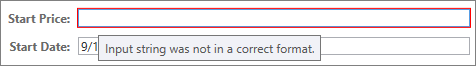
If your Binding has associated validation rules but you do not specify an ErrorTemplate on the bound control, a default ErrorTemplate will be used to notify users when there's a validation error. The default ErrorTemplate is a control template that defines a red border in the adorner layer. With the default ErrorTemplate and the ToolTip, the UI of the StartPriceEntryForm TextBox looks like the following when there's a validation error.
For an example of how to provide logic to validate all controls in a dialog box, see the Custom Dialog Boxes section in the Dialog boxes overview.
Validation process
Validation usually occurs when the value of a target is transferred to the binding source property. This transfer occurs on TwoWay and OneWayToSource bindings. To reiterate, what causes a source update depends on the value of the UpdateSourceTrigger property, as described in the What triggers source updates section.
The following items describe the validation process. If a validation error or other type of error occurs at any time during this process, the process is halted:
The binding engine checks if there are any custom ValidationRule objects defined whose ValidationStep is set to RawProposedValue for that Binding, in which case it calls the Validate method on each ValidationRule until one of them runs into an error or until all of them pass.
The binding engine then calls the converter, if one exists.
If the converter succeeds, the binding engine checks if there are any custom ValidationRule objects defined whose ValidationStep is set to ConvertedProposedValue for that Binding, in which case it calls the Validate method on each ValidationRule that has ValidationStep set to ConvertedProposedValue until one of them runs into an error or until all of them pass.
The binding engine sets the source property.
The binding engine checks if there are any custom ValidationRule objects defined whose ValidationStep is set to UpdatedValue for that Binding, in which case it calls the Validate method on each ValidationRule that has ValidationStep set to UpdatedValue until one of them runs into an error or until all of them pass. If a DataErrorValidationRule is associated with a binding and its ValidationStep is set to the default, UpdatedValue, the DataErrorValidationRule is checked at this point. At this point any binding that has the ValidatesOnDataErrors set to
trueis checked.The binding engine checks if there are any custom ValidationRule objects defined whose ValidationStep is set to CommittedValue for that Binding, in which case it calls the Validate method on each ValidationRule that has ValidationStep set to CommittedValue until one of them runs into an error or until all of them pass.
If a ValidationRule doesn't pass at any time throughout this process, the binding engine creates a ValidationError object and adds it to the Validation.Errors collection of the bound element. Before the binding engine runs the ValidationRule objects at any given step, it removes any ValidationError that was added to the Validation.Errors attached property of the bound element during that step. For example, if a ValidationRule whose ValidationStep is set to UpdatedValue failed, the next time the validation process occurs, the binding engine removes that ValidationError immediately before it calls any ValidationRule that has ValidationStep set to UpdatedValue.
When Validation.Errors isn't empty, the Validation.HasError attached property of the element is set to true. Also, if the NotifyOnValidationError property of the Binding is set to true, then the binding engine raises the Validation.Error attached event on the element.
Also note that a valid value transfer in either direction (target to source or source to target) clears the Validation.Errors attached property.
If the binding either has an ExceptionValidationRule associated with it, or had the ValidatesOnExceptions property is set to true and an exception is thrown when the binding engine sets the source, the binding engine checks to see if there's a UpdateSourceExceptionFilter. You can use the UpdateSourceExceptionFilter callback to provide a custom handler for handling exceptions. If an UpdateSourceExceptionFilter isn't specified on the Binding, the binding engine creates a ValidationError with the exception and adds it to the Validation.Errors collection of the bound element.
Debugging mechanism
You can set the attached property PresentationTraceSources.TraceLevel on a binding-related object to receive information about the status of a specific binding.
See also
.NET Desktop feedback
Feedback
Coming soon: Throughout 2024 we will be phasing out GitHub Issues as the feedback mechanism for content and replacing it with a new feedback system. For more information see: https://aka.ms/ContentUserFeedback.
Submit and view feedback for