Entry
The .NET Multi-platform App UI (.NET MAUI) Entry allows you to enter and edit a single line of text. In addition, the Entry can be used as a password field.
Entry defines the following properties:
CharacterSpacing, of typedouble, sets the spacing between characters in the entered text.ClearButtonVisibility, of typeClearButtonVisibility, controls whether a clear button is displayed, which enables the user to clear the text. The default value of this property ensures that a clear button isn't displayed.CursorPosition, of typeint, defines the position of the cursor within the entry.FontAttributes, of typeFontAttributes, determines text style.FontAutoScalingEnabled, of typebool, defines whether the text will reflect scaling preferences set in the operating system. The default value of this property istrue.FontFamily, of typestring, defines the font family.FontSize, of typedouble, defines the font size.HorizontalTextAlignment, of typeTextAlignment, defines the horizontal alignment of the text.IsPassword, of typebool, specifies whether the entry should visually obscure typed text.IsTextPredictionEnabled, of typebool, controls whether text prediction and automatic text correction is enabled.ReturnCommand, of type ICommand, defines the command to be executed when the return key is pressed.ReturnCommandParameter, of typeobject, specifies the parameter for theReturnCommand.ReturnType, of typeReturnType, specifies the appearance of the return button.SelectionLength, of typeint, represents the length of selected text within the entry.VerticalTextAlignment, of typeTextAlignment, defines the vertical alignment of the text.
ClearButtonVisibility, of typeClearButtonVisibility, controls whether a clear button is displayed, which enables the user to clear the text. The default value of this property ensures that a clear button isn't displayed.HorizontalTextAlignment, of typeTextAlignment, defines the horizontal alignment of the text.IsPassword, of typebool, specifies whether the entry should visually obscure typed text.ReturnCommand, of type ICommand, defines the command to be executed when the return key is pressed.ReturnCommandParameter, of typeobject, specifies the parameter for theReturnCommand.ReturnType, of typeReturnType, specifies the appearance of the return button.VerticalTextAlignment, of typeTextAlignment, defines the vertical alignment of the text.
These properties are backed by BindableProperty objects, which means that they can be targets of data bindings, and styled.
In addition, Entry defines a Completed event, which is raised when the user finalizes text in the Entry with the return key.
Entry derives from the InputView class, from which it inherits the following properties:
CharacterSpacing, of typedouble, sets the spacing between characters in the entered text.IsReadOnly, of typebool, defines whether the user should be prevented from modifying text. The default value of this property isfalse.IsSpellCheckEnabled, of typebool, controls whether spell checking is enabled.Keyboard, of typeKeyboard, specifies the soft input keyboard that's displayed when entering text.MaxLength, of typeint, defines the maximum input length.Placeholder, of typestring, defines the text that's displayed when the control is empty.PlaceholderColor, of type Color, defines the color of the placeholder text.Text, of typestring, defines the text entered into the control.TextColor, of type Color, defines the color of the entered text.TextTransform, of typeTextTransform, specifies the casing of the entered text.
CharacterSpacing, of typedouble, sets the spacing between characters in the entered text.CursorPosition, of typeint, defines the position of the cursor within the editor.FontAttributes, of typeFontAttributes, determines text style.FontAutoScalingEnabled, of typebool, defines whether the text will reflect scaling preferences set in the operating system. The default value of this property istrue.FontFamily, of typestring, defines the font family.FontSize, of typedouble, defines the font size.IsReadOnly, of typebool, defines whether the user should be prevented from modifying text. The default value of this property isfalse.IsSpellCheckEnabled, of typebool, controls whether spell checking is enabled.IsTextPredictionEnabled, of typebool, controls whether text prediction and automatic text correction is enabled.Keyboard, of typeKeyboard, specifies the soft input keyboard that's displayed when entering text.MaxLength, of typeint, defines the maximum input length.Placeholder, of typestring, defines the text that's displayed when the control is empty.PlaceholderColor, of type Color, defines the color of the placeholder text.SelectionLength, of typeint, represents the length of selected text within the control.Text, of typestring, defines the text entered into the control.TextColor, of type Color, defines the color of the entered text.TextTransform, of typeTextTransform, specifies the casing of the entered text.
These properties are backed by BindableProperty objects, which means that they can be targets of data bindings, and styled.
In addition, InputView defines a TextChanged event, which is raised when the text in the Entry changes. The TextChangedEventArgs object that accompanies the TextChanged event has NewTextValue and OldTextValue properties, which specify the new and old text, respectively.
For information about specifying fonts on an Entry, see Fonts.
Create an Entry
The following example shows how to create an Entry:
<Entry x:Name="entry"
       Placeholder="Enter text"
       TextChanged="OnEntryTextChanged"
       Completed="OnEntryCompleted" />
The equivalent C# code is:
Entry entry = new Entry { Placeholder = "Enter text" };
entry.TextChanged += OnEntryTextChanged;
entry.Completed += OnEntryCompleted;
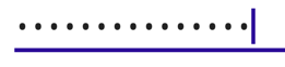
The following screenshot shows the resulting Entry on Android:

Note
On iOS, the soft input keyboard can cover a text input field when the field is near the bottom of the screen, making it difficult to enter text. However, in a .NET MAUI iOS app, pages automatically scroll when the soft input keyboard would cover a text entry field, so that the field is above the soft input keyboard. The KeyboardAutoManagerScroll.Disconnect method, in the Microsoft.Maui.Platform namespace, can be called to disable this default behavior. The KeyboardAutoManagerScroll.Connect method can be called to re-enable the behavior after it's been disabled.
Entered text can be accessed by reading the Text property, and the TextChanged and Completed events signal that the text has changed or been completed.
The TextChanged event is raised when the text in the Entry changes, and the TextChangedEventArgs provide the text before and after the change via the OldTextValue and NewTextValue properties:
void OnEntryTextChanged(object sender, TextChangedEventArgs e)
{
    string oldText = e.OldTextValue;
    string newText = e.NewTextValue;
    string myText = entry.Text;
}
The Completed event is raised when the user has ended input by pressing the Return key on the keyboard, or by pressing the Tab key on Windows. The handler for the event is a generic event handler:
void OnEntryCompleted(object sender, EventArgs e)
{
   string text = ((Entry)sender).Text;
}
After the Completed event fires, any ICommand specified by the ReturnCommand property is executed, with the object specified by the ReturnCommandParameter property being passed to the ReturnCommand.
Note
The VisualElement class, which is in the Entry inheritance hierarchy, also has Focused and Unfocused events.
Set character spacing
Character spacing can be applied to an Entry by setting the CharacterSpacing property to a double value:
<Entry ...
       CharacterSpacing="10" />
The result is that characters in the text displayed by the Entry are spaced CharacterSpacing device-independent units apart.
Note
The CharacterSpacing property value is applied to the text displayed by the Text and Placeholder properties.
Limit input length
The MaxLength property can be used to limit the input length that's permitted for the Entry. This property should be set to a positive integer:
<Entry ...
       MaxLength="10" />
A MaxLength property value of 0 indicates that no input will be allowed, and a value of int.MaxValue, which is the default value for an Entry, indicates that there is no effective limit on the number of characters that may be entered.
Set the cursor position and text selection length
The CursorPosition property can be used to return or set the position at which the next character will be inserted into the string stored in the Text property:
<Entry Text="Cursor position set"
       CursorPosition="5" />
The default value of the CursorPosition property is 0, which indicates that text will be inserted at the start of the Entry.
In addition, the SelectionLength property can be used to return or set the length of text selection within the Entry:
<Entry Text="Cursor position and selection length set"
       CursorPosition="2"
       SelectionLength="10" />
The default value of the SelectionLength property is 0, which indicates that no text is selected.
Display a clear button
The ClearButtonVisibility property can be used to control whether an Entry displays a clear button, which enables the user to clear the text. This property should be set to a ClearButtonVisibility enumeration member:
Neverindicates that a clear button will never be displayed. This is the default value for theClearButtonVisibilityproperty.WhileEditingindicates that a clear button will be displayed in the Entry, while it has focus and text.
The following example shows setting the property:
<Entry Text=".NET MAUI"
       ClearButtonVisibility="WhileEditing" />
The following screenshot shows an Entry on Android with the clear button enabled:

Transform text
An Entry can transform the casing of its text, stored in the Text property, by setting the TextTransform property to a value of the TextTransform enumeration. This enumeration has four values:
Noneindicates that the text won't be transformed.Defaultindicates that the default behavior for the platform will be used. This is the default value of theTextTransformproperty.Lowercaseindicates that the text will be transformed to lowercase.Uppercaseindicates that the text will be transformed to uppercase.
The following example shows transforming text to uppercase:
<Entry Text="This text will be displayed in uppercase."
       TextTransform="Uppercase" />
Obscure text entry
Entry provides the IsPassword property which visually obscures entered text when it's set to true:
<Entry IsPassword="true" />
The following screenshot shows an Entry whose input has been obscured:
Customize the keyboard
The soft input keyboard that's presented when users interact with an Entry can be set programmatically via the Keyboard property, to one of the following properties from the Keyboard class:
Chat– used for texting and places where emoji are useful.Default– the default keyboard.Email– used when entering email addresses.Numeric– used when entering numbers.Plain– used when entering text, without anyKeyboardFlagsspecified.Telephone– used when entering telephone numbers.Text– used when entering text.Url– used for entering file paths & web addresses.
The following example shows setting the Keyboard property:
<Entry Keyboard="Chat" />
The Keyboard class also has a Create factory method that can be used to customize a keyboard by specifying capitalization, spellcheck, and suggestion behavior. KeyboardFlags enumeration values are specified as arguments to the method, with a customized Keyboard being returned. The KeyboardFlags enumeration contains the following values:
None– no features are added to the keyboard.CapitalizeSentence– indicates that the first letter of the first word of each entered sentence will be automatically capitalized.Spellcheck– indicates that spellcheck will be performed on entered text.Suggestions– indicates that word completions will be offered on entered text.CapitalizeWord– indicates that the first letter of each word will be automatically capitalized.CapitalizeCharacter– indicates that every character will be automatically capitalized.CapitalizeNone– indicates that no automatic capitalization will occur.All– indicates that spellcheck, word completions, and sentence capitalization will occur on entered text.
The following XAML code example shows how to customize the default Keyboard to offer word completions and capitalize every entered character:
<Entry Placeholder="Enter text here">
    <Entry.Keyboard>
        <Keyboard x:FactoryMethod="Create">
            <x:Arguments>
                <KeyboardFlags>Suggestions,CapitalizeCharacter</KeyboardFlags>
            </x:Arguments>
        </Keyboard>
    </Entry.Keyboard>
</Entry>
The equivalent C# code is:
Entry entry = new Entry { Placeholder = "Enter text here" };
entry.Keyboard = Keyboard.Create(KeyboardFlags.Suggestions | KeyboardFlags.CapitalizeCharacter);
Customize the return key
The appearance of the return key on the soft input keyboard, which is displayed when an Entry has focus, can be customized by setting the ReturnType property to a value of the ReturnType enumeration:
Default– indicates that no specific return key is required and that the platform default will be used.Done– indicates a "Done" return key.Go– indicates a "Go" return key.Next– indicates a "Next" return key.Search– indicates a "Search" return key.Send– indicates a "Send" return key.
The following XAML example shows how to set the return key:
<Entry ReturnType="Send" />
Note
The exact appearance of the return key is dependent upon the platform. On iOS, the return key is a text-based button. However, on Android and Windows, the return key is a icon-based button.
When the Return key is pressed, the Completed event fires and any ICommand specified by the ReturnCommand property is executed. In addition, any object specified by the ReturnCommandParameter property will be passed to the ICommand as a parameter. For more information about commands, see Commanding.
Hide and show the soft input keyboard
The SoftInputExtensions class, in the Microsoft.Maui namespace, provides a series of extension methods that support interacting with the soft input keyboard on controls that support text input. The class defines the following methods:
IsSoftInputShowing, which checks to see if the device is currently showing the soft input keyboard.HideSoftInputAsync, which will attempt to hide the soft input keyboard if it's currently showing.ShowSoftInputAsync, which will attempt to show the soft input keyboard if it's currently hidden.
The following example shows how to hide the soft input keyboard on an Entry named entry, if it's currently showing:
if (entry.IsSoftInputShowing())
    await entry.HideSoftInputAsync(System.Threading.CancellationToken.None);
Enable and disable spell checking
The IsSpellCheckEnabled property controls whether spell checking is enabled. By default, the property is set to true. As the user enters text, misspellings are indicated.
However, for some text entry scenarios, such as entering a username, spell checking provides a negative experience and should be disabled by setting the IsSpellCheckEnabled property to false:
<Entry ... IsSpellCheckEnabled="false" />
Note
When the IsSpellCheckEnabled property is set to false, and a custom keyboard isn't being used, the native spell checker will be disabled. However, if a Keyboard has been set that disables spell checking, such as Keyboard.Chat, the IsSpellCheckEnabled property is ignored. Therefore, the property cannot be used to enable spell checking for a Keyboard that explicitly disables it.
Enable and disable text prediction
The IsTextPredictionEnabled property controls whether text prediction and automatic text correction is enabled. By default, the property is set to true. As the user enters text, word predictions are presented.
However, for some text entry scenarios, such as entering a username, text prediction and automatic text correction provides a negative experience and should be disabled by setting the IsTextPredictionEnabled property to false:
<Entry ... IsTextPredictionEnabled="false" />
Note
When the IsTextPredictionEnabled property is set to false, and a custom keyboard isn't being used, text prediction and automatic text correction is disabled. However, if a Keyboard has been set that disables text prediction, the IsTextPredictionEnabled property is ignored. Therefore, the property cannot be used to enable text prediction for a Keyboard that explicitly disables it.
Prevent text entry
Users can be prevented from modifying the text in an Entry by setting the IsReadOnly property to true:
<Entry Text="User input won't be accepted."
       IsReadOnly="true" />
Feedback
Coming soon: Throughout 2024 we will be phasing out GitHub Issues as the feedback mechanism for content and replacing it with a new feedback system. For more information see: https://aka.ms/ContentUserFeedback.
Submit and view feedback for