ImageButton
The .NET Multi-platform App UI (.NET MAUI) ImageButton view combines the Button view and Image view to create a button whose content is an image. When you press the ImageButton with a finger or click it with a mouse, it directs the app to carry out a task. However, unlike the Button the ImageButton view has no concept of text and text appearance.
ImageButton defines the following properties:
Aspect, of typeAspect, determines how the image is scaled to fit the display area.BorderColor, of type Color, describes the border color of the button.BorderWidth, of typedouble, defines the width of the button's border.Command, of type ICommand, defines the command that's executed when the button is tapped.CommandParameter, of typeobject, is the parameter that's passed toCommand.CornerRadius, of typeint, describes the corner radius of the button's border.IsLoading, of typebool, represents the loading status of the image. The default value of this property isfalse.IsOpaque, of typebool, determines whether .NET MAUI should treat the image as opaque when rendering it. The default value of this property isfalse.IsPressed, of typebool, represents whether the button is being pressed. The default value of this property isfalse.Padding, of typeThickness, determines the button's padding.Source, of type ImageSource, specifies an image to display as the content of the button.
These properties are backed by BindableProperty objects, which means that they can be targets of data bindings, and styled.
The Aspect property can be set to one of the members of the Aspect enumeration:
Fill- stretches the image to completely and exactly fill the ImageButton. This may result in the image being distorted.AspectFill- clips the image so that it fills the ImageButton while preserving the aspect ratio.AspectFit- letterboxes the image (if necessary) so that the entire image fits into the ImageButton, with blank space added to the top/bottom or sides depending on whether the image is wide or tall. This is the default value of theAspectenumeration.Center- centers the image in the ImageButton while preserving the aspect ratio.
In addition, ImageButton defines Clicked, Pressed, and Released events. The Clicked event is raised when an ImageButton tap with a finger or mouse pointer is released from the button's surface. The Pressed event is raised when a finger presses on an ImageButton, or a mouse button is pressed with the pointer positioned over the ImageButton. The Released event is raised when the finger or mouse button is released. Generally, a Clicked event is also raised at the same time as the Released event, but if the finger or mouse pointer slides away from the surface of the ImageButton before being released, the Clicked event might not occur.
Important
An ImageButton must have its IsEnabled property set to true for it to respond to taps.
Create an ImageButton
To create an image button, create an ImageButton object, set its Source property and handle its Clicked event.
The following XAML example shows how to create an ImageButton:
<ContentPage xmlns="http://schemas.microsoft.com/dotnet/2021/maui"
             xmlns:x="http://schemas.microsoft.com/winfx/2009/xaml"
             x:Class="ControlGallery.Views.XAML.ImageButtonDemoPage"
             Title="ImageButton Demo">
    <StackLayout>
       <ImageButton Source="image.png"
                    Clicked="OnImageButtonClicked"
                    HorizontalOptions="Center"
                    VerticalOptions="Center" />
    </StackLayout>
</ContentPage>
The Source property specifies the image that appears in the ImageButton. The Clicked event is set to an event handler named OnImageButtonClicked. This handler is located in the code-behind file:
public partial class ImageButtonDemoPage : ContentPage
{
    int clickTotal;

    public ImageButtonDemoPage()
    {
        InitializeComponent();
    }

    void OnImageButtonClicked(object sender, EventArgs e)
    {
        clickTotal += 1;
        label.Text = $"{clickTotal} ImageButton click{(clickTotal == 1 ? "" : "s")}";
    }
}
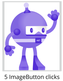
In this example, when the ImageButton is tapped, the OnImageButtonClicked method executes. The sender argument is the ImageButton responsible for this event. You can use this to access the ImageButton object, or to distinguish between multiple ImageButton objects sharing the same Clicked event. The Clicked handler increments a counter and displays the counter value in a Label:
The equivalent C# code to create an ImageButton is:
Label label;
int clickTotal = 0;
...

ImageButton imageButton = new ImageButton
{
    Source = "XamarinLogo.png",
    HorizontalOptions = LayoutOptions.Center,
    VerticalOptions = LayoutOptions.CenterAndExpand
};
imageButton.Clicked += (s, e) =>
{
  clickTotal += 1;
  label.Text = $"{clickTotal} ImageButton click{(clickTotal == 1 ? "" : "s")}";
};
Use the command interface
An app can respond to ImageButton taps without handling the Clicked event. The ImageButton implements an alternative notification mechanism called the command or commanding interface. This consists of two properties:
Commandof type ICommand, an interface defined in theSystem.Windows.Inputnamespace.CommandParameterproperty of typeObject.
This approach is suitable in connection with data-binding, and particularly when implementing the Model-View-ViewModel (MVVM) pattern. For more information about commanding, see Use the command interface in the Button article.
Press and release an ImageButton
The Pressed event is raised when a finger presses on a ImageButton, or a mouse button is pressed with the pointer positioned over the ImageButton. The Released event is raised when the finger or mouse button is released. Generally, the Clicked event is also raised at the same time as the Released event, but if the finger or mouse pointer slides away from the surface of the ImageButton before being released, the Clicked event might not occur.
For more information about these events, see Press and release the button in the Button article.
ImageButton visual states
ImageButton has a Pressed VisualState that can be used to initiate a visual change to the ImageButton when pressed, if it's enabled.
The following XAML example shows how to define a visual state for the Pressed state:
<ImageButton Source="image.png"
             ...>
    <VisualStateManager.VisualStateGroups>
        <VisualStateGroup x:Name="CommonStates">
            <VisualState x:Name="Normal">
                <VisualState.Setters>
                    <Setter Property="Scale"
                            Value="1" />
                </VisualState.Setters>
            </VisualState>
            <VisualState x:Name="Pressed">
                <VisualState.Setters>
                    <Setter Property="Scale"
                            Value="0.8" />
                </VisualState.Setters>
            </VisualState>
        </VisualStateGroup>
    </VisualStateManager.VisualStateGroups>
</ImageButton>
In this example, the Pressed VisualState specifies that when the ImageButton is pressed, its Scale property will be changed from its default value of 1 to 0.8. The Normal VisualState specifies that when the ImageButton is in a normal state, its Scale property will be set to 1. Therefore, the overall effect is that when the ImageButton is pressed, it's rescaled to be slightly smaller, and when the ImageButton is released, it's rescaled to its default size.
For more information about visual states, see Visual states.
Disable an ImageButton
Sometimes an app enters a state where an ImageButton click is not a valid operation. In those cases, the ImageButton should be disabled by setting its IsEnabled property to false.
Feedback
Coming soon: Throughout 2024 we will be phasing out GitHub Issues as the feedback mechanism for content and replacing it with a new feedback system. For more information see: https://aka.ms/ContentUserFeedback.
Submit and view feedback for