FlyoutPage
 Browse the sample
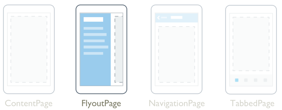
The .NET Multi-platform App UI (.NET MAUI) FlyoutPage is a page that manages two related pages of information – a flyout page that presents items, and a detail page that presents details about items on the flyout page.
A FlyoutPage has two layout behaviors:
- In a popover layout, the detail page covers or partially covers the flyout page. Selecting an item on the flyout page will navigate to the corresponding detail page. Apps running on phones always use this layout behavior.
- In a split layout, the flyout page is displayed on the left and the detail page is on the right. Apps running on tablets or the desktop can use this layout behavior, with Windows using it by default.
For more information about layout behavior, see Layout behavior.
FlyoutPage defines the following properties:
Detail, of type Page, defines the detail page displayed for the selected item in the flyout page.Flyout, of type Page, defines the flyout page.FlyoutLayoutBehavior, of typeFlyoutLayoutBehavior, indicates the layout behavior of flyout and detail pages.IsGestureEnabled, of typebool, determines whether a swipe gesture will switch between flyout and detail pages. The default value of this property istrue.IsPresented, of typebool, determines whether the flyout or detail page is displayed. The default value of this property isfalse, which displays the detail page. It should be set totrueto display the flyout page.
The IsGestureEnabled, IsPresented, and FlyoutLayoutBehavior properties are backed by BindableProperty objects, which means that they can be targets of data bindings, and styled.
FlyoutPage also defines an IsPresentedChanged event, that's raised when the IsPresented property changes value.
Warning
FlyoutPage is incompatible with .NET MAUI Shell apps, and an exception will be thrown if you attempt to use FlyoutPage in a Shell app. For more information about Shell apps, see Shell.
Create a FlyoutPage
To create a flyout page, create a FlyoutPage object and set it's Flyout and Detail properties. The Flyout property should be set to ContentPage object, and the Detail property should be set to a TabbedPage, NavigationPage, or ContentPage object. This will help to ensure a consistent user experience across all platforms.
Important
A FlyoutPage is designed to be the root page of an app, and using it as a child page in other page types could result in unexpected and inconsistent behavior.
The following example shows a FlyoutPage that sets the Flyout and Detail properties:
<FlyoutPage xmlns="http://schemas.microsoft.com/dotnet/2021/maui"
            xmlns:x="http://schemas.microsoft.com/winfx/2009/xaml"
            xmlns:local="clr-namespace:FlyoutPageNavigation"
            x:Class="FlyoutPageNavigation.MainPage">
    <FlyoutPage.Flyout>
        <local:FlyoutMenuPage x:Name="flyoutPage" />
    </FlyoutPage.Flyout>
    <FlyoutPage.Detail>
        <NavigationPage>
            <x:Arguments>
                <local:ContactsPage />
            </x:Arguments>
        </NavigationPage>
    </FlyoutPage.Detail>
</FlyoutPage>
In this example, the Flyout property is set to a ContentPage object, and the Detail property is set to a NavigationPage containing a ContentPage object.
The following example shows the definition of the FlyoutMenuPage object, which is of type ContentPage:
<ContentPage xmlns="http://schemas.microsoft.com/dotnet/2021/maui"
             xmlns:x="http://schemas.microsoft.com/winfx/2009/xaml"
             xmlns:local="clr-namespace:FlyoutPageNavigation"
             x:Class="FlyoutPageNavigation.FlyoutMenuPage"
             Padding="0,40,0,0"
             IconImageSource="hamburger.png"
             Title="Personal Organiser">
    <CollectionView x:Name="collectionView"
                    x:FieldModifier="public"
                    SelectionMode="Single">
        <CollectionView.ItemsSource>
            <x:Array Type="{x:Type local:FlyoutPageItem}">
                <local:FlyoutPageItem Title="Contacts"
                                      IconSource="contacts.png"
                                      TargetType="{x:Type local:ContactsPage}" />
                <local:FlyoutPageItem Title="TodoList"
                                      IconSource="todo.png"
                                      TargetType="{x:Type local:TodoListPage}" />
                <local:FlyoutPageItem Title="Reminders"
                                      IconSource="reminders.png"
                                      TargetType="{x:Type local:ReminderPage}" />
            </x:Array>
        </CollectionView.ItemsSource>
        <CollectionView.ItemTemplate>
            <DataTemplate>
                <Grid Padding="5,10">
                    <Grid.ColumnDefinitions>
                        <ColumnDefinition Width="30"/>
                        <ColumnDefinition Width="*" />
                    </Grid.ColumnDefinitions>
                    <Image Source="{Binding IconSource}" />
                    <Label Grid.Column="1"
                           Margin="20,0"
                           Text="{Binding Title}"
                           FontSize="20"
                           FontAttributes="Bold"
                           VerticalOptions="Center" />
                </Grid>
            </DataTemplate>
        </CollectionView.ItemTemplate>
    </CollectionView>
</ContentPage>
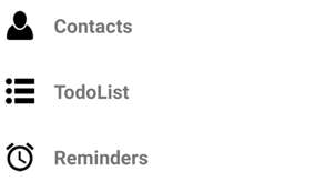
In this example, the flyout page consists of a CollectionView that's populated with data by setting its ItemsSource property to an array of FlyoutPageItem objects. The following example shows the definition of the FlyoutPageItem class:
public class FlyoutPageItem
{
    public string Title { get; set; }
    public string IconSource { get; set; }
    public Type TargetType { get; set; }
}
A DataTemplate is assigned to the CollectionView.ItemTemplate property, to display each FlyoutPageItem. The DataTemplate contains a Grid that consists of an Image and a Label. The Image displays the IconSource property value, and the Label displays the Title property value, for each FlyoutPageItem. In addition, the flyout page has its Title and IconImageSource properties set. The icon will appear on the detail page, provided that the detail page has a title bar.
Note
The Flyout page must have its Title property set, or an exception will occur.
The following screenshot shows the resulting flyout:
Create and display the detail page
The FlyoutMenuPage object contains a CollectionView that's referenced from the MainPage class. This allows the MainPage class to register a handler for the SelectionChanged event. This enables the MainPage object to set the Detail property to the page that represents the selected CollectionView item. The following example shows the event handler:
public partial class MainPage : FlyoutPage
{
    public MainPage()
    {
        ...
        flyoutPage.collectionView.SelectionChanged += OnSelectionChanged;
    }

    void OnSelectionChanged(object sender, SelectionChangedEventArgs e)
    {
        var item = e.CurrentSelection.FirstOrDefault() as FlyoutPageItem;
        if (item != null)
        {
            Detail = new NavigationPage((Page)Activator.CreateInstance(item.TargetType));
            if (!((IFlyoutPageController)this).ShouldShowSplitMode)
                IsPresented = false;
        }
    }
}
In this example, the OnSelectionChanged event handler retrieves the CurrentSelection from the CollectionView object and sets the detail page to an instance of the page type stored in the TargetType property of the FlyoutPageItem. The detail page is displayed by setting the FlyoutPage.IsPresented property to false, provided that the FlyoutPage isn't using a split layout. When the FlyoutPage is using a split layout, the flyout and detail pages are both displayed and so it's not necessary to set the FlyoutPage.IsPresented property.
Layout behavior
How the FlyoutPage displays the flyout and detail pages depends on the form factor of the device the app is running on, the orientation of the device, and the value of the FlyoutLayoutBehavior property. This property should be set to a value of the FlyoutLayoutBehavior enumeration, which defines the following members:
Default– pages are displayed using the platform default.Popover– the detail page covers, or partially covers the flyout page.Split– the flyout page is displayed on the left and the detail page is on the right.SplitOnLandscape– a split screen is used when the device is in landscape orientation.SplitOnPortrait– a split screen is used when the device is in portrait orientation.
The following example shows how to set the FlyoutLayoutBehavior property on a FlyoutPage:
<FlyoutPage ...
            FlyoutLayoutBehavior="Split">
  ...
</FlyoutPage>
Important
The value of the FlyoutLayoutBehavior property only affects apps running on tablets or the desktop. Apps running on phones always have the Popover behavior.
Feedback
Coming soon: Throughout 2024 we will be phasing out GitHub Issues as the feedback mechanism for content and replacing it with a new feedback system. For more information see: https://aka.ms/ContentUserFeedback.
Submit and view feedback for