Style apps using XAML
.NET Multi-platform App UI (.NET MAUI) apps often contain multiple controls that have an identical appearance. For example, an app may have multiple Label instances that have the same font options and layout options:
<Label Text="These labels"
       HorizontalOptions="Center"
       VerticalOptions="Center"
       FontSize="18" />
<Label Text="are not"
       HorizontalOptions="Center"
       VerticalOptions="Center"
       FontSize="18" />
<Label Text="using styles"
       HorizontalOptions="Center"
       VerticalOptions="Center"
       FontSize="18" />
In this example, each Label object has identical property values for controlling the appearance of the text displayed by the Label. However, setting the appearance of each individual control can be repetitive and error prone. Instead, a style can be created that defines the appearance, and then applied to the required controls.
Introduction to styles
An app can be styled by using the Style class to group a collection of property values into one object that can then be applied to multiple visual elements. This helps to reduce repetitive markup, and allows an apps appearance to be more easily changed.
Although styles are designed primarily for XAML-based apps, they can also be created in C#:
- Style objects created in XAML are typically defined in a ResourceDictionary that's assigned to the
Resourcescollection of a control, page, or to theResourcescollection of the app. - Style objects created in C# are typically defined in the page's class, or in a class that can be globally accessed.
Choosing where to define a Style impacts where it can be used:
- Style instances defined at the control-level can only be applied to the control and to its children.
- Style instances defined at the page-level can only be applied to the page and to its children.
- Style instances defined at the app-level can be applied throughout the app.
Each Style object contains a collection of one or more Setter objects, with each Setter having a Property and a Value. The Property is the name of the bindable property of the element the style is applied to, and the Value is the value that is applied to the property.
Each Style object can be explicit, or implicit:
- An explicit Style object is defined by specifying a
TargetTypeand anx:Keyvalue, and by setting the target element's Style property to thex:Keyreference. For more information, see Explicit styles. - An implicit Style object is defined by specifying only a
TargetType. The Style object will then automatically be applied to all elements of that type. However, the subclasses of theTargetTypedo not automatically have the Style applied. For more information, see Implicit styles.
When creating a Style, the TargetType property is always required. The following example shows an explicit style:
<Style x:Key="labelStyle" TargetType="Label">
    <Setter Property="HorizontalOptions" Value="Center" />
    <Setter Property="VerticalOptions" Value="Center" />
    <Setter Property="FontSize" Value="18" />
</Style>
To apply a Style, the target object must be a VisualElement that matches the TargetType property value of the Style:
<Label Text="Demonstrating an explicit style" Style="{StaticResource labelStyle}" />
Styles lower in the view hierarchy take precedence over those defined higher up. For example, setting a Style that sets Label.TextColor to Red at the app-level will be overridden by a page-level style that sets Label.TextColor to Green. Similarly, a page-level style will be overridden by a control-level style. In addition, if Label.TextColor is set directly on a control property, this takes precedence over any styles.
Styles do not respond to property changes, and remain unchanged for the duration of an app. However, apps can respond to style changes dynamically at runtime by using dynamic resources. For more information, see Dynamic styles.
Explicit styles
To create a Style at the page-level, a ResourceDictionary must be added to the page and then one or more Style declarations can be included in the ResourceDictionary. A Style is made explicit by giving its declaration an x:Key attribute, which gives it a descriptive key in the ResourceDictionary. Explicit styles must then be applied to specific visual elements by setting their Style properties.
The following example shows explicit styles in a page's ResourceDictionary, and applied to the page's Label objects:
<ContentPage ...>
    <ContentPage.Resources>
        <Style x:Key="labelRedStyle"
               TargetType="Label">
            <Setter Property="HorizontalOptions" Value="Center" />
            <Setter Property="VerticalOptions" Value="Center" />
            <Setter Property="FontSize" Value="18" />
            <Setter Property="TextColor" Value="Red" />
        </Style>
        <Style x:Key="labelGreenStyle"
               TargetType="Label">
            <Setter Property="HorizontalOptions" Value="Center" />
            <Setter Property="VerticalOptions" Value="Center" />
            <Setter Property="FontSize" Value="18" />
            <Setter Property="TextColor" Value="Green" />
        </Style>
        <Style x:Key="labelBlueStyle"
               TargetType="Label">
            <Setter Property="HorizontalOptions" Value="Center" />
            <Setter Property="VerticalOptions" Value="Center" />
            <Setter Property="FontSize" Value="18" />
            <Setter Property="TextColor" Value="Blue" />
        </Style>
    </ContentPage.Resources>
    <StackLayout>
        <Label Text="These labels"
               Style="{StaticResource labelRedStyle}" />
        <Label Text="are demonstrating"
               Style="{StaticResource labelGreenStyle}" />
        <Label Text="explicit styles,"
               Style="{StaticResource labelBlueStyle}" />
        <Label Text="and an explicit style override"
               Style="{StaticResource labelBlueStyle}"
               TextColor="Teal" />
    </StackLayout>
</ContentPage>
In this example, the ResourceDictionary defines three styles that are explicitly set on the page's Label objects. Each Style is used to display text in a different color, while also setting the font size, and horizontal and vertical layout options. Each Style is applied to a different Label by setting its Style properties using the StaticResource markup extension. In addition, while the final Label has a Style set on it, it also overrides the TextColor property to a different Color value.
Implicit styles
To create a Style at the page-level, a ResourceDictionary must be added to the page and then one or more Style declarations can be included in the ResourceDictionary. A Style is made implicit by not specifying an x:Key attribute. The style will then be applied to in scope visual elements that match the TargetType exactly, but not to elements that are derived from the TargetType value.
The following code example shows an implicit style in a page's ResourceDictionary, and applied to the page's Entry objects:
<ContentPage ...>
    <ContentPage.Resources>
        <Style TargetType="Entry">
            <Setter Property="HorizontalOptions" Value="Fill" />
            <Setter Property="VerticalOptions" Value="Center" />
            <Setter Property="BackgroundColor" Value="Yellow" />
            <Setter Property="FontAttributes" Value="Italic" />
            <Setter Property="TextColor" Value="Blue" />
        </Style>
    </ContentPage.Resources>
    <StackLayout>
        <Entry Text="These entries" />
        <Entry Text="are demonstrating" />
        <Entry Text="implicit styles," />
        <Entry Text="and an implicit style override"
               BackgroundColor="Lime"
               TextColor="Red" />
        <local:CustomEntry Text="Subclassed Entry is not receiving the style" />
    </StackLayout>
</ContentPage>
In this example, the ResourceDictionary defines a single implicit style that are implicitly set on the page's Entry objects. The Style is used to display blue text on a yellow background, while also setting other appearance options. The Style is added to the page's ResourceDictionary without specifying an x:Key attribute. Therefore, the Style is applied to all the Entry objects implicitly as they match the TargetType property of the Style exactly. However, the Style is not applied to the CustomEntry object, which is a subclassed Entry. In addition, the fourth Entry overrides the BackgroundColor and TextColor properties of the style to different Color values.
Apply a style to derived types
The Style.ApplyToDerivedTypes property enables a style to be applied to controls that are derived from the base type referenced by the TargetType property. Therefore, setting this property to true enables a single style to target multiple types, provided that the types derive from the base type specified in the TargetType property.
The following example shows an implicit style that sets the background color of Button instances to red:
<Style TargetType="Button"
       ApplyToDerivedTypes="True">
    <Setter Property="BackgroundColor"
            Value="Red" />
</Style>
Placing this style in a page-level ResourceDictionary will result in it being applied to all Button objects on the page, and also to any controls that derive from Button. However, if the ApplyToDerivedTypes property remained unset, the style would only be applied to Button objects.
Global styles
Styles can be defined globally by adding them to the app's resource dictionary. These styles can then be consumed throughout an app, and help to avoid style duplication across pages and controls.
The following example shows a Style defined at the app-level:
<Application xmlns="http://schemas.microsoft.com/dotnet/2021/maui"
             xmlns:x="http://schemas.microsoft.com/winfx/2009/xaml"
             xmlns:local="clr-namespace:Styles"
             x:Class="Styles.App">
    <Application.Resources>
        <Style x:Key="buttonStyle" TargetType="Button">
            <Setter Property="HorizontalOptions"
                        Value="Center" />
            <Setter Property="VerticalOptions"
                        Value="CenterAndExpand" />
            <Setter Property="BorderColor"
                        Value="Lime" />
            <Setter Property="CornerRadius"
                        Value="5" />
            <Setter Property="BorderWidth"
                        Value="5" />
            <Setter Property="WidthRequest"
                        Value="200" />
            <Setter Property="TextColor"
                        Value="Teal" />
        </Style>
    </Application.Resources>
</Application>
In this example, the ResourceDictionary defines a single explicit style, buttonStyle, which will be used to set the appearance of Button objects.
Note
Global styles can be explicit or implicit.
The following example shows a page consuming the buttonStyle on the page's Button objects:
<ContentPage ...>
    <StackLayout>
        <Button Text="These buttons"
                Style="{StaticResource buttonStyle}" />
        <Button Text="are demonstrating"
                Style="{StaticResource buttonStyle}" />
        <Button Text="application styles"
                Style="{StaticResource buttonStyle}" />
    </StackLayout>
</ContentPage>
Style inheritance
Styles can inherit from other styles to reduce duplication and enable reuse. This is achieved by setting the Style.BasedOn property to an existing Style. In XAML, this can be achieved by setting the BasedOn property to a StaticResource markup extension that references a previously created Style.
Styles that inherit from a base style can include Setter instances for new properties, or use them to override setters from the base style. In addition, styles that inherit from a base style must target the same type, or a type that derives from the type targeted by the base style. For example, if a base style targets View objects, styles that are based on the base style can target View objects or types that derive from the View class, such as Label and Button objects.
A style can only inherit from styles at the same level, or above, in the view hierarchy. This means that:
- An app-level style can only inherit from other app-level styles.
- A page-level style can inherit from app-level styles, and other page-level styles.
- A control-level style can inherit from app-level styles, page-level styles, and other control-level styles.
The following example shows explicit style inheritance:
<ContentPage ...>
    <ContentPage.Resources>
        <Style x:Key="baseStyle"
               TargetType="View">
            <Setter Property="HorizontalOptions" Value="Center" />
            <Setter Property="VerticalOptions" Value="Center" />
        </Style>
    </ContentPage.Resources>
    <StackLayout>
        <StackLayout.Resources>
            <Style x:Key="labelStyle"
                   TargetType="Label"
                   BasedOn="{StaticResource baseStyle}">
                <Setter Property="FontSize" Value="18" />
                <Setter Property="FontAttributes" Value="Italic" />
                <Setter Property="TextColor" Value="Teal" />
            </Style>
            <Style x:Key="buttonStyle"
                   TargetType="Button"
                   BasedOn="{StaticResource baseStyle}">
                <Setter Property="BorderColor" Value="Lime" />
                <Setter Property="CornerRadius" Value="5" />
                <Setter Property="BorderWidth" Value="5" />
                <Setter Property="WidthRequest" Value="200" />
                <Setter Property="TextColor" Value="Teal" />
            </Style>
        </StackLayout.Resources>
        <Label Text="This label uses style inheritance"
               Style="{StaticResource labelStyle}" />
        <Button Text="This button uses style inheritance"
                Style="{StaticResource buttonStyle}" />
    </StackLayout>
</ContentPage>
In this example, the baseStyle targets View objects, and sets the HorizontalOptions and VerticalOptions properties. The baseStyle is not set directly on any controls. Instead, labelStyle and buttonStyle inherit from it, setting additional bindable property values. The labelStyle and buttonStyle objects are then set on a Label and Button.
Important
An implicit style can be derived from an explicit style, but an explicit style can't be derived from an implicit style.
Dynamic styles
Styles do not respond to property changes, and remain unchanged for the duration of an app. For example, after assigning a Style to a visual element, if one of the Setter objects is modified, removed, or a new Setter added, the changes won't be applied to the visual element. However, apps can respond to style changes dynamically at runtime by using dynamic resources.
The DynamicResource markup extension is similar to the StaticResource markup extension in that both use a dictionary key to fetch a value from a ResourceDictionary. However, while the StaticResource performs a single dictionary lookup, the DynamicResource maintains a link to the dictionary key. Therefore, if the dictionary entry associated with the key is replaced, the change is applied to the visual element. This enables runtime style changes to be made in an app.
The following example shows dynamic styles:
<ContentPage ...>
    <ContentPage.Resources>
        <Style x:Key="baseStyle"
               TargetType="View">
            <Setter Property="VerticalOptions" Value="Center" />
        </Style>
        <Style x:Key="blueSearchBarStyle"
               TargetType="SearchBar"
               BasedOn="{StaticResource baseStyle}">
            <Setter Property="FontAttributes" Value="Italic" />
            <Setter Property="PlaceholderColor" Value="Blue" />
        </Style>
        <Style x:Key="greenSearchBarStyle"
               TargetType="SearchBar">
            <Setter Property="FontAttributes" Value="None" />
            <Setter Property="PlaceholderColor" Value="Green" />
        </Style>
    </ContentPage.Resources>
    <StackLayout>
        <SearchBar Placeholder="SearchBar demonstrating dynamic styles"
                   Style="{DynamicResource blueSearchBarStyle}" />
    </StackLayout>
</ContentPage>
In this example, the SearchBar object use the DynamicResource markup extension to set a Style named blueSearchBarStyle. The SearchBar can then have its Style definition updated in code:
Resources["blueSearchBarStyle"] = Resources["greenSearchBarStyle"];
In this example, the blueSearchBarStyle definition is updated to use the values from the greenSearchBarStyle definition. When this code is executed, the SearchBar will be updated to use the Setter objects defined in greenSearchBarStyle.
Dynamic style inheritance
Deriving a style from a dynamic style can't be achieved using the Style.BasedOn property. Instead, the Style class includes the BaseResourceKey property, which can be set to a dictionary key whose value might dynamically change.
The following example shows dynamic style inheritance:
<ContentPage ...>
    <ContentPage.Resources>
        <Style x:Key="baseStyle"
               TargetType="View">
            <Setter Property="VerticalOptions" Value="Center" />
        </Style>
        <Style x:Key="blueSearchBarStyle"
               TargetType="SearchBar"
               BasedOn="{StaticResource baseStyle}">
            <Setter Property="FontAttributes" Value="Italic" />
            <Setter Property="TextColor" Value="Blue" />
        </Style>
        <Style x:Key="greenSearchBarStyle"
               TargetType="SearchBar">
            <Setter Property="FontAttributes" Value="None" />
            <Setter Property="TextColor" Value="Green" />
        </Style>
        <Style x:Key="tealSearchBarStyle"
               TargetType="SearchBar"
               BaseResourceKey="blueSearchBarStyle">
            <Setter Property="BackgroundColor" Value="Teal" />
            <Setter Property="CancelButtonColor" Value="White" />
        </Style>
    </ContentPage.Resources>
    <StackLayout>
        <SearchBar Text="SearchBar demonstrating dynamic style inheritance"
                   Style="{StaticResource tealSearchBarStyle}" />
    </StackLayout>
</ContentPage>
In this example, the SearchBar object uses the StaticResource markup extension to reference a Style named tealSearchBarStyle. This Style sets some additional properties and uses the BaseResourceKey property to reference blueSearchBarStyle. The DynamicResource markup extension is not required because tealSearchBarStyle will not change, except for the Style it derives from. Therefore, tealSearchBarStyle maintains a link to blueSearchBarStyle and is updated when the base style changes.
The blueSearchBarStyle definition can be updated in code:
Resources["blueSearchBarStyle"] = Resources["greenSearchBarStyle"];
In this example, the blueSearchBarStyle definition is updated to use the values from the greenSearchBarStyle definition. When this code is executed, the SearchBar will be updated to use the Setter objects defined in greenSearchBarStyle.
Style classes
Style classes enable multiple styles to be applied to a control, without resorting to style inheritance.
A style class can be created by setting the Class property on a Style to a string that represents the class name. The advantage this offers, over defining an explicit style using the x:Key attribute, is that multiple style classes can be applied to a VisualElement.
Important
Multiple styles can share the same class name, provided they target different types. This enables multiple style classes, that are identically named, to target different types.
The following example shows three BoxView style classes, and a VisualElement style class:
<ContentPage ...>
    <ContentPage.Resources>
        <Style TargetType="BoxView"
               Class="Separator">
            <Setter Property="BackgroundColor"
                    Value="#CCCCCC" />
            <Setter Property="HeightRequest"
                    Value="1" />
        </Style>

        <Style TargetType="BoxView"
               Class="Rounded">
            <Setter Property="BackgroundColor"
                    Value="#1FAECE" />
            <Setter Property="HorizontalOptions"
                    Value="Start" />
            <Setter Property="CornerRadius"
                    Value="10" />
        </Style>

        <Style TargetType="BoxView"
               Class="Circle">
            <Setter Property="BackgroundColor"
                    Value="#1FAECE" />
            <Setter Property="WidthRequest"
                    Value="100" />
            <Setter Property="HeightRequest"
                    Value="100" />
            <Setter Property="HorizontalOptions"
                    Value="Start" />
            <Setter Property="CornerRadius"
                    Value="50" />
        </Style>

        <Style TargetType="VisualElement"
               Class="Rotated"
               ApplyToDerivedTypes="true">
            <Setter Property="Rotation"
                    Value="45" />
        </Style>
    </ContentPage.Resources>
</ContentPage>
In this example, the Separator, Rounded, and Circle style classes each set BoxView properties to specific values. The Rotated style class has a TargetType of VisualElement, which means it can only be applied to VisualElement instances. However, its ApplyToDerivedTypes property is set to true, which ensures that it can be applied to any controls that derive from VisualElement, such as BoxView. For more information about applying a style to a derived type, see Apply a style to derived types.
Style classes can be consumed by setting the StyleClass property of the control, which is of type IList<string>, to a list of style class names. The style classes will be applied, provided that the type of the control matches the TargetType of the style classes.
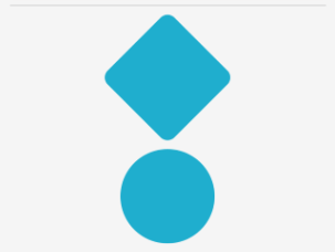
The following example shows three BoxView instances, each set to different style classes:
<ContentPage ...>
    <ContentPage.Resources>
        ...
    </ContentPage.Resources>
    <StackLayout>
        <BoxView StyleClass="Separator" />
        <BoxView WidthRequest="100"
                 HeightRequest="100"
                 HorizontalOptions="Center"
                 StyleClass="Rounded, Rotated" />
        <BoxView HorizontalOptions="Center"
                 StyleClass="Circle" />
    </StackLayout>
</ContentPage>
In this example, the first BoxView is styled to be a line separator, while the third BoxView is circular. The second BoxView has two style classes applied to it, which give it rounded corners and rotate it 45 degrees:
Important
Multiple style classes can be applied to a control because the StyleClass property is of type IList<string>. When this occurs, style classes are applied in ascending list order. Therefore, when multiple style classes set identical properties, the property in the style class that's in the highest list position will take precedence.
Feedback
Coming soon: Throughout 2024 we will be phasing out GitHub Issues as the feedback mechanism for content and replacing it with a new feedback system. For more information see: https://aka.ms/ContentUserFeedback.
Submit and view feedback for