Access and configure the sub-grid properties of a form
This topic applies to Dynamics 365 Customer Engagement (on-premises). For the Power Apps version of this topic, see: Sub-grid properties for model-driven app main forms overview
You can configure a sub-grid on a form to display a list of records or a chart. Select Show Chart Only on the Display tab to show a chart instead of a list.
You can access Sub-Grid properties in solution explorer. Under Components, expand Entities, expand the entity you want, and then select Forms. In the list of forms, open the form of type Main. Then on the Insert tab, select Sub-Grid to view sub-grid properties.
| Tab | Property | Description |
|---|---|---|
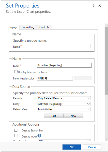
| Display | Name | Required: The unique name for the sub-grid that is used when referencing it in scripts. The name can contain only alphanumeric characters and underscores. |
| Label | Required: The localizable label for the sub-grid visible to users. | |
| Display label on the Form | Whether the label should be displayed on the form. This is required if you enable Display Search Box. You can also choose to have the panel header color. | |
| Records | Choose from two options: - Only Related Records: Sub-grid will display only records related to the current record. - All Record Types: Sub-grid will display records filtered only by the default view or, if the view selector is enabled, any views the user chooses. The option you choose will affect the behavior of the show list control. More information: Show list behavior |
|
| Entity | Depending on the option you choose for Records, this list displays either: - Only Related Records: A list of entities that are related to this entity with the name of the lookup field on that entity which defines the relationship in parentheses. - All Record Types: A list of all entities. |
|
| Default View | Choose the view that will be applied by default. If you do not enable any other views using the View Selector property. This will be the only view. Use the Edit button to open the default view for editing. Use the New button to create a new view to use for this sub-grid. |
|
| Display Search Box | Display the search box. When this option is chosen the Display Label on the Form option is required. | |
| Display Index | Only forms using the Classic forms support display index. Select this check box if you want the alphabetical index to be available with the list. This lets you jump to records starting with a particular letter or number. |
|
| View Selector | You have three options: - Off: Only the default view can be used. - Show All Views: Allow people to choose any view. - Show Selected Views: Use the Ctrl key with your cursor to select which of the available views to show. |
|
| Default Chart | Select which chart to show if Show Chart Only is selected. | |
| Show Chart Only | Rather than a list of records a chart will be displayed. | |
| Display Chart Selection | If Show Chart Only is selected, allow people to choose different charts. | |
| Availability | Specify whether the section should be available on phone. | |
| Formatting | Layout | Select the number of columns the control occupies. When the section containing the sub-grid has more than one column you can set the field to occupy up to the number of columns that the section has. |
| Number of rows | Determines how many records are shown on a page of a subgrid. | |
| Use available space | Note: This property only works with the legacy web client. It has no effect on Unified Interface. If Automatically expand to use available space is chosen, the form will allow space for two records and will expand the space as the number of records increases. If the number exceeds the Number of Records, users can navigate to additional pages to view the records. If Automatically expand to use available space is not chosen, the form will provide space for the number of records defined by Number of rows and users can navigate to additional pages to view any additional records. |
|
| Controls | Controls | Choose to add controls and select the radio button to have them for Web, Phone or Tablet. |
In forms using the Classic forms, actions performed on a sub-grid were available in the ribbon. Developers can customize the behavior of these actions or add additional actions by customizing the ribbon.
In forms using the Updated forms actions for sub-grids are placed near the sub-grid, making them easier to access. However the command bar does not allow for custom actions to be added. Developers can edit the ribbon to modify the actions for the remaining three actions: show list, add record, and delete record.
Show list behavior
When displaying a list in forms with the Updated forms, each sub-grid displays the Open View button  in the top right corner when the entity is also displayed as one of the entities included in the navigation area of the form editor. Choosing this button will open the view. The behavior will change depending on the option chosen for the Records property.
When you select Only Related Records the view will open using one of the associated views in the same window. To return to the form, use the back button or choose the current record primary name value in the navigation bar.
When you select All Record Types the view will open in a new window.
Add record behavior
When displaying a list in forms with the Updated forms, each sub-grid displays the Add record button  in the top right side of the sub-grid. Choosing this button will allow you to add a record. This behavior will change depending on the option chosen for the Records property and if the lookup is for activity records.
When you select Only Related Records the default behavior is the behavior to add existing records. People see an in-line lookup to search for an existing record first. This helps prevent creating duplicate records. If they can’t find an existing record, they can choose the New option. When a new record is created any of the field mappings defined in the relationship will be applied. More information: Map entity fields
When you select All Record Types the default behavior is to add a new record. The quick create form will be shown if the target entity has one. If not, the default entity main form is shown.
If the sub-grid displays activities, people will first need to choose the type of activity and then they will see the “add new record” behavior.
Delete record behavior
When you select a record in a sub-grid the Delete button  appears on the right side of the row. The behavior of this delete action is different depending on the type of relationship with the current entity.
When the sub-grid uses a 1:N (one-to-many) relationship, the normal record delete behavior is to show a confirmation dialog before deleting the record.
When the sub-grid uses a N:N (many-to-many) relationship, the record in the relationship (or intersect) entity relating to two records is deleted without a confirmation and the record will no longer be displayed in the sub-grid. But the record that was displayed is not deleted.
See also
Feedback
Coming soon: Throughout 2024 we will be phasing out GitHub Issues as the feedback mechanism for content and replacing it with a new feedback system. For more information see: https://aka.ms/ContentUserFeedback.
Submit and view feedback for