Arrange views with StackLayout
Stacking views in a vertical or horizontal list is a common design for user interfaces. Think about some common pages in applications. Examples include sign in, register, and settings pages. All these pages typically contain stacked content. In this unit, you learn how to arrange views in a vertical or horizontal list by using StackLayout and the optimized StackLayout controls VerticalStackLayout and HorizontalStackLayout.
What is a StackLayout, VerticalStackLayout, and HorizontalStackLayout?
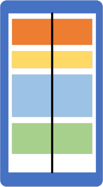
StackLayout is a layout container that organizes its child views left-to-right or top-to-bottom. The direction is based on its Orientation property, and the default value is top-to-bottom. The following illustration shows a conceptual view of a vertical StackLayout.
StackLayouthas a list ofChildrenthat it inherits from its base classLayout<T>. The list stores views, which is helpful because most UI elements you work with in .NET MAUI derive fromView. Layout panels also derive fromView, which means you can nest panels if you need to.VerticalStackLayoutandHorizontalStackLayoutare the preferred layouts to use when you know that your orientation isn't going to change, because they're optimized for performance.
How to add views to a StackLayout
In .NET MAUI, you can add views to a StackLayout in C# code or in XAML. Here's an example of three views added using code:
<StackLayout x:Name="stack">
</StackLayout>
public partial class MainPage : ContentPage
{
public MainPage()
{
InitializeComponent();
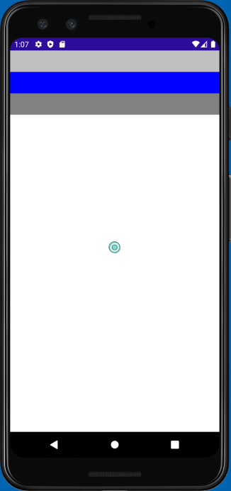
var a = new BoxView { Color = Colors.Silver, HeightRequest = 40 };
var b = new BoxView { Color = Colors.Blue, HeightRequest = 40 };
var c = new BoxView { Color = Colors.Gray, HeightRequest = 40 };
stack.Children.Add(a);
stack.Children.Add(b);
stack.Children.Add(c);
}
}
You can add the views to the Children collection and StackLayout automatically positions the views in a vertical list. Here's what it looks like on an Android device:
To do the same thing in XAML, nest the children inside the StackLayout tags. The XAML parser adds the nested views to the Children collection automatically because Children is the ContentProperty for all layout panels. Here's an example of the same three views being added to a StackLayout in XAML:
<StackLayout>
    <BoxView Color="Silver" />
    <BoxView Color="Blue" />
    <BoxView Color="Gray" />
</StackLayout>
How views are ordered in a StackLayout
The order of the views in the Children collection determines their layout order when they're rendered. For views added in XAML, the textual order is used. For children added in code, the order in which you call the Add method determines the layout order.
How to change the space between views in a StackLayout
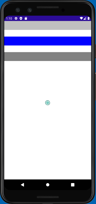
It's common to want some space between the children of a StackLayout. StackLayout lets you control the space between each child by using the Spacing property. The default value is zero units, but you can set it to whatever looks good to you. Here's an example of setting the Spacing property to 30 in XAML:
<StackLayout Spacing="30">
    <BoxView Color="Silver" />
    <BoxView Color="Blue" />
    <BoxView Color="Gray" />
</StackLayout>
The following screenshot shows how the UI would render on Android:
How to set the orientation of a StackLayout
StackLayout lets you arrange children in either a column or a row. You control this behavior by setting its Orientation property. So far, we've been showing only a vertical StackLayout.
Vertical is the default. Whether you explicitly set the Orientation to Vertical is up to you. Some programmers prefer an explicit setting to make the code more self-documenting.
Here's an example of setting the Orientation to Horizontal in XAML:
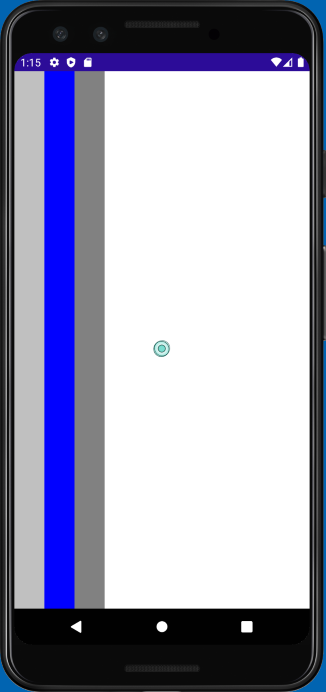
<StackLayout x:Name="stack" Orientation="Horizontal">
    <BoxView Color="Silver" WidthRequest="40"/>
    <BoxView Color="Blue" WidthRequest="40"/>
    <BoxView Color="Gray" WidthRequest="40"/>
</StackLayout>
Note
As described in the previous exercise, the change in orientation of the StackPanel causes it to ignore the HeightRequest properties of each BoxView. Instead, you set the WidthRequest.
The following screenshot shows how the UI would render on an Android device:
Set a view's LayoutOptions in a StackLayout
Every view has a VerticalOptions and HorizontalOptions property. You can use these properties to set the position of the view within the rectangular display area provided by the layout panel.
As noted previously, with StackLayout, the behavior of the LayoutOptions properties depends on the Orientation property of the StackLayout. StackLayout uses the LayoutOptions property in the direction opposite to its Orientation. By default, an element in a stack layout isn't allocated any extra space in the same direction as the Orientation of the stack layout. Assigning a position for that direction in this default case doesn't change the rendering of the element. There's a change in the rendering, though, when position is combined with expansion.
What about expansion?
Recall from an earlier unit that the LayoutOptions struct contains a bool property called Expands that is now obsolete in .NET MAUI. When you set the VerticalOptions and HorizontalOptions, you might notice the LayoutOptions of StartAndExpand, CenterAndExpand, EndAndExpand, and FillAndExpand. If you set LayoutOptions to one of these AndExpand options, the option is ignored and the first part of the LayoutOptions is used such as Start, Center, End, or Fill. If you're migrating from Xamarin.Forms, you should remove all AndExpand from these properties. Later in the module, we see how to achieve similar functionality when we learn about Grid.
Optimized StackLayouts
As mentioned earlier, the VerticalStackLayout and HorizontalStackLayout are optimized StackLayout controls with predefined orientations. We recommended that you use these controls when possible, for the best layout performance. These layouts have the functionality of LayoutOptions and Spacing that the regular StackLayout has.
<VerticalStackLayout Spacing="30">
    <BoxView Color="Silver" />
    <BoxView Color="Blue" />
    <BoxView Color="Gray" />
</VerticalStackLayout>

<HorizontalStackLayout Spacing="30">
    <BoxView Color="Silver" />
    <BoxView Color="Blue" />
    <BoxView Color="Gray" />
</HorizontalStackLayout>