Create a Power BI report
Previously, you connected to your Dataverse for Teams table data and then transformed it. Now, you can build a report with interactive visualizations by using the Report view in Power BI, which consists of the following areas:
Report canvas - Where visualizations are created and arranged (number 1 in the image).
Filters pane - This allows you to filter and only work with subsets of data (number 2 in the image).
Visualizations pane - Where you can select and edit the visualizations (number 3 in the image).
Fields pane - Where you can choose the data to include in the visualizations or include it as a filter (number 4 in the image).
Pages tab - Where you can create more report canvases (number 5 in the image).


The basic steps to add visualizations to the report are:
Select a visualization from the Visualizations pane.
Select and drag the required fields from the Fields pane into the Visualizations pane or Filters pane.
Move and resize the visualization in the report canvas.
Make more edits to the visualization in the Visualizations pane.
Add a stacked column chart
To add a stacked column chart, follow these steps:
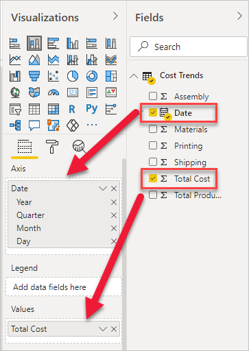
Select the Stacked Column Chart icon from the Visualizations pane.

Select and drag the following elements from the Fields pane:
- Date field to Axis
- Total Cost field to Values
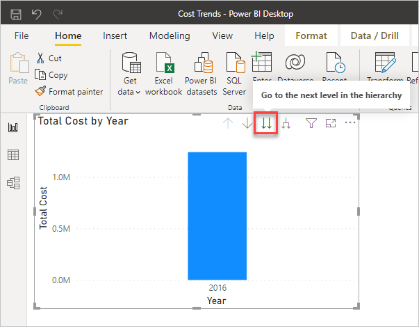
Notice that the chart is showing the data by years. You can drill in to see the data by quarter and month by selecting the Go to the next level in the hierarchy icon. In the next step, you will edit the chart to show the data by month.
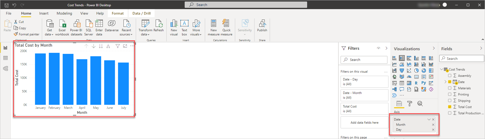
With the chart selected in the report canvas, remove Year and Quarter under Axis so that the graph shows the data by month.
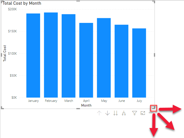
Resize the chart in the report canvas by selecting and dragging the indicated border controls. Have the chart fill up the upper-left portion of the canvas.


Add a line chart
To add a line chart, follow these steps:
Select the Line Chart icon in the Visualizations pane.

Note
If you already have a visualization selected in the report canvas, then selecting another visualization will replace it. Make sure that you don't have a visualization selected by selecting a blank area of the report canvas before you create a new one.
Select and drag the following entities from the Fields pane.
For Axis:
- Date (remove Year and Quarter)

For Values:
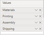
- Materials
- Printing
- Assembly
- Shipping
Select and drag to resize the line chart to cover the lower half of the report canvas.

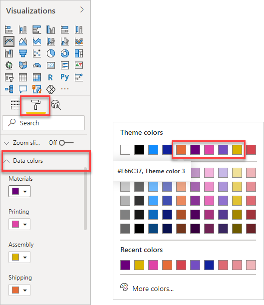
Change the data colors by going to the Visualizations pane, selecting the Format tab, and then expanding Data colors. Use the drop-down list next to each color and select the following theme colors:
- Materials - Theme color 4
- Printing - Theme color 5
- Assembly - Theme color 6
- Shipping - Theme color 3


Add a stacked area chart
To add a stacked area chart, follow these steps:
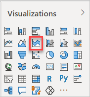
Select the Stacked Area Chart icon in the Visualizations pane.
Select and drag the following entities from the Fields pane to the Values area.
For Axis:
- Date (Remove Year and Quarter)

For Values:
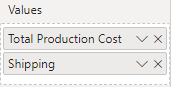
- Total Production Cost
- Shipping
Change the colors of the area chart to make it consistent with the rest of the report. In the Visualizations pane, select the Format tab and then expand Data colors. Use the drop-down list next to each color and select the following theme colors:
- Total Production Cost - Theme color 2
- Shipping - Theme color 3

If the new chart has automatically set the Y axis to zoom in on the shipping data, in the Format tab expand the Y Axis section and type in 0 for the start. The graph now shows both the Total Production Cost and the Shipping information.

Select and resize the chart in the report canvas to occupy the existing space.


Change data to use currency format
Notice that the report shows data in the legends and pop-out windows as simple numbers without formatting. It would be more useful to have the data appear as currency.

To change to currency format, follow these steps:
Under the Fields pane, select the Assembly field.
In the Column tools ribbon, select the Currency format icon.

Repeat these steps for Materials, Printing, Shipping, Total Cost, and Total Production Cost.

After you have completed these steps, your data will appear as currency.

Explore the report
Power BI links your charts to be interactive when selecting a visual in one chart; the other charts will automatically adjust. For example, if you click on the data point for March under Total Production Cost and Shipping by Month, the other two charts will adjust to show data for that month. Total Cost by Month will highlight the data for March while the Materials, Printing, Assembly, and Shipping by Month line graph shows just the data point for March. Click on the same data point to revert all the charts back to normal.

Experiment by selecting other visuals in the other charts. As you add additional tables into your reports, you will create more complex reports that automatically interact to help you and your users explore the data. For more information on Power BI visual interactions and how to configure them, please see the links that are provided in the Summary section at the end of the module.
Save the report
Save the report by selecting File > Save as in the menu. Enter Contoso Cost Trends as a name and then select Save. Power BI Desktop uses a pbix file extension for its saved files.
The final report should look similar to the following image.
