Data visualization style guidelines for Office Add-ins
Good data visualizations help users find insights in their data. They can use those insights to tell stories that inform and persuade. This article provides guidelines to help you design effective data visualizations in your add-ins for Excel and other Office apps.
We recommend that you use Fluent UI to create the chrome for your data visualizations. Fluent UI includes styles and components that integrate seamlessly with the Office look and feel.
Data visualization elements
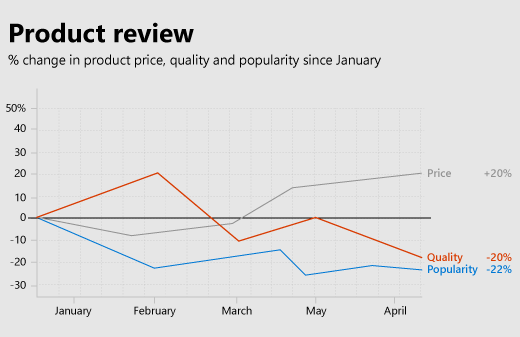
Data visualizations share a general framework and common visual and interactive elements, including titles, labels, and data plots, as shown in the following figure.
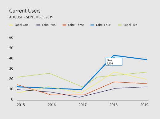
Chart titles
Follow these guidelines for chart titles.
Make your chart titles easily readable. Position them to create a clear visual hierarchy in relation to the rest of the chart.
In general, use sentence capitalization (capitalize the first word). To create contrast or to reinforce hierarchies, you can use all caps, but all caps should be used sparingly.
Incorporate the Fluent UI type ramp to make your charts consistent with the Office UI, which uses Segoe. You can also use a different typeface to differentiate chart content from the UI.
Use sans-serif typefaces with large counters.
Axis labels
Make your axis labels dark enough to read clearly, with adequate contrast ratios between the text and background colors. Make sure that they are not so dark that they compete with data ink.
Light grays are most effective for axis labels. Explore the following Fluent UI neutral color palettes.
Data ink
The pixels that represent the actual data in a chart are referred to as data ink. This should be the central focus of the visualization. Avoid the use of drop shadows, heavy outlines, or unnecessary design elements that distort or compete with the data. Use gradients only when data values are tied to color values. Avoid three-dimensional charts unless a measurable, objective value is bound to a third dimension.
Color
Choose colors that follow operating system or application themes rather than hardcoded colors. At the same time, make sure that the colors you apply don't distort the data. Misuse of color in data visualizations can result in data distortion and incorrect reading of information.
For best practices for use of color in data visualizations, see the following:
- Why rainbow colors aren't the best option for data visualizations
- Color Brewer 2.0: Color Advice for Cartography
- I Want Hue
Gridlines
Gridlines are often necessary for accurately reading a chart, but should be presented as a secondary visual element, enhancing the data ink, not competing with it. Make static gridlines thin and light, unless they are designed specifically for high contrast. You can also use interaction to create dynamic, just-in-time gridlines that appear in context when a user interacts with a chart.
Light grays are most effective for gridlines. Explore the following Fluent UI neutral color palettes.
The following image shows a data visualization with gridlines.
Legends
Add legends if necessary to:
- Distinguish between series.
- Present scale or value changes.
Make sure that your legends enhance the data ink and don't compete with it. Place legends:
- Flush left above the plot area by default, if all legend items fit above the chart.
- On the upper right side of the plot area, if all legend items don't fit above the chart, and make it scrollable, if necessary.
To optimize for readability and accessibility, map legend markers to the relevant chart shape. For example, use circle legend markers for scatter plot and bubble chart legends. Use line segment legend markers for line charts.
Data labels and tooltips
Ensure that data labels and tooltips have adequate white space and type variation. Use algorithms to minimize occlusion and collision. For example, a tooltip might surface to the right of a data point by default, but surface to the left if right edges are detected.
Design principles
The Office Design team created the following set of design principles, which we use when designing new data visualizations for the Office product suite.
Visual design principles
- Visualizations should honor and enhance the data, making it easy to understand. Highlight the data, adding supporting elements only as needed to provide context. Avoid unnecessary embellishments, such as drop shadows and outlines, chart junk, or data distortion.
- Visualizations should encourage exploration by providing rich visual feedback. Use well-established interaction patterns, interface controls, and clear system feedback.
- Embody time-honored design principles. Use established typographic and visual communication design principles to enhance form, readability, and meaning.
Interaction design principles
- Design to allow for exploration.
- Allow for direct interactions with objects that reveal new insights (sorting via drag, for example).
- Use simple, direct, familiar interaction models.
For more information about how to design user-friendly interactive data visualizations, see UI Tenets and Traps.
Motion design principles
Motion follows stimulus. Visual elements should move in the same direction at the same rate. This applies to:
- Chart creation
- Transition from one chart type to another chart type
- Filtering
- Sorting
- Adding or subtracting data
- Brushing or slicing data
- Resizing a chart
Create a perception of causality. When staging animations:
- Stage one thing at a time.
- Stage changes to axes before changes to data ink.
- Stage and animate objects as a group if they are moving at the same speed in the same direction.
- Stage data elements in groups of no more than 4-5 objects. Viewers have difficulty tracking more than 4-5 objects independently.
Motion adds meaning.
- Animations increase user comprehension of changes to the data, provide context, and act as a non-verbal annotation layer.
- Motion should occur in a meaningful coordinate space of the visualization.
- Tailor the animation to the visual.
- Avoid gratuitous animations.
Motion follows data.
- Preserve data mappings. If an area is tied to a measure, maintain that area in transition.
- Maintain a consistent animation design language. Where possible, map data visualization animation to existing Office motion design language. Use similar animations for similar chart types.
Accessibility in data visualizations
- Don't use color as the only way to communicate information. People who are color blind will not be able to interpret the results. Use shape, size and texture in addition to color when possible to communicate information.
- Make all interactive elements, such as push buttons or pick lists, accessible from a keyboard.
- Send accessibility events to screen readers to announce focus changes, tooltips, and so on.
See also
Office Add-ins
Feedback
Coming soon: Throughout 2024 we will be phasing out GitHub Issues as the feedback mechanism for content and replacing it with a new feedback system. For more information see: https://aka.ms/ContentUserFeedback.
Submit and view feedback for