Power BI Report Server - May 2022 release
Important
This content is archived and is not being updated. For the latest documentation, go to What's new in Power BI?. For the latest release plans, go to Dynamics 365 and Microsoft Power Platform release plans.
| Enabled for | Public preview | General availability |
|---|---|---|
| Users by admins, makers, or analysts | - |  May 31, 2022
 |
Business value
Power BI Report Server is the on-premises solution for reporting today, with the flexibility to move to the cloud tomorrow. It's included with Power BI Premium, so you have the ability to move to the cloud on your terms. This release includes updated custom visual support, enhanced Windows Narrator support, and security and reliability updates.
Feature details
Power BI Report Server provides customers with the flexibility to deploy reporting on-premises, for customers who can't use the cloud service for compliance or policy reasons. In this release, we've included an update to custom visual support, enhanced Windows Narrator support, and security and reliability updates.
While Power BI Report Server isn’t a substitute for the breadth of capabilities in the Power BI service, we continue to enhance Power BI Report Server based on customer feedback.
Listed below is a complete list of updates that you will have access to:
Dynamic format strings now supported for all chart elements
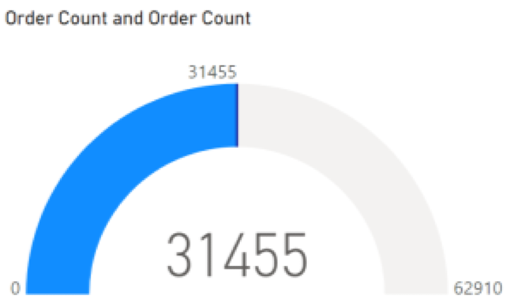
Reports with Analysis Services (AS) data sources can provide dynamic format strings, or cell-level formatting, to customize the formatting of your data. Reports with calculation groups will also convert regular format strings into dynamic format strings. We’ve gotten feedback over time that these dynamic format strings were applying inconsistently across several different visuals, including the gauge visual and some cases of categorical bar charts. We know that this inconsistency has affected decisions you’ve made around report design, so we’re highlighting here that after the numerous changes that we've made, categorical visuals should now support all dynamic format strings.
Multi-row card selection
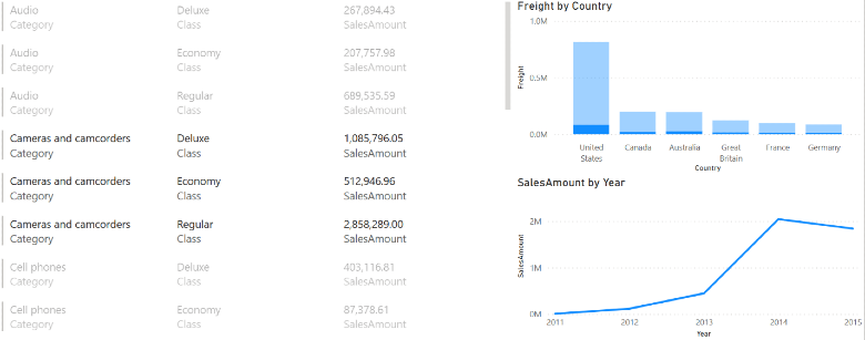
You can now select rows in your multi-row card to cross-highlight and cross-filter the other visuals in your report! Unselected rows will dim to help you identify which rows you have selected. You can use Ctrl + click or Shift + click to select multiple rows at once. This brings interactivity in multi-row cards closer to parity with our other visual offerings.
Bookmark navigator now shows the last selected bookmark per group
We’ve been listening to your feedback on the new bookmark navigator. To better support interaction between multiple navigators, bookmark groups, and interaction with elements on the report, we now ensure that once you select a bookmark in the navigator, it continues to stay selected, regardless of other changes in the report state. The “active” bookmark in any navigator continues to stay active until you select another bookmark in the navigator, either from the navigator or the bookmarks pane. Previously, selecting any other bookmark, including those not in the bookmark group represented by a navigator, would clear the selections in the bookmark navigator. This small behavior change enables the use of multiple navigators targeting separate bookmark groups to operate and have independent “active” bookmarks.
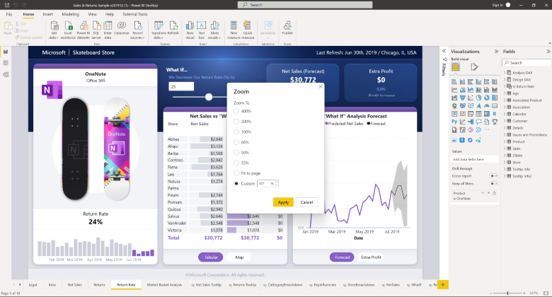
Canvas Zoom
With this long anticipated feature, you have the ability to zoom on the canvas! For report readers, this is especially important for improving readability. For report creators, this helps magnify the canvas to make pixel-perfect tweaks. You can drag the slider to set the zoom level or select the zoom % to launch the zoom level dialog and type in a custom input. Use the new quick “fit to page” button to get back to the default view.
Data point rectangle select
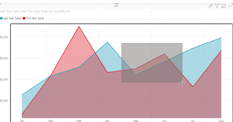
You can now multi-select data points by clicking and dragging over a supported visual. Here’s how it works:
When editing a report, you can create a selection rectangle by holding down Ctrl, then clicking and dragging within a visual. Letting go of the mouse will select all points overlapping the selection rectangle. Your previous selections are preserved, and already selected data points are deselected — it's as though you held down the Ctrl key and individually clicked every single point that overlaps the selection rectangle. You can also click and drag while holding down the Shift key instead. This will only add data points to your selection without deselecting any points. As always, you can clear your current selection by clicking an empty space on the plot area (without holding down any key).
When viewing a report, you can create a selection rectangle by clicking and dragging across a visual with no other keys held down.
We’ve also introduced keyboard controls to help you access data point rectangle select without a mouse. Pressing the S key while focused on the plot area or a data point will enter rectangle select mode, displaying a crosshair on the visual. You can move the crosshair using the arrow keys and speed up that movement by holding down the Shift key.
Then, when you’re ready to start drawing the rectangle from your cursor’s position, hold down the Space key and use the same crosshair movement controls to create the selection rectangle. Selection is completed once you let go of the Space key, and you can clear selections by pressing Ctrl+Shift+C. Data point rectangle select is available for line, area, scatter, treemap, and map visuals, and you can select up to 3,500 data points at one time.
Mandatory label policy
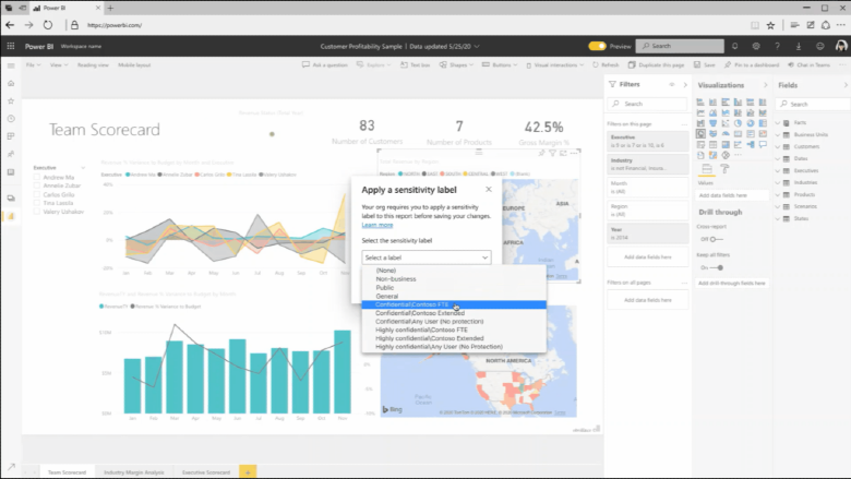
Mandatory label policies enable organizations to ensure that MIP sensitivity labels will be applied to your new content when you create it in or upload it to Power BI. When you try to save a .pbix file, Power BI prompts you to choose a label before you can save the item. Also, the option to remove a label isn’t available when a mandatory label policy applies.
Updated slicer defaults for accessibility improvements
The new base theme for slicers is being updated to enhance overall accessibility. This will affect all newly created reports for some slicers, including List and Date slicers. List slicers will have slightly larger font and spacing between the items to accommodate touch, and generally make selection easier. Default colors are also updated to have slightly higher contrast for List and Horizontal slicer types. Date pickers will now have a calendar icon, and input labels by default. The new defaults are designed to meet standard accessibility requirements, so to best create accessible content, we advise keeping the default settings. These items can also be modified in the new Format pane or controlled via a custom theme if you want your report defaults to be different. To learn more about Power BI and accessibility, check out our Overview of accessibility in Power BI.
Windows 11 support
Windows 11 introduces four high-contrast themes – Aquatic, Desert, Dusk, and Night sky, each with its new color palette that is distinctive from its counterpart in Windows 10. In this release, Power BI fully supports the new Windows 11 high-contrast themes and is compatible with Windows 10 high-contrast themes and custom themes. Colors of the window background, body text, highlighted text and background, hyperlink, disabled text, button text and background, and icons will adapt to the user’s system colors at runtime. As a result, if you have low vision, you will have a smoother experience navigating through the Power BI app and utilizing all kinds of dialogues, regardless of the Windows operation system you use. This change does not impact any report themes.
