Add navigators to Reporting Services mobile reports
Note
SQL Server Mobile Report Publisher is deprecated for all releases of SQL Server Reporting Services after SQL Server Reporting Services 2019. It is discontinued starting in SQL Server Reporting Services 2022 and Power BI Report Server.
In SQL Server Mobile Report Publisher, you add navigators to filter the data in visualizations by time or by selection.
Navigators are similar to slicers in Power BI and Excel PivotTables, but navigators have some unique traits, too.
Time-based navigators filter tables by selecting rows that fall in a specific time range.
Selection-based navigators filter tables by selecting rows where a particular column value matches the selected key value. Or, in cases of hierarchical trees, where a particular column value belongs to the subtree of the selected key value. There are two types of selection navigators:
- Selection lists are single-column tables you can use to filter your mobile report, similar to slicers in Power BI and Excel.
- Scorecard grids filter the mobile report, too.
Time navigators
As its name implies, you use the time navigator to filter a range of data bounded by a time range.

When you view the report in Preview or in the Reporting Services web portal, you drag the arrows in the time navigator to filter the rest of the report.
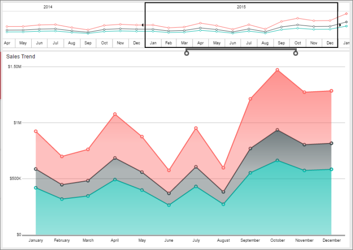
By default, the time navigator filters all the visuals in the report that are connected to time-based data. If a table contains more than one time-based column, only the first is used for filtering. The series table drives the embedded visualization and determines the overall date range of the mobile report.
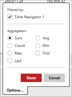
You can disconnect a visualization from the time navigator.
Select the visualization, then select the Data tab.
In Data Properties, select Options.
Clear the Filtered by check box.
Selection lists
The selection list filters data in a mobile report by matching the value you select in the list to the value of a specified column for each row of a filtered table.
From the Layout tab, drag Selection list to the design surface and resize it the way you want it.
Select the Data tab, and in the Data properties pane under Keys, select the table and column that is the filter.
Under Labels, select the column with the label to be displayed. The key column and label column can be the same.
If you're using hierarchical tree data, select a parent key column.
After you set the data properties, under Tables Filtered by Selection List, select the tables to be filtered and the column to filter by. This column needs to match values in the selection list's key column.
For each visualization in the mobile report that you want the selection list to filter:
Select the visualization, select the Data tab, and in the Data properties pane, select Options next to the field name.

Under Filtered by, select the selection list.
When you view the mobile report in Preview or in the Reporting Services web portal and select a value in the selection list, it filters the other visualizations in the mobile report.

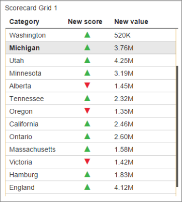
Scorecard grid
The scorecard grid filter functions much like the selection list filter, but it also displays value columns and score indicators, which are the same as the indicators in an indicator data grid. After selecting the key, label, and optional parent key columns, you select an input table and column to provide the scorecard with data. The scorecard data column should be filterable by the key column.
From the Layout tab, drag Scorecard grid to the design surface and resize it the way you want it.
Select the Data tab, and in the Data properties pane under Keys, select the table and column that is the filter.
Under Labels, select the column with the label that is displayed. The key column and label column can be the same.
To add a score indicator, in the Data Columns pane, select Add score.
Name the score indicator and select Options to set the same properties you'd set for an indicator in a data grid:
- Gauge type
- Value field
- Comparison field
- Value direction
To add a value indicator, in the Data Columns pane, select Add value.
Name the value indicator as desired, choose its source column from the table, and select how the table is formatted.
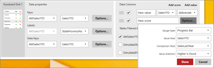
After you set the data properties, under Tables Filtered by Selection List, select the tables to be filtered and the column to filter by. This column needs to match values in the selection list's key column.
When you view the mobile report in Preview or in the Reporting Services web portal and select a value in the scorecard grid, it filters the other visualizations in the mobile report.
Set which visualizations are filtered
Gallery elements are configured to use filters by clicking the options button for a particular input in data view. Filters are enabled by toggling the appropriate checkbox.
You can decide which visualizations in the mobile report that a navigator filters:
Select the visualization, select the Data tab, and in the Data properties pane, select Options next to the field name.
Under Filtered by, select the navigator. Multiple navigators filter Each visualization.
Cascading filters
Filters can also be cascaded together so that the selected value of one filters the available values in a second. To cascade filters, apply the filters to the Key column as you would a regular gallery element.
Related content
Feedback
Coming soon: Throughout 2024 we will be phasing out GitHub Issues as the feedback mechanism for content and replacing it with a new feedback system. For more information see: https://aka.ms/ContentUserFeedback.
Submit and view feedback for