Specify an axis interval in a paginated report (Report Builder)
Applies to: ✅ Microsoft Report Builder (SSRS) ✅ Power BI Report Builder ✅ Report Designer in SQL Server Data Tools
Learn to change the number of labels and tick marks on the category (x) axis in a chart by setting the axis interval in a paginated report.
On the value axis (usually the y axis), axis intervals provide a consistent measure of the data points on the chart.
But on the category axis (usually the x axis), sometimes an automatic axis interval results in categories without axis labels. You can specify the number of intervals you want in the axis Interval property. Report Builder calculates the number of intervals at run time, based on the data in the result set. For more information about how axis intervals are calculated, see Formatting Axis Labels on a Chart.
To try setting the axis interval with sample data, see Tutorial: Add a Column Chart to Your Report (Report Builder).
Note
The category axis is usually the horizontal or x-axis. However, for bar charts, the category axis is the vertical or y-axis.
This topic doesn't apply to:
- Date or time values on the category axis. Be default, DateTime values appear as days. You can specify a different date or time interval, such as a month or time interval. For more information, see Format Axis Labels as Dates or Currencies.
- Pie, doughnut, funnel or pyramid charts, which do not have axes.
To show all the category labels on the x-axis
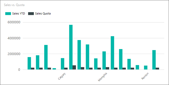
In this column chart, the horizontal label interval is set to Auto.
Right-click the category axis and click Horizontal Axis Properties.

In the Horizontal Axis Properties dialog box > Axis Options tab, set Interval to 1 to show every category group label. To show every other category group label on the x-axis, type 2.
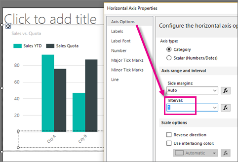
Select OK.
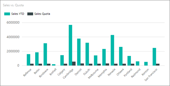
Now the column chart displays all its horizontal axis labels.
Note
When you set an axis interval, all automatic labeling is disabled. If you specify a value for the axis interval, you may see unpredictable labeling behavior, depending on how many categories are on the category axis.
Change the label interval in Properties pane
You can also set the label interval in the Properties pane.
In report design view, click the chart, then select the horizontal axis labels.
In the Properties pane, set LabelInterval to 1.

The chart looks the same in design view.
Click Run to preview the report.
Now the chart displays all its labels.
To enable a variable interval calculation on an axis
By default, Reporting Services sets the axis interval to Auto. This procedure explains how to set it back to the default.
Right-click the chart axis that you want to change, and then click Axis Properties.
In the Horizontal Axis Properties dialog box > Axis Options tab, set Interval to Auto. The chart will display the optimal number of category labels that can fit along the axis.
Select OK.
See Also
Formatting a Chart (Report Builder and SSRS)
Formatting Data Points on a Chart (Report Builder and SSRS)
Sort Data in a Data Region (Report Builder and SSRS)
Axis Properties Dialog Box, Axis Options (Report Builder and SSRS)
Specify a Logarithmic Scale (Report Builder and SSRS)
Plot Data on a Secondary Axis (Report Builder and SSRS)
Feedback
Coming soon: Throughout 2024 we will be phasing out GitHub Issues as the feedback mechanism for content and replacing it with a new feedback system. For more information see: https://aka.ms/ContentUserFeedback.
Submit and view feedback for