TrueType hinting
Hinting is an essential part of the production of a quality font. It is indispensable in every font intended to be legible at small sizes on low resolution output devices. A well-hinted font offers the quality only provided in the past by hand-tuned bitmaps - but with all the speed and reduced memory requirements which characterize outline font formats. Moreover, because the bitmaps are still produced by an outline font, text can be rotated, scaled and viewed at different sizes, and even printed out while maintaining high image quality.
The TrueType font format offers far more power and flexibility in its hinting capabilities than other font formats. Well-hinted TrueType fonts are consequently the best fonts when it comes to displaying text on the screen.
This paper explains exactly what hinting is, why it is necessary, and how the TrueType approach to hinting differs from the approaches adopted by other font formats. As a means of demonstrating the power of the TrueType format, several examples are shown here which compare TrueType fonts side-by-side with equivalent PostScript Type 1 fonts rendered by the ATM rasterizer.
What is Hinting?
At its most basic level hinting (or, more accurately, instructing) a font is a method of defining exactly which pixels are turned on in order to create the best possible character bitmap shape at small sizes and low resolutions. Since it is a glyph's outline that determines which pixels will constitute a character bitmap at a given size, it is often necessary to modify the outline to create a good bitmap image; in effect modifying the outline until the desired combination of pixels is turned on. A hint is a mathematical instruction added to the font to distort a character's outline at particular sizes. Technically, hints result in operations which modify a contours' scaled control point co-ordinates before the outline is scan converted. In TrueType a combination of these hints, and the resulting distortions, affords a very fine degree of control over the bitmap shape produced.
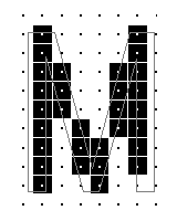
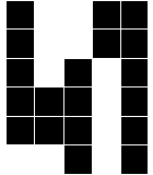
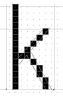
Modifying an outline in this manner results in what is known as a grid-fit. On the basis of the instructions contained in the individual font file, the TrueType rasterizer adjusts the glyph outlines to fit the bitmap grid appropriate for whichever size the text is to be displayed at. This outline adjustment is carried out on a case-by-case basis and is illustrated in figure 1 below.
 |
 |
| Figure 1a. An outline that hasn't been grid-fitted. Note how poorly the outline corresponds to the pixel pattern, and above all how awkward the bitmap of the M is. | Figure 1b. The same outline grid-fitted. Now the outline has been adjusted to fit snugly around each pixel, ensuring that the correct pixels are turned on. |
Grid-fitting explicitly ensures that certain features of the glyphs are regularized, and allows us to overcome many of the problems traditionally associated with displaying text at low resolutions. Because the outlines are only distorted at a specified number of small sizes, the contours of the letterforms at higher resolutions remain unchanged, and undistorted.
Although many font formats and applications offer some hinting facilities, these hints typically consist of a few global parameters that are only capable of specifying distances that should be kept the same. TrueType enables the designer to stipulate exactly how the glyphs and their spacing will appear at low resolutions in isolation as well as within a textsetting.
Why is Hinting Necessary?
Scaling an unmodified outline's control point co-ordinates to the small sizes of a computer screen can result in severe quality control problems. At low resolutions, with few pixels available to describe the character shapes, features such as stem weights, crossbar widths and serif details can become irregular, inconsistent or even missed completely. These irregularities detract substantially from the legibility and overall attractiveness of a textsetting.
These problems are a result of the absolute and finite size of the pixel. Mathematically scaling a character outline presents no problem until the pixel grid of the output device is introduced; at this point it is possible that parts of the outline will pass through only a fraction of a pixel, rather than containing the pixel completely. If the pixel is turned on in such a case, that part of the curve will be wider than the original outline; if it is left off, it will be narrower.
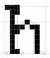
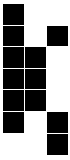
The decision whether or not to turn such a pixel on or to leave it off is a crucial one. On systems and displays utilizing the capabilities of a grayscale rasterizer, the difficulty is lessened somewhat by the possibility of using different levels of gray, but when the text is displayed as a monochrome bitmap, the rasterizer can only make a binary choice (on or off, black or white, 1 or 0). In this case, if the outline has not been grid-fitted by hints, the bitmap will be produced by the results of point co-ordinates being mathematically rounded up or down. The introduction of the 'chance' effects of rounding up and down can significantly impair the quality of type at low resolutions. As figure 2 below shows, rounding can have some unpleasant side effects.
 |
 |
| Figure 2a. Note how heavy the upper serif has become in comparison with the stem weights. | Figure 2b. Here, rounding of points has resulted in uneven vertical stem weights and missing serif details. |
 |
| Figure 2c. This lowercase 'm' has uneven stems and arches. |
How Does Hinting Help?
Since hinting is fundamentally about improving the appearance of text at small sizes and low resolutions, many of our concerns when hinting a font are the same as when drawing a font. At Microsoft we take great pains to ensure that all of the fonts we ship are hinted to very high levels. The issues we attempt to address through hinting fall into the following seven categories: color, readability, spacing, weight, alignment, symmetry and 'local aesthetics' (the actual bitmap shapes for eachcharacter).
Color
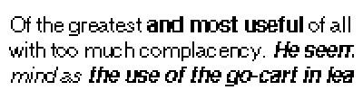
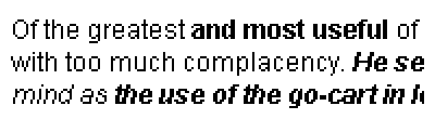
Color is arguably the most striking aspect of a text setting. This is no less true at screen sizes than at high resolution or on the printed page. Abrupt and uneven changes in the color of a word or line are likely to distract the reader. If text is to be legible, an even color isessential.
In the context of typography, the word 'color' refers to the balance of black and white on the page or screen. The black character shapes and white background of the page combine to produce 'color'. Regardless of how bold or light that color is, it should at least be even andconsistent.
The color of words is determined and complicated by a number of issues - such as the contrast between thick and thin stem weights, the size of the characters' internal spaces, the amounts of intercharacter spacing and interlinear spacing, the jaggedness of diagonal strokes, and the overall thickness of a stroke. Excessively patchy, dark or light areas tend to attract the reader's eye too much for the reading process to be a smooth and efficientone.
Maintaining an even text color means that the type remains as unobtrusive for the reader as possible. Figure 3 below demonstrates the difference between even and uneven color in different fonts used to set the text.
 |
 |
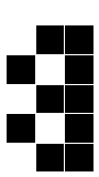
| Figure 3a. Uneven color in a text setting. Note how unevenly distributed the stroke weight is, and how the bowls of the lowercase a and e are very tight in comparison with the open round characters. | Figure 3b. Even color in a text setting. Stroke weight is consistent, diagonals and curves are controlled, and the overall effect is much more appealing than the example at left. |
Readability
Readability is a second critical attribute of a well-hinted font. Every glyph should be identifiable as a particular character. If this is not the case, it will be difficult to attain the desired standard of legibility with the font. At very low resolutions it can become quite difficult to represent a character adequately. This is where an element of compromise comes into play; making an 'm' look like an 'm' at 9 ppem may require some playing with the bitmap. Figure 4 below shows some particularly unreadable glyphs.
 |  |  |
Spacing
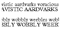
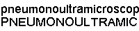
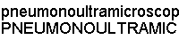
Another contributor to poor legibility at low resolutions is inconsistent intercharacter spacing. This irregular spacing occurs as the result of two things: the rounding up or down in width of the bitmap to fit the character outline, and the difference between the width of the bitmap in pixels and the set width of the character on a high resolution printer. In reality, the space between characters and between words should appear as a regular interval to the eye. Making sure that glyphs do not run into one another at small sizes is vital to maintain even color across thefont.
Spacing characters at low resolutions can be extremely difficult. What should be done, for example, when the lowercase 'i' occupies a total width of four pixels and has a one pixel stem width? Placing one pixel of space on either side creates problems with the remaining pixel. Adding it to the right or left will affect the spacing of characters that precede or follow the letter 'i' in a word, while adding to the stem width will normally make it too heavy for the rest of the characters in the font. These are important considerations, for as the illustrations below show, intercharacter spacing can have a profound effect on the legibility of a font. With the control TrueType offers for adjusting the space around characters as well as the actual letterforms themselves, it is relatively easy to ensure a text setting such as the one shown on the right below. (We'll provide more info on how TrueType makes spacing issues easier to deal with later in this article.)
 |
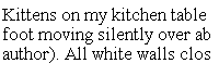 |
| Figure 5a. Spacing. Uneven spacing in a text sample. Notice how some of the characters bump up against each other, while others create excessive space between themselves. Together these things can dramatically alter the 'color' of a setting. | Even spacing. Each character spaces well between others and the overall effect is much more appealing. |
 |
 |
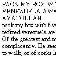
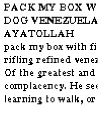
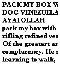
| Figure 5b. Spacing. The spacing produced by ATM v3.01 Helvetica Bold (at 12 ppem / 9 points). Enlarged. | TrueType Arial Bold, rendered at 12 ppem (9 points) by the Microsoft TrueType rasterizer v1.66. Enlarged. |
Weight
In a well-hinted font the weight of the strokes of the characters is controlled. This is important not just within a given font, but also in relation to other fonts in the same typeface family. It makes little sense to deem a weight bold if at the same size the roman or italic weights are just as heavy or even heavier. The following are specific considerations addressed by good qualityhinting:
- At which ppem sizes do character's stem widths widen to two, three, four and five pixel stems? Is this suitable for the weight and appearance of the font, or is it too late, or toosoon?
- How do the weights of the regular characters compare with the bold and italic of the same typeface family? It should be possible to control the stem widening (to more pixels) sufficiently to produce a weight difference at everysize.
- Do the uppercase glyphs widen in the stems before the lower caseglyphs?
- Do the weights of the numerals follow the uppercase or lowercase characters? Or neither?
- Do round character features become wider before straight and square features? Or viceversa?
- Are the overshoots consistent? Do they happen too early or too late? Do they work with fonts in the samefamily?
Each of these issues is important in aiding legibility on the screen. If there isn't a discernible difference between two weights of a font on the screen, it can be difficult to tell headings from text. If uppercase glyphs appear much bolder than lowercase ones, they will draw too much attention to themselves. And if round characters widen too early, they can affect both the spacing and the color of a textsetting.
 |
 |
 |
 |
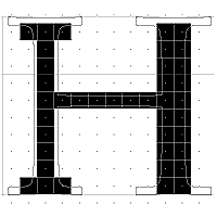
| Figure 6. Weight across a font family. PostScript versions of Times and Times Bold rendered by Adobe Type Manager v3.01 at 11 ppem (8 point). Enlarged. | TrueType Times New Roman rendered by the Microsoft TrueType rasterizer 1.66 at 11 ppem (8 point). Enlarged. Here the weight relationship between the two fonts is much more apparent. |
Alignment
Another important consideration when hinting a font is the control of various alignments, both within the font, and in the wider font family. Generally, similar elements should be kept the same at small sizes, where a one or two pixel difference is much more noticeable than it would be over a height of 24 pixels, for example. In practice this means forcing uppercase characters to align to the same height, and doing the same with lowercase characters at both descender level, ascender level and x height. Cap heights need to align properly when a word is set in uppercase characters. But even more than this, these same elements need to align properly across the different variants of the same typeface family. It will normally be important to ensure that x-heights, for example, align exactly when an entire sentence is set in a regular weight except for one word which is set in either italic or bold. Figure 7 compares an example of proper alignment with one of improper alignment.
 |
 |
| Figure 7a. Alignment across a font. An example of poor alignment across a line of text. Note how the round characters appear taller than those with flat tops, and how unsettling it is to follow the line. | The same font as shown at left, but with improved alignment. Although the round characters actually have slightly greater outline size than the flat characters, they are forced to the same height at this size. |
 |
| Figure 7b. Alignment across a family. PostScript versions of Helvetica, Helvetica Italic, Helvetica Bold and Helvetica Bold Italic rendered by Adobe Type Manager v3.01 at 12 ppem (9 point). Enlarged. |
 |
| TrueType versions of Arial, Arial Italic, Arial Bold and Arial Bold Italic rendered by the Microsoft TrueType rasterizer v1.66 at 12 ppem (9 point). Enlarged. |
Symmetry
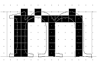
Although symmetry could easily be subsumed under the following category (local aesthetics) it is discussed here separately because it is generally something which needs to be controlled across the entire font. Despite the subtleties often present in the outlines of characters with diagonal strokes, one of the cleanest methods of dealing with diagonals is to treat them symmetrically at small sizes. This ensures that 'jaggies' are regularized and minimized. The illustrations below show how treating the diagonal strokes symmetrically can improve the appearance of the localshape.
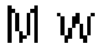 |
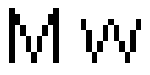 |
| Figure 8a. Symmetry in a character. The uppercase 'M' (13 ppem/10 point) and lowercase 'w' (15 ppem/11 point) of Helvetica, rendered by Adobe Type Manager v3.01. Enlarged. | TrueType Arial's uppercase 'M' (13 ppem/10 point) and lowercase 'w' (15 ppem/11 point) rendered by the Microsoft TrueType rasterizer v1.66. |
It makes little sense for nearly symmetrical characters to be treated non-symmetrically with only a few pixels. In lines of text, such as those shown below, symmetrical bitmaps can substantially improve the general appearance:
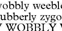 |
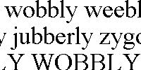 |
| Figure 8b. Symmetry across a font. In this text sample set at 36 ppem, the diagonals have not been treated symmetrically. Notice how this adversely affects the textual color. | Here the diagonals are symmetrical, helping lend the sample a much more even color, despite the weight problems apparent in the lowercase r. |
Local aesthetics
The categories discussed above have been those that affect the look of the font as a whole. Of course it is also important to consider local aesthetics - the individual bitmap shapes themselves. Hinting can be particularly useful in helping the avoidance of individual pixel spurs and flat runs, for example. It can also help ensure that specific bitmaps are not deformed, remain readable, and that bowls and counters have not closedup.
Hinting vs. Other Methods
Shape modification
TrueType affords the designer or engineer more flexibility and control over the final bitmap appearance than any other font format in use today. Through the use of the extensive range of commands in the TrueType instruction set, the designer is able to move any point on a glyph's outline as little or as much as necessary to turn on or off any pixel on the bitmap grid. This provides as much control as a simple bitmap editor. Commands can be used not only to improve legibility of fonts at small sizes, but also to fundamentally alter the appearance of any bitmap at any size - enabling the production, for example, of a font where different sizes will produce a different shape. Because TrueType is a programming language (at the assembly level), the format offers font designers and engineers an amazing degree of versatility. The sizes affected by the hinting commands can also be determined by setting low and high size thresholds, or cut-ins.
A practical example of this flexibility was demonstrated recently in a Microsoft font designed specifically for display on television under the NTSC signal. During preliminary work it became clear that at small sizes it would be impossible to render certain character features satisfactorily - such as the diagonal bar of the uppercase N. The designer, conscious of making every glyph as individual as possible, established a threshold below which he programmed certain characters to change shape. Illustrated below are the outlines and resulting bitmaps from 21 and22ppem.
 |
| Figure 9. The outlines and resulting bitmaps at sizes of 21 ppem and 22 ppem. Despite the differences in shape, these bitmaps are produced by the same font. By adjusting the outline sufficiently, the designer has managed to ensure that each bitmap remains individual and identifiable. |
Optical scaling
Since TrueType enables the designer or programmer to alter a letterform at every single size, it follows that optical scaling can be built into the TrueType font, allowing the subtle adjustment of characters at different sizes to ensure their correctappearance.
The designing of bitmap letterforms has always involved a degree of optical scaling, with each and every size having to be rasterized - and often designed - separately. Unfortunately, these modifications have always involved, even been determined by, an element of compromise; this pixel or that pixel? In a TrueType font, the ability to create optically correct letterforms is extended up to very large sizes (up to 2048 ppem) and by the capabilities of TrueType Open, a new extension to the TrueType specification (EDITOR: This eventually evolved into the OpenType initiative).
Non-linear scaling
Non-linear scaling is often (understandably) confused with optical scaling. Whereas the concept of optical scaling involves altering the shapes of characters in order to ensure a correct appearance at particular sizes, non-linear scaling in TrueType simply enables the widening or narrowing of the widths of a glyph and its side-bearings at sizes where, were the widths to scale in a linear fashion (for example, increasing in a regular pattern from small to large sizes) we might encounter spacing or weight problems. In a situation where, for example, the lowercase 'i' would normally scale to occupy an advance width of four pixels, we might elect to force it to fit within three pixels, placing one pixel of white space on either side of a one pixel black stem. In such cases, we are clearly forcing the font to scale in a non-linear fashion.
In effect, non-linear scaling means that TrueType hinting is not limited merely to controlling the shape of each character. The type designer is able to adjust the inter character spacing by varying the amount of white space to either side of a letterform. This facility is critical in helping maintain an even, consistent color across lines of text, and is a highlight of TrueType hinting not available in other fontformats.
Diagonal control
Diagonal control is another feature of TrueType hinting that helps lead to better visual quality in a font. Keeping diagonal strkes as symmetrical as possible helps to avoid unnecessary jaggedness or 'stepping'. The use of separate vectors for measuring distances and moving points on a glyph's outline enables a very fine degree of control over point positioning in a diagonal stroke element. In the example shown below it can be seen that the distance a point must be moved to ensure a correct bitmap stroke is measured in one direction, while it is actually moved in a slightly different direction. This feature allows us to measure the true width of an element such as a diagonal stroke, and to maintain it, rather than basing our judgments inaccurately on a straight horizontal measure. Attaining stroke weight consistency with this feature can also aid the color, spacing and symmetry of a font at small sizes and low resolutions.
 |
 |
| Figure 10a. TrueType enables the measurement of a distance such as a diagonal stroke weight along the projection vector, while the movement of the point to be shifted can take place completely independently... | ...enabling the exact positioning of the outline in order to create a perfect pixel pattern. |
Controlling diagonals in this manner enables TrueType fonts to represent italic and oblique letterforms with much greater fidelity than other font formats. The illustration below shows how much more even TrueType diagonal control can make asetting.
 |
 |
| Figure 10b. Diagonal control in an italic font. ATM Times Italic at 11 ppem (8 points). | TrueType Times New Roman Italic at 11 ppem (8 points). |
Intelligence in the hints
With TrueType, the intelligence is in the hints rather than in the rasterizer. That is, all alterations to the original outline description are performed through instructions contained in the font rather than by the rasterizer acting on its own. This approach has three important implications.
First, it means that the bulk of the calculations takes place during font production rather than at runtime. In this sense, TrueType is similar to a compiled language, while outline font technologies that perform most of their work during execution are more like interpreters.
Second, having the intelligence in the hints means that font vendors can precisely control the final appearance of the fonts - because they apply the hints. In contrast, with approaches that rely on the rasterizer to apply hints or perform other outline adjustments, font vendors have less control over the final appearance of thefonts.
Finally, having the intelligence in the hints allows tool vendors to improve their hinting technology without requiring users to buy a new rasterizer or additional printer ROM. This means that end users can upgrade their fonts for just the price of the fonts themselves, without incurring any other hardware or softwarecosts.
Feedback
Coming soon: Throughout 2024 we will be phasing out GitHub Issues as the feedback mechanism for content and replacing it with a new feedback system. For more information see: https://aka.ms/ContentUserFeedback.
Submit and view feedback for